Food packaging must protect the product, speed up service and enhance every sale.Pastry shops, delicatessens and wine...
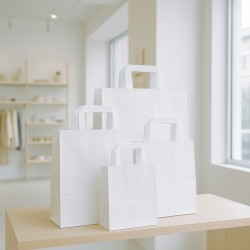
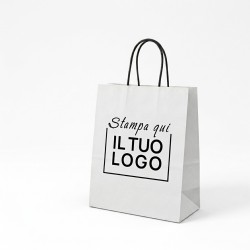
White kraft paper shopping bag with flat handle, 9 sizes€87.11
 ChartaRè, RossiCarta's Online Packaging Store



Food packaging must protect the product, speed up service and enhance every sale.Pastry shops, delicatessens and wine...
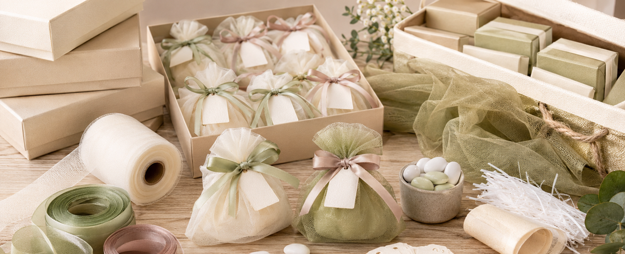
Packaging for wedding favors requires proportionate containers, coordinated materials and procedures that are easy to...

Grass paper, tulle, shavings and tissue paper perform different functions in professional packaging.The correct...

Choosing the right wrapping paper is a practical and commercial decision for every store that packs products at the...

Choosing between paper, non-woven or polypropylene gift bags is not just a matter of aesthetics. For a shop,...

Choosing the right gift bags means making the moment of delivery to the customer easier, faster and more...
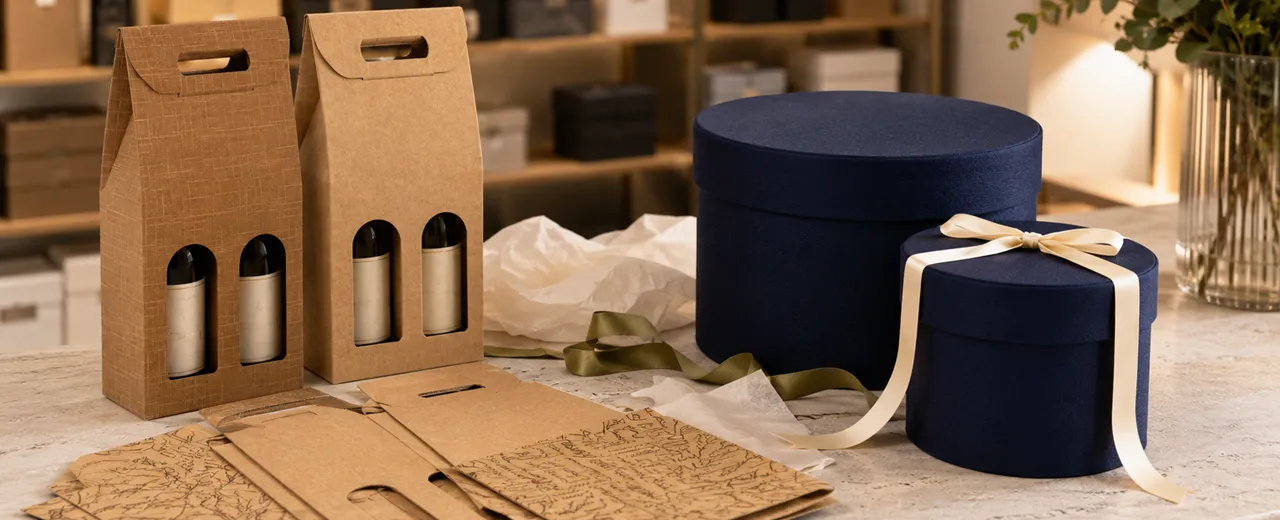
Choosing the right box means finding the balance between protection, practicality and perceived value. Folding...

Wrapping well means transforming the delivery of a product into a gesture of care, attention and trust. A well-kept...

Packaging for small shops must enhance every purchase without slowing down the counter and checkout.Wrapping better...

A journey into the value of wrapping, starting from the care of Japanese retailers to get to the professional...

Cloud Dancer brings white to the center of a broader visual reflection.
In packaging, white is never an empty choice or without a message.
It can communicate cleanliness, calmness, elegance, precision and greater attention to detail.
However, it can also become cold, anonymous or too fragile if it is used without design.
This is why we must distinguish white as a color from white as a packaging system.
A white shopping bag, a light tissue or a light box only work if they are proportionate to the product.
The paper, texture, weight and finish have as much impact as the chosen shade.
At the point of sale, white makes the gesture of delivery more orderly.
In e-commerce, it creates a cleaner and more controlled opening.
In the gift, leave room for the ribbon, logo, print, and the product itself.
Cloud Dancer helps us read white as a soft base, not as a rigid or hospital white.
Its commercial value stems from its ability to reduce visual noise.
Less color does not mean less communication, if materials and details are chosen methodically.
Personalization allows you to add identity without losing essentiality.
In the following sections we see how to build a clear, elegant and really usable packaging.
Cloud Dancer forces us to look at white in a less superficial way. In professional packaging, in fact, white is not just a neutral base on which to print a logo or place a ribbon. It is a choice that changes the perception of the product, the reading of the packaging and the way in which the customer interprets the level of service.
Cloud Dancer represents a soft and airy white, far from the optical effect that is too rigid. In packaging, this difference is important, because not all whites produce the same feeling.
A cool white can seem technical, sanitary or impersonal. A white that is too bright can look artificial. A softer white, on the other hand, allows you to build bright but not distant packages, clean but not empty, essential but not poor.
The Gift Paper category is a useful place to start, because wrapping is often the most visible surface of after-sales packaging. When we choose a light paper, we are not just covering a product. We are creating a backdrop that must enhance shape, volume, ribbon and opening gesture.
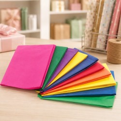
Tissue Paper for Packaging also works very well in this logic. A white or semi-transparent tissue should not attract all the attention, but accompany the product, protect it and create a first level of care.
In packaging, white works when it lets the material speak. Paper grain, folding, embossing, contrast with a black logo or natural ribbon become more noticeable. Cloud Dancer, read as a reference, therefore invites us to use white not as an absence, but as a designed space.




The after-sales packaging must confirm the quality of the experience. After the purchase, the customer is no longer just evaluating the product. It is observing how it is delivered, protected, wrapped and presented.
White can be very effective at this time because it communicates immediate order. A well-proportioned white shopping bag, a clean tissue or a clear box make the delivery more readable and more controlled. The customer perceives less visual noise and more care.
Plain Wrapping Paper allows you to build consistent and continuous packaging, especially when we want to maintain a stable palette throughout the year. White can become the main base, while ribbons, labels or small chromatic accents introduce variations without breaking the identity.
In the after-sales, white works well also because it slows down the gaze. A very colorful packaging can strike immediately, but it can also quickly wear away the effect. Clear, well-constructed packaging focuses less on impact and more on permanence. The customer notices the precision of the fold, the cleanliness of the edge, the quality of the paper, and the consistency of the closure.
This choice is particularly suitable for boutiques, perfumeries, cosmetics, accessories, household items, publishing, design, objects and curated handicrafts. White should not replace the brand font, but create a neater field of vision in which the brand can stand out better
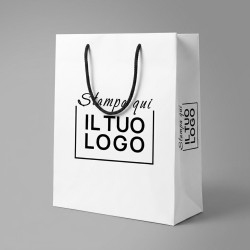
The shopper is one of the most visible elements of the packaging. He leaves the store, accompanies the customer and continues to communicate the brand even after the sale. When we choose a white shopping bag, we are choosing a very exposed surface.
The Shoppers, Bags and Bags category allows us to think about white as a support, not just as a color. Format, handle, weight and structure affect the final perception as much as the shade.
Paper shopping bags are suitable for many professional activities because they allow you to choose between havana, white, colored, flat handle or corded models. White becomes particularly useful when the store wants a bright, tidy and easily coordinated base.
The white kraft paper shopper with flat handle is practical for continuous use, frequent consumption and quick management at the counter. The white maintains a clean look, while the flat handle helps keep bulk and operating cost down.
The white kraft paper shopper with a lanyard handle adds a more polished presentation. It is indicated when the packaging needs to communicate more attention and when the bag becomes part of the perceived value of the purchase.
Simplicity, however, must be designed. A white shopping bag that is too big, too thin or not very consistent with the product may seem random. A white shopper chosen in the correct size, with a suitable handle and perhaps with an essential print, can become a very recognizable sign.
White is in danger of becoming flat when it is handled only as an even surface. To avoid this, we need to work on textures, transparencies, weights and overlaps.
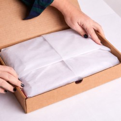
Tissue paper is one of the most effective tools. It can protect, separate, wrap and create a smooth transition between box and product. A white or semi-transparent tissue allows you to maintain a clean reading without sacrificing depth.
White Glossy Tissue Paper is particularly consistent with clear packaging because it offers a neat and professional effect. It can be used for clothing, accessories, cosmetics, delicate objects and products that need to be protected without weighing down the packaging.
Clear surfaces work well when layered with measure. We can use tissue paper in contact with the product, plain outer paper, natural ribbon or fabric and a white shopper as a final container. The overall effect is not poor, because each material adds a different layer: protection, light, structure, touch and closure.



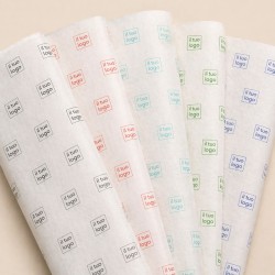
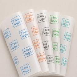

White also allows you to highlight small details. A tone-on-tone print, a minimal sticker, a well-centered closure or a slightly embossed paper are more visible precisely because they do not compete with strong colors.
The rule is not to confuse white with emptiness. A clear packaging must have presence, even if it is silent. The presence comes from the quality of the paper, the precision of the folds and the correct relationship between product and format.
The box is the point where white becomes structure. If the shopper accompanies the customer out of the store and the tissue takes care of the moment of opening, the box gives shape and stability to the entire experience.
The Boxes category allows you to evaluate different containers by function, format and level of presentation. A clear box can communicate order, but it must be proportionate to the contents and solid enough not to deform.
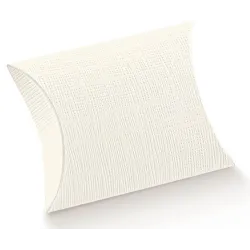
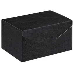
Gift Boxes are useful when the product needs to be delivered with greater care or when the purchase can become a ready-to-give package. In a Cloud Dancer palette, the box can be white, light brown or natural, while the contrast can come from ribbon, logo, label or internal tissue.
Fabric Ribbons help to give depth to the white. A ribbon made of double satin, organza, cotton or jute can completely change the tone of the packaging. White on white creates a very clean effect. Ivory or natural warms the whole. Black, burgundy or deep blue introduce contrast and make the packaging more assertive.





The finish must be proportionate. If the product is essential, a tape that is too important can seem off the charts. If the product is premium, a closure that is too poor can weaken the final perception. White works when every detail seems chosen and not added at the last moment.
One of the reasons white is so useful in packaging is its ability to accommodate the brand. Logos, patterns, typography and small graphic signs become more legible on a clear basis, as long as they are designed with measure.
The Shopper and Custom Boxes category is the reference when we want to make the outer packaging more recognizable. On a white shopping bag, personalization can work with strong contrast or with a softer approach, using colors consistent with the identity of the store.
Personalized Papers and Tissues allow you to carry the brand inside the package. A personalized white tissue can be very effective because it maintains lightness, but adds recognizability when opening.
White should be treated as graphic space. We must not fill it for fear that it will look empty. We have to let him breathe. A well-placed logo, a light print, or a controlled pattern can communicate more professionalism than overly loaded graphics.


Personalization works when it respects support. A white shopper with a black logo can be elegant and direct. A personalized tone-on-tone tissue can be more discreet. A printed ribbon can complete the package without occupying the entire surface. Each element must have a specific task.
To use Cloud Dancer as a reference in packaging we need to start with a simple method. White must become a conscious choice, not a shortcut.
The first step is to define the function of the package. Is it used for counter delivery, gifting, shipping, e-commerce opening or premium presentation? Each function requires different materials. White may remain the common thread, but the shopping bag, box, tissue paper and ribbon must change according to use.
The second step is to choose the contrast level. An all-white palette communicates a lot of cleanliness, but requires quality materials and great precision. A white palette with Havana or natural is warmer. A white with black palette is more graphic. A white palette with colorful accents is more commercial and recognizable.
The third step is to test the packaging with real products. An empty white box may look perfect, but with the product inside, it may be too big. A light-colored shopping bag can be elegant, but it must support weight and volume. A white tissue can enhance an accessory, but it may not be enough to protect a more delicate item.
The fourth step is to create replicable pairings. For the store we can define a basic combination: white shopper, light tissue and sticker. For the gift we can add box and ribbon. For e-commerce we can insert tissue, filling and outer box, while still maintaining a clean reading.
The fifth step is to avoid anonymity. White must be recognizable through proportions, paper quality, logo, graphic detail or finish. If all elements are generic, the packaging does not communicate identity. If, on the other hand, the system is consistent, even a very clear palette can become memorable.
Cloud Dancer reminds us that white is not absence, but project. In after-sales packaging, it can become a very effective commercial choice because it reduces visual noise, enhances the material and leaves room for the product. At ChartaRè, we help shops, companies and e-commerce to build clear, coordinated and professional packaging systems, where white does not remain neutral, but becomes a concrete part of the customer experience.
 Practical Guide: The Art of Window Dressing
 Artificial intelligence (AI) in the Physical Store.
 What is the Favor (Favour) and its History
 The Principle of Complementarity of Colors
 A Practical Guide to Creative Packaging
 The Importance of Good Customer Care: Physical and E-commerce