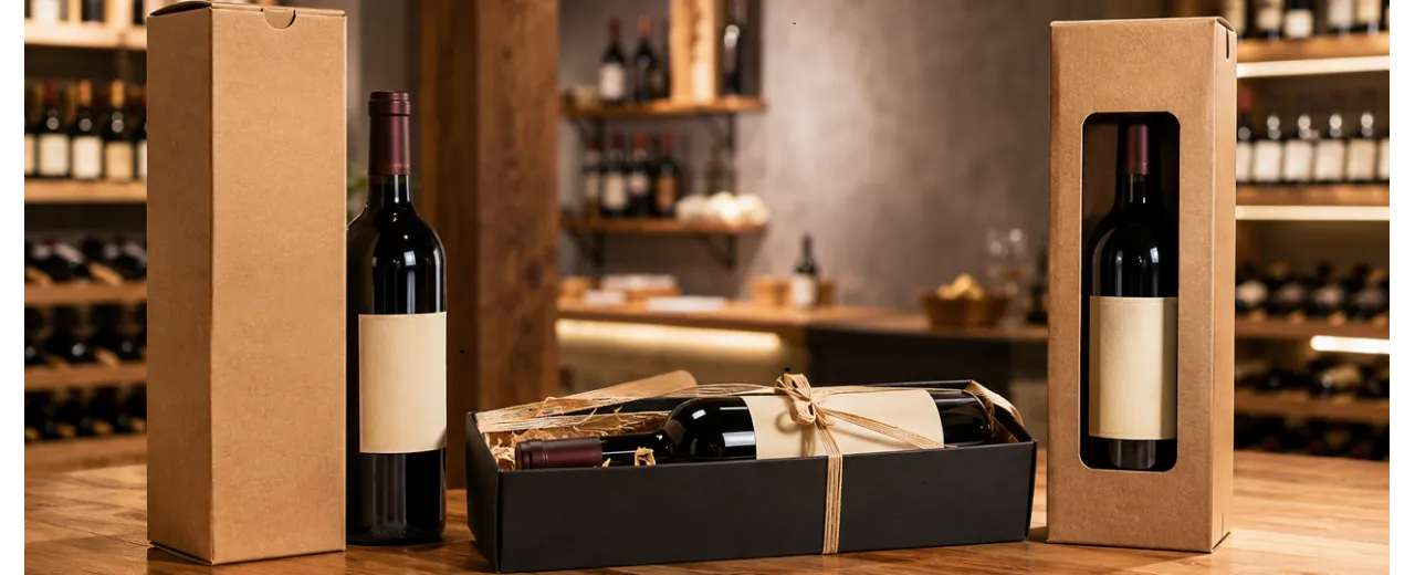
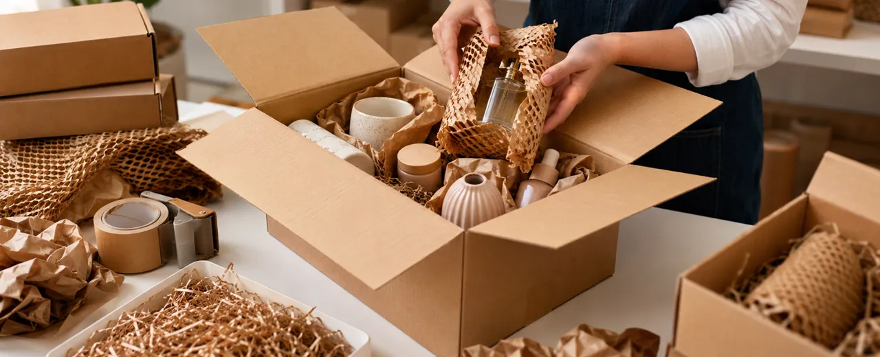
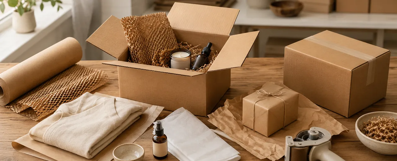
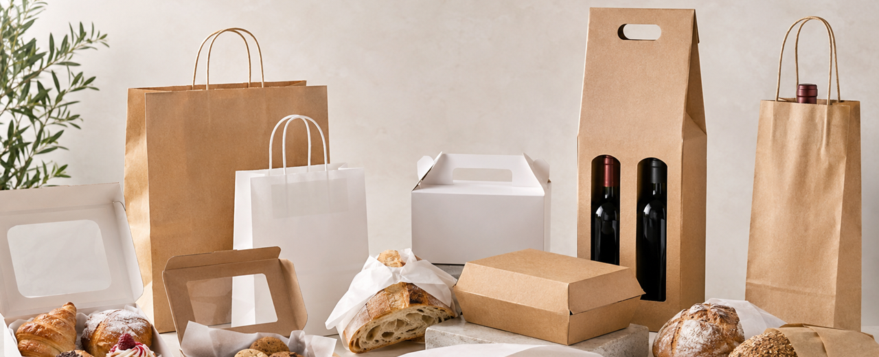
Even before the customer uncorks, pours, smells or tastes, you have already sold (or lost) an important part of the value of your wine, oil or vinegar. Because in specialized retail – and in particular in wine shops – the purchase decision almost always arises from signals: visual, tactile, "stage" signals, which the brain interprets as clues of quality, rarity, care, brand consistency. In other words: the perceived value is built first in the packaging and only then in the palate.
If you run a wine shop, you see it every day. In front of the shelf or display table, the customer does not have the time (nor the tools) to really evaluate the substance of each reference: he cannot know everything about appellations, vintages, cultivars, aging times, volatile acidity or extraction methods. What he can do – and does – is estimate. Estimate the positioning by reading a few elements: the impact of the label, the clarity of the information, the typography, the cleanliness of the project, the "hand" of the finishes, the solidity of the whole. And above all, when it picks up the bottle or the package, the body confirms (or denies) what the eye has promised: weight, rigidity, consistency, friction of surfaces, the sound of a closure, the precision of a joint. All this is sensory marketing applied to the point of sale, and it works because it is immediate. (Labelservice)
This is where an often underestimated point comes into play: packaging is not an accessory, it is part of the value proposition. It doesn't just "beautify"; It translates into form what you (or the manufacturer) want to make perceived: craftsmanship, heritage, contemporaneity, territoriality, technical precision, sustainability, exclusivity. If the content is premium but the container doesn't show it, you create friction. And in the wine shop, friction costs dearly: it reduces confidence, increases objections ("Why does it cost like this?"), shifts the comparison to cheaper alternatives and, in the end, forces you to sell with a discount or with too long an explanation.
The mechanism is simple: when the customer is uncertain, he attributes value using extrinsic cues (signals external to the product). Research on consumer behavior shows that elements such as weight and perceived quality of materials can influence expectations, ratings, and even willingness to pay. In the beverage world, "weight" is a concrete example: heavier bottles are often associated with higher prices and quality, and in general the heaviness of packaging can shift perception towards greater intensity and desirability.
It doesn't mean "weighing everything down": it means understanding that your customer uses touch as a cognitive shortcut. If you want to be premium, you must also be premium on contact.
Now think of the wine shop as a multi-act theater, where the packaging plays at different times:
- Act 1: The Shelf. Here, the winner is the one who gets read in 2–3 seconds. The visual hierarchy (name, type, origin, band) must function as a "human" distance: you are not designing a collector's label, but an object that must stand out among dozens of references. Finishes such as reliefs, foil, special papers are not used to "decorate": they are used to create a stopping point of the eye and to signal care.
- Act 2: The Banker. Here the packaging must become operational: quick to prepare, reliable, without surprises. If packaging requires too much time or too much manual work, the wine shop avoids it during peak hours. If, on the other hand, the solution is designed for real gestures (quick opening, insert that guides the bottle, solid closure), the staff uses it naturally and the sale "rises" without friction.
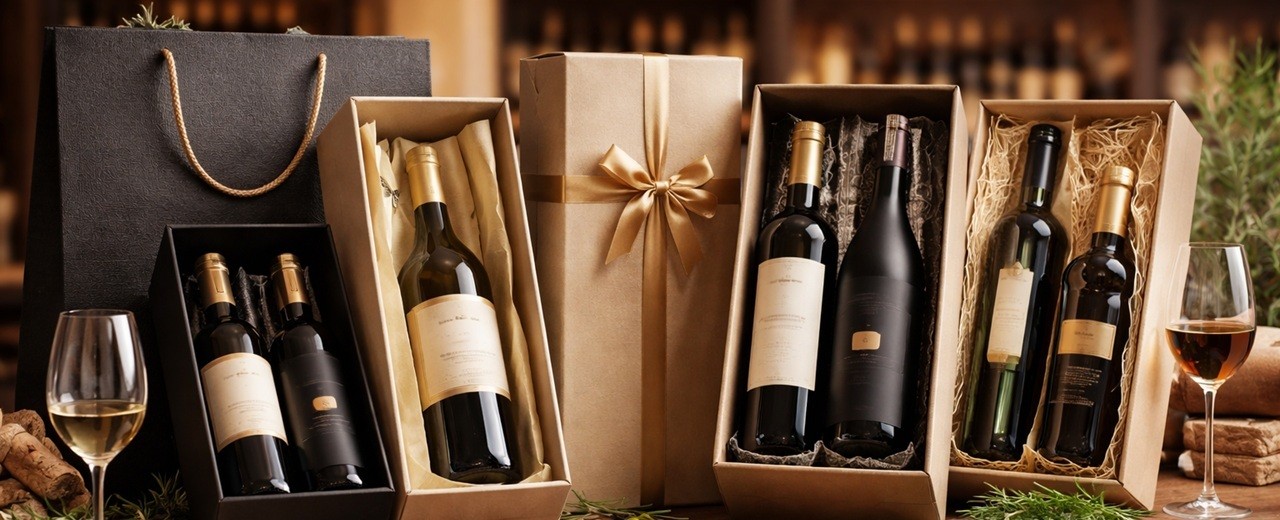
- Act 3: the road and unboxing. The customer takes away your packaging: on that journey the box must hold, not deform, not communicate fragility. And if there is shipping (e-commerce, corporate, remote gifts), the packaging must really protect: shocks, vibrations, compressions are part of the real life of the packages. There are test protocols (e.g. for e-commerce) and paper-based structural solutions with inserts and dividers designed for bottles, precisely to reduce damage and returns.
This is the point: perceived value does not only mean "beautiful box". It means designing a coherent system that holds together aesthetics, function and context of use, with a measurable goal: to sell better, with less friction, with a more alto receipt and a more solid reputation.
Because wine, oil and vinegar have a common characteristic: they are products with a very high cultural component, but often purchased quickly. Even the competent customer, in front of a shelf, alternates rationality and impulse. If the packaging is congruent with the promise of the contents, you make it easier to say "yes". If it's not, force the customer to look elsewhere (price, reviews, well-known brand) or postpone the decision.
That's why, when we talk about "packaging that sells", we are talking about a strategic lever, not a detail:
- in the wine shop helps you guide the choice and simplify the consultation;
- for the winery, oil mill or vinegar factory, it transforms the product into a gift object (therefore into added value);
- in corporate gifting and seasonal occasions it makes the proposal ready, "closed", convincing;
- In e-commerce, it protects margins and reputation, because it reduces breakages and improves the receiving experience.
From here on, the right approach is not to ask yourself "what box do I use?", but "what perception do I want to activate, at what time, and with what signals?". It is exactly on this grammar – materials, finishes, colors, textures, structure, operating speed, protection and unboxing – that packaging is built capable of making you perceive value even before tasting.
If you work in a wine shop, this is good news: because it means that you can govern an important part of the sale without changing the product, but changing how you present it and how you deliver it. And if you're a producer, it means you can narrow the distance between the real quality you have in the content and the perceived quality that the market recognizes you at first glance.
We give you two reading possibilities, one of only 5 minutes and the other complete. The full reading takes at least 30 minutes.
Here is a summarized guide for a 5-minute read.
In wine shops, wine, oil and vinegar are not sold only with the contents: they are sold with the perception you build before tasting. The customer, in front of a shelf full of references, decides in a few seconds whether to approach or move on. At that moment he is not really judging the quality of the product, because he cannot do that; is evaluating indications of reliability, care and consistency. It is here that packaging becomes a "silent seller": it does not speak, but orients; it does not convince with arguments, but with signals.
The first sign is attention. If your product doesn't get read quickly, it risks remaining invisible. Premium visibility does not come from excess, it comes from order: clear hierarchies, breathing spaces, a clear focal point. From a distance, the customer must understand what he is looking at and to which group he belongs. Up close he must perceive precision, not confusion. When this step takes place, you reduce one key thing: the perceived risk. And when the risk goes down, the price becomes easier to accept.
Then the matter comes into play. The perceived value is built with materials, finishes and details that the body recognizes before the mind. A rigid box that does not flex, a paper with an important "hand", a deep matte surface, a measured relief, a foil used as an accent and not as a show: these are tests of competence. The premium is not a sum of effects, it is discipline. The customer may not be able to describe what convinces him, but he knows when something is done well. And he understands it above all in the construction details: alignments, closures, edges, joints, internal stability. If the packaging has weaknesses, the content loses value by association, especially when the purchase is a gift.
In the wine shop, quality must also be operational. Perfect but awkward packaging is avoided at peak times. To really work on the bench, it must be quick to assemble, intuitive, repeatable, clean in the result, even when there is a hurry. The packaging must help the staff to work well without "fighting": the bottle must enter and remain still, the closure must take place immediately, the shopper must hold without deforming. If the gesture of the packaging is smooth, it looks professional. And when the customer sees professionalism, he trusts more. In a premium market, trust is what drives up the receipt without the need for justification.
Colors, textures and visual hierarchies serve to stand out among the references without screaming. The color positions, the texture confirms, the hierarchy guides. Each choice must be consistent with what you want to make perceived: craftsmanship, technique, gift elegance, contemporaneity. If you mix incompatible registers, you create dissonance and the customer returns to compare only the price. If, on the other hand, everything is aligned, the customer perceives that "it is right this way", and the value stabilizes.
Recognizability is the other decisive point, especially for the wine shop. A customer may love a bottle, but if they don't remember you, the relationship breaks down. Packaging is one of the few spaces you can check and sign: shoppers, boxes, tissues, seals, tags, inserts. Personalization works when it's consistent and repeated: a few stable elements that become a code. There is no need to invade, you need to "mark" with elegance. Every package that leaves the store is a piece of memory that walks. If your signature is clear, the customer comes back more easily and trusts sooner.
Today, moreover, the path matters as much as the shelf. From take-away to shipping, the packaging must withstand shocks, vibrations, compressions and transport times without betrayal. If the bottle moves, if the packaging is oversized, if the inside is messy, the premium breaks right in the last meter. And if oil or vinegar lose even a drop, the perception plummets. For this reason, protection and unboxing do not have to be opposed: a well-designed interior can be both security and scene. When the package arrives intact and the opening is orderly, the perceived quality increases even before tasting.
Finally, the receipt increases when you turn the purchase into a solution. Bargains sell because they simplify the decision: gifts, dinners, anniversaries, events, corporate. Here it works to think in lines and by kits: not "a bottle", but a tasting set; Not "a box", but a proposal ready to donate. In the corporate sector, then, you sell representation and peace of mind: precision, build quality, sober customization, reliable delivery. If your proposal is clear and scalable, the price goes up because you are not selling paper and cardboard: you are selling image and reduced risk.
The conclusion is simple: packaging sells when it makes value immediate, credible and stable. It makes you stand out, supports the price, simplifies the bank, protects you along the way, signs your identity and multiplies the opportunities. In the wine shop, where the customer decides in seconds and wants to feel confident, a well-designed package is not a cost. It's the visible part of your expertise. And often it's what makes you choose, even before the first taste.
Here is the complete guide.
You can also buy with your eyes: packaging as a "silent seller"
In your store, time is never neutral. In front of a wine shelf, a selection table or a wall of oils and vinegars, the customer decides in a few moments whether to approach or move on. Before he even understands what he is looking at, his brain does something very concrete: it selects. He does not select "the best", he selects what appears clearer, more reliable, more consistent with the expectation he has at that moment. It is here that packaging becomes a silent seller: it does not speak, but orients; it does not explain, but suggests; it does not argue, but makes us perceive.
In the wine shop this mechanism is even more evident, because the choice is almost always a balance between desire and risk. Even when the customer is competent, he cannot verify the real quality of each reference on the spot. However, it can read clues: visual order, cleanliness of the project, quality of finishes, consistency between promise and positioning. If these clues are solid, you reduce the "perceived risk" and increase the willingness to spend. If they are weak, the price suddenly becomes "alto" even when, objectively, it is not.
The key point is that the purchase does not start from taste: it starts from attention. Attention is a scarce resource, and on the shelf the one who manages to "stop" it for a second wins. That second is everything: it is the moment when the eye stops scrolling and begins to evaluate. From there, the sequence is almost always the same: look, approach, hand-holding, micro-evaluation, decision. Packaging must work at every step, with different rules. From a distance it must be legible and recognizable. Up close it must appear well-groomed and credible. In the hand it must confirm the promise with tactile and constructive signals: rigidity, consistency, precision, "absence of defects". A package that opens badly, that gives way, that wrinkles, that makes a "poor" noise when you touch it, is not only disappointing an aesthetic: it is taking away value from the contents.
When we talk about wine, oil and vinegar, we are talking about products that carry with them an enormous imagery: territory, tradition, technique, craftsmanship, time, expertise. Packaging has the task of making that imagery immediately visible, without telling it in words. It is a translation. If the label and packaging communicate "precision", the customer expects precision in the flavor profile as well. If they communicate "warmth" and "family", they expect welcome and authenticity. If they communicate "research" and "contemporaneity", they expect originality and cleanliness. The silent salesman does not invent: he amplifies what is there, makes it immediately perceptible.
This is why form is never just form. Typography is never just typography. The choice of a paper, a varnish, a relief or a foil is never decoration. These are positioning signals. The customer, even without realizing it, interprets these signals as he would a person's clothing: he does not establish the absolute value, he establishes the "register". Is it elegant or casual? Is it essential or baroque? Is it technical or romantic? Is it contemporary or classic? And above all: is it consistent with what you are asking me in terms of price?
This is where a fundamental concept for the wine shop comes in: the consistency between price and perception. The bottle may be excellent, the oil may have an impeccable supply chain, the vinegar may have required years of waiting; But if the packaging doesn't give aligned signals, you're asking the customer for an extra effort: trust without immediate evidence. On the other hand, when packaging and product "say the same thing", you make the act of purchasing easy. You don't have to convince: you just have to accompany.
Then there is a specificity of the wine shop that makes packaging even more decisive: the sale is often consulting, but not always. You have times when you can tell and times when you can't. When you're full, when the customer comes in with a quick lens, when they have to give a gift on the fly, the packaging works for you. In those cases, the silent seller must do three very practical things: make it immediately clear who the product is for, make it clear that it "holds" a price, and make people feel that it is already ready to be donated. A gift purchase, in particular, is driven by the fear of making a bad impression: if the packaging is credible, elegant and "fixed", the customer feels that the figure will make it good even before knowing the taste.
This is true across the board for wine, oil and vinegar, with an important difference: in wine the imagery of the label is already codified and competitive, while for oil and vinegar the packaging is often the real element that can make the leap in the band. An extraordinary oil in an anonymous bottle remains, in the eyes of many, "an oil like many others". An important vinegar without signs of cure risks being perceived as a standard condiment. If you work well on the presentation, you can transform three "daily" categories into three "gift" categories, and this transformation, in the wine shop, is a margin multiplier.
When you say "you can also buy with your eyes", therefore, you are not making a generic observation: you are describing measurable commercial leverage. Every detail that increases attention, readability, and consistency reduces the need for explanation and increases the likelihood of purchase, especially in fast-paced situations. And every detail that confirms the value of touch and manipulation reduces dissonances: the customer does not think "beautiful, but...". He thinks "that's right".
Your goal, in this chapter, is to set an operational idea: packaging is not the last step, it is the first. It is the first contact with value. If you want to sell value, you have to allow the customer to perceive it effortlessly, in a few seconds, in the real context of the shelf and counter. When this happens, the product starts to "sell itself" in the most concrete way possible: it brings you more convinced people, shorter questions, and a price that is easier to accept. And you can dedicate your expertise not to justify, but to enhance.
Perceived value: materials, finishes and details that increase value
When a customer picks up a bottle, they're not just evaluating the product—they're evaluating your promise. And the promise, in the wine shop, is read above all through the material. The perceived value arises from a simple but very powerful principle: what appears well constructed, coherent and "right" to the touch is automatically interpreted as more reliable, more accurate, therefore more worthy of a alto price. The point is not to "make luxury", but to make quality tangible with signals that the body recognizes even before the mind.
The first lever is the material, because the material is never neutral. Paper and cardboard, for example, are not just supports: they are language. A natural paper, with a perceptible grain and elegant rigidity, communicates authenticity and substance. Glossy coated paper, if not governed, risks slipping towards a promotional aesthetic. A velvety coating creates an immediate association with the high-end, because it transforms contact into a "warm", controlled, intentional experience. Even the simple thickness – and above all the structural rigidity – works as a signal: if the package does not flex, does not vibrate, does not "sound empty", the customer feels solidity and translates it into value.
In the world of wine, oil and vinegar this is crucial because you are selling products that live on reputation, time and culture. A light and poor packaging, or one that seems to have been created to "make volume", subtracts credibility from the narrative of the content. On the contrary, a well-chosen cardboard, a combination with a good body, a box covered with sharp edges and precise alignments build an immediate bridge between price and perception: the customer does not have to ask himself "why does it cost like this", he intuits it.
However, there is one detail that often separates premium packaging from one that "tries": the difference between weight and quality. For years, especially in wine, weight (large bottles, thick glass) has been used as a shortcut to prestige. Today this shortcut is increasingly ambivalent, because the consumer and the supply chain pay more attention to environmental impact and logistics. You, therefore, must be able to obtain the same perception of solidity without falling into excess. And this is where secondary packaging becomes strategic: a well-designed box, with a rigid structure and intelligent internal insert, can restore "perceptual weight" and protection without forcing the primary object. In the wine shop, this solution works because it shifts the value to the gesture of the gift and to the overall experience, not just to the bottle.
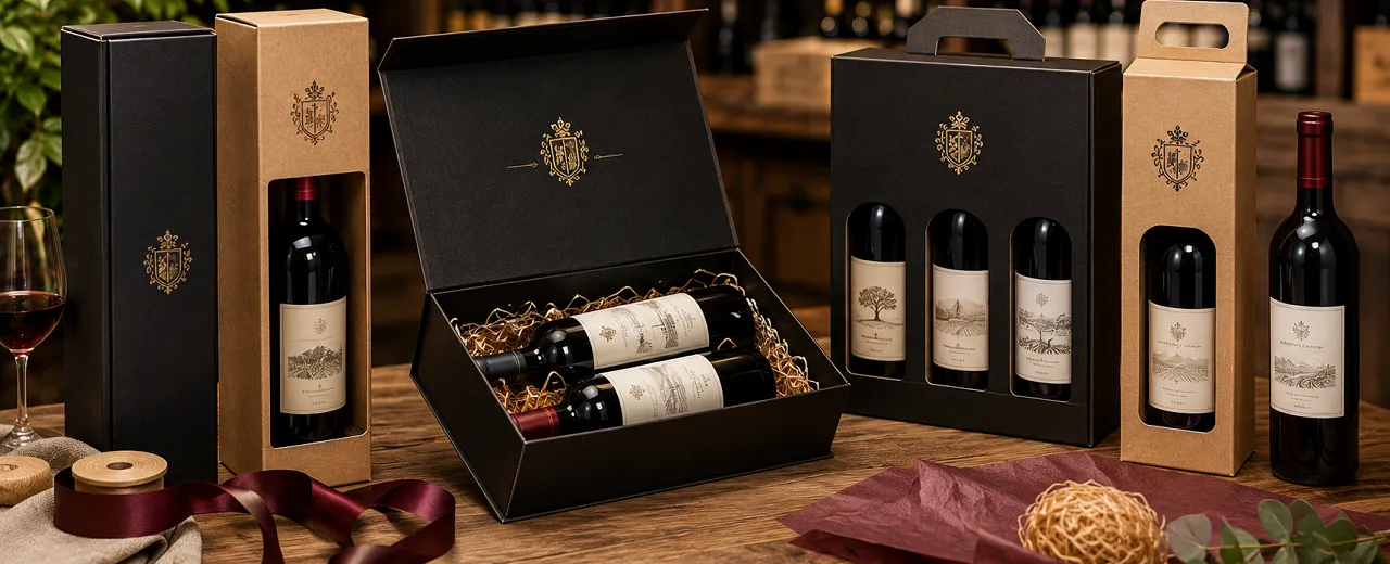
The second lever is the finishes, which do not serve to decorate but to guide the reading and create points of sensory confirmation. Value does not come from accumulation, it comes from precision. A deep opacity, for example, communicates control and contemporaneity; A selective glossy varnish, used with moderation, creates a contrast that the eye interprets as "care" and "design". Hot foil, if applied where it makes sense – on a sign, a monogram, a typographic detail – is not a special effect: it is a rank marker. Embossing and debossing are not a quirk: they transform the brand into relief, they bring it from the pupils to the fingers, and when you feel a brand under your fingertips it tends to seem more real, more stable, more authoritative.
Touch deserves a separate reflection, because it is the most underestimated dimension and the one that has the greatest impact in the decisive moment: when the customer takes over and, without thinking about it, "measures" the product. The velvety surfaces, textured papers, controlled reliefs and even the micro-roughness of a quality uncoated work as fascia signals. You're not just improving aesthetics – you're building expectation. And expectation, in products such as wine, oil and vinegar, is half the experience. If the expectation rises, the tasting is also interpreted within a more favorable framework.
Then there are the construction details, which are the real "traitors" of the premium: if you get those wrong, no finish saves you. The customer may not be able to name the defect, but he perceives it. A rigid box with edges that don't fit together, a coating that wrinkles, visible glue, a lid that doesn't close properly, an interior that lets the bottle move, a handle that cuts your fingers or a bag that deforms immediately are all poor quality micro-messages. And the customer, in front of a gift, is ruthless: he does not want to risk. If a packaging "does not stand", the value collapses.
On the contrary, when the details are resolved, you get a very concrete effect: you reduce mental friction. A joint that closes precisely, a magnet that hooks with the right "click", an insert that guides the bottle and blocks it without forcing it, a fluid opening that does not tear the paper, a handle that really holds, an interior that protects and at the same time makes a scene. These are all things that, for the customer, become proof of competence. He's not just buying a product: he's buying the feeling that you know what you're doing.
In the wine shop, moreover, materials and finishes must dialogue with a real condition: the light of the store and the reading distance. A matte black that looks perfect in photography can "close" on the shelf if it does not have well-calibrated contrasts. A texture that is too dense can dirty the perception if the graphics are already complex. An extended metallic effect can become noisy and lose its elegance. Premium, on the counter, is often subtraction: breathed spaces, legible typography, a single material accent placed in the right place. The customer interprets this discipline as security. It's the same principle that a label with clear hierarchies and consistent materials looks more expensive even when it's simpler.
At this point you have to make a choice of method: do you want the packaging to tell "craftsmanship", "technique" or "luxury gift"? Because each word implies a different grammar. Craftsmanship loves natural papers, warm colors, organic textures, discreet finishes; the technique loves cleanliness, precision, controlled contrasts, minimal but impeccable details; Luxury Gift loves structure, scenographic opening, curated interiors, metallic accents or reliefs that make the brand memorable. The important thing is that you don't mix incompatible registers. An oil that you want to position as essential and contemporary loses credibility if you dress it with baroque signs. A high-end aged vinegar loses strength if you present it with a "food shelf product" graphic language. Perceived value comes from alignment, not abundance.
Finally, there is the variable that today directly affects the perception of value: sustainability. You don't have to treat it as a statement, you have to treat it as a design quality. Certifiable materials, well-selected recycled papers, finishes compatible with recycling, more responsible glues and paints, reduction of superfluous elements: if they are integrated intelligently, they become a further sign of premium, because they communicate modernity and competence. The customer does not want to be told "it is sustainable" as a slogan; he wants to see that it is well thought out, and that beauty is not in contradiction with responsibility.
If you want a rule of thumb, it's this: perceived value arises when the customer doesn't find any weaknesses. He must not notice the "effect", he must note the overall quality. The right materials, consistent finishes and impeccable construction details allow you to do the most important thing in the wine shop: make the price natural. When the packaging is credible, the value is not questioned. You accept. And you can focus your expertise on telling the story of the product, not on defending the price list.
Counter experience: practical packaging for staff, impeccable for the customer
In the wine shop, packaging is not a "side gesture". It is an operational step that happens at the most delicate moment: the one in which the sale must become an experience, without slowing down the work and without creating uncertainty. If you want packaging to really sell, you need to design it as a benchtop process, not just an aesthetic choice. This means something very concrete: it must be fast, repeatable, intuitive and clean in the final result, even when you are in full flow, even when there is no expert person at the counter, even when the customer is observing everything.
The difference between "beautiful" packaging and packaging that works in a wine shop is measured in seconds and micro-frictions. A second too long in assembly, a closure that does not take place immediately, an insert that does not guide the bottle, a shopper that deforms, a ribbon that requires free hands and attention: these are all small complications that, added together, become a deterrent. Staff naturally tend to avoid what is inconvenient and repeat what is quick. If you want premium packaging to be offered continuously, you need to make it "easy to choose" even for those who prepare it.
This is why the ergonomics of the packaging is the first real factor of sales at the counter. Ergonomics means that the box opens where it should, can be assembled without tools, closes without a struggle, and above all "understands" at the first attempt. Quick-assembly structures, those that snap into place and stay in the square, are created precisely for this: to allow a precise result with a simple gesture. In the wine shop, this detail is decisive, because the premium perception does not tolerate visible imperfections. If a box is crooked, if the lid does not align, if the gluing is noticeable, if the bottle dances inside, the customer does not see a technical error: he sees an insecurity. And insecurity, when he is buying a gift, weighs as much as the price.
The counter, then, is a place where the packaging becomes a "theater" in a few square centimeters. Here the choreography of the gesture counts: you take the bottle, clean it, present it, package it, deliver it. If the packaging is well designed, the gestures are natural and professional, and the customer perceives competence even without you saying anything. If, on the other hand, the packaging forces you to look for pieces, to fold imprecisely, to push too hard to insert the bottle, to hastily fix what does not fit, then the gesture loses elegance and the perceived value deflates just when it should rise.
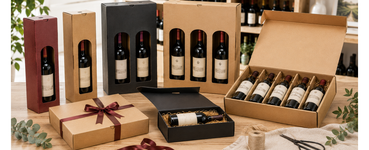
Another decisive aspect is variant management. In the wine shop you don't work with just one format: you have 0.75, half bottles, magnums, slender, pot-bellied bottles, with different shoulders; For oil and vinegar you have even more variable heights and diameters. If the packaging is not designed to absorb these differences, it forces you to keep too many codes, take up too much stock, waste time looking for "the right box", risk errors at the counter. The solution is not to complicate, but to design modularity and intelligent tolerances: consistent internal measurements, inserts that guide and lock, separators that avoid impacts, systems that allow the use of a coordinated line even on different formats without compromising stability. When this logic is done well, you reduce chaos and increase perceived quality, because the result is always orderly.
Then there is the often underestimated issue of visual cleanliness. The customer does not have to see "behind the scenes". Exposed tape, forced folds, irregular cuts, crooked labels, twisting handles, tearing paper: everything communicates improvisation. A wine shop packaging must be designed to come out of the counter already "finished", with clean closures and intact surfaces, without requiring too many manipulations. Even when you add an adhesive seal or branded element, it must be a quick and centerable gesture, not a laboratory precision job. Quality, in the store, is always quality under pressure.
Practicality on the bench, however, does not only concern assembly. It also covers storage and preparation. In peak periods, such as holidays or company anniversaries, the difference is made by the fact that packages take up little space before use, that pre-assemble quickly, that do not get damaged if they are close to the counter, that do not lose shape. If a box arrives flat and assembles in seconds, you can handle higher volumes without sacrificing aesthetics. If, on the other hand, the packaging is bulky or delicate, it forces you to compromise: less choice, less order, less continuity.
Finally, there is delivery, which is a point of truth: the packaging must be comfortable to carry and safe. A handle is not a graphic detail, it is an element of trust. If the customer perceives that he is holding up, that he distributes the weight, that he does not cut his hand, that he does not swing the bottle, then the experience remains premium even outside the store. If, on the other hand, the shopper is deformed, if the bottom gives way, if the handles seem fragile, the customer experiences a micro-stress and associates it with the product. And here you lose twice: you lose perceived value and you lose the possibility that that package becomes a credible "walking advertisement".
When you design packaging for the wine shop, therefore, you have to think like a dining room manager: you want the service to be fluid, constant, replicable. Staff must be able to pack well even quickly, without anxiety and without errors; The customer must receive an object that seems inevitable, coherent, of a high level, ready to give as a gift. It is in this convergence between operations and image that packaging stops being a cost and becomes a lever. Because if everything flows over the counter, you sell more, sell better and make natural what would otherwise require explanations: the price, the positioning, the value.
Colours, textures and visual hierarchies: how to stand out among references
In the wine shop you don't win because you are "more beautiful". You win because you're more readable, more recognizable, and more consistent at a time when the customer's eye is still scrolling. Real competition is not between products, it is between micro-instants of attention. The customer enters, orients himself, makes a first quick scan of the shelf or table, then approaches only what, in that moment, gave him a clear signal: "Here is something worth considering". Colors, textures and visual hierarchies serve this purpose. They are not aesthetics for their own sake, they are a navigation system.
The first misconception to avoid is to think that "getting noticed" means shouting. In a department full of labels that are already very communicative, the graphic excess produces noise and the noise camouflages. Premium visibility almost always comes from a control: a few strong elements, placed in the right place, with an order that is perceived at first glance. When the eye meets order, it associates order with competence. And competence, in categories such as wine, oil and vinegar, is read as quality.
Visual hierarchy is your first tool. You have to decide which information should "pop out" from afar and which should only come later. On the shelf, at a real distance, the customer does not read, he recognizes. So your front-pack doesn't have to tell everything: it must immediately make it clear what it is, who it is for, what group it belongs to. If the wine shop also sells as a gift, the hierarchy must include an element of immediate "dignity," something that says, "This looks good in the hand, it looks good to give." It's not necessarily a big logo; often it is a balance of spaces, a posed typography, a material or chromatic accent that has the right weight.
This is where typography comes into play, which in the wine shop works as a tone indicator. Characters that are too thin or too compressed become illegible from a distance and communicate fragility; hyper-decorative fonts risk making you perceive artifice. Premium typography is not "special", it is precise. It has airy line spacing, consistent spacing, impeccable alignments. When everything is calibrated, the customer doesn't think about the typography, he thinks about the product. And that's exactly what you want: elegance is invisible, but you can feel it.
Color is the second lever, and should be treated as a code, not as a preference. Color is not only used to please, it is used to position. In the wine shop, color works on three levels at once: it breaks the pattern of the shelf, establishes an emotional register and communicates an expectation about the contents. A clear and very clean base creates an idea of freshness, precision, contemporaneity; a dark and deep background, if well managed, creates gravitas and promise of intensity; a warm and natural palette recalls craftsmanship, territory, authenticity; metallic accents or sharp contrasts can suggest celebration, exclusivity, "special moment". The point is not that there is a "right" color, the point is that every color choice must be consistent with the story you want to convey and with the price you ask.
In the wine shop, however, the color must also coexist with the real light and the visual density of the shelves. The same label can look different depending on the lighting, shadows, reflection of the glass, proximity to more aggressive labels. If you design (or choose) a package without considering this context, you risk two opposite mistakes: becoming invisible because it "turns off", or becoming noisy because it "reflects too much". This is why finishes and textures matter as much as colors: a deep matte absorbs and ennobles, a soft-touch adds presence without screaming, a selective varnish creates a controlled point of light that guides the eye where you want it, without transforming the entire front into an effect.
The texture, in fact, is the third lever, and it is often the one that makes you make the leap without changing almost anything in the graphics. When the client sees and then touches a surface that he has "handed", his judgment stabilizes. It's as if he says, "It's not just beautiful, it's done well." This confirmation is fundamental because it takes place precisely in the transition from the gaze to the hand, which is the moment in which you really decide. If the texture is consistent with the message, it amplifies. If it is inconsistent, it contradicts. A product that you want to make perceived as technical and contemporary suffers if you dress it with a casual roughness; A product that you want to make perceived as artisanal loses truth if you make it too plasticized and slippery.
Then there is an issue that weighs more heavily in the wine shop than elsewhere: the management of the "neighbors". You are never communicating in a vacuum, you communicate among others. So your project must start from a practical question: compared to the references that surround me, how do I differentiate myself without leaving my register? Effective differentiation is not about changing everything, it is about choosing a single breaking point. It can be a large breathing area in the midst of full labels, it can be a more controlled palette, it can be a distinctive typographic sign, it can be a material element that can be perceived even from afar. The common mistake is to look for difference in everything: the result is an object that asks too much and returns little.
Another decisive dynamic is the expectation of "category". Wine, oil and vinegar have different codes, and the customer recognizes them even if he does not admit it. In wine, many registers are now saturated: minimalism, illustration, tradition, experimentation. Here hierarchy and cleanliness become the real differential. In oil and vinegar, on the other hand, there is often still room to build a clearer premium language, precisely because many packages remain anchored to standard food codes. If you raise the bar with a more "gift" and more editorial grammar, you get an immediate effect: you transform the object from a pantry to a gift, and that transformation changes the willingness to spend.
Finally, you must remember that the wine shop sells in two ways: advice and autonomy. When the customer is autonomous, your packaging must lead the way. When the customer asks for advice, your packaging should make it easier for you to respond, because it allows you to point to an item that already "looks right." In both cases, the color-texture-hierarchy system must come before the words. If it comes later, you're asking the customer for an effort that, often, they won't make.
If you really want packaging to become a silent seller, here lies the discipline: build a front that is understood in an instant, that has a clear focal point, that maintains a balance of spaces, that uses color as positioning, that introduces textures and finishes as proof of quality, and that remains consistent even under the real lights of the wine shop. When this discipline is respected, a very concrete thing happens: your reference does not "fight" to be seen. It is chosen because it already seems like a good choice. And, for a premium product, it's the biggest benefit you can build before you even taste.
Personalization and branding: making yourself recognizable
In the wine shop, "being good" is not enough if you are not also recognizable. Your customer may appreciate advice, may remember an extraordinary wine, may fall in love with an oil or vinegar, but if you don't leave a clear mark to take away, the memory is lost. Branding, inside the packaging, serves exactly this: to transform a purchase into a memory that can be traced back to you, not just to the product. And here personalization is not an aesthetic whim: it is a commercial technology to keep people coming back, increase trust and make future choice easier.
When you talk about recognizability, you're not just talking about logos. You're talking about stable codes that the customer learns without studying. A recurring color, a typography that is always the same, a precise way of layout, a texture or a finish that becomes a "signature", a construction detail that is repeated. Recognizability arises from the consistent repetition of a few elements, not from continuous invention. If you change your style with each pack, you get variety; If you maintain a system, you get identity. And identity, in a place where references change, is what makes the wine shop a brand, not just a point of sale.
Packaging is one of the very rare moments when you can control the experience from start to finish. The label is decided by the producer, the bottle is often standardized, digital communication is crowded. The packaging, on the other hand, is your territory: it speaks of you even when the content belongs to others. For this reason, especially if you are a wine shop, your personalization must think as a "frame of authority". You're not stealing the show from the producers; You are declaring that the selection is taken care of, that there is a competent hand, that what comes out of your desk has been chosen and presented with criteria. It is a form of implied warranty.
The most effective way to personalize, almost always, is to start with a simple idea: the customer must recognize you in three seconds even when they don't see the name. This is achieved by building an identity system applicable to different materials, on different formats, in different situations, without losing coherence. If your hallmark is a matte black with a foil detail, it must work on a one-bottle box, a two-bottle box, a shopping bag, a band, a tissue, a card. If your hallmark is a natural palette and a card with an important hand, it must be replicable without becoming "poor" when the support changes. Coherence is a technical fact before it is a graphic one: it means choosing a few elements that hold up reality.
Personalization must also be scalable. In the wine shop you have seasonal peaks, variable volumes, different needs between a daily purchase and an important gift. If your branding is too complex or too expensive per unit, you'll only use it occasionally, and it doesn't build memory every now and then. You need a tiered structure: an always-on, visible, and sustainable base, and then a "premium" tier that you can activate when the occasion calls for it. The base can be a shopper with a strong mark, a well-designed adhesive seal, a branded tissue, a band with your signature, a matching tag. The premium level can be a rigid box, a magnetic closure, an insert with a dedicated print, a foil or an embossing, a name personalization for corporate gifting. The principle is that the customer must always find you, but he must also clearly perceive when you are moving up the band.
Then there's a point that often makes the difference between "personalized" and "memorable": personalization should be designed as an experience, not an application. If you put the logo on everything, you get repetition but not necessarily prestige. On the other hand, if you choose a specific point where the brand appears as a "seal" or "editorial signature," you gain authority. A well-placed seal communicates control and care. A short sentence consistent with your voice, printed with recognizable typography, creates relationship. A box interior with a discreet pattern, a map of the territory, a micro-story about the selection, transforms the opening into a gesture that the customer remembers. Recognizability is not only visual: it is also narrative, as long as it is dry and coherent.
If you also work with wineries, oil mills and vinegar factories, customization opens up even more strategic territory: intelligent co-branding. Here you have to avoid two opposite risks. The first is to annul yourself and become invisible; the second is to overpower the producer and generate inconsistency. The solution is a clear hierarchy: the product remains the protagonist, you remain the guarantor. This is built with "lateral" or "closing" elements that do not compete with the label: the outer box that acts as a frame, the band that tells the story of the selection, the tag that explains why that reference is there, the seal that certifies the exit from the wine shop, an insert that signs the experience. In this way, the customer remembers both the manufacturer and you, and above all remembers that the meeting between the two took place thanks to your expertise.
One aspect that you cannot ignore today is perceived authenticity. In the premium market, the customer does not only buy quality: he also buys peace of mind. Personalization can become a trusted device if it includes signs of care and traceability without being "police". An elegant batch number, a cleanly inserted QR code that refers to a well-made service page, a small note on storage and use for oil and vinegar, an invitation to register the bottle or to discover the selection of the month. It's not technology for its own sake: it's a way to extend the experience beyond the counter, and therefore to make your brand present the moment the product is consumed.
Finally, personalization must be designed for photography and sharing, even if you are not "searching" for social media. Today many packages are photographed automatically: to say thank you, to show a gift, to tell a purchase. If your packaging has a recognizable and clean detail, end up in that image without asking. And that is marketing with very high credibility, because it comes spontaneously. The condition is always the same: the sign must be elegant, legible, coherent, non-intrusive.
When you make your packaging recognizable, you're doing something very concrete: you're turning a sale into an asset. Every shopper that leaves the store is a micro-billboard on the move. Every well-designed box is a promise that the customer associates with you. Every detail repeated with consistency builds familiarity, and familiarity, in a market saturated with offers, is one of the strongest factors of choice. If your customer, next time, comes in and thinks "I trust here", you have already won half the game. Packaging, when it is really branding, serves exactly this: to ensure that the quality of your selection becomes recognizable even before the first taste, and memorable long after the last.
The process: from take-away to shipping, packaging that can withstand transport, e-commerce, gifting and unboxing
When designing packaging for wine, oil and vinegar, your real opponent is not the shelf: it is the path. The path is made up of different hands, different surfaces, shocks, vibrations, pressures, temperature changes, waiting times and, above all, unpredictability. If packaging gives way along the way, you're not just losing a content; You're losing credibility, operating time, and margin. In the wine shop this is already true in take-away, but it becomes decisive when you enter the world of e-commerce and gifting at a distance, where the experience is no longer "assisted" by the counter: it is entrusted entirely to what you deliver.
Take-away is the first test, and it's stricter than it looks. The customer goes out, walks, gets into the car, puts the package down, picks it up, tilts it. In this short journey, it is decided whether your packaging communicates safety or fragility. A shopper that swings, a bottom that embarks, a handle that marks the hand, a box that flexes: these are micro-stresses that the customer registers immediately. And when there's stress, premium evaporates. Here, drag is not an abstract concept: it is the combination of structure, weight distribution and stability of the centre of gravity. Wine, oil and vinegar are "lever objects": a weight concentrated in alto, a rigid glass, a shape that amplifies the oscillations. Effective packaging doesn't just have to hold weight; it must prevent it from turning into movement.
When you then move on to shipping, the problem changes scale. In express transport, the package typically experiences drops from small heights, side impacts, stacking compressions, and continuous vibrations. It's not a question of "if" it happens: it happens. This is why e-commerce packaging must think as a system, not as a wrapper. The most common mistake is trusting in the "generic" robustness of an outer box and forgetting that the real protection is internal. If the bottle can move, you've already lost. Movement generates energy, and energy always finds the weak point: shoulder, bottom, neck, corners.
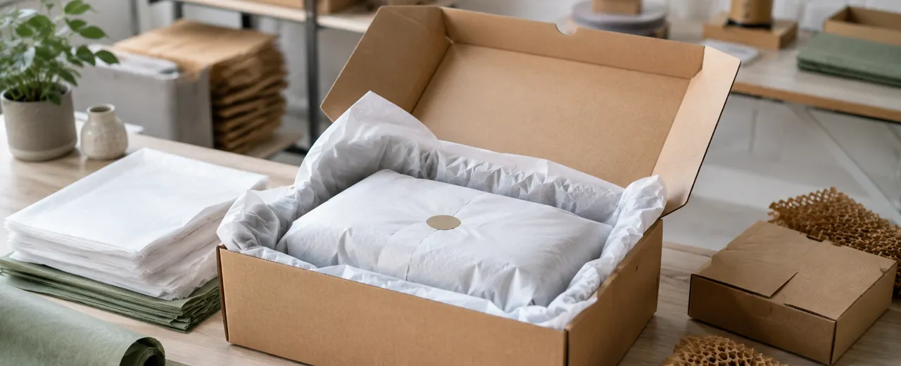
The technical solution is always a balance between three factors: blocking, amortizing, distributing. Blocking means preventing the translation and rotation of the bottle, with inserts designed on real geometries and with intelligent tolerances, because in the wine shop and in the supply chain there is not just one format. Damping means managing the impact in a controlled way, using materials and geometries that dissipate energy without collapsing. Distribution means preventing pressure from concentrating on one point, which often happens when the insert is too rigid or when the outer box is too large and the contents "float" in a vacuum.
This is where a fundamental distinction comes into play: "beautiful" packaging and "network-ready" packaging. An elegant rigid box can be perfect for the counter and bad for the courier if it is not accompanied by a suitable secondary shipping. You have to consider that gift wrapping and shipping wrapping are two different functions. The first must seduce and represent; the second must protect, seal and withstand compression. When you try to make a single object do both without a precise project, you often get a compromise: either you lose aesthetics, or you lose confidence. Instead, when you design the route, you can get the best of both worlds: a flawless gift box that comes in a dimensioned and structured shipping box, with consistent internal protections, so that the unboxing is premium and the journey is safe.
The "gifting" chapter deserves specific attention, because here you are not shipping a bottle: you are shipping a report. Those who receive a gift evaluate the care first and then the contents. And care is made up of signals: integrity, cleanliness, absence of crushing, clean closures, fluid opening, internal order. If the box arrives dented or if the contents look like they're "thrown in," even the best product suffers a devaluation. Conversely, if it's easy to open, if everything is in place, if there's protection that looks smart and discreet, you're telling the recipient, "This is designed for you." And this is where unboxing and protection stop being opposites and become the same thing: a project that stages security.
Then there are the category-specific risks, and ignoring them means increasing returns and complaints. In wine, the main risk is glass breakage, especially on edges and bottoms. In oil and vinegar, there is often a theme of closures and micro-leaks: even a drop can ruin a label, impregnate a paper, compromise aesthetics and generate a perception of "dirt" that is unacceptable in the premium. The internal packaging must therefore include not only a mechanical block, but also a "hygienic" management of any micro-event, with materials that do not stain at first contact and with solutions that protect surfaces and printing. The customer does not forgive a gift that comes with smell or halos.
Another critical point is sizing. When shipping, the box being "too big" is almost always a mistake. More empty volume means more internal acceleration, therefore more shocks; It also means more costs, more instability in stacking, and more likelihood of crushing because the walls work worse. Packaging that really holds up comes from the right measurements: enough space for the inserts, not for the vacuum. The same principle applies to take-away: an oversized shopper makes the object more unstable and communicates less care.
Then there is the issue of closure and integrity. In the e-commerce world, the customer interprets a well-sealed package as reliability, and an "easy to hack" package as risk. The closure must be sturdy, but also clean. Too much visible tape, improvised layering, badly placed labels: these are low-end signals. On the contrary, consistent seals, studied bands, clean cuts, stickers placed with criterion create a professional impression. And this has a direct effect on trust: it reduces reception anxiety and improves the predisposition to openness.
Finally, you need to consider the effect on your daily work and hidden costs. Packaging that really protects reduces breakages and returns, but also reduces the hours spent managing complaints, refunds, replacements, new shipments, "difficult" conversations with the customer. Protection is an economic lever, not just a qualitative one. And the same goes for unboxing: a curated experience increases the likelihood of repurchase and word of mouth, because it makes the purchase memorable and "shareable" effortlessly. In a market where the content is often excellent but the offer is wide, the complete experience becomes differentiating.
If you take away a single idea from this chapter, it has to be this: you're not designing a box, you're designing a path. From the counter to the house, from the courier to the table, from the opening to the first payment. When the package holds up that path without betrayal, the value is not only perceived before tasting: it arrives intact until tasting. And in the wine shop, where every customer can become a return or a recommendation, this integrity is as valuable as the product itself.
Occasions that increase the receipt: ideas and packaging lines for seasons, events and corporates
In the wine shop, the receipt grows when you make the purchase easier to "close" and more natural to justify. Occasions are the most powerful engine, because they transform the choice from a rational comparison to an immediate response to a need: to give a gift, to present oneself well, to thank them, to celebrate, to represent a company, to bring something to a dinner, to build a small quality stock. In all these cases, the customer is not just looking for a bottle: he is looking for a complete, ready, coherent solution, with a level of presentation that protects him from uncertainty. Packaging, here, is not "outline": it is the element that makes the purchase easier and, precisely for this reason, more alto.
The first lever is to work by "lines" and not by individual pieces. If you propose episodic packaging, every time you start from scratch: you have to explain, you have to convince, you have to find the right combination quickly. If, on the other hand, you build a recognizable seasonal line, the customer immediately understands where the proposal is located and how much it is worth. The line does not necessarily have to be wide, it must be consistent. All you need is a stable visual grammar, applied to a few key formats, for perception to make the leap: your wine shop does not "package", sign. And when you sign, the price stops looking like a surcharge and becomes added value.
Seasons work because they create urgency and simplify the decision. Christmas is the most obvious moment, but the point is not the anniversary itself: it is the repetition of need. During the year you have continuous micro-peaks, from dinners with friends to family celebrations, from local holidays to events in the city, from second homes to returning from holidays, up to thank-you gifts. If you set up a packaging system that adapts to these moments without changing skin every time, you turn the occasion into a habit. Habit is what keeps the customer coming back to buy "as usual," and "as usual" is one of the most profitable phrases you can get at the wine shop.
To really increase the receipt, you need to design formats that push the upgrade without forcing. The single bottle remains essential, but it is the double or triple packaging that creates the natural leap, because it allows you to tell a small story: tasting, comparison, journey. In wine it can be "white and red" or "different vintages"; in oil it can be "monocultivar and blend"; in vinegar it can be "different aging"; Between categories you can build a triptych with a very high perceived yield, such as wine-oil-vinegar, which lends itself very well to "kitchen" gifts and quality gifting. You're not selling three products – you're selling one set. And a set, psychologically, seems more thought out, more complete, more worthy of spending.
The same logic applies to accessories, which in the wine shop are a margin accelerator when they become part of the solution. A serious corkscrew, a drip stopper, a pourer, a small service accessory or a well-made tasting card change the perception of the whole: it is no longer a purchase, it is an experience. The packaging must provide this possibility in a clean way, without improvisation and without "fillers": a dedicated housing, an insert that blocks, an orderly internal composition. When the accessory appears designed and not added, the customer accepts it more easily and you raise the receipt without creating suspicion.
Events are another lever because they have a fundamental characteristic: they generate multiple and often close purchases. Tastings, presentations with producers, theme nights, small catering, weddings and anniversaries, food and wine favors, gifts for guests or customers. In these cases, packaging must work on two fronts: uniformity and scalability. The customer who buys several pieces wants aesthetic consistency; You want a system that prepares quickly and remains impeccable even in terms of quantity. Here a coordinated line with a few variations is perfect: it creates a "collection" effect and allows you to offer a clear proposal, with defined prices and levels.
The corporate is the most profitable chapter, but also the one that requires the most discipline. Companies don't buy gifts: they buy representation. They want reliability, punctuality, image, and above all they want to avoid risks. If you offer well-designed corporate packaging, you are not selling boxes: you are selling peace of mind. In this context, the perceived value depends on three elements that must be impeccable: the sober but evident customization, the build quality that supports delivery and storage, and the opening experience that seems "level" without being theatrical. The corporate does not like excess: it loves precision. A box that opens well, a neat interior, a short but well-printed message, a note inserted with logic, a clean seal that communicates control. If everything is consistent, the price goes up naturally because the company is not comparing your cost to the cost of a bottle: it is comparing it to the reputational risk of giving the wrong gift.
In corporate, then, process design is part of the offer. Times, customization, management of names, labeling, multiple shipments, different destinations, possible packaging with differentiated messages. Here the difference is made if you offer a "turnkey" system that really works, with a packaging line designed to be replicable and with a level of finish that remains constant on quantity. The way you present the proposal also matters: not an endless catalog, but a few well-built kits, each with a clear sense and a consistent price range. The company wants to choose quickly and feel safe.
Finally, there is an aspect that increases the receipt without you having to "push": the staging of premium as a natural option. If your store shows a packaging line with a strong identity, if the packaging is ready and visible, if the combination is already thought out, the customer does not ask you "do you have a box?". He asks you "which one do you recommend?". It is a paradigm shift: from a logistical request to a consulting request. And when packaging enters consultancy, it becomes part of the value you sell.
The key, in short, is to transform bargains into a system: a basic line that is always available, a premium line for important gifts, a corporate line designed with discipline, and formats that make it easy to level up without feeling "pushed". If you do this, the receipt grows for a very concrete reason: you are not selling more, you are making it easier to buy better. And in the wine shop, where the value must be immediately perceptible, this ease is the most effective form of sales.
The point, in the end, is not to establish whether packaging "matters". The point is to accept that, for wine, oil and vinegar, packaging is already part of the perceived quality and therefore part of the economic value you are able to realize. In the wine shop you see it in an almost surgical way: the same content, presented in a different way, generates different questions, different times at the counter, different objections to the price and, above all, a different predisposition to buy. When the packaging is consistent, solid, and well-designed, the customer doesn't ask you to justify; asks you to confirm.
Throughout the article you have worked on a simple truth: the sale is born before the tasting. It is born when the customer sees, recognizes, takes in hand and "feels" that what he is choosing is of a high level. This is not a superficial effect: it is a process of reducing perceived risk. The customer, faced with a premium price, is not only evaluating the future goodness of the product; he is evaluating the probability of making a right choice, of making a good impression, of receiving or giving an object that is up to par. Packaging, when it is designed well, does exactly that: it makes the choice safer.
You have also seen that premium is not the accumulation of effects, but discipline. Materials, finishes and details do not work if there are "many"; They work if they are relevant and accurate. The difference between convincing packaging and one that seems to be built at random is almost always in the invisible points: edges, alignments, closures, rigidity, stability of the contents, ease of assembly, rendering under the real lights of the store. That's where authority is at stake. And in the wine shop, where the customer observes the gesture of the packaging and takes away the object in his hand, authority cannot only be declared: it must be verifiable.
Then there is a decisive step that often separates those who use packaging as an accessory from those who use it as a lever: thinking of it as a system and not as a single object. System means consistent visual hierarchies, a recognizable signature, formats that cover real needs, solutions that hold up from take-away to shipping, up to unboxing. In a market where e-commerce and remote gifting weigh more and more, this continuity is not optional. If the packaging arrives dented, if the bottle moves, if the inside is messy, the premium perception breaks right in the last meter. On the contrary, when everything holds up and everything is ordered, the value is not only perceived: it is consolidated.
Finally, you have seen why bargains are the most powerful lever to grow the receipt: not because they "push" you to buy, but because they make it natural to buy better. The seasonal line, the tasting set, the solved gift box, the reliable corporate kit: these are tools that transform customer demand. From "how much does it cost?" to "which one should I choose?". From "a bottle" to "a solution". And it is precisely here that the wine shop stops being a place of sale and becomes a place of selection and presentation, that is, a brand.
If you want to take home an operational criterion, it is this: every time you introduce a premium reference, ask yourself if the packaging is making the same promise as the content and if it is doing it in an immediate, credible, repeatable way. If the answer is yes, the price stands on its own, the counter works better, the customer feels more confident and your name remains on the experience even after the product has been consumed. This is how packaging "sells": not because it embellishes, but because it builds trust before tasting and maintains it until the last gesture.
For ChartaRè, this is the correct perspective: to design packaging that is not only beautiful, but strategic. Packaging that helps you transform wine, oil and vinegar into objects to choose and give as a gift, with a level of presentation that really supports the value. Because, when the packaging is done well, it doesn't add a cost: it adds a reason to say yes.