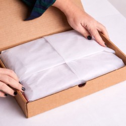
Tissue paper and wrapping paper for shipping have different functions and should not be confused. The tissue protects...

Colored Paper Shopper with Lanyard Handle - 25 pieces€25.58
 ChartaRè, RossiCarta's Online Packaging Store


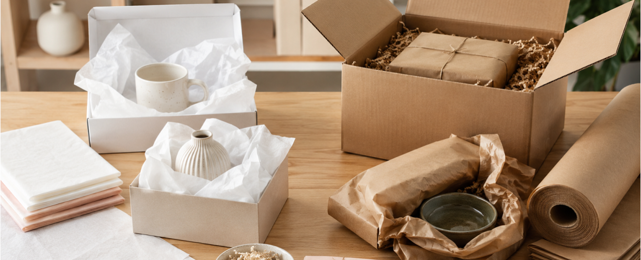
Tissue paper and wrapping paper for shipping have different functions and should not be confused. The tissue protects...
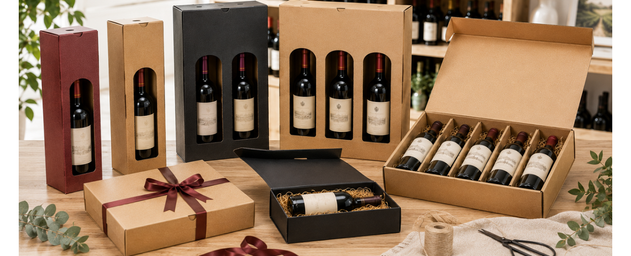
Wine boxes of 1, 2, 3 or 6 bottles help wine shops and wineries manage sales, gifts and delivery. Each format...
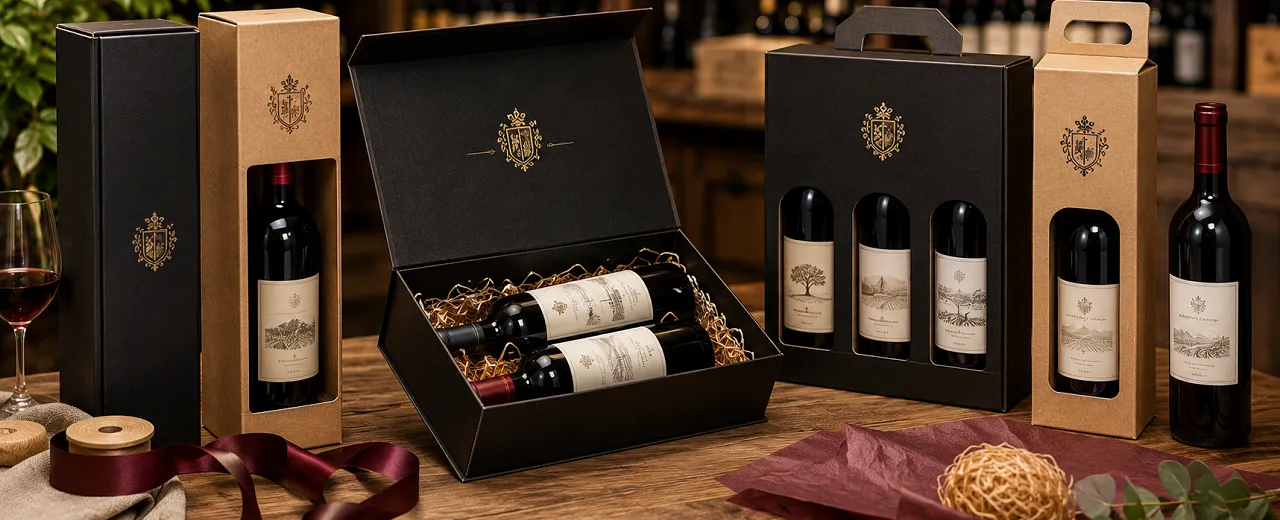
Personalised wine boxes enhance bottles, gift selections and corporate gifts. Logo, format and quantity must be...
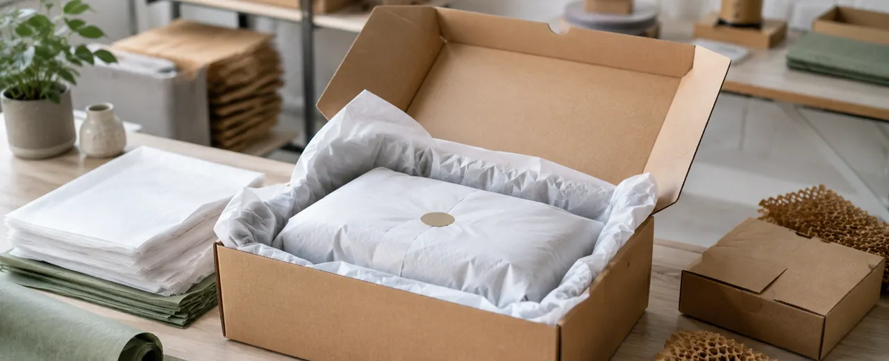
Tissue paper helps e-commerce businesses to superficially protect products and better present them inside the...
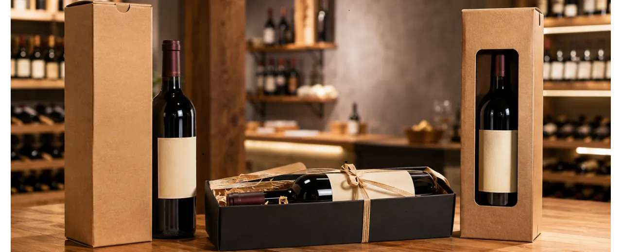
Wine boxes help wine shops and wineries to enhance bottles, gift selections and company packaging.Choosing between...
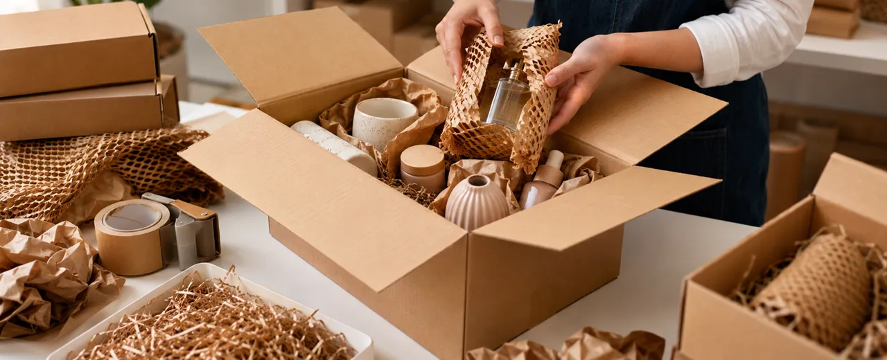
Fragile products require packaging designed according to weight, shape, material and mode of transport.Glass,...
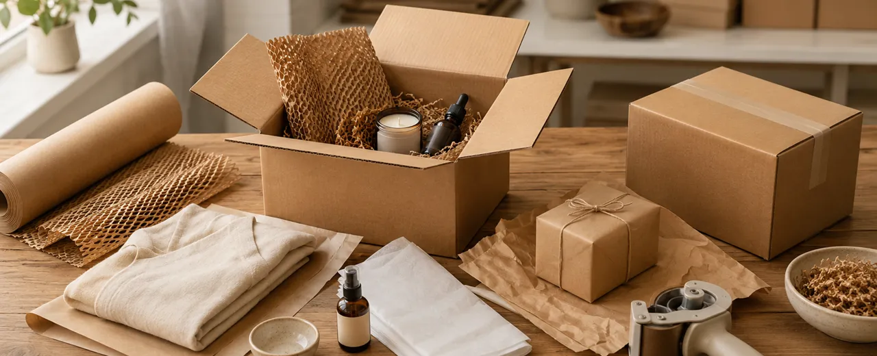
Preparing a package well means protecting the product and delivering an orderly and professional order to the...
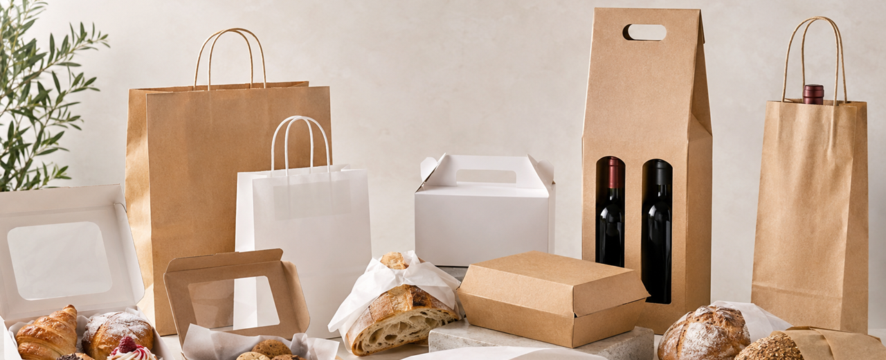
Food packaging must protect the product, speed up service and enhance every sale.Pastry shops, delicatessens and wine...
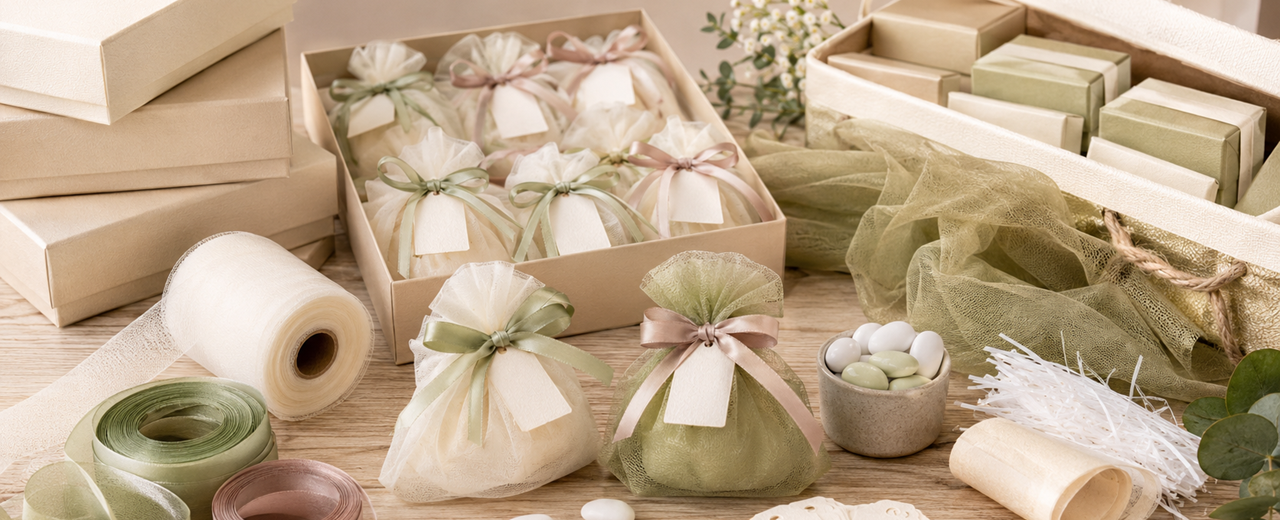
Packaging for wedding favors requires proportionate containers, coordinated materials and procedures that are easy to...
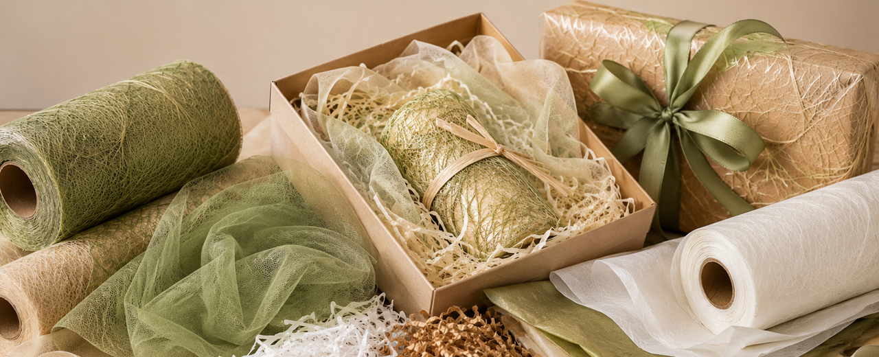
Grass paper, tulle, shavings and tissue paper perform different functions in professional packaging.The correct...
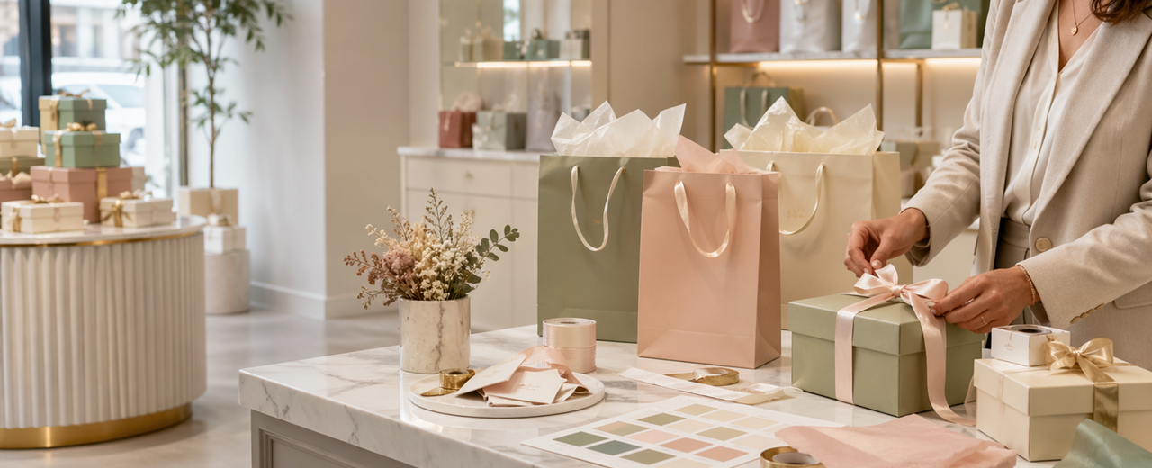
In packaging for boutiques and gift shops, color communicates even before the customer touches the product. A well-constructed palette makes the packaging tidier, more desirable, and more consistent with the store. Shopping bags, wrapping paper, tissue, ribbons and boxes must be chosen as parts of the same system. Colour is not only used to decorate, but to enhance the product, the occasion of purchase and the perception of the service. Messy packaging can lower the value even when the product is good. A simple, repeatable palette helps staff pack better and faster. In this guide we see how to choose colors and combinations to build professional and recognizable packaging. Color is one of the most immediate levers of packaging. Even before the customer analyzes materials, format or finishes, he perceives an overall impression: elegance, naturalness, freshness, warmth, luxury, energy or simplicity. For boutiques and gift shops, this impression is decisive, because packaging often accompanies products chosen to please, surprise or be gifted. A well-constructed packaging does not change the product, but presents it in the correct way and makes it more desirable. Choosing the colors of the packaging does not mean following the personal taste of the moment. It means building a palette that is consistent with the store, with the products sold, with the type of customer and with the experience we want to perceive. Gift wrap, shopper, tissue, ribbons and boxes must communicate with each other. When each material has a random color, the customer perceives confusion. When the palette is clear, the packaging looks designed and the store looks more professional.
Color is not a final detail. It is a structural part of the package. A white shopper communicates different sensations from a Havana shopper, a plain wrapping paper creates a different effect from a bright pattern, a fabric ribbon changes the tone of a box more than it seems. This is why we must consider color as a commercial element, not just an aesthetic one. Gift wrapping paper is often the first material on which to build the palette. It is the most visible surface of the wrapping and can make a packaging more elegant, more natural, younger or more suitable for gifting. Paper Shoppers complete the journey, because they accompany the customer out of the store and continue to communicate the image of the business even after the sale. For boutiques and gift shops, the palette should help make it easier to choose. If the customer sees consistent packaging, they immediately perceive a tidier environment. This can make it more natural to offer a gift package, a coordinated box or a more refined shopper. Color doesn't sell on its own, but it supports how the product is perceived.
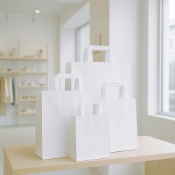
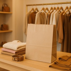
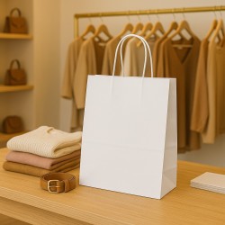
Colourful and neutral shopping bags for boutiques and gift shops
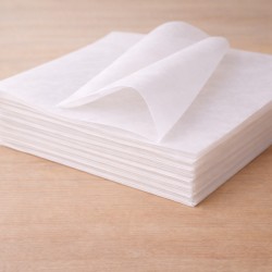
An effective palette starts with a few colors. The first is the dominant color, i.e. the one that identifies the main tone of the packaging. It can be white, Havana, black, cream, blush pink, sage green, blue, burgundy, or another shade consistent with the store. The second layer is made up of the supporting colors, which serve to create balance. The third level is made up of accents, used on ribbons, tissues, tags or seasonal details. The Shoppers, Bags and Bags category allows you to think about external packaging in a practical way. The shopper must be consistent with the palette, but also with weight, format and frequency of use. A boutique can choose a white or black base for a cleaner effect. A gift shop can work with colorful or Havana shopping bags for a warmer and more immediate result. Tissue Paper for Packaging helps to build the second color level. A white tissue lightens, a colored one creates surprise, a semi-transparent one makes the opening more delicate. The tissue is useful because it allows you to insert color without changing the entire structure of the package. The basic palette must be repeatable. If each employee chooses different combinations, the packaging loses its identity. If, on the other hand, the store establishes a few clear combinations, the result becomes more recognizable and easier to manage at the counter.
Gift wrapping paper and tissue paper are the most useful materials for building chromatic depth. The paper creates the external surface, the tissue works inside shopping bags and boxes, creating a second visual level. When these two elements are consistent, the packaging immediately appears more polished. Plain Wrapping Paper is suitable when we want to maintain a clean, elegant and easily coordinated image. It is a strong choice for boutiques, perfumeries, concept stores and gift shops that want to create continuity throughout the year. Fancy Wrapping Paper , on the other hand, allows you to introduce character, seasonality and greater visual impact, especially for gift wrapping, promotions and specific commercial periods. The mistake to avoid is to mix patterned paper, colored tissue and lit ribbon without a hierarchy. If everything wants to attract attention, the product takes a back seat. Better to choose a protagonist and leave the task of completing it to the other elements. A patterned paper can be combined with neutral tissue paper and plain ribbon. A solid color paper can instead accommodate a colored tissue or a more evident ribbon. The color must accompany the product, not overpower it. In a boutique, deep neutral hues can enhance accessories, clothing, and cosmetics. In a gift shop, warmer or seasonal colors can make the packaging more emotional, as long as they stay uncluttered.
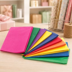
Papers and tissues to build the palette
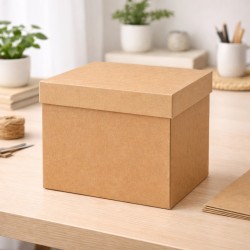
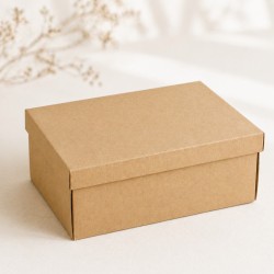
Shopping bags and boxes are the most visible and most structural containers in packaging. Their color greatly affects the final perception. A Havana box communicates naturalness and craftsmanship. A white box conveys order and cleanliness. A black box can create a more elegant effect. A colorful shopper makes the delivery more lively and recognizable. Gift Boxes are essential when the product needs to be enhanced with more structure. The color of the box must dialogue with paper, tissue and ribbon, but also with the contents. A delicate product can be supported by a clear palette. An important accessory may work best in a dark box or in a bolder contrast. The choice of container should not be guided only by the photographic effect. It must work at the bench, in the warehouse and in the actual delivery. If we choose too many colorways, staff will struggle more to maintain consistency. If, on the other hand, we use two or three color bases, we can create many combinations with tissues and ribbons without multiplying the stocks too much. For boutiques and gift shops, a practical solution is to work with a base colour for everyday shopping bags, a neutral box for products to be enhanced and some colour accents for seasons or anniversaries. In this way, the packaging remains recognizable, but does not become rigid.
The ribbon is a small detail, but very visible. It can close, finish, create contrast and give a more refined tone to the packaging. This is why it must be chosen carefully. The wrong ribbon can weigh down the package, while a consistent ribbon can make even simple packaging look more elegant. Decorative Ribbons allow you to work with different colors, materials and finishes. They are useful for creating a gift line, differentiating seasons or adding a color accent to the packaging. The Fabric Ribbons give a softer and more refined effect, suitable for boutiques, perfumeries, accessories, objects and higher-end gift packaging. Polypropylene Belts are practical when color, speed and handling are needed on higher volumes. The tape should have a precise function. It can pick up the color of the tissue, create contrast with the paper, recall the logo of the store or distinguish a gift box from an ordinary package. It does not have to be chosen just because it is available at the counter. A good rule of thumb is to keep a few continuous colors and add seasonal variations only when needed. White, ivory, black, gold, burgundy, sage green, blue and powder pink can build very different languages. The difference is the combination with paper and box, not the isolated color.
Boxes and tapes for coordinated packages
The seasons are important for boutiques and gift shops, but they don't have to upset the packaging every time. Christmas, sales, spring, summer, Valentine's Day or new collections can introduce different colors, but the base of the store must remain recognizable. If everything changes every season, the customer does not build memory. Your best bet is to keep a permanent palette and add temporary accents. A boutique with a black and white base can put gold, red or green at Christmas time. A havana-based gift shop can add sage, peach, or burgundy depending on the season. A perfumery can work with white, cream, and pastel accents to maintain a more delicate tone. The seasonal palette should be easy to apply. It can fit into gift wrap, tissue, ribbon or shopping bag, but not necessarily all of the elements together. Often, just one material change is enough to update the packaging without complicating the warehouse. To avoid waste, it's best to use seasonal colors on fast-rotating materials, such as paper, tissue, and ribbon. Shopping bags and boxes, especially if purchased in larger quantities, can remain more neutral. In this way, the store maintains continuity and better controls costs.
Customization is useful when the palette is already clear. Printing a logo on shoppers, boxes or tissues without having defined colors and materials risks producing an inconsistent result. First you build the system, then you decide where to put the brand. The Shopper and Personalised Boxes category allows you to bring colour and identity to the outer packaging. A personalized shopper makes delivery recognizable, especially for boutiques and gift shops that want to be remembered outside the store. Personalized Papers and Tissues , on the other hand, work on the moment of opening, creating a more refined experience inside boxes and shoppers. Personalization doesn't have to be complex. Sometimes a logo in a consistent color, a tissue with a light pattern or a personalized ribbon is enough to make the packaging more recognizable. The point is to choose the most useful support. If the shopper is the most visible material, it is better to start from there. If the opening experience is central, the tissue can play a stronger role. If the store works a lot with gift packages, the ribbon can become a recurring sign. At ChartaRè, we help boutiques, gift shops, perfumeries, concept stores and retail businesses to build consistent packaging palettes, choosing paper, shoppers, ribbons, boxes and customized solutions based on real use. Color becomes effective when it is not only beautiful, but recognizable, tidy and easy to repeat every day.
Custom packaging for recognizable palettes
The complementary colors are located in opposite positions on the color wheel and, juxtaposed, reinforce each other: red and green, blue and orange, yellow and purple. In packaging, they are useful for creating an immediate point of attention, but they do not necessarily have to occupy the same surface.
The safest method is to choose a dominant color and use the complementary as an accent on the ribbon, label, seal, or graphic detail. If both are very saturated and present in equal parts, the packaging risks becoming noisy. For a more elegant result, you can desaturate one of the two colors or place them on a neutral base. Contrast must guide the gaze towards the product and brand, not compete with them.
In the gift box, harmony comes from the relationship between paper, box, tissue, ribbon and accessories. Choosing each element separately can produce a formally rich but inconsistent package. Instead, it is better to start from the emotion and the occasion: delicacy, energy, naturalness, elegance or celebration.
An effective combination uses a base, a backing color, and a single accent. Powder pink and warm white communicate delicacy; deep red and opaque gold support a festive register; blue and silver suggest order and winter atmosphere. The inner tissue paper must also participate in the palette: it is the first color that appears during the opening and can confirm or weaken the whole project.
Autumn-winter palettes work when they balance reassuring shades and an accent capable of giving energy. Warm browns, burgundy, dusty blues, and light yellows can build very different color families without depending on a single seasonal trend.
For retail, it's helpful to keep a continuous base — kraft, cream, cocoa, or deep blue — and replace only the accent. A bright yellow makes the composition more accessible, a lacquer red increases depth, a retro blue communicates calm. The season must update the system, not force it to be redone: this reduces stocks that are difficult to reuse and keeps the identity of the store recognizable.
Colors suggest immediate associations, but do not possess a fixed commercial meaning. Red can communicate energy or urgency, green nature and balance, blue trust, black exclusivity and white simplicity. However, the perception changes with material, sector, culture and price range.
The correct question is not "what does this color mean?", but "what promise does it create about this product?". A green on kraft can support a natural positioning; The same green paired with black and gold can become more premium. Before confirming a palette, it is therefore advisable to check it on the real support, next to the product and in the light conditions of the store or e-commerce photographs.
To update your packaging in hot weather, you don't need to chase every trendy color. It is more useful to choose one of the three directions that return with greater continuity: bright pastels for lightness and gift, natural tones for authenticity and matter, or lively accents for promotions and young collections.
Limiting the palette to three or four shades makes it easier to coordinate paper shopping bags, boxes and ribbons, keeping the result replicable at the counter.
A soft, milky brown can become a more refined base than raw kraft and less severe than dark chocolate. It works as a continuous warm neutral: it supports daily purchases and important packages, while the register changes through a few accents.
Ink blue and light gold make it more authoritative; sage and raw cotton move him towards a natural language; powder and thin satin add delicacy. The same base can therefore serve three levels of packaging — essential, gift and premium — varying paper quality, ribbon width and finish. In this way, color is not only aesthetic: it simplifies tidying up, time at the counter and recognizability of images online.
 Practical Guide: The Art of Window Dressing
 Artificial intelligence (AI) in the Physical Store.
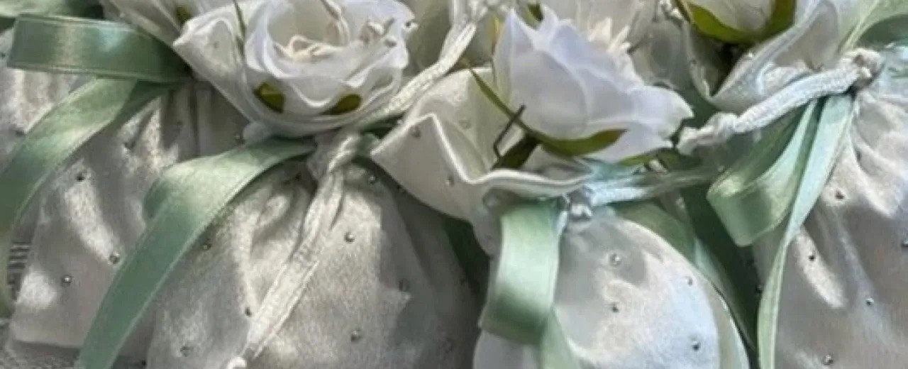 The DIY Wedding Favor, the Perfect One.
 Packaging with Sustainability: The Future of Environmental Impact
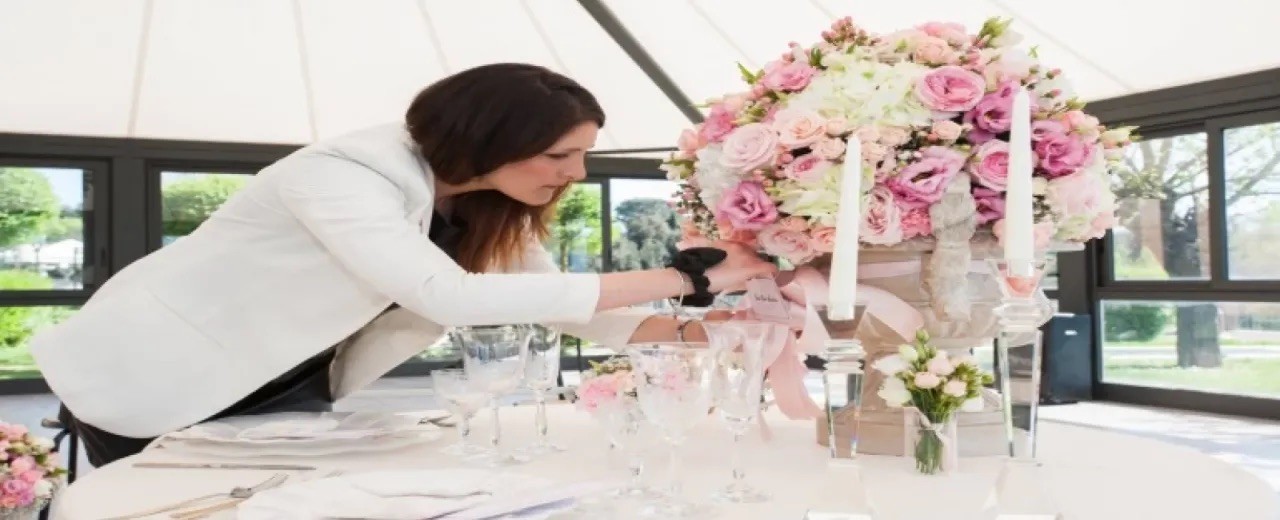 Practical Guide to Customizing Wedding Favors: Tune in to the Theme of the Event and Personal Tastes
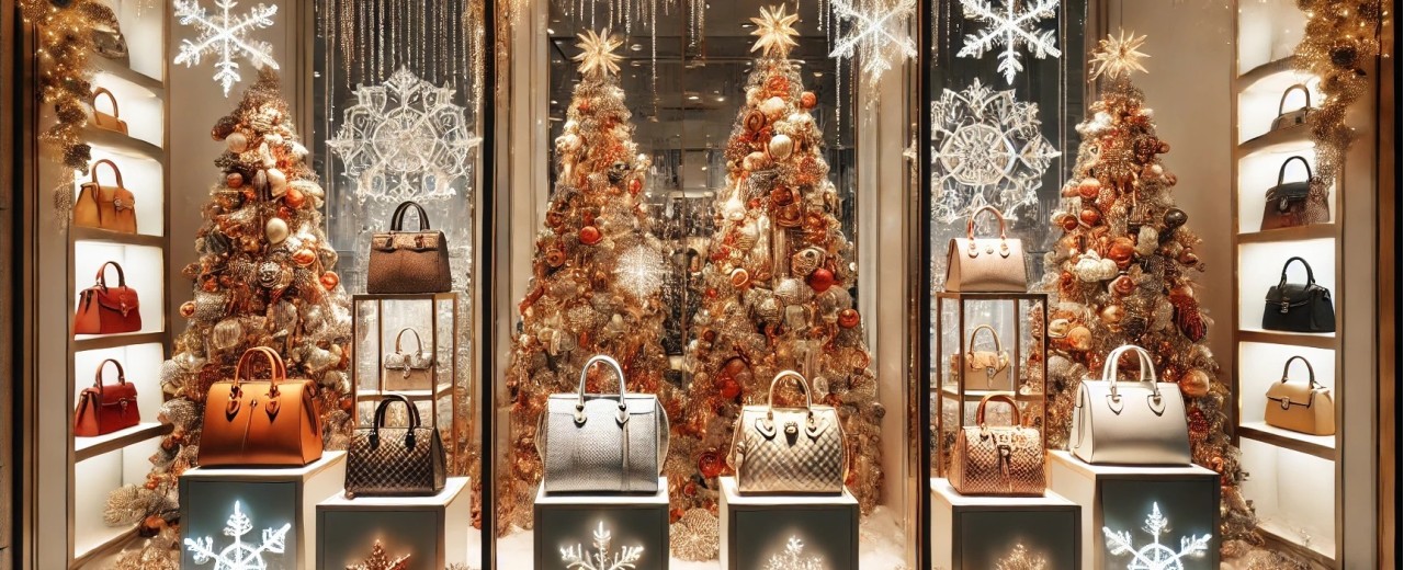 Preparing for Christmas Magic: When and How to Present Your Window Displays to Maximize Sales