When it comes to packaging a product, the color of the wrapping is not just a matter of aesthetics, but a powerful tool that profoundly influences the consumer's perception.
In this article we want to examine a specific case referring to ice cream makers, please, do not call ice cream makers Ice cream makers!
In particular, for a product like ice cream, wrapping not only protects, but communicates a powerful message about the taste, quality and experience that will be lived. Each color conveys specific emotions and psychological associations, which can affect the purchase choice and the final impression you have of the product. In this article, we will explore how the choice of color in the after-sales wrapping can impact the perception of the perceived quality of ice cream and how each color can tell a unique story for the ice cream it contains. Whether it's the warm and inviting orange, sophisticated gold or fresh green, colour can make the difference between a product that stands out and one that tends to go unnoticed.
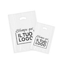
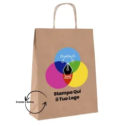
Combine the logo with the color of the card
Combining the logo with the color of the paper is a key element in ensuring consistent and attractive visual communication. The right combination can enhance brand value, convey the right message, and attract the consumer's attention. Here are some guidelines on how to best do this:
1. Contrast for visibility
The contrast between the color of the card and the color of the logo is essential to ensure that the logo is clearly visible and legible. If the logo is dark, opt for a light-colored paper, and vice versa. This helps to make the logo stand out without it getting lost in the paper or becoming difficult to see.
Example: If your logo is dark in color (such as black or dark blue), choose a light-colored paper (such as white, cream, or pastel) to make sure the logo stands out. Conversely, if the logo is light (white, silver), a darker paper (such as blue, dark green, or black) will make the logo stand out.
2. Harmony between colors
The color scheme should reflect the brand's identity and values. If your brand has corporate colors, make sure the color of the card is in line with this palette. Using complementary or analogous colors can create a feeling of visual harmony, but be careful not to overload the design.
Example: If your logo is a mix of bright colors, such as red and yellow, you may want to choose a paper that echoes one of these tones or a more neutral shade, such as white or gray, to prevent the final result from looking too heavy. A more understated approach works well with a sleek, minimalist logo.
3. Logo style and paper
The texture and type of paper play an important role. If the logo is sleek and sophisticated, you may want to choose a paper with a more refined texture, such as a glossy or matte paper, perhaps with a metallic finish or embossing. If the logo is more playful or informal, you can opt for a more natural or eco-friendly paper, such as kraft or recycled paper, that reflects the brand's character.
Example: A minimalist logo with clean lines can be paired with a neutral-colored matte paper for a sleek look, while a more fun or creative logo pairs well with colorful papers with an interesting texture, such as embossed or satin-finished paper.
4. Text and readability
Also consider the legibility of the text on the logo, especially if there is information such as the brand name, website, or a motto. Avoid combining colors that may reduce readability, such as light text on light paper or dark text on dark paper. Good contrast will help keep the design clean and easily readable.
Example: If your logo includes text, make sure that the color of the logo and paper create enough contrast to ensure that the text is legible at a glance.
5. Special Effects
For an extra touch, you can consider using special prints on the logo, such as gold, silver or foiling printing. These effects pair well with dark or neutral papers, giving them a luxurious and distinctive look. However, it's important not to overdo it with special effects – simplicity and elegance are often key.
Example: A logo printed in gold on a black or dark gray paper creates an elegant and prestigious effect, ideal for a premium or exclusive brand.
The combination of the color of the paper and the logo is not only about the aesthetic aspect, but also about the consistency with the brand and the experience you want to convey to the customer. The right combination must be visually appealing, consistent with the brand identity and easily readable. Experimenting with contrasts, harmonies and textures will allow you to find the ideal combination to best represent your brand.
Here are some examples to illustrate how an ice cream parlor can use different color variations to wrap its products and how this can influence customer perception.
Red
Red is an extremely powerful and dynamic color that is known to stimulate energy, excitement, and appetite. It is associated with passion, strength, and intensity, and is able to attract attention immediately, making it perfect for products that want to be noticed and appreciated.
Psychology of the color red:
Red is a color that evokes strong emotions and can significantly affect the consumer's perception of the product. In a context such as an ice cream parlor, a red wrapping might suggest that the ice cream is decadent, tasty and indulgent. Red stimulates the appetite, which is why it is often used for foods, especially those that are sweet or rich in flavor.
Psychological example:
If an ice cream parlor uses a red wrapper, the consumer could perceive these products as tasty, intense and satisfying. Red also conveys a sense of warmth and welcome, creating an emotional connection with the consumer, who will feel drawn to the vibrancy of the color and the idea of a full and satisfying sensory experience. Red is a color that stimulates and attracts, perfect for ice creams that want to be perceived as intense, tasty and indulgent. A red wrapping can attract attention and stimulate the appetite, communicating a rich and satisfying experience to the consumer.
Brown
Chocolate brown is a very powerful color and ideal for conveying feelings of richness, warmth and comfort. It is a color that immediately evokes the idea of intense taste and satisfaction.
Psychology of Chocolate Brown:
Brown is strongly associated with chocolate, which is considered a comfort food par excellence. Using this color for ice cream wrapping could make the product feel luxurious and satisfying. It is also a color that conveys reliability and solidity, making the consumer feel confident in choosing a high quality product.
Psychological example:
A chocolate brown wrapping could be perfect for a takeaway ice cream wrapping. Consumers may feel attracted by the call to a rich and rewarding sensory experience, anticipating a full and satisfying taste. In addition, associated with the quality of the chocolate, this color could also communicate that the ice cream has been made with fine ingredients and craftsmanship. Brown is a great choice for a wrapping that wants to convey an image of elegance, comfort and rich taste, just like chocolate itself.
Cream or even Ivory
The cream color is delicate, elegant and versatile, and is perfect for conveying feelings of refinement, elegance and sophistication. It is a color that recalls purity, calm and naturalness, and is often associated with fresh, high-quality ingredients.
Psychology of the color cream:
Cream is a color that does not disturb the eye, but rather invites a feeling of comfort and warmth. It is the perfect color for products that want to express simplicity but with a touch of sophistication. In an ice cream parlor, a cream wrap might suggest that the ice cream is made with fresh, natural ingredients, such as vanilla ice cream, or softer, creamier variations.
Psychological example:
If an ice cream parlor uses a cream wrapper, consumers may perceive the product as delicate and refined, but also as simple and natural. The cream wrapping suggests that the product is made with quality ingredients, without the need for bright colors or excessive ornamentation. It can also evoke a feeling of craftsmanship, as the cream color communicates a certain attention to detail and well-being. The cream color is ideal for products that want to convey discreet elegance, natural quality and refinement. In an ice cream wrapper, it adds a touch of class without being too intrusive, creating an immediate connection with the freshness and high quality of the ingredients.
Blue
Blue is a color that evokes calm, confidence, and sophistication. It is a cool and relaxing color, often associated with feelings of freshness and superior quality. In the context of an ice cream parlor, a blue wrapping can be an elegant choice, suggesting a premium, fresh and sophisticated product.
Psychology of the color blue:
Blue is known for its connotations of serenity and reliability, and is often used to convey a sense of cleanliness and freshness. When used in ice cream wrapping, blue can make the product feel fresh, refined , and made with high-quality ingredients. In addition, blue is also the color associated with natural and healthy products, so a blue wrapping could suggest that ice cream is made with fresh and natural ingredients.
Psychological example:
If an ice cream parlor uses a blue wrapper, customers may perceive these ice creams as fresh and refreshing, with a touch of elegance. Blue, particularly in darker shades, could also suggest a sophisticated or premium choice, making it look more exclusive. Blue is ideal for a wrapping that wants to convey freshness, refinement and high quality. It is perfect for delicate and fresh ice creams, such as those made with mint or exotic fruits, and can appeal to those consumers looking for a sophisticated and natural product.
Green
Green is a color that evokes freshness, naturalness and health. It is often associated with nature, regeneration, and sustainability, making it perfect for communicating the quality and freshness of a product. A green wrapping can give the impression of a natural, fresh and sustainable product.
Psychology of the color green:
Green is the color of nature and life. It is known for its calming effect and its ability to convey balance and well-being. In addition, green is often linked to the idea of health and fresh, natural ingredients, which makes it a perfect choice for a wrapper that wants to communicate a healthy or eco-friendly product. It can also suggest that the ice cream is artisanal, handmade , and free of artificial additives.
Psychological example:
A green wrapping for a could evoke freshness and naturalness, making ice cream perceived as a light, fresh and healthy option. A green wrapping could also make you think of vegan or lactose-free ice creams, associating the color with naturalness and the absence of ingredients of animal or synthetic origin. Green is an ideal color for a wrapping that wants to convey freshness, naturalness and health. It is perfect for take-away ice cream wrappers, and can appeal to consumers looking for a healthy, artisanal product made with natural ingredients.
Yellow
Yellow is a color that evokes joy, positivity and energy. It's bright, lively, and stimulates joy and optimism, making it perfect for products that want to be perceived as fresh, surprising, and inviting. Yellow is often associated with sunshine, happiness, and vibrancy, and is a color that easily attracts attention.
Psychology of the color yellow:
Yellow is the color that stimulates mental activity and optimism. It is commonly used to convey positivity and cheerfulness, making it ideal for products that want to elicit emotions of happiness and enthusiasm. It is also associated with freshness and fruity taste, which makes it perfect for ice cream wrappers that recall these concepts.
Psychological example:
A yellow wrapping can create an immediate idea of freshness, summer and vitality. Yellow, thanks to its brilliance, stimulates the appetite, but at the same time gives a sense of lightness and joy. In addition, this color can make ice cream look more appealing and lively, enticing the consumer to choose a product that promises a fresh and dynamic taste experience. Yellow is a perfect color for a wrapping that wants to convey energy, positivity and freshness. It is ideal for wrapping and can appeal to those consumers looking for a vibrant and cheerful product that promises a refreshing and tasty experience.
Black
Black is a color that evokes elegance, luxury and sophistication. It is a sophisticated color, which conveys a sense of exclusivity and prestige. Although it is a strong and bold color, black also has a minimalist look that can give an image of high quality and class, without ever being excessive.
Psychology of the color black:
Black is associated with concepts such as mystery, authority , and timeless elegance. It is a color that gives an idea of luxury and sophistication, and is often used for premium or exclusive products. In the context of an ice cream wrapper, black can suggest that the ice cream is high-quality, artisanal and sophisticated.
Psychological example:
If an ice cream parlor chooses a black wrapper for particularly sought-after ice creams, the customer may perceive the product as more refined and luxurious. Black, especially when combined with gold or silver details, can lend a sense of exclusivity, making ice cream feel like a premium and special product. Black is a perfect color for a wrapping that wants to convey elegance, luxury and superior quality. It is ideal for gourmet or artisanal ice creams, giving an image of exclusivity and refinement. A black wrapping attracts the attention of those looking for a premium experience, reflecting the value and elegance of the product.
White
White is a color that evokes purity, freshness and simple elegance. It is a bright and neutral color, associated with concepts of cleanliness, minimalism and natural quality. White is perfect for conveying the idea of a fresh, light and refined product, and is an ideal choice for a wrapping that wants to make an ice cream perceived as delicate and of high quality.
Psychology of the color white:
White is the color that represents simplicity, order and purity. It is a color that conveys calm and tranquility, and is often used to suggest that the product is natural and made with higher quality ingredients. White is also a color that communicates a sense of freshness and cleanliness, perfect for ice creams made from fresh and light ingredients.
Psychological example:
If an ice cream parlor chooses a white wrapper for ice creams such as fiordilatte, vanilla or lactose-free ice cream, the consumer may perceive these products as simple, natural and fresh. White communicates the idea of an artisanal and pure preparation, without artificial additives, and suggests impeccable quality and a certain refinement. White is an ideal color for a wrapping that wants to convey freshness, purity and natural refinement. It is perfect for ice creams made from fresh and simple ingredients, and attracts those consumers looking for a genuine, natural and refined product. A white wrapping can make ice cream look artisanal and high-quality, creating an impression of purity and lightness.
Rose
Pink is a color that evokes sweetness, femininity and tenderness. It is a delicate and welcoming color, often associated with feelings of joy, kindness, and innocence. Pink is perfect for conveying a sense of freshness and light elegance, and is particularly suitable for products that want to be perceived as delicate, sophisticated and fanciful.
Psychology of the color pink:
Pink is the color that represents sweetness, compassion , and romance. It is often used to evoke feelings of freshness and gentleness, and to give an impression of lightness and natural elegance. It is a color that tends to appeal to a younger audience or to those looking for products that communicate positivity and joy.
Psychological example:
A pink wrapping could be perceived as fresh, delicate and delicious. Pink creates an immediate connection with sweetness and lightness, suggesting that ice cream is a mouth-watering but not too heavy choice. In addition, it could be used for ice cream designed for special occasions, such as ice cream for events such as birthday parties or other celebrations. Pink is an ideal color for a wrapping that wants to convey delicacy, sweetness and freshness. It can appeal to consumers looking for a delicate, cheerful and refined taste experience. A pink wrap can also make ice cream feel like a festive and special choice, perfect for occasions or gifts.
Fouxia
Fuchsia is a vibrant, energetic and bold color, mixing pink and purple, evoking feelings of creativity, passion and playfulness. It is an eye-catching colour that conveys a sense of cheerfulness, vitality and originality. A fuchsia wrapping can make the product feel unique, modern and fun, attracting those consumers looking for a distinctive experience.
Fuchsia Color Psychology:
Fuchsia is a color that communicates energy and liveliness, but at the same time maintains a certain elegance thanks to its more refined shade than bright pink. It is often associated with creativity, individuality and a free spirit, making it ideal for products that want to convey an innovative and youthful image.
Psychological example:
A fuchsia wrapping could attract the attention of younger consumers or those looking for something different. Fuchsia immediately conveys a sense of excitement and joy, suggesting that ice cream is not just a dessert but a real sensory experience. This color can also be perfect for festive or creative wrapping, intended for special occasions such as parties or events. Fuchsia is a perfect color for a wrapping that wants to convey energy, originality and creativity. It is ideal for ice creams with an exotic or particular taste, creating a unique and fun product image. A fuchsia wrapping attracts consumers looking for something exciting, festive and vibrant, making ice cream feel like a fresh and modern choice.
Gold
The color gold is a symbol of luxury, sophistication , and prestige. It is a color that evokes timeless elegance and exclusivity, and is often used to communicate high quality and premium. Gold has a strong association with success, wealth, making it perfect for products that want to convey a sophisticated and refined image.
Psychology of the color gold:
Gold is the color of luxury, wealth , and power, but also of celebration and glory. It is a color that attracts attention and captures the light, creating a sense of value and prestige. It is used for products that want to be seen as exclusive and unique, making the product perceived as the highest quality.
Psychological example:
A gold wrapper for an ice cream can be used. Gold suggests that ice cream is rich, refined , and exclusive, creating an elevated sensory experience. In addition, it can be used for limited edition products or for ice creams designed for special occasions such as weddings, elegant parties or celebrations.
The gold color is perfect for a wrapping that wants to convey luxury, refinement and high quality. It is ideal for gourmet or exclusive ice creams, making the product perceived as a premium and great value choice. A gold wrapping catches the eye and immediately communicates a sense of elegance and prestige, perfect for attracting those looking for a classy and refined experience.
Silver
The silver color evokes elegance, refinement and modernity. It is a color that suggests freshness and sophistication, but with a more contemporary connotation than gold. Silver is associated with technology, precision and superior quality, and is perfect for conveying the image of a premium product but with a more sober and modern approach.
Psychology of the silver color:
Silver is the color of modern sophistication and sustainability, often associated with innovation and the future. It is a color that conveys a sense of freshness and purity, while maintaining an aura of luxury and discreet elegance. Silver is less bold than gold, but just as powerful in communicating quality and exclusivity.
Psychological example:
A silver wrapper for an ice cream could easily be used. The silver color gives an air of sophistication and elegance without being too ostentatious, perfect for attracting an audience looking for a refined product, but with a more modern and subtle aesthetic than gold. It can also be used for limited edition ice cream or for special occasions such as anniversaries or elegant events.
The silver color is ideal for a wrapping that wants to convey refinement, premium quality and modernity. It is perfect for gourmet or artisanal ice creams, making the product feel elegant, but with a touch of discretion and modern sophistication. A silver wrapper draws attention with a sense of understated elegance, perfect for those looking for a premium, yet more subtle and refined experience.
Orange
The color orange is a color that evokes energy, cheerfulness and vitality. It is warm, stimulating and welcoming, and is often associated with creativity, fruity taste and freshness. Orange has the ability to attract attention in a positive way, arousing feelings of optimism and playfulness. It is perfect for a wrapping that wants to convey an image of liveliness and fun.
Psychology of the color orange:
Orange is a color that stimulates the appetite and is traditionally associated with fresh and sweet products, such as citrus fruits, fruits , and spices. It evokes a feeling of warmth and positivity, and is often used to convey a sense of joy and immediate satisfaction. It's also a color that suggests a youthful and dynamic approach, perfect for appealing to consumers looking for something fun and refreshing.
Psychological example:
An orange wrapping for ice cream could make the product feel fresh, fruity and inviting. The orange color stimulates the appetite and creates an immediate association with the freshness and vibrancy of ice cream, making it seem like a tasty and tempting option. In addition, orange can be used for ice creams designed for festive occasions, such as birthdays or summer events, where the energy of color blends perfectly with the joyful atmosphere.
The orange color is ideal for a wrapping that wants to convey energy, joy and freshness. It is perfect for ice creams made with citrus or tropical fruits, and can attract consumers looking for a tasty and playful experience. An orange wrap makes ice cream look like a lively and refreshing choice, perfect for those looking for a fun and energetic product.
What colors or shades to avoid
When choosing a color for ice cream wrapping, it is crucial to take into account the psychology of color and the emotions that color can evoke in consumers. Some colors, while they may look attractive at first glance, may not be ideal for a product like ice cream. Here are some colors that an ice cream maker may want to avoid for wrapping:
1. Dark Brown
While brown can be associated with chocolate, in its darker hues it could suggest old age, decay , or grime. This could negatively affect the perception of the freshness of the product. Also, a dark brown wrapping may not convey the idea of a fresh and inviting product, but rather something heavy and dated.
2. Dark Grey
Gray, particularly in its darker shades, can be perceived as a neutral and sad color, which does not stimulate appetite or interest. It is a color that does not evoke joy or liveliness, qualities that are important for a product like ice cream, which should be associated with freshness, fun and pleasure.
3. Black too dull
While black, when used elegantly, can convey luxury and sophistication, a matte black wrapper might give an impression of heaviness or drama, which may not be in line with the freshness and lightness you expect from an ice cream. In addition, a black wrapping could be associated with products that are too intense or sumptuous, not very suitable for a fresh and fun dessert.
4. Dark Green
Although green is generally associated with freshness, a very dark or olive-green green can suggest a sense of maturity or grimness, which may be unappealing for an ice cream. In addition, a dark green might be perceived as more suitable for savory or natural products, but not necessarily for a dessert like ice cream.
5. Beige or cream too pale
Although beige or cream may seem like a delicate and natural color, in its paler shades it may be too bland or anonymous, not capturing the consumer's attention. Ice cream packaged in a wrapping that is too light may not look interesting or inviting enough, especially if the product does not stand out visually.
6. Pastel pink too light
Pastel pink, while associated with sweetness and freshness, can be too delicate or childish for some more sophisticated ice cream lines. In addition, a pink wrapping that is too light could be perceived as fragile or not very bold, reducing the perception of a more premium or gourmet product.
An ice cream maker should avoid colors that evoke sadness, dullness , or heaviness, such as dark brown, dark gray, or dull black. In addition, colors that are too light or delicate such as pale beige or very light pastel pink may be too anonymous and not capture attention. The goal is to choose colors that stimulate the appetite, evoke freshness and joy, and that reflect the lightness and creativity of ice cream.
The choice of color for ice cream wrapping is much more than just a matter of aesthetics.
You will have understood by reading this article that color is a powerful tool that can profoundly influence consumer perception, stimulate appetite and communicate the quality of the product. Each color has the power to tell a story, evoke emotions, and create an immediate connection with the customer. Choosing the right wrapping color not only improves the viewing experience, but can also make the difference between a product that attracts and one that goes unnoticed.
So, what is the color that best represents the unique character of your ice cream?