When you think of Christmas and try to imagine a "classic" decoration, you don't start from a shape, a texture or a material. Start with three colors. You immediately see a deep red, an intense green, a touch of gold that catches the light. Before you even choose a ribbon, a ball or a box, the palette is already there, carved into your visual memory. It's as if Christmas has an unwritten color code that you, your customer, and everyone who walks into the store know instinctively, without needing to explain it.
Yet this code was not born by chance. Gold, red and green are not just "beautiful colors that work at Christmas", but the result of a very long stratification of religious symbols, popular traditions, artistic images, commercial choices and family habits. Every red bow you tie around a box, every green decoration you add to a wreath, every golden detail you put in a wrap tells a story much older than the individual item you're packaging.
If you stop for a moment to look at your windows or decorated shelves, you realize that these three colors work together like a language. Red brings warmth, closeness, emotion; green recalls nature, continuity, an idea of reassuring "evergreen" that resists winter; Gold adds light, preciousness, a promise of celebration and value. Together, they build an atmosphere that your customer instantly recognizes as "Christmassy," even if you don't need to put a single Santa in sight.
Behind this immediacy there are centuries of history. Even before Christmas was a Christian holiday as you know it today, in winter rites related to the cycle of light and nature were celebrated. The evergreen tree, for example, was already a symbol of life that does not go out, a sign of continuity in the darkest moment of the year. Green was therefore not born only as the "color of the Christmas tree", but as a visual response to a deep need for stability and hope. When you choose a ribbon or paper in a certain shade of green today, you are unknowingly hooking this long tradition of meaning.
Red is intertwined with the sacred and domestic dimensions. It is the color of the liturgical vestments in some celebrations, of the figure of St. Nicholas and then of Santa Claus, but also of the fire in the fireplace, of the shared wine, of the berries that dot wreaths and garlands. It is a color that speaks of warmth, heart, emotional intensity. When you use it in packaging or decoration, you are not just "lighting up" the scene: you are evoking a family atmosphere, an intimacy that the customer has associated with Christmas since childhood.
Finally, gold carries with it the language of light and the sacred. It refers to icons, vestments, treasures brought as gifts, but also to the artificial lights that illuminate the darkness of winter, to the surfaces that shine under the spotlights of a shop window. It is the color that transforms an object into a gift, a simple container into a "precious thought". When you put even just one golden detail in a package, you are declaring that that product deserves attention, that it has a special value at a special time of the year.
Over the centuries, these dimensions – religious, symbolic, family, commercial – have intertwined, sedimented, simplified. Art, illustrated children's literature, cinema, advertising and visual merchandising have taken up, emphasized and made universal these chromatic choices. Today you inherit this "ready-made" imagery: you don't need to explain it to your audience, you just need to use it. But precisely because you use it every year, it is worth understanding where it comes from, what it really communicates and how you can use it in a conscious and non-trivial way.
If you are involved in decoration, shop windows, fittings or packaging, knowing the history and meaning of Christmas colors offers you a real advantage. It allows you to decide when to stay in the groove of the classic and when to deviate intelligently; it helps you choose the right shades based on the identity of your store or brand; It gives you tools to build a coherent narrative between what you display, how you wrap it and how you deliver it into the customer's hands.
In this article we will accompany you on this journey: from the historical and symbolic roots of Christmas colors to their practical translation into decoration, window dressing and packaging. You will start looking at gold, red and green not only as three discounted colors for the season, but as three narrative codes that you can orchestrate to make each staging and each wrapping not only "Christmas", but truly meaningful and memorable for those who observe it.
The origins of the colors of Christmas: from pagan festivals to Christian tradition
To understand why today, when you think of Christmas, you immediately see gold, red and green, you need to take a step back in time, long before the lights, the shop windows and even before Christmas as a Christian holiday. You have to imagine a world where winter is not just a season, but a testing ground: the cold is more intense, the light is scarce, the crops are at a standstill. In this context, colors are not an aesthetic detail, but a symbolic language that speaks of survival, hope and rebirth.
In the heart of winter, European populations celebrated festivals related to the solstice: the longest night of the year, the one in which darkness seems to prevail, but at the same time the return of light begins, imperceptibly. This is where green comes into the picture. The branches of pine, fir, holly and other evergreen plants were brought indoors or displayed outside as a reminder that life has not disappeared, it has just retreated deeply. That intense green, in the midst of the dull tones of winter, was a very powerful visual sign: nature resists, the cycle will resume. When you use green today in decorations, papers, ribbons, you are repeating, without knowing it, that ancient gesture of bringing "life" into the dark.
Next to the green there has always been the call of fire. Red, originally, is the color of flames that warm, illuminate, and bring together. It is the color of the brazier around which we gather, of the blood that flows and therefore represents energy, vital force, protection. In mid-winter festivals, where logs were burned, courtyards were lit up and resistance to the hostile season was celebrated, warm tones had an almost ritual function: to ignite the perception of heat even when temperatures said otherwise. If you think of the red berries of holly or mistletoe, you understand how this color has always lived in close contact with green: nature that resists, life that pulsates.
Then there is gold, which before being a color is a material. In the ancient imagination, gold has a double symbolic force: it is solidified light and concentrated wealth. It recalls the sun, its warm and regular light, but also what is rare, precious, to be protected. It is used in jewelry, decorations, ritual objects. In a context of harsh winter and limited resources, showing something golden is equivalent to saying: here there is abundance, here there is protection, here there is something worthwhile. When you insert golden details in your set-up, you reissue this gesture in a contemporary key: you declare value, you promise light.
With the advent of Christianity, this symbolic heritage was not erased, but reinterpreted. The Church overlaps the feasts of the solstice and transforms them into a celebration of the birth of Christ. The evergreen branches, already signs of life and continuity, become symbols of eternal life. Green takes on a spiritual connotation: it is not only nature that resists the cold, it is hope that resists evil, it is the idea of a pact that does not break. The Christian Christmas inherits this color and transports it to churches, homes, iconography.
Red, in turn, is charged with new meanings. It becomes the color of martyrdom, of sacrifice, of the love of Christ who "gives blood" for men. But it does not lose its domestic and warm dimension: the color of fire, wine, family warmth remains. It is fascinating to see how a single color manages to hold together the sacred and the everyday: on the one hand, the liturgical vestments, the vestments, the sacred representations; on the other hand, the table, the fireplace, the small details that make you feel "at home". When you choose a specific red for a ribbon or paper, you move within this double resonance: spiritual intensity and emotional intensity.
Gold, in Christian language, is immediately linked to the dimension of the divine. It is the color of celestial glory, of the rays of light that surround the sacred figures, of the gifts of the Magi. He enters the icons, the frames, the mosaics, the liturgical objects. Its task is to make visible an invisible reality: the sacred. At the same time, however, the language of the precious, of the "important gift", also remains. It is significant that in the narrative of Christmas precious metal gifts and rare perfumes appear: where there is gold, there is something unique, worthy of being celebrated.
As the centuries passed, this combination of pagan and Christian meanings solidified. In medieval churches and in manuscript miniatures, red, green and gold are found in constant dialogue: in the guise of the characters, in the decorative motifs, in the backgrounds. Christmas begins to be represented not only as a theological event, but also as a domestic, affective scene. And the colors follow this double register: they tell you a religious mystery, but also a familiarity, a warmth, a sense of belonging.
When the modern age and then the bourgeois age arrived, Christmas iconography left the churches and entered the homes, the squares, the nascent culture of the image. The decorated tree, which has roots in the Germanic world and in the link with evergreen trees, becomes the perfect stage for this chromatic trio. The green of the fir tree serves as a visual base, the red of the decorations lights up focal points, the gold of the wires and lights creates sparks of prestige. Slowly, the association becomes fixed: when you see these three colors together, even in completely secular contexts, you immediately think of Christmas.
At this point, the commercial dimension also comes into play. With the spread of postcards, illustrated catalogues, advertisements and large city shop windows, these colour choices were codified and repeated until they became a standard. The red of Santa's clothes, the green of the stylized fir trees, the gold of the greeting writings and decorative stars build a shared visual repertoire. It is a repertoire that crosses religions, languages, cultures, and that today allows you to communicate "Christmas" even just by placing a green box with a red ribbon and a small golden detail on a desk.
Whether you're decorating, decorating or packaging, all of this has a clear consequence: every time you work with gold, red and green, you're on a centuries-long trajectory. You are not simply choosing "the colors that go to Christmas", you are touching deep chords of collective memory, you are dialoguing with ancient rites of light and hope, with centuries of sacred art, with the evolution of the culture of giving. The more you know about these origins, the more you can decide how to use them: whether to stay completely within the canon of the classic, whether to move the shades to give a more contemporary character, whether to insert contrasts designed to enhance your store or brand identity.
Understanding where these colors come from allows you to make a leap in quality: you don't just "follow tradition", but start designing it. And every combination you build, every window you illuminate, every package that leaves your store becomes one more piece of this very long story, which from the ancient winter solstice reaches your hands.
Red: the color of the sacred, of domestic warmth and intense emotions
When you think of Christmas, red is almost always the first color that comes up. It is enough for you to glimpse a vermilion detail, a crimson fabric, a shiny berry on a neutral background for your mind to complete the scene by itself: a set table, a lit fireplace, stacked packages, a full, almost dense atmosphere of expectation and warmth. Red is not a simple chromatic "accent", it is a very powerful emotional signal. It speaks to you of fire, of heart, of presence. It's the color you can't ignore.
In its most ancient dimension, red is first and foremost the color of life that flows. It refers to blood, therefore to the life force, to vulnerability and power together. It is the color of wounds and passions, of victories and sacrifices. When Christianity overlaps with ancient cults, red absorbs a very precise sacred value: it becomes the color of martyrdom, of love "to the point of self-giving," of the great liturgical feasts. You meet him in the robes of the cardinals, in the fabrics that dress the altars and celebrations, in the details that emphasize solemn moments. If you look at any Christian iconography related to the Passion or the great feasts, you can recognize how red is used to say: something decisive happens here, here there is an intensity that cannot be watered down.
At the same time, this color does not remain closed in the space of the sacred. It enters the home, the everyday, the most intimate dimension of the party. Think of the red of shared wine, the brick and flames of the fireplace, apples, holly berries, fabrics that visually warm a room. Red is the color of domestic warmth: it makes a room feel more lived-in, a table as more generous, a package as "fuller" of something, even when the contents are still mysterious. It is as if he were saying to your customer: here you will not only find a product, but a moment of closeness, a portion of intimacy.
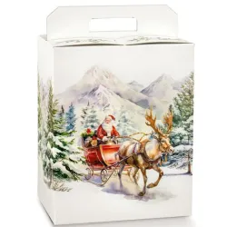
On the front of the most recent Christmas imagery, red is inextricably linked to figures you know very well. The St. Nicholas of European folk tales, with his liturgical clothes, and the modern Santa Claus, with his scarlet coat edged in white, definitively fix the link between this color and the idea of the gift, of the journey into the night, of the arrival of something desired. Over the decades, illustrations, advertisements, movies, postcards, and Christmas campaigns have amplified this code to the point of making it automatic: a large red coat, a cap, a ribbon tied around a package, and immediately your customer's mind activates the "Christmas" file.
Then there is a psychological dimension that concerns you very closely, because it directly affects how your customer perceives your fittings and your wrappers. Red is a color that accelerates. It attracts the eye faster than others, focuses attention, creates a sense of urgency or importance. Where there is red, there is something that demands a decision. This is why it is often used in communication to report offers, news, calls to action. In the Christmas context, this same energy translates into positive excitement, expectation, and a desire to participate in the party. When you use it in a storefront or packaging, you need to be aware of it: you're literally turning up the emotional volume of the scene.
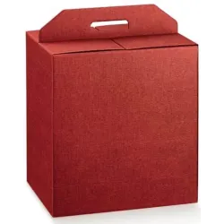
This power, however, needs measurement. An excess of red can become tiring, aggressive, even repulsive. This is where your professional sensibility comes into play. Not all reds are the same and not all intensities produce the same effect. A deep shade, close to burgundy, tells of a more sophisticated, almost aristocratic Christmas, and goes well with rich materials, such as velvets, embossed papers, satin ribbons. A brighter cherry red speaks a more playful, familiar, family- and child-oriented language. A bright and saturated red, very shiny, can work very well in pop, urban, contemporary contexts, especially if you combine it with clear whites and cold metallics.
The material you make red with is also fundamental. A matte red, on a natural paper, communicates a certain sobriety, a discreet refinement, ideal if you want to give your store a quality identity without excesses. A glossy red, on smooth or metallic surfaces, immediately declares celebration, brilliance, celebratory spirit. If you choose a ribbon of textured fabric, red becomes warm and tactile; If you opt for a brilliant plastic film, it becomes immediate, commercial, almost scenographic. Every time you select a red paper or ribbon from the sample book, you're deciding not just on a color, but on the type of story you're going to tell with that red.
In the dialogue with the other colors of Christmas, red plays a leading role. On the green of the fir tree, the garlands, the papers that recall nature, red lights up points of visual focus that guide the eye. It is like strong punctuation: it indicates where the customer must stop, linger, desire. Alongside gold, red builds a couple of strong impact, which immediately recalls the idea of a precious gift, an important occasion, a "special moment of the year". If, on the other hand, you relate it to whites, ivories, warm grays, red becomes the beating heart of a calmer, more Nordic palette, where a few well-dosed accents are enough to give a Christmas character to the entire environment.
For you, who work with physical spaces and concrete objects, red is also a directing tool. You can use it to create paths inside the store, to guide the view to certain areas, to emphasize the gift section, to highlight products that you want to push particularly. A red bow repeated consistently throughout the display area becomes a narrative thread that holds together shelves, displays, checkout counter and packages that leave the store. The customer does not notice it in a rational way, but perceives a unity, a coherence that reinforces the identity of your space.
Then there is a more intimate dimension, which concerns personal memories. For many customers, red is the color of the first holidays remembered as children: the bow on the first "important" gift, the large tablecloth taken out only in December, the sweater with Christmas motifs, the glass balls hanging from the tree of their grandparents' house. When you use red intelligently, you tap into this deep emotional archive. You can't control it completely, but you can put yourself in the best condition so that a detail, a tone, a color combination trigger an affectionate recognition, a feeling of "already seen and already loved".
The challenge, for you, is not to consider red as an obvious choice just because "it has always been done this way". You can ask yourself which type of red best represents the character of your store or the brand you are communicating. You can decide whether to use red as the absolute protagonist or as an accent note on a more unusual palette. You can work by subtraction, limiting it to a few high-quality details, or by controlled saturation, building scenographic shop windows in which red dominates but is balanced by more neutral materials and textures.
In the end, red in Christmas is all this: sacredness and domestic life, emotional intensity and visual strategy, personal memory and marketing. When you tie a red ribbon around a box, when you choose a red paper for the after-sales wrapping, when you decide to insert a large red element in the window, you are setting in motion a series of meanings that go far beyond the technical gesture. You're telling your customer: this isn't just a purchase, it's a scene, a moment, a piece of celebration that you take with you. And the strength of this promise passes, almost inevitably, through that red that he knows, recognizes and, year after year, continues to expect.
Green: nature, rebirth and the evergreen tree that defies winter
If you close your eyes and think of Christmas in a "classic" way, probably the image that appears first is not an object, but a mass of green. It is the dense green of the fir tree, that of the garlands on the door, of the compositions on the counter, of the motifs printed on the gift cards. It is a color that does not scream like red and does not shine like gold, but it holds the scene. It is the backdrop on which the rest can stand out. In your work, green is often the first color you choose without even realizing it, because it gives you the foundation on which to build everything else.
Its history begins long before the Christmas tree as you know it today. In the ancient cultures of Northern Europe, when the winter landscape became bare and the cold became harsh, evergreen plants took on an almost magical role. They were concrete proof that life had not disappeared, that something continued to resist. Bringing fir, pine, holly branches into the house literally meant inviting life to stay, creating a green parenthesis in the heart of the most hostile season. Green was not decoration, it was a talisman.
When Christianity begins to overlap with these rituals, it does not eliminate this practice, it transforms it. The evergreen becomes a symbol of eternal life, of hope that does not wither, of promise that resists time and difficulties. Green, from the color of nature that does not give up, becomes the color of a deeper trust. It's fascinating to think that when you choose a green gift paper or an artificial wreath to hang in your window today, you're updating this ancient alliance between man, nature and hope in a contemporary way.
The Christmas tree, as you imagine it, is a point of arrival of this story. The fir tree that enters the house, which is decorated, illuminated, surrounded by packages, is a very powerful gesture: in the heart of winter, you bring a symbol of a living forest into the most intimate space. The green of the tree is the support on which the red and gold can play, but it is never neutral. Even when you choose an artificial tree, even when you opt for shades slightly different from natural green, the effect is always that of a stable, reassuring presence that holds the scene together.
From a psychological point of view, green has a characteristic that interests you a lot: it calms, stabilizes, rebalances. It is a color that the eye perceives as "resting", because it is located in an intermediate area of the visual spectrum. In a Christmas environment where red can raise emotional tones and gold can intensify the sense of stimulation, green acts as a mediator. When you fill the space with green, natural or reproduced elements, you are offering your customers a visual experience that puts them at ease, that gives a sense of continuity, that does not tire.
This effect is amplified when green is associated with materials reminiscent of nature. Think of a fir green embossed paper that visually recalls the texture of pine needles, or a cotton or linen ribbon dyed in a tone of moss green, juxtaposed with a brown cardboard box. In these choices there is a coherence that the customer perceives even without rationally decoding it: color and material speak the same language, the whole tells a story of authenticity, of connection with the land, of attention to quality.
In recent years, greenery has also acquired a new dimension, which you cannot ignore: that of sustainability. "Being green" has become an expression that goes beyond color and touches the way a company produces, communicates, and presents itself. This double register is very interesting for you. When you use greenery in packaging or in the set-up, you not only evoke nature in a poetic sense, but also touch the imagery of ecology, respect, conscious choice. If the material you use is actually recyclable, certified, declared, green becomes a kind of chromatic underlining of your positioning.
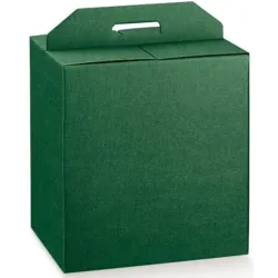
Not all greens, however, tell the same story. A dark, deep forest green has a classic, almost aristocratic flavor. It works great if you want to give your Christmas an elegant and timeless tone, especially if you pair it with a warm gold and muted reds. In this case, the effect is that of a sober luxury, of a well-kept tradition, suitable for boutiques, wine bars, concept stores that want to appear refined without being cold. A bright green, almost "grass", immediately shifts the discussion to a more playful and contemporary level, ideal if you are addressing families, children, informal environments, if you like a more pop and light Christmas. A sage or olive green, dustier and more sophisticated, brings Christmas into a more Nordic or minimalist palette, where a few red or gold details are enough to achieve the festive effect without falling into cliché.
The temperature of the greenery is another key element. A green with a stronger yellow component is warm, sunny, close to the idea of summer nature, and for this reason it can lighten the visual burden of the winter period, especially if your store is small and needs to breathe. A green with a more marked blue component, on the other hand, appears deeper, more "winter woodland", perfect if you want to give density and create an enveloping atmosphere. In packaging, this difference translates into imaginary tactile sensations: a warm green seems closer, softer; a cold green appears more distant, more elegant, almost velvety.
Within the Christmas scene, greenery does a silent but fundamental job: it unifies. You can change shapes, patterns, materials, but if you keep a consistent base of green you're holding the story together. Garlands, branches, papers, boxes, ribbons, labels, all these elements can dialogue with each other thanks to a well-chosen family of greens. This allows you to be more daring with color accents, with prints, with finishes, because you know that green will act as a visual glue. The customer perceives this consistency as professionalism, attention to detail, care for the project.
In the practice of your daily work, greenery is also a tool for modulating the perception of spaces. In a very bright shop window, with lots of natural light, the intense greens are enriched and allow reds and golds to emerge without being excessive. In a more intimate interior, perhaps with low ceilings or dark surfaces, lighter or desaturated greens help to lighten the whole and avoid a scene that is too gloomy. Even in the checkout counter, where packages are finished and delivered, a constant green detail, such as a ribbon or seal, becomes a kind of signature, a recurring note that fixes the identity of your store in the memory.
Then there is a more emotional, less rational aspect, which concerns the relationship between greenery and memory. For many people, the first memory of Christmas is linked to a tree: the scent of resins, hands filling with needles while hanging decorations, the feeling of a "corner of the woods" recreated in the living room. Even when the tree is artificial, this memory is reactivated by visual analogy. Green then becomes the color of an inner landscape, of an experience that is repeated from year to year with small variations. When you build a set-up that really puts greenery at the center, you're not just replicating a standard, you're offering your client an echo of that original feeling of wonder.
The challenge, for you, is to use green in a conscious way, not as a simple "filler". You can ask yourself what Christmas image you want to convey and what role nature should play in that narrative. Do you want a Christmas in the woods, with branches, pine cones, bark, material papers, almost to create an immersive setting? Or do you prefer a more graphic, stylized green, declined in patterns printed on paper and boxes, in smooth ribbons, in satin surfaces, for an urban and tidy effect? In both cases, greenery helps you build a bridge between the idea of celebration and the idea of environment, between the individual object and the overall atmosphere.
When, when choosing the color combination for the season, you find yourself in front of the range of greens available, try to see them not as simple variations, but as different ways of telling the same story: the story of a color that, for centuries, has accompanied man in the passage through winter, reminding him that life continues even when everything seems to standstill. Every green paper you select, every ribbon, every box, every detail in this shade is a small declaration of trust: something endures, something will last, something is worth celebrating.
In this sense, green is perhaps the "quietest" of the Christmas colors, but it is also the one that leaves the most room for your creativity. You can expand it, reduce it, dirty it, illuminate it, bring it towards blue or yellow, without ever losing the link with Christmas. It is the background canvas on which to lay your vision of the season. And when your customer, leaving the store with a green package in his hands, feels that that color speaks to him of celebration, nature, continuity, you will know that your work of chromatic direction has hit the mark.
Gold: light, sacredness and the idea of precious in Christmas celebrations
If red speaks to you of emotions and green of continuity, gold is the color that, in Christmas, pronounces a very clear word: value. All you need is a golden detail, even the slightest, for an object to stop looking ordinary and start looking "more". A gold writing on a box, a warm border on a paper, a thin metal wire in a ribbon: suddenly the gift changes status, even before it is opened. Gold does not describe the content, but it foretells its importance.
The history of this color is deeply linked to light. Even before becoming a dye printed on paper or finished on packaging, gold is a metal that men have always interpreted as solidified light. It does not oxidize, it shines even in difficult conditions, it resists time: it is as if it retains something of the sun. In ancient civilizations, owning gold meant having in your hands a part of the divine, of stability, of the immutable. This is why you find it in crowns, jewels, symbols of power, ritual objects.
When Christianity asserts itself and begins to build its own images, gold enters sacred art as a background, a frame, an aura. In Byzantine mosaics, gold backgrounds do not represent a real space, but a luminous elsewhere: not sky, not earth, but a field of absolute light in which the sacred becomes visible. In icons, gold surrounds the faces, defines halos, frames, details that do not serve to imitate nature, but to suggest a presence that surpasses it. Gold is the color of what deserves to be adored, venerated, contemplated.
In the history of Christmas, this value is intertwined with that of the gift. The Magi, who bring gold together with other precious gifts, fix in the imagination the link between the birth of Christ and the idea of an offering of great value. From that moment, gold also becomes the color of thanksgiving, of celebration, of "I didn't bring just anything". When you apply a gold hot stamping on a case today, when you choose a gold ribbon to close an important box, you are resuming this visual tradition: declaring that what you are delivering is not trivial.
Over time, gold leaves churches and palaces to enter homes and public spaces. Bourgeois Christmas, with its decorated living rooms, trees full of decorations and richly set tables, multiplies the occasions on which gold can appear: frames, candlesticks, edges of plates, fabrics, metal threads in decorations. In a winter that is almost always gray, gold brings into the house the sensation of a light that does not depend on the weather, of a glow that remains even when it is already dark outside. This is why you still associate it so naturally with the holidays today: in a season of low light, gold is a visual response to the search for splendor.
For you, who work with space, products, and packaging, gold is a very powerful but delicate resource. It is the color that least tolerates approximation, because a moment separates it from the risk of appearing tacky, excessive, showy in a gratuitous way. The difference between a gold that tells about elegance and a gold that just seems "too much" lies in the shades and the way you use it. A warm, slightly veiled gold has the flavor of real metal, of ancient leaf, of the frames of museums and churches. A cold, almost dull yellow gold risks appearing artificial, poor, if it is not supported by quality materials and finishes.
The surface on which you make the gold live completely changes the message. A mirrored, foil-style polished gold captures the light in a clear and theatrical way. It's perfect if you want a scenographic effect, if your brand speaks an overtly glamorous language, if your customers expect a brilliant, almost cinematic Christmas. A satin or matt gold, on the other hand, conveys an idea of discreet luxury: it does not renounce preciousness, but whispers it instead of shouting it. On a coated rigid box, on a quality paper, on a minimal label, a soft gold becomes synonymous with care, investment in detail, attention to touch as well as to the eye.
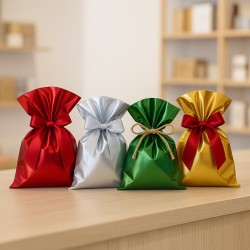
Gold dialogues in a privileged way with the other two great colors of Christmas. Next to red, he builds the most explosive couple: red and gold together speak of full celebration, warmth, rich tables, important gifts. If you choose this combination for a showcase or packaging line, you are pressing the accelerator on the celebratory register, you are declaring in no uncertain terms that that is the highlight of the year. Alongside green, however, gold takes on a more sophisticated role. On the deep green of the fir tree or the papers that recall it, gold appears as light filtering through the branches, as a reflection of illuminated snow, as a precious detail in a more natural context. The effect is less blatant, but very refined.
The relationship between gold and white should not be forgotten. In a white and gold Christmas palette, with only very few hints of red or green, the atmosphere becomes rarefied, almost Nordic, suitable for spaces that want to communicate minimalism, silent luxury, contemporaneity. In this case, gold is no longer the color of excess, but that of the precious essential: few strokes, but precisely thought out. Even in your checkout counter, a simple gold seal on a neutral paper, or a thin golden bow on a Havana box, can be enough to give the feeling of a "level" wrapping, without having to load the scene with superfluous elements.
From a psychological point of view, gold intercepts a very human desire: that of feeling, at least for a moment, at the center of something special. Your customer won't tell you "I wish this package made me feel important", but the fact of receiving or giving something wrapped in a neat packaging, with golden details, changes the way they perceive the experience. Gold acts as an amplifier of perceived value. A simple product, wrapped with a good paper and a well-placed gold detail, can seem richer, more important, more thoughtful. It is a very powerful lever, especially in retail, where you often cannot touch the product before purchasing, but you can judge what surrounds it.
For you, it's not just about "putting gold," it's about deciding where, how much, and how. A gold hot-stamped logo on essential packaging can be enough to position your brand in a certain segment, especially if the rest of the packaging is sober. A golden texture on a paper gives movement and light, but it must be managed so as not to steal the show from the product. An all-gold ribbon can work if the rest is neutral, but it risks overloading if colors and patterns are already very present. In any project, always ask yourself if gold is adding meaning or just noise.
Then there is an interesting aspect related to time. Gold, by its symbolic nature, does not go out of fashion as quickly as other colors. Shades and finishes may follow trends, but the idea of gold as a sign of preciousness remains stable. This means that investing in a good range of golden solutions – ribbons, papers, boxes, labels – allows you to build a base that you can decline for several seasons, perhaps changing the combinations, weights, details, without having to rethink everything from scratch every time. Gold is an identity element that you can dose according to your style: constant protagonist or measured cameo.
Finally, don't forget that gold is, by definition, a color of light. In your shop windows, in your display islands, in your corners, the relationship between gold and lighting is crucial. A beautiful gold in natural light can look flat under cold spotlights; A seemingly discreet gold can light up perfectly under well-placed warm lights. When choosing materials and finishes, always think about how they will live in your real space, not just in the sample book. Sometimes it is enough to move a light point or change the temperature of the bulbs to transform an anonymous gold into a real protagonist.
Ultimately, gold in Christmas is your grammar of the "precious". It is the color with which you emphasize what matters, with which you transform a simple passage of the cash register into a small ritual, with which you help your customer to perceive himself – and the person to whom he will give the gift – as recipients of something worthwhile. When you apply a gold border, when you choose a gold print, when you tie a ribbon with a metallic thread, you are saying: this gesture deserves light. And in a time when everyone is trying, in different ways, to feel a little brighter, the way you use gold can make a real difference.
How art, cinema and advertising have fixed the gold-red-green trio in the imagination
When you think about Christmas, you're not just reminiscing about lived experiences. You are also, without realizing it, leafing through a gallery of images that you have absorbed over time: illustrations, films, television commercials, catalogs, posters, shop windows. It's as if your idea of Christmas were a montage, built by generations of artists, illustrators, directors and creatives who have worked on the same three colors, repeating and varying them until they turn into a universal code. Gold, red and green do not live only on real objects, but above all on the images that have told them.
All this begins long before television and social media. In the nineteenth century, with the spread of color printing techniques, the first illustrated postcards and greeting cards became a very powerful tool for establishing a shared Christmas aesthetic. Victorian illustrators, for example, depict trees laden with decorations, decorated living rooms, children in elegant dresses, and tables laid with them. In these scenes, the green of the fir trees and garlands and the red of the ribbons, flakes and berries begin to appear together with an increasingly evident coherence. Gold enters as a precious detail: postcard borders, greeting letters, decorative frames. Every year, millions of almost similar images circulate and accumulate in the collective memory, reinforcing the idea that "Christmas" is expressed precisely through this triptych of colors.
With the twentieth century and the birth of the great illustrated magazines, the covers of Christmas issues take up and amplify this language. You see figures in red cloaks walking in the snow, green crowns at doors, interiors illuminated by warm lights reflecting off golden objects. Even when the style changes, from romantic illustration to the most modern graphic sign, the color code remains surprisingly stable. Artists can reinvent shapes, points of view, compositions, but they know that to be immediately recognized as "Christmas" they must rely on red, green and gold. It is a tacit pact between those who create and those who watch.
Then comes cinema, and along with cinema comes colour. The first great Christmas scenes of classic cinema do nothing but translate into movement what the press had already codified. In bourgeois black and white living rooms you can sense the presence of trees, decorations, bows, but it is with color that the scheme becomes explicit. The tree is saturated green, the balls and bows are red, the lights produce golden reflections on metals, frames, fabrics. The families gathered around the fireplace, the children under the tree, the illuminated shop windows in the Christmas city scenes become for the public a sort of ideal model of "how the holiday should look".
And it's not just about what you see in the foreground. The direction of photography, the use of lights, the way the rooms are furnished and lit all work in the same direction. Christmas interior scenes are often warmed up by golden lights, which make reds more intense and greens deeper. Outdoors, the contrast between the white of the snow and the patches of red and green of the decorations creates images that are strongly imprinted in the memory. When you watch these films, year after year, almost always during the holidays, you get used to recognizing Christmas as a combination of those precise color relationships.
Advertising, at a certain point, collects all this visual heritage and transforms it into a systematic tool. Brands that want to "talk about Christmas" know that they have to move on that palette. The TV commercials show tables set with red and green fabrics, warm lights that turn to liquid gold, stacked packages in which at least one of these three colors is always clearly visible. Campaigns in newspapers, department store catalogs, flyers from local stores repeat the same pattern, with variations in style but with impressive color fidelity. The implicit message is clear: if you want to be perceived as "Christmas", you have to speak this language.
The windows of department stores and, in general, the urban layout also play an important role. The cities, during the Christmas period, are transformed into an open-air set. The illuminations prefer warm tones, close to gold. Public decorations are filled with green and red. Shop windows, especially the most iconic ones, become small looping films: theatrical sets in which mannequins, objects, lights and backdrops tell festive stories. If you look at these windows with the gaze of a professional, you realize how omnipresent the gold-red-green trio is, declined in a thousand stylistic versions, but always recognizable. Even when a brand chooses alternative palettes, it often retains at least a subtle reference to these colors so as not to completely leave the perceptive field of Christmas.
Over time, this repetition has a very precise effect: it builds a perceptual shortcut. Your customer doesn't need to consciously analyze the images they see; it is enough for him to grasp a certain combination of colors to immediately classify a scene as "Christmas". It's the same mechanism by which, when you see an orange sky over a stylized city, you immediately think of a sunset, even if the design is minimal. Gold, red and green work in the same way: they have become the lowest common visual denominator of Christmas in Western culture.
For you, who deal with decoration, shop windows and packaging, all this has an interesting consequence. You work within an imaginary that has already been written, but you have the opportunity to rewrite it every time with your hand. You can decide whether to explicitly mention cinema and advertising, building windows that recall certain filmic atmospheres or certain iconic campaigns, or whether to adopt a more subtle language, which uses the same color codes but leads them towards a new aesthetic. In both cases, your customer will feel an immediate familiarity, because those colors belong to a visual archive that they have always known.
Think, for example, of how packaging can "stage" Christmas just like a movie does. A deep green box, with a red ribbon and a light gold print, immediately recalls classic images: the tree, the bow on the important gift, the candlelight. If, on the other hand, you choose a geometric graphic pattern in gold on a green background, with only small red details, you get closer to a more contemporary language, but still remain within the code. If you invert the weights, using a lot of white and inserting gold, red and green only as accents, you evoke a more Nordic, more essential Christmas, but the reference remains clear.
The same goes for the shop window. You can build a setting that recalls scenes from a traditional Christmas movie, with trees, packages, fabrics and lights dosed in order to evoke that same emotion. Or you can reduce everything to a few strong signs: a deep green background, a red claim, a few carefully placed gold details. Even so, the passer-by will immediately understand that they are looking at a "Christmas" shop window, because the visual archaeology of the gold-red-green trio works for you.
Perhaps the most fascinating thing is that you are not bound to these colors by obligation, but for communicative convenience. You could choose completely different palettes, and it's often interesting to do this to stand out. But knowing that the audience carries this grammar within them allows you to consciously play with expectation. Packaging that is almost entirely neutral, with a single red seal on a green background, can be more incisive than one that is entirely saturated with colours. A shop window dominated by natural and white woods, with a few green and gold elements, can convey an equally strong feeling of Christmas, precisely because it relies on a code that the passer-by recognizes on the fly.
Art, cinema and advertising, after all, have given you a powerful shortcut: you only need three colors, in the right proportions, to say "Christmas" before even showing a single explicit symbol such as a reindeer or a Santa Claus. Your job, as a professional, is to decide each season whether to use this shortcut literally or to bend it to your identity, your positioning, the type of customer you want to attract.
When you design your next collection of wrappers or the next installation, you can ask yourself which images, among all those sedimented in the collective memory, you want to evoke. Do you prefer the warmth of movies where the family gathers around the fireplace? Or the glamour of advertising campaigns that turn Christmas into a glittering event? Or even the almost museum-like elegance of certain art illustrations? In any case, know that gold, red and green are ready-to-use tools to build that bridge between the imaginary world and the concrete experience of your store.
In the end, the gold-red-green trio is the result of more than a century of images that you have seen, reviewed, loved, perhaps without remembering the details but holding back the effect. Today you move within this magnetic field. With your color choices you can simply indulge him, or you can guide him, modulating him, refining the way your customer "sees" Christmas. It is in this space, between the collective visual memory and the concrete project of a showcase or a wrapper, that your work takes shape and can really make a difference.
Psychology of color: why gold, red and green "seem" Christmas to us immediately
If you stop for a moment to think about it, it is almost surprising how fast the process is: you see a particular red combined with a certain type of green, with perhaps a touch of gold, and even before recognizing shapes or details your mind has already pronounced a precise word: Christmas. There is no need to see a fir tree, a reindeer, a star, a nativity scene. All you need is a chromatic fragment. This reflex is not innate, it is the result of a long training that you have done without realizing it, year after year, between shop windows, movies, wrappers, home decorations. And today, in your work, this perceptual shortcut is one of the most powerful levers you have at your disposal.
Color psychology helps you name what you experience every day. Colors do not communicate in the same way for all cultures, but have recurring patterns that are consolidated through experience. Your brain works by associations: it binds a color to a context, an emotion, a ritual, and over time transforms this link into automatism. So, just as you associate blue with certain ideas of professionalism or pink with more delicate registers, in the same way you associate gold, red and green with that specific mixture of warmth, anticipation, light and rituality that you call Christmas.
Red, from this point of view, acts as an emotional accelerator. Perceptual psychology tells you that it is a color that captures attention, increases the level of arousal, makes things more urgent and closer. But in the Christmas context it is not an anxious urgency: it is a positive excitement, that of the days leading up to the holiday, of hidden gifts, of lights that come on in the city. Your memory has archived thousands of red scenes related to these moments: bows on gifts, tablecloths, sweaters, decorations. For this reason, when you use red in a window or packaging at Christmas time, you don't have to explain anything: the oldest part of the emotional brain has already connected the dot.
Green acts differently. It is a color that for many has an effect of balance, of visual calm, of distance from chaos. In a Christmas context, however, this effect is intertwined with the association with the natural world and the evergreen tree. Your customer, looking at a fir green paper or a box in that shade, is not only thinking of nature in a generic sense. He thinks, often without realizing it, of a very specific scene: a decorated tree, a forest in winter, a garland at the door. Green thus becomes the color of a pacified belonging: it tells you that the party has a stable base, that it is not just emotional flash in the pan, but the return of a ritual that you know and that is repeated.
Gold, on the other hand, introduces an element of difference into the picture. From a psychological point of view, it is the color that signals exceptionality and value. You don't often encounter it in everyday life in pure form, apart from specific objects: jewelry, high-end product details, carefully chosen graphic elements. That's why, when gold appears, your brain interprets: there's something out of the ordinary here. At Christmas, this exceptionality is combined with the idea of celebration and gift. Gold becomes the luminous frame that separates the "ordinary day" from the "special day". A golden border, a gold lettering, a small metal accessory on a wrapping move the product into another mental category: it is no longer just a purchase, it is a gift.
The combination of the three colors then works as a formula. Red lights up, green stabilizes, gold ennobles. Together they build an emotional microclimate that your customer recognizes on the fly. Not because I studied color theory, but because the constant repetition of these combinations created a preferential neural pathway. It's a bit like hearing the first notes of a song you've listened to a thousand times: it only takes a few seconds and you already know what the chorus will be. When you use this triad in your store or packaging project, you're activating exactly the same mechanism.
Added to this is the level of autobiographical memory. The colors of Christmas are not only cultural patterns, they are also containers of personal memories. The red of a bow can bring to mind the first "important" gift received as a child. Green of a certain tone can evoke the tree of a house, with its scent and shade in the living room. Gold can recall a particular decoration, a decoration that was brought out only on the most awaited days. Every time you reproduce these colors, you give the customer the opportunity to bring these fragments of memory to the surface, even if he will not be able to tell you exactly why a certain setting excites him more than another.
The interesting thing, for you, is that color psychology does not imprison you, it offers you tools. Knowing that red catches the eye, that green calms, that gold adds value, allows you to consciously design the emotional journey of the customer within your spaces. You can use red in strategic points to guide the eye towards certain products, you can create greener areas where you want the person to slow down, observe, feel at ease, you can dose gold in points where you want to emphasize a more alto segment of the range or a more refined shopping experience.
At the same time, knowing these mechanisms allows you to play with expectations. If you use the gold-red-green triad in a very literal way, the customer will instantly enter "Christmas mode", he will feel that he is in the right place to look for gifts and solutions for the holidays. If, on the other hand, you decide to shift the center of gravity, for example by reducing the presence of red to a few details or choosing dustier greens and more discreet golds, you will get a more sophisticated effect, but you will continue to move within the same perceptual field. It's a matter of volume: you can turn it up, down, modulate the keys, without changing the song.
In packaging, all this becomes tangible. A neutral box with a small red ribbon and a gold seal on a green background creates a refined, subtle, almost whispered Christmas impression. A full red wrapper, with an ouro pattern on a green background, speaks a more direct, opulent, extroverted language. In both cases, the customer will have the feeling of having something "seasonal" in his hands, but the type of Christmas he will perceive will be different: more intimate and intimate in the first case, more festive and theatrical in the second. You can choose which emotion to privilege based on the positioning of your store and the audience you are targeting.
The distribution of color in space also matters a lot. If you saturate a storefront with red, you're aiming for an immediate, almost explosive impact. If you let green as a base and use red and gold only as accents, the message will be more elegant, but still readable as Christmassy. The psychology of perception tells you that the eye is always looking for balances and focal points: working on the relative quantity of each color means deciding which emotions to put in the foreground and which to leave in the background.
The body component should not be forgotten. You don't just "think" about colors, you also feel them. An environment dominated by warm lights and gold-red details can make the room feel more enveloping, almost physically warmer. On the contrary, a Christmas built on cold greens, whites and only minimal touches of red and gold can give a feeling of air, space, breath. When you design a set-up, you're not just composing an image, you're influencing how people will feel inside that image: more collected, more energetic, more relaxed, more stimulated.
The strength of the gold-red-green trio lies precisely in this interweaving of levels: cultural, emotional, perceptive, bodily. It works because it has settled in everyone's visual habits, because it has been confirmed by generations of images, because it hooks into personal memories and shared rituals. For you it is not a cage, but an alphabet. You can use it to write simple and direct sentences, or to construct more complex speeches, where the same color code is interpreted in a minimal, luxurious, playful, natural, urban way.
When, planning the next season, you will be faced with the choice of colors, try to take a step further than "this is Christmas, this is not". Ask yourself what kind of Christmas you want your client to feel: more emotional, more contemplative, more sparkling, more collected. Then he uses gold, red and green not as obligations, but as refined tools to build that feeling. You will discover that, by dosing them consciously, you can obtain very different atmospheres, all immediately readable as Christmassy, but each with its own voice. And it is in this subtle difference in voice that the perception of quality and uniqueness of your store or the brand you are telling is often played.
From theory to decoration: using classic colours for decorations, shop windows and packaging
At this point you have a precious key in your hand: you know where gold, red and green come from, you know the symbols they carry with them, you are clear about how art, cinema and advertising have carved these three colors in our imagination. But all this knowledge risks remaining abstract if you don't bring it down into your everyday work, where you really play the perception of your store or the brand you tell: in the decoration of the spaces, in the construction of the windows, in the design of the packaging and the after-sales wrapping. It is here that theory must be transformed into a concrete chromatic direction, capable of guiding the gaze, directing emotions, giving coherence to what you exhibit and what you deliver into the hands of the customer.
The first choice you find yourself making is almost always that of the "base" on which to kneel the rest. In classic Christmas, this base is often green. Whether it's the real green of a real fir tree, the interpreted green of an artificial tree, the printed green of a scenographic wallpaper or the full green of a large backdrop, his task is to create a continuous field of vision, a sort of stage on which red and gold can appear as actors. If you build a shop window, for example, you can decide that green is the element that unifies: a panel in the background, some garlands, some branches, perhaps a choice of boxes or shopping bags in coordinated tones. The customer will not perceive greenery as the protagonist, but as an atmosphere, as a "Christmas air" that envelops the rest.
Inside this base, it is red that allows you to create rhythm. Each red spot is a signal, a strong pause, a point where the gaze stops. If you insert a few well-placed red objects in the window, you will immediately make them focus. If, on the other hand, you spread the red in a diffuse way, you will get a more lively, almost musical effect, but you will have to dose it carefully so as not to saturate the scene. The same principle applies inside the store: a red runner on a display floor, a large red bow on a key shelf, a group of red boxes among many green elements will guide the customer's visual path without the need for aggressive signs. Red is your loudest voice: choosing the amount of red means deciding how loud you want to speak.
Gold comes later, like the touch that defines the register. You can think of it as a selective light that only turns on what is really important to you. A golden thread between the branches of a garland, a gold writing on the glass of the window, a metallic border on some boxes, a thin ribbon that stands out on an opaque paper, are all different ways of saying to the customer: look here, this is a special moment. If you rely on a gold that is too dominant, you risk making everything "special" in the same way and therefore flattening the differences. If, on the other hand, you use it as an underline, you will be able to build clear hierarchies: there are elements that furnish, elements that guide and elements that celebrate.
In the work on decorations, this logic can help you not to fall into the trap of "putting a lot" thinking that it is synonymous with "making an effect". It is not the quantity of decorations that makes Christmas, but the consistency between colors, shapes and materials. If you choose to work on the tree, for example, you can ask yourself what kind of story you want to tell. A tree dense with reds and golds, with a few pauses of visible green, will tell the story of a rich, theatrical, almost baroque Christmas, perfect for environments that want to communicate opulence, abundance, full celebration. A tree that lets the green breathe, with more rarefied red decorations and delicate gold details, will instead suggest a more measured, elegant, attentive to detail Christmas. In both cases, the customer will immediately recognize the code, but will hear a difference in tone.
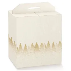
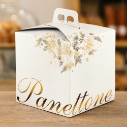
You can transfer the same direction from decorations to objects and packaging. Think about boxes: they are perhaps the most powerful tool you have to bring the colors of Christmas out of your store, into your customers' homes and relationships. A forest green box with a red ribbon and a small touch of gold, perhaps in the logo or label, is a manifesto of timeless classicism. A red box with a green interior and a gold print on the lid is more decisive, more exuberant, suitable for those who want a declared, visible, photographable Christmas. A neutral box, havana or white, with a green strap and a closure sealed by a gold sticker, with a red string thread, speaks a more contemporary language, sensitive to sustainability issues, but without giving up the Christmas code.
Even in wrapping paper you can play on many levels. A solid paper, red or green, with a thin and repeated gold print, builds a surface that is already decoration in itself, even if the box underneath is simple. A solid color paper, perhaps in a deep green, deliberately left "clean", becomes a perfect canvas to enhance the gesture of the ribbon: it will be the red bow, with a small golden insert, that will transform it into a festive object. This allows you to simplify the stock, working on a few quality color bases, and to shift the customization to accessories: ribbons, cords, package seals, labels.
In the shop window, the challenge is to orchestrate these elements without losing sight of the product. The goal is not to make a generic Christmas shop window, but to make a shop window in which Christmas enhances what you sell. If you work with red, green and gold in an intelligent way, the products will not be swallowed up by the scenography, but will become a natural part of the story. You can use green to build volumes and backdrops that frame items, red to highlight lines or categories you want to focus on, gold to highlight higher-end references or gift ideas you focus on. Each object must seem "in its place" in that story, not simply resting in a sea of decorations.
It should not be forgotten that Christmas continues outside the shop window, in the sales space and above all at the time of wrapping. The checkout counter is the place where the visual experience becomes a tactile experience, where the customer sees his package born. If you find the same color codes here that you saw in the window, you will feel a reassuring continuity. A roll of green or red paper in sight, an orderly display of ribbons, a selection of boxes in the three key shades, are not just work tools, but part of the scenography. When your hand knots a red ribbon on a green box and finishes with a gold seal, the client witnesses a small staging consistent with everything they have seen up to that point.
From theory to practice, there is one last fundamental step: the ability to measure and adapt. Each store has its own architecture, its own light, its own audience. What works in a downtown boutique, with high ceilings and large windows, can be overkill in a small neighborhood store, and vice versa. This is why it is important that you get used to reading the three colors not as rigid formulas, but as variables to be modulated. If the space is small, for example, an excess of red and gold could be suffocating: in that case it will be green, perhaps lightened by whites and natural materials, that will guarantee breath, while red and gold will enter the scene through a few targeted details. If the space is very large and is likely to appear cold, you can afford to intensify the reds and use gold to create islands of visual heat, keeping green as a common thread.
In the end, using the classic colors of Christmas in a conscious way means accepting that you are dialoguing with something bigger than yourself: a collective imagination, a shared memory, a set of expectations that your customer brings with him when he crosses the threshold. Your task is not to turn everything upside down, but to orchestrate these elements so that the person immediately feels "in the right place", but at the same time recognizes a specificity, a care, a style that belong only to your store or the brand you represent.
When, at the end of a December day, you look at your window lit from the outside and see someone passing by who slows down, observes, smiles, and maybe enters, you will realize one thing: it will not have been a single object or a single decoration that convinced him, but the whole. A certain way of being together of gold, red and green, of lights and materials, of volumes and details. At that moment, all the history you have retraced – from ancient rituals to nineteenth-century postcards, from films to advertising campaigns – will have passed, almost invisible, through your direction, to translate into a concrete scene that speaks to your customer in a language that he recognizes and for which he is a little nostalgic every year. And it is there, in that nostalgia satisfied with intelligence and measure, that Christmas, in your work, stops being just a season and really becomes a project.
At the end of this journey, you may realize that gold, red and green are no longer simply "the colors of Christmas", but three voices that speak different languages and that you, in your work, can translate and orchestrate. You come across them every year, you have seen them in a thousand versions, but each time you have the opportunity to decide whether to use them out of habit or by choice. The difference is all here: in moving from "it's always been done this way" to "I'm consciously building an image, an atmosphere, a story".
If you think back to the journey you have made, you realize that these three colors are not born in the window. They are born in the ancient rites that defied winter, in the need for light when the days are shorter, in religious symbols, in illustrations, in films, in advertising campaigns that raised you without you realizing it. Green is survival and continuity that become hope. Red is warmth, blood, heart, celebration. Gold is light, sacredness, value. The moment you choose them, you take all of this with you, whether you want it or not. The good news is that, knowing this, you can use it in your favor.
Your customer doesn't need you to explain these stories to them. He will not enter the shop thinking of the sacred trees of Nordic cultures or the gold backgrounds of Byzantine mosaics. But all this will work anyway, under the radar. When he sees a deep green box with a red ribbon and a gold detail, he will feel that "it's Christmas", that that package is right for this time of year, that he can trust the way you are interpreting the holiday. He won't be able to tell you why, but he will feel that there is consistency between what he sees in the window, what he lives in the store and what he brings home.
In this sense, you are not just someone who "decorates" or "wraps". You are the person who translates a collective imagination into concrete experience. When you design a shop window, choose a palette for the season, organize the shelves or prepare the wrapping counter, you are building an emotional environment in which your customer moves. Gold, red, and green are your main tools, but they're not chains: they're a vocabulary. You can use them in a classic, almost iconic way, to reassure and confirm an expectation. Or you can move them, dampen them, dilute them, contaminating them with neutrals, natural materials, unusual accents, to tell a Christmas that more resembles your way of being and your positioning.
The real challenge is precisely this: to find a balance between tradition and identity. Your customer comes with a very specific wish, even if they never explicitly formulate it. He wants to find something he knows – a certain light, a certain warmth, a certain climate – but he also wants to feel that you are not just repeating a script. He wants to recognize Christmas, but also recognize you. It is in this narrow space that color awareness becomes a competitive advantage. Knowing that a certain shade of red tells a different story from another, that a green can be classic or contemporary depending on how you approach it, that gold can be whispered or declared, allows you to compose scenes that remain in the memory.
Every detail, if you think about it, becomes a small declaration of poetics. The choice of one paper instead of another, the way you cross a ribbon, the decision to insert a single golden stroke instead of filling everything with light, tell your customer what kind of attention you bring to your craft. And it's not just about aesthetics. At a time of year when consumption can become hectic, your way of working with colors can also suggest a different rhythm: slower, more conscious, more curated. A thoughtful, harmonious, well-resolved wrapping communicates respect for the product and for the person who will receive it.
You don't need to turn everything upside down every year. Sometimes, the step forward is not to change palettes, but to learn how to read it in a new way. You can start from the same gold-red-green triad and decide that that season will be brighter, or more intimate, or more natural, or more urban. You can intervene on the intensities, on the materiality, on the distribution in space. You can make the green hold up the architecture, the red accent and the gold the underline, or invert the weight, depending on what you want the customer to feel when they enter, look, touch, take away.
In the end, the goal is not just to "create atmosphere", but to create connections. Christmas is a season in which people are more sensitive to signs, gestures, attentions. A store that uses colors in an intelligent way is perceived as a place that has thought about the experience of those who enter, not just the goods on display. A carefully designed packaging, which harnesses the power of gold, red and green without abusing them, transforms every purchase into something more than a transaction: into a small ritual, into a moment worth remembering.
If you decide to work with this awareness, every color choice stops being automatic and becomes a design act. You are not just "dressing" Christmas, you are interpreting a very long story and making it recognizable in your space, with your hand. And when, at the end of the season, you think back to the shop windows set up, the wrappers delivered, the people you saw leaving with their packages in their arms, you will realize that the red thread – or rather, the red, green and gold thread – that holds everything together is not the repetition of a cliché, but your ability to transform three colors into a language. A language that your customer understands on the fly and that, precisely for this reason, allows you to enter a little more into his habits, his memories, his way of imagining, every year, his Christmas.