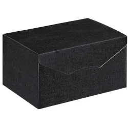
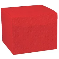
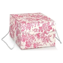
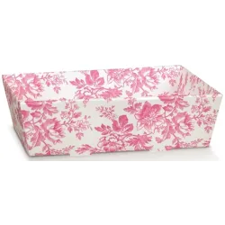
Micro-seasons are not a fad, nor are they a creative exercise for its own sake. They are a concrete, measurable and very contemporary way of governing customer attention in a year that, now, no longer moves in big blocks. Traditional seasons remain in the background, of course, but real buying behavior is made up of impulses, recurrences, changes of pace, weekends that become gift-giving occasions, small emotional transitions that turn on and off in a matter of weeks. In this scenario, the idea of launching recurring mini-collections becomes a strategy: it allows us to remain present without being repetitive, to communicate novelty without upsetting assortments and budgets, to transform the physical store and e-commerce into a palimpsest of experiences, not a static catalog.
In this game of speed and precision, color is not a decorative detail: it is the main engine. It is the first message the customer receives, often before even reading a word, and it works on several levels simultaneously. On a perceptual level, it creates order, hierarchy, recognizability; on an emotional level, it directs desire and willingness to spend; on a commercial level, it simplifies choice and makes the gift-giving gesture more immediate. When we talk about micro-seasons, in fact, we also talk about micro-decisions: I choose now, I choose fast, I choose because "it represents me," I choose because "it looks good," I choose because "it is perfect for the occasion." Color, more than any other lever, is able to make that yes instant. It is a universal language, but it is not neutral: it changes with finishes, with materials, with the lighting of the store, with the quality of the print, with the way it is combined with textures and details. And above all, it changes over time, because time itself is part of meaning.
That is why to talk about micro-seasons is to talk about a calendar. Not a rigid calendar, but an intentional, designed rhythm. The most common mistake is to think of mini-collections as a sequence of unconnected "pretty ideas." In reality, the real strength lies in continuity: a succession of color appointments that build familiarity and expectation. The customer must not only notice a novelty, he must learn to recognize a way of proposing novelty. When this happens, color becomes signature, and signature becomes value. This is where the macro-effect is born: not in the single capsule, but in the coherent sum of capsules that, month after month, transform the offering into a narrative. A narrative that can be seen before it is even explained, and that can be cleverly replicated on showcase, social content, landing page, packaging, counter presentation, and unboxing.
From a packaging perspective, then, micro-seasons are an extraordinary opportunity for efficiency. Working by palettes means thinking in modules, not complications. Instead of changing everything every time, we can set a constant base and intervene with slight but alto impactful variations: a color accent, a finish, a ribbon, a tissue, a label, a detail that "lights up" perception. This approach keeps logistics under control and, at the same time, elevates perceived quality. Because the customer, when he receives a package or when he looks at a well-made wrapper, does not just evaluate the product: he evaluates the world we are delivering to him. If that world is consistent, curated and contemporary, the value he or she places on the purchase increases. More interestingly, it also increases the propensity to choose the gift from us, instead of elsewhere, because we are helping it look good.
There is another, often underestimated aspect that makes micro-seasons a powerful lever: the ability to "localize" the year. Not all hot times coincide with the same dates for every audience. There are areas where the peak is linked to ceremonies, others where the labor recovery weighs in, and still others where seasonality is linked to fairs, travel, urban events, shopping weekends. Micro-seasonality allows one to be relevant. It allows us to say, with color, "here and now." We are not talking generically about spring or Christmas: we are talking about a precise state of mind, a precise occasion, a precise desire. And it is this relevance that makes the message more compelling, and the purchase more natural.
When, in the title, we say micro-seasons and macro-effect, we mean just that: a modular, sustainable and repeatable investment that produces cumulative results. Each mini-collection is an opportunity to refresh communication without having to invent a narrative from scratch every time; each palette is a way to stimulate cross-selling, because the customer spontaneously tends to complement what "fits together"; each launch is one more reason to come back, to browse, to share. And in an age when attention is the rarest commodity, having twelve color motifs to get noticed throughout the year means having twelve opportunities to preside over the customer's mind, without being invasive or repetitive.
This in-depth study was born with a clear goal: to transform color from intuition to tool, from personal taste to replicable strategy. We are not interested in chasing trends superficially; we are interested in designing palettes that work in the store, that make assortment management more efficient, that improve the shopping experience, and that enhance the wrapper as an extension of the product. Because, since time immemorial, that is where a decisive part of perception is played: at the moment when purchase becomes presentation, and presentation becomes storytelling. With twelve color ideas, distributed in micro-seasons, we can build a whole year of mini-collections capable of speaking to the customer with immediacy, elegance and concreteness. And when color is chosen well, it doesn't just "feel good": it sells better, it stays imprinted and makes memorable what would otherwise be just a transaction.
With this table we give you, for each period, three alternatives to work with Micro-Season Titles, Protagonist Color, Accent and Neutral. then read on and we'll explain everything properly.
| Quarterly | Micro-season | Protagonist | Accent | Neutral |
| Q1 (Jan-Mar) | Warm Snow | #F6F1E8 | #D8C3A5 | #B8B0A6 |
| Q1 (Jan-Mar) | Ink and Milk | #1C2A44 | #F3EFE6 | #3B3F46 |
| Q1 (Jan-Mar) | Modern Mimosa | #FAF8F2 | #F2C230 | #A7B8A8 |
| Q2 (Apr-Jun) | Pastel Sorbet | #FFF7F0 | #E7C3C6 | #A9CDEB |
| Q2 (Apr-Jun) | Citrus and Mediterranean | #D8C9B0 | #F36B2A | #1D5E8A |
| Q2 (Apr-Jun) | Botanical Garden | #F4EBDD | #D96C7B | #2E6B4E |
| Q3 (Jul-Sept) | Sand and Salt | #D7C2A8 | #F7F7F4 | #8C8F8A |
| Q3 (Jul-Set) | Tonale Sunset | #F3E6D3 | #C65A3A | #F28C78 |
| Q3 (Jul-Set) | Back to Studio | #D9DDE2 | #C9A227 | #0F4C5C |
| Q4 (Oct-Dec) | Forest and Copper | #8A6B4E | #B66A4A | #164A3F |
| Q4 (Oct-Dec) | Velvet Night | #1E1E22 | #C6A15B | #4B1F3A |
| Q4 (Oct-Dec) | Sugar and Crystal | #F5FAFF | #BFC2C7 | #BFD7EA |
Why micro-seasons really work (and why color is the accelerator)
Micro-seasons work because they respond to a simple truth: Today the customer does not buy "in a season," he buys within a sequence of moments. Quick moments, often emotional, almost always linked to a concrete need or a desire that is suddenly ignited. The change of light at the end of winter, the desire to renovate the house before spring, a birthday that arrives unannounced, an invitation to dinner, a ceremony, a weekend away, a return to work, the first cold evening in which one seeks warmth, the rush for gifts that explodes even before December. It is no coincidence that attention is constantly shifting and choice tends to be concentrated in short windows: the buying decision has become faster, more visual, more sensitive to signals that simplify.
Inside this dynamic, the micro-season is not a "mini Christmas" repeated over and over again, nor is it a promotion in disguise. It is a marketing and merchandising device that holds together rhythm, clarity, and identity. We are talking about short capsules, designed to live well in two to four weeks, with a recognizable theme and a simple promise: Here you find a consistent, curated selection, ready to choose from and ready to give away. It's a model that values immediacy because it cuts through the noise. When we offer a mini-collection, we are not expanding the choice indefinitely; we are guiding the choice. And guiding the choice means increasing the likelihood that the purchase will happen, especially when the customer had not come in with a specific idea or when they are looking for inspiration rather than a specific product.
The reason this logic produces a macro-effect is that continuity creates habit. A well-constructed micro-season leaves a trace in the customer's mind, and the trace becomes expectation. If in January he finds an essential and bright palette that communicates restart, in March he encounters livelier and lighter shades that announce a change of mood; in June he recognizes a Mediterranean language that smells of weekends; in September he perceives a return to a tidier and "smarter" routine; in November he enters a warmer, textured, enveloping world. We are not just changing colors: we are building an emotional calendar, a sequence that makes the shopping experience more interesting and, above all, more recognizable. This is where the micro becomes macro. Because the sum of twelve consistent launches throughout the year produces a capital of attention that a single seasonal campaign alone struggles to build.
In this framework, color is the accelerator, because it is the first information the brain registers and the most immediate to decode. Even before understanding what we are selling, the customer understands "what kind of world" we are proposing to him. Color directs the perception of quality, suggests a positioning, generates expectation, creates desire or tranquility, conveys energy or elegance. It is a most powerful lever precisely because it works before reasoning. It requires no explanation: it imposes itself naturally. When a mini-collection stems from a well-defined palette, everything looks neater, more intentional, more premium. And order, in retail and e-commerce, is not aesthetics: it is conversion. Order reduces friction, helps with choice, increases trust.
There is one decisive detail, however: there is no "one color" in the abstract, there is a color in its context. The same shade can be economical or sophisticated depending on the finish, texture, substrate, and pairings. A green can become natural when matte and paired with a warm ivory, or tech and urban when paired with a cool gray with glossy details. A pink can be childlike or couture, depending on whether we pair it with a graphite black or a creamy cream. Color, in packaging, is always a matter: it lives in the tissue paper, the ribbon, the label, the box, the print, the window light. That is why, when we talk about micro-seasons, we are not just talking about "picking a hue," but designing a visual system that is repeatable and recognizable, capable of working both at the counter and on a smartphone screen.
The other reason why color acts as an accelerator is its ability to make "gift" even what was not born as a gift. A color mini-collection, if well presented, moves the object from the plane of use to the plane of occasion. The customer no longer just buys a product, he buys a gesture. And the packaging becomes the language that completes that gesture. Something very concrete happens in practice: the medio receipt increases because the customer adds a matching item, chooses a better box, matches a ribbon, wants the right tissue, is guided by consistency. Color, here, is the director: it makes coordination perceived as a value and turns the accessory choice into a necessary choice. It is a subtle, but decisive step.
Finally, micro-seasons work because they are also operationally sustainable. Provided they are set up methodically, they do not require assortment revolutions or uncontrolled multiplications of references. Rather, they require a stable base and intelligent variation. We can hold certain elements constant and intervene with changing accents, building lean but alto impactful capsules. It is the difference between adding complexity and building system. The moment color becomes the common thread, we can design mini-collections that renew quickly without losing consistency, reducing waste and increasing the effectiveness of communication.
In summary, the success of micro-seasons stems from the encounter between the psychology of choice, commercial rhythm, and visual identity. Color is the element that makes this encounter immediate, perceptible and replicable. It is what makes it possible to launch mini-collections throughout the year without looking "always the same" and without appearing random. It is what transforms a sequence of initiatives into a recognizable path. And it is what, more than any other lever, allows us to achieve the real goal: not just to sell in a moment, but to build a visual and commercial relationship that lasts twelve months.
The method: how we build a color calendar that does not complicate, but multiplies
The point is not to have twelve color ideas. The point is to make them work as a system. This is where many capsules are born well and end badly: they start with an interesting insight, but lack a structure that makes them repeatable, measurable, and sustainable. The result is that, after two or three launches, you end up with misaligned materials, hard-to-manage inventory, messages that don't add up, and an aesthetic that changes too often to become recognizable. An effective color calendar, on the other hand, must not increase complexity-it must multiply impact for the same amount of effort. It must get us more attention, more consistency, and more sales, without turning operations into a maze.
It takes a method to build it, and above all it takes a change in perspective: color is not a "graphic theme," it is a positioning choice that runs through product, packaging, and communication. When set up well, it drives the buying experience almost invisibly. The customer perceives order, intention, quality. We, behind the scenes, get a direction that simplifies decisions and makes content production, storefront preparation, counter setup, and online item presentation faster. In other words, color becomes the grammar with which we write the year.
The first pillar of the method is the stable base. Every brand, every store, every e-commerce needs a common ground that remains recognizable even when seasonal palettes change. It is a neutral, or a family of neutrals, that serves as a continuous frame: warm ivory, kraft, pearl gray, graphite black, cream, sand. It is not a generic aesthetic choice; it is a strategic choice. The stable base allows the customer to recognize the hand, that sense of "everything is thought out here" that often distinguishes an ordinary package from a premium experience. And at the same time, operationally, it keeps a significant portion of purchases consistent, reducing dispersion and making inventory management smoother. A stable base is also a promise of quality: it means that we are not changing style to chase the effect of the moment, but are modulating a same identity through different accents.
The second pillar is palette discipline. Rigor is needed here, because consistency does not come from having lots of colors, it comes from knowing how to dose them. A micro-season must be immediately recognizable and easy to replicate on different materials. To achieve this, color must be treated as a relationship of forces: a protagonist that defines the atmosphere, an accent that creates energy, and a neutral that gives breath. This seemingly simple rule is actually the heart of the system, because it makes each capsule controllable. If the protagonist changes, the world changes. If the accent changes, the rhythm changes. If the neutral changes, the perception of quality and temperature changes. With this structure we can build twelve micro-seasons without losing identity and without confusing the customer, because each time we are telling something new with the same grammar.
The third pillar is the translation of color into matter, which is the difference between a "beautiful" calendar and a "saleable" calendar. In packaging, hue alone is not enough. The customer does not buy a color code, he buys an impression: light, depth, softness, strength, precision. A blue on matte paper communicates solidity; the same blue on a glossy substrate can appear colder, more technical, even cheaper if the printing is not perfect. A gold can be elegant if it is champagne and used with measure, or become loud if it is too saturated and too present. A palette works when the finishes amplify the desired effect and when the materials support the brand promise. Therefore, in designing micro-seasons, the most important work is not to choose "what color is in fashion," but to choose how that color lives: whether it becomes velvety, pearly, metallic, transparent, textural. Matter is what transforms a color choice into a premium experience, often without the need to increase the number of elements or resort to expensive solutions.
The fourth pillar is modularity, that is, the ability to change a lot by intervening on a few points. This is where the color calendar stops being a creative idea and becomes a commercial machine. A micro-season must be able to be staged quickly, either in store or online. This is achieved by building packaging kits that always have the same architecture, but change in some high-visibility elements. The customer must recognize the brand's imprint, and at the same time feel the novelty. If every launch requires doing it all over again, the rhythm breaks down and the strategy runs out of steam. If, on the other hand, we have a constant base and set of variables, we can keep quality high and management agile. Modularity is also a form of sustainability: it reduces waste, enables smart reordering, allows us to better absorb the unexpected, and most importantly avoids the "we invented a beautiful thing, but we can't repeat it" effect.
The fifth pillar, often overlooked, is touchpoint consistency. A color calendar doesn't just live in the package: it lives in the storefront, the website graphics, the photography, the stories, the ads, the tickets, the counter communication. When customers see the micro-season online and find it identical when they receive their order, a rare and very powerful alignment is created between expectation and reality. This alignment increases trust and, consequently, willingness to spend. Conversely, if the palette is present in the content but not in the packaging, or vice versa, the micro-season loses strength: it remains a half-baked idea, and does not become an experience. Consistency is not an aesthetic detail; it is a performance lever.
At this point a practical question comes into play: how do we prevent twelve micro-seasons from becoming twelve small unconnected worlds? The answer lies in rhythm and progression. A well-constructed color calendar alternates energy and pause, warmth and freshness, saturation and neutrality. As in a magazine, we cannot have twelve screaming covers: the strength lies in controlled variation. There are micro-seasons that need to push momentum and cheerfulness, and others that need to bring back elegance and cleanliness. There are times when the customer wants lightness and lightness, and others when they seek protection and envelopment. If we design this progression intelligently, the calendar appears not as a series of trends, but as a coherent narrative of the year, a direction that accompanies the client without forcing it.
Finally, the method becomes complete when we link it to a measurement principle. Each micro-season has a commercial task, and color must support that task. There are palettes designed to increase gift giving, others to push package upgrades, others to encourage combining products, and still others to make the choice immediate in a busy period. The authority of a color calendar also lies here: it is not an exercise in style, it is a design that holds together brand, operations, and goals. When color works in this direction, it stops being a "to choose" element and becomes an asset, something that doesn't just beautify, but really directs buying behavior.
With this method, the color calendar does not ask us to do more. It asks us to do better. It allows us to create twelve mini-collections throughout the year while maintaining one identity, one quality standard, one direction. And it delivers the most valuable advantage in contemporary retail: the ability to always be current without ever being inconsistent.
Micro-seasons Q1: January, February, March. The restart can be seen before even telling the story
The first quarter of the year is the most interesting test case for a micro-season strategy because it works at a time that many consider "cold" and yet, if interpreted well, becomes extremely fertile. January is not only the month of sales and re-entry: it is also the month of reorganization, of good intentions, of the need to put things in order and start again with a feeling of control. February introduces a different emotional tension, made up of small gestures, attention to detail, a desire to care; it is a month that demands intimacy, but also energy, as the light slowly begins to change again. March, finally, is the threshold: the air moves, the city wakes up, the client begins again to seek novelty with more lightness. In this sequence, color becomes a directing lever: no need to shout, need to accompany. And precisely because the quarter begins as "silent," a well-designed palette has enormous power: it transforms restart into visual experience, making the point of sale and e-commerce more desirable, clearer, and more contemporary.
In Q1, the micro-season must do two things simultaneously. On the one hand, it must reassure, because the customer is fresh from a busy period and often needs simplicity, cleanliness, and credible promises. On the other, it must stimulate, because without a signal of novelty, attention is dispersed and choice is postponed. The solution lies in perceived quality: in the first quarter we don't win with excess, we win with precision. This is the perfect time for palettes that are bright but not childish, deep but not gloomy, elegant but not distant. Packaging, here, is more important than ever, because it is often what allows you to enhance the purchase even when the customer is buying for himself. In fact, well-thought-out packaging is not just for "gift-giving": it serves to make the purchase feel like a gesture of care and choice, not an impulsive and anonymous act.
The first micro-season of the quarter works on the idea of warm cleanliness, that rare feeling where essentials are not cold, but cozy. It is the world of a creamy white that doesn't dazzle and doesn't taste like a hospital, a champagne gold that doesn't flaunt and doesn't fall into the Christmassy, and a greige that builds continuity and makes everything more textural. This palette is ideal because it immediately gives a premium perception without the need for artifice: it is bright, photographable, neat. In the packaging it translates into a precise experience: wrap-around tissue, matte surfaces, measured metallic details that look more like a graphic sign than a decoration. It is a micro-season that works beautifully to reposition the offering after the holidays, to make even what is continuous feel "new," and to build an image of care that prepares for subsequent launches. The customer reads it as reassurance: here there is taste, here there is order, here I can buy without going wrong.
The second micro-season of Q1 can move to a more assertive, more "design" grammar, perfect for those who want to communicate authority and contemporaneity. Ink blue is one of the smartest colors for Q1 because it speaks of reliability, substance, and quality without the need for explanation. Combined with clean ivory and graphite gray, it builds a world that is both classic and modern, unisex, and extremely transversal. It is the ideal palette when we want to give a feeling of a solid, well-positioned brand, and when we want to make the presentation of even not necessarily premium products more "important." In packaging, this combination allows for an elegant play between solids and voids: a dark box with an ivory label, stark typography, a ribbon that makes no noise but gives structure. It's a micro-season that works especially well in digital, because the contrasts are clear, legible, and the photography is clean; in physical, however, it creates a point of gravity, a corner of the store that looks immediately curated and desirable.
The third micro-season, straddling late winter and early spring, has the task of opening. We must not anticipate spring in a naive way; we must introduce an energy signal that is still sophisticated. Here mimosa yellow is a very powerful choice, precisely because it is loaded with meaning without being tied to a single occasion. It is a color that communicates vitality, light, optimism; but to make it work in packaging we have to discipline it. The secret lies in using it as an accent, accompanied by a sage green that lowers the emotional saturation and a powdery white that keeps the whole elegant. A "modern and gentle" image is built into this triad: not shouted, but present. It is a micro-season that generates enthusiasm and, above all, creates content. It is easy to stage, easy to photograph, easy to recognize. And it works great for gift capsules, because it makes the message immediate: this is a bright, positive, ready-to-choose proposition.
What makes Q1 really effective, however, is not just the beauty of the palettes, but the way we make them come alive as a sequence. In January, the customer wants order and a feeling of clean restart; in February, he willingly accepts a step toward intensity, because he is looking for quality and substance; in March, he wants an opening, a signal that the pace is changing. If we respect this progression, the color calendar becomes a natural path. The client follows it effortlessly and begins, almost unconsciously, to recognize a direction: it is not "a random color," it is a way of telling the story of the year. And when the client perceives direction, trust increases. When trust increases, so does the willingness to choose better packaging, to complete the purchase, to return.
In the first quarter, packaging plays an even more strategic role, because it often has to do double duty: enhance the purchase at a time of greater rationality and, at the same time, rekindle the desire for novelty. It is the ideal time to focus on matte finishes, controlled metallic details, textures that feel to the touch, and tone-on-tone combinations that communicate quality. It is also the time when we can educate the customer about consistency: if each micro-season has its own clear feel, and if we find it in the window, on the website, and in the packaging, the experience becomes complete. And a complete experience, in contemporary retail, is the most effective form of differentiation.
Q1, ultimately, is not a "waiting period"-it is the beginning of the story. It is the quarter when we set standards, set the visual grammar, make the customer understand that from us novelty is not confusion, but care. And when care is visible, color stops being decoration and becomes a commercial promise: entering, choosing, buying becomes easier. And this ease, added month after month, is exactly what turns micro-seasons into macro-effects.
Micro-seasons Q2: April, May, June. The lightness that sells, between ceremony and desire for movement
The second quarter is the time when demand becomes more "mobile." Light changes, habits change, occasions change. The customer leaves home more frequently, returns to events, weekends, invitations, small celebrations; and, along with this, the need to make everything simpler, more immediate, more beautiful grows. April, May and June are months when shopping naturally lends itself to the gesture, the gift, the attention to detail. It is a quarter that calls for neither heaviness nor excess, but requires a direction capable of interpreting lightness as value, not superficiality. This is where micro-seasons can express their full power: because the natural rhythm of the year offers us more pretexts, and color becomes the most effective shortcut to transform an assortment into an experience.
In Q2, the key word is desirability. The customer doesn't just want to find "something suitable," he wants to feel that what he is choosing is current, consistent, ready to function in different contexts. Color, in these months, works as an invitation: it must make people want to touch, to get close, to imagine the scene in which that product will be used or given away. And packaging, in parallel, becomes a tool for simplification: it must make the purchase immediately presentable, without asking the customer for further steps. This is the season when the wrapper becomes, more than ever, a perceived service. Not because it "serves" to protect, but because it serves to complete the gesture, to make it appear natural, effortless.
The first micro-season of Q2 can interpret spring with a delicate but contemporary language, avoiding the risk of the already seen. Pastel tones work, but only when they are treated with precision, avoiding that "sugary" effect that lowers the perception of value. A palette that works on powder pink, sky blue and milk white creates a clean, bright, extremely photographable scene. It is a world that speaks of care, kindness, freshness, and naturally lends itself to moments such as ceremonies, invitations, and "presence" gifts. In packaging, this combination is best expressed when the material remains opaque and soft: light tissue papers, thin but quality ribbons, essential labels with clean typography. The strength lies in the air we leave between the elements. In spring, the void becomes part of the design: the less we crowd, the more we communicate sophistication.
Then comes a time when Q2 calls for energy. Not an aggressive energy, but a sunny, narrative energy capable of evoking movement. This is where the Mediterranean imagery comes in, which is among the most powerful because it combines emotion and familiarity. A combination of tangerine, sea blue, and sand immediately builds an atmosphere of travel, of weekends, of full light, but without becoming folksy. It's a palette that works great when we want to push the desire for novelty, when we want to make a corner of the store more "alive," or when we want to create content that speaks to the warm season without falling into stereotypical summer. In packaging, this triad is particularly effective because it allows us to work with textural media, such as natural papers and textures that evoke the feeling of authenticity. Blue acts as an anchor, sand acts as a base, and tangerine brightens. The result is a glimpse that captures and, at the same time, remains credible and controlled. It is a micro-season that invites you to give as a gift, but also to buy for yourself, because it makes the object part of a larger imagery.
The third micro-season of the quarter, the one that accompanies May and June, is perfect for a botanical language, which does not mean "green everywhere," but means balance between naturalness and design. Leaf green, peony pink, and warm ivory, when dosed rigorously, tell of a mature, more sophisticated, richer spring. It is a palette that lends itself particularly well to those areas where perceived quality is paramount, such as home decor, beauty, premium food, and anything that thrives on detail. In packaging, botanicals work when they become controlled, non-fancy intrusive textures: a light pattern, a relief, a label with a clean mark, a ribbon that recalls naturalness but with a curated finish. The effect is that of a "designed" garden, not a random lawn. And this is what drives up the perceived value: the feeling that even nature, by us, is a stylish choice.
What unites the micro-seasons of Q2 is the ability to turn lightness into authority. This is an important transition: in spring and summer, lightness is often mistaken for ease. In reality, communicating lightness without slipping into the mundane requires even more alto control, because any excess is immediately out of place. Therefore, in the second quarter, consistency of materials and finishes becomes central. This is the period when a ribbon that is too shiny can lose elegance, when a print that is too full can weigh it down, when a shade that is too saturated can look cheap. In contrast, when we work with opacity, with light textures, with well-calibrated contrasts, the palette gains "air" and thus value.
From a business perspective, Q2 is also the quarter of recurring occasions, and micro-seasons become a way to preside over these occasions without turning them into routines. The key is versatility: a palette must work as both a gift and a self-purchase proposition; it must be suitable for an event, but also for a spontaneous gesture. And here color does a decisive job: it makes the proposal recognizable and helps the customer choose in seconds. When the palette is clear, the customer doesn't have to ask if it "fits": he sees it. And when he sees it, he buys more easily.
In Q2, packaging should also encourage combination. It is a quarter when the customer is more willing to add, to complement, to make the purchase more "presentable." If the micro-season is constructed well, coordination becomes automatic: what looks good together invites to be purchased together. It is a simple mechanism, but very powerful, because it increases the medio receipt without forcing. It is not aggressive upselling: it is consistency that becomes desire.
The second quarter, ultimately, is the ideal season to make micro-seasons a habit. It is the period when the public is most receptive to visual cues, when photography renders at its best, when the storefront can play with natural light, when the online benefits from clean, bright palettes. If in Q1 we built the standard and trust, in Q2 we garner attention and desire. And color, when designed as a system, becomes the most effective way to turn that attention into choice, and that choice into an experience the customer will want to repeat.
Micro-seasons Q3: July, August, September. Summer is not a break, it is a stage
The third quarter is often treated as a "in-between" time, a time to draw breath and wait for the restart. In reality, July, August and September are decisive months precisely because they test a brand's ability to remain desirable without becoming noisy. Summer amplifies everything: light makes materials more obvious, people move more, contexts change rapidly, and buying becomes more spontaneous and more tied to the occasion. And then there is September, which is not simply a re-entry, but a real reset: routines return, priorities and budgets are reorganized, the search for order begins again. If we treat Q3 as a break, we lose one of the most powerful seasons for building continuity and habit. If we interpret it as a stage, on the other hand, we can turn the year into a narrative that never stops, but changes tone naturally.
In Q3, color has to do a special job: it has to hold up to full light. In summer, what appears elegant and deep in winter can be heavy; what is too saturated can become aggressive; what is too cold can seem distant. This is the quarter when packaging must "breathe," when matter matters more than decoration, and when color consistency must be simple and immediate. Micro-season, here, works when it seems inevitable, as if it were the most natural response to the time of year. It is a quarter that rewards essential and sensory palettes, capable of evoking touch, climate and atmosphere without the need for explanation.
The first summer micro-season works very well on an imagery of cleanliness, salt, and light. A world of sand, white and stone, for example, is extremely effective because it combines minimalism and warmth, contemporary and natural. It is a palette that communicates "vacation" without cliché, and it has a concrete advantage: it fits easily with so many products and sectors because it does not impose a decorative identity, but builds context. In packaging, this micro-season becomes a material experience: papers with natural textures, matte finishes, cotton or dry fabric ribbons, tone-on-tone labels that look like part of the substrate. It is a proposal that does not ask the customer to choose "the right color": it reassures him with elegant simplicity and invites him to buy even when he is buying for himself, because that packaging already feels like a gesture of care.
As summer enters its most emotional moment, the second micro-season can shift to a warmer and more narrative register, that of sunsets and tonal shades. Here terracotta, soft coral and cream build a scene that is both Mediterranean and sophisticated because it works on close gradations, on a color continuity that gives a feeling of harmony. It is a palette that sells well because it evokes a precise image: sun-warmed skin, low light, conviviality, a beauty that is not artificial. And in packaging, tonal beauty has an immediate effect: everything looks coordinated even with a few elements, because the colors go together without aggressive contrasts. This micro-season is ideal when we want to increase the gift component, because the customer tends to perceive these shades as "welcoming," and welcoming is a quality that makes the gift-giving gesture easier. The decisive detail here is the quality of the finish: if the tones are warm, the material must be consistent, soft, never too shiny, otherwise the atmosphere breaks down and the result slips toward the commercial.
Then comes September, and with September the music changes. It is the month of recovery, but not in the generic sense of "back to work": it is the month when the customer starts looking for structure, order, efficiency again, and at the same time wants to feel updated, contemporary, ready. In this micro-season, color should communicate controlled energy. A combination of petrol green, mustard and light gray has special value because it combines rigor and creativity. Petrol is deep but not somber, mustard introduces warmth and personality, and gray creates cleanliness and space. It is a palette that works perfectly in re-entry because it speaks of new organization with a touch of character. In packaging, September is the ideal time to return to more graphic, sharper, more "studio" signs: labels with clean typography, well-calibrated contrasts, elements that suggest precision. The customer perceives that the proposal has realigned itself to the urban rhythm, without losing style. And it is this ability to change tone while maintaining identity that builds the macro-effect of micro-seasons.
Q3, more than other quarters, requires attention to an often underestimated aspect: color temperature. We are not just talking about hot or cold in a theoretical sense, but how a hue is perceived in very bright light, in a warm environment, in a context of movement. In summer, light "eats" details and can make flat what is already flat. This is why summer micro-seasons need textures, materials that create micro-shadows, finishes that give depth without reflecting too much. It is a time when a well-chosen paper is worth more than complex graphics, because the material supports the perception of quality in an immediate and non-negotiable way.
From a business perspective, Q3 is also the quarter when simplicity becomes conversion. The summer customer has less patience to decode. He wants to understand right away, choose quickly, feel confident. The micro-season, with a clear palette and consistent layout, reduces decision fatigue. And when we reduce decision fatigue, we increase the likelihood of impulse buying and completion. This is where packaging becomes a multiplier: it not only accompanies, it accelerates. If the presentation is already perfect, if the color scheme "looks good" effortlessly, the customer is more likely to add a ribbon, a better box, a coordinated element. Not because we impose it on them, but because the visual system makes it natural.
Finally, the third quarter plays a strategic role in view of the fourth: it is the bridge. If in July and August we build desirability with lightness and matter, and in September we reintroduce structure and order, we arrive in October ready, with a clientele that has not become disaccustomed to our direction. This is a crucial point: many realities visually "disappear" in the summer and then try to recover everything in the fall. Micro-seasons avoid this void. They keep the brand alive, present, consistent, and make restarting easier because the customer does not have to rediscover us: they have already followed us, month after month, in a narrative that never breaks its promise.
Q3, then, is not a side time. It is a season in which color must know how to be essential, sensory and intelligent. It is the quarter in which matter speaks more than graphics and in which consistency is worth more than special effect. If we treat it as a stage and not a pause, micro-seasons become a structural advantage: they allow us to remain desirable when it is most difficult, and to arrive at Q4 with an identity already warm, already recognizable, already ready to turn attention into purchase.
Micro-seasons Q4: October, November, December. Celebration as language, not cliché
The fourth quarter is the point at which everything accelerates. The air temperature changes, the light changes, the way people enter a store or scroll through an online catalog changes. The purchase becomes charged with intention, the gift becomes the protagonist again, the packaging becomes part of the value, because it not only accompanies the product: it represents it. It is also the period when competition is most intense and, as a result, the quality of direction makes the difference. In Q4, it is not who "does Christmas" first or who fills everything with red and gold that wins, but who can build a consistent, recognizable, and, above all, contemporary image. Micro-seasons in fall and December work when they can turn the holiday into language, not cliché: a system of palettes and finishes that holds up to commercial pressure without losing elegance.
Q4, more than any other quarter, is the natural territory of packaging. The customer is predisposed to perceive packaging as part of the gesture. The box, the tissue, the ribbon, the label, the card become tools that facilitate choice and allow the gift to be "closed" without further steps. Here color is no longer just atmosphere: it is immediacy. It must make it clear in seconds whether we are talking about warmth, luxury, modernity, tradition, brilliance or intimacy. And it must do so credibly, because the customer's eye, in Q4, is more trained than ever: it sees dozens of similar proposals, instinctively compares, recognizes what is carefully constructed and what is improvised. Precisely for this reason, a color calendar that accompanies October, November and December becomes a structural advantage: it allows us to renew without confusing, to increase impact without increasing noise.
October is the month of matter. It is the time when the perception of quality comes primarily through the feeling of texture, warmth, solidity. It is the perfect time for palettes that evoke forest, wood, warm metals. A fir green, a well-dosed copper, a dark kraft or a warm brown base build an instantly premium imagery because it is rooted in nature but filtered through a contemporary taste. It is a combination that works in a special way when we want to give the idea of a "refined" autumn: not rustic, but textural; not nostalgic, but dense. In packaging, this micro-season thrives on matte surfaces, textured papers, and metallic details that should never become intrusive. Copper, in particular, is an accelerator of perceived value when used as an accent, as a signature, as a controlled spotlight. It is the micro-season that sets the stage: it is not yet full party, but it is already a promise of quality and gift.
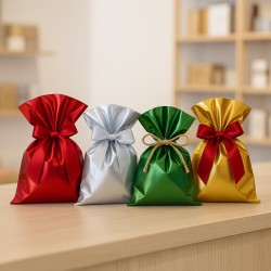
November is the month of choice. This is where the customer moves from curiosity to decision, and color direction must help him. Notably, there is no need to shout. It is necessary to build a world that immediately makes one feel elegance and intensity. A palette centered on plum, antique gold, and graphite black has just that function: it is evening, enveloping, sophisticated, and at the same time very current. It is a combination that communicates "special" without slipping into the predictable. In packaging, it works because it allows for a play of depth: black or graphite gives structure, plum adds character and warmth, and antique gold introduces a sign of preciousness that is not Christmas gloss, but value. It is an ideal micro-season for the period of multiplying events, dinners, occasions, because it translates the holiday into an elegant and adult code. And it is also particularly effective for those who want to differentiate themselves from traditional palettes, yet maintain an immediate readability of "holiday time."
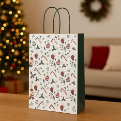
December, finally, is the month of light. But the light today does not have to be that of classic red and gold. If we want to maintain a contemporary positioning and build a truly recognizable proposition, we can choose a micro-season that makes Christmas more modern, cleaner, more photographable. A world of ice blue, silver, and cool white builds a crystalline, almost architectural image that communicates celebration without the weight of tradition. It is a palette that works remarkably well in digital, because it renders well in photos and video, and because it immediately stands out in the color noise of December. In packaging, this micro-season allows for a distinct elegance: clear tissue, silver details, light patterns that suggest snow and sparkle without becoming invasive decoration. The result is a quality, essential Christmas that looks more premium precisely because it does not look like everything else.
The decisive element of Q4, however, is not just choosing correct palettes. It is governing quantity. In fall and December, the biggest risk is overlap: too many colors, too many materials, too many messages. The micro-season is exactly about avoiding this. If each period has a clear color world, the customer perceives order within abundance. And order, in Q4, is the most powerful form of luxury. When a counter or storefront is consistent, the customer chooses more easily and trusts more, because he feels that someone has already done the selection work for him. This is also true online: a product page placed in a consistent color scheme looks more curated, more upscale, more "right" for a gift.
Then there is one aspect that makes Q4 particularly interesting: the cumulative effect of finishing. This is the quarter when small details can generate big results, because the customer is more willing to invest in what makes the gift better. A well-done metallic accent, a richer textured card, a firmer box, a ribbon with a better hand become natural choices when the overall mood warrants it. Color, here, is not just aesthetics: it is a narrative that legitimizes the upgrade. If the color world communicates value, the customer also perceives spending a little more on the packaging as consistent. And this, in terms of profitability, is one of the most important macro-effects.
The fourth quarter is also the time when consistency between communication and unboxing weighs more heavily than the rest. If we promise a world in the window or on social and then deliver a neutral, anonymous package, we miss the most valuable opportunity of the year: the one in which the customer is predisposed to remember. If, on the other hand, the experience is aligned, the micro-season becomes memorable. And memory, in the gift market, is everything: it means being the first choice the following year.
Ultimately, designing Q4 with micro-seasons means avoiding two opposite mistakes: remaining prisoners of "always the same" and, conversely, chasing the special effect without control. Color, organized as a calendar, allows us to go through October, November and December with a natural crescendo: matter, elegance, light. It is a path that takes the client to the party with authority and desirability, without falling into clichés. And it is the most solid way to turn the most competitive season of the year into a territory where the difference is not a fluke, but a designed choice.
From palette to sale: when micro-season becomes method, performance and identity
Micro-seasons only really work when they stop being a creative idea and become an operating system. This is the step that separates a sequence of "beautiful" launches from a strategy that produces continuity, margin and recognizability. Color alone is not enough; what matters is its ability to transform into a consistent experience throughout the purchase journey, from the first glance to the moment the customer takes the package away or opens the delivery at home. When the color calendar is designed as a method, the mini-collection is no longer an episode: it becomes a virtuous routine. And a virtuous routine is the most valuable thing we can build, because it reduces internal fatigue and multiplies external effect.
The first point, which is often underestimated, is that a micro-season is not created to "say many things," but to say one thing very clearly. Clarity is a commercial advantage, not a simplification. In a crowded marketplace, clarity is what enables the customer to choose quickly and confidently. It is also what makes the experience memorable. If a mini-collection has a defined feel, a name that makes it recognizable, a consistent palette and a concrete translation in the packaging, then the customer doesn't have to interpret: he perceives. And when he perceives, he buys more easily. This is the first transformation to understand: we are not "coloring" the catalog, we are building a perceptual shortcut that reduces friction and increases conversion.
Achieving this clarity requires discipline of execution, because the micro-season must be visible everywhere, otherwise it remains unfinished. A palette that lives only in social graphics or only in the storefront is not a micro-season: it is a fragment. The real leap happens when the customer finds the same color world in all touchpoints, and then feels that what he has seen is real, tangible, consistent. Consistency, here, is not an aesthetic affectation: it is a promise kept. And a fulfilled promise builds trust. In retail, trust is a multiplier, because it drives faster choice, reduces doubt, increases the propensity to upgrade packaging, and fuels word of mouth. Online, consistency between image and unboxing reduces the distance between expectation and reality, and this has direct effects on satisfaction, repurchase, and the way the customer narrates the experience.
Then there is a question of efficiency that makes micro-seasons particularly suitable for those who want to grow without complicating their lives. A well-constructed color calendar doesn't require redoing everything every time, it requires changing intelligently. The point is not to multiply materials and references, but to design a stable base and high-visibility variables. When we work this way, operations become sustainable: we can set up faster, we can produce content with more continuity, we can reorder in a judicious way, we can react to what works without disrupting everything. It is a way of working that gives rhythm without stress, because it turns the launch into a replicable procedure. And this replicability is the heart of the macro-effect: if something is replicable, we can improve it; if we can improve it, we can grow it; if we grow it, it becomes part of the identity.
At this point the relationship between color and perceived value comes into play. Each micro-season must be able to legitimize a positioning. When the palette, finishes, and materials are consistent, the customer perceives more quality even with the same product. It is a well-known phenomenon: what appears more polished is evaluated as more reliable and more worthy of spending. In packaging this is even more evident, because the customer instinctively associates the accuracy of the packaging with the accuracy of the offering. If the box is solid, if the ribbon has "hand," if the tissue is beautiful, if the label is centered and legible, if the whole is harmonious, then everything seems more important. In this scenario, color becomes the direction that holds every detail together. It is not an element that is added: it is the structure that allows the detail to make sense.
When this structure is well designed, micro-seasons also become a natural tool for growing the receipt medio. Not because they push aggressively, but because they make completion desirable. Color coordination invites "closure" to the experience: adding an item, choosing better packaging, matching an accessory, making the purchase immediately ready to give away. It is a simple psychological dynamic: what looks good together seems incomplete if it remains separate. If the micro-season is built with consistency, combination becomes the most natural behavior. And what is natural always sells better than what is imposed.
The other great strength of the final chapter, the one that turns micro-seasons into strategy, is measurability. Each mini-collection can be read as a controlled experiment: change the palette, change the mood, change the accent materials, and we can observe what happens. We can see which color world generates the most interest, which one increases gift-giving propensity the most, which one works best in photography, which one makes the most effective window display, which one pushes the envelope completion the most. This allows us to build an archive of real knowledge, which year after year makes the calendar more and more powerful. It is not about chasing trends, it is about knowing your audience and speaking in a language that really responds to their impulses and expectations.
Finally, there is one aspect that, in the long run, is worth more than any single performance: identity. When the customer recognizes the way we use color, he doesn't just recognize a palette; he recognizes an idea of quality, of care, of style. This is where the micro-season produces the most important macro-effect: it creates memory. And memory, in a saturated market, is the real currency. A customer who remembers how we present ourselves, how we package, how we translate the occasions of the year into coherent worlds, is a customer who returns with less hesitation. It is a customer who chooses us not only because he "needs," but because he knows the experience will be up to par with us. It is a customer who, in the gift-giving season, is not looking for solutions: he is looking for certainty.
Taking a palette from theory to sales ultimately means turning color into an infrastructure. An infrastructure made of simple rules, consistent finishes, well-chosen materials, repeatability, control and measurement. This is how a mini-collection does not remain an episode, but becomes an appointment. This is how the year turns into a sequence of recognizable moments, where each micro-season adds a piece to identity and a boost to performance. And when this happens, color stops being an aesthetic choice-it becomes one of the most effective ways to guide the customer, increase perceived value, and build a brand that is recognizable at first glance.
Closing a path on micro-seasons actually means opening a broader perspective: to stop thinking of the year as four large blocks and start governing it as a sequence of moments, each with a specific energy, a dominant need, an imagery that the client instinctively recognizes. This is what macro-effect is all about. It comes not from the single right palette, nor from the creative twist, but from the continuity with which we build credible, readable and consistent appointments. When the customer perceives that there is a direction behind what he sees, the relationship changes: he no longer enters just to find a product, he enters to find a world.
Color, in this system, is much more than an aesthetic choice. It is the quickest synthesis of a positioning, the immediate translation of an atmosphere, the lever to guide the eye and, consequently, the decision. It is a language that works before words and often even more than words, because it enters perception directly, without demanding time or attention. In an age when attention is fragmented and competition is constant, having a recognizable color language means reducing friction, increasing trust, making the choice easier. And when the choice is simple and rewarding, conversion is not a rare event-it becomes a natural consequence.
Then there is an element that deserves to be reiterated, because it is what makes this strategy truly suitable for contemporary retail: operational sustainability. Micro-seasons must not complicate, must not multiply uncontrollably, must not turn into a succession of urgencies. If they are designed methodically, they become an accelerator of efficiency. They provide a stable base on which to graft intelligent variations, they enable the organization of set-up and content production at a predictable pace, they make purchasing clearer and inventory management cleaner. Above all, they build an internal habit that is reflected externally: when we work with order, the customer also perceives order. And order, in the gift and quality market, is a concrete form of luxury.
Packaging, in this scenario, stops being an accessory and returns to its most strategic role: it is the point at which color becomes experience. It is not just the hue that makes the difference, but the material with which the hue is expressed, the finish that makes it credible, the detail that signs it without weighing it down. When the color world experienced in the storefront or online is found in the package, the experience comes to a coherent close, and that coherence becomes memory. This is where the micro-season makes the quantum leap: it does not remain a graphic theme, it becomes a physical memory. And what remains on you, what you see and touch, is what you narrate. In other words, color doesn't just sell; it creates conversation, fuels recognition, makes return more likely.
In the end, the promise of micro-seasons is simple and powerful: do not wait for the "big moment" to be relevant. Build relevance with continuity. Give customers recurring reasons to stop, choose, return. In a year made up of micro-decisions, it is more effective to preside over twelve well-designed windows than to put all your eggs in a few overloaded seasonal waves. Because twelve micro-seasons, if consistent, do not disperse identity: they strengthen it. They make it clearer, more present, more recognizable. And they transform novelty from exception to language.
If there is an ultimate goal to keep in mind, it is this: to make the customer recognize our style even before our assortment. Let him perceive quality even before comparing details. Let him feel, as he enters our world, that everything is thought out. The color calendar, when designed as a system, allows us exactly that. It allows us to be contemporary without chasing, elegant without stiffening, creative without losing control. And above all, it allows us to turn time, which is the most difficult variable to manage in retail, into an ally: a rhythm of appointments that builds desirability, confidence and memory, month after month, until each micro-season becomes an inevitable piece of a macro-effect that is seen, measured and remembered.
