1. Colors as an Expression of Trend and Identity
Colour is much more than an aesthetic element: it is a universal language capable of communicating emotions, values and identity. In the context of the spring-summer 2025 trends, colors take on a key role to represent the energy, freshness and innovation that characterize this season. This chapter explores how color influences design, fashion and packaging choices, becoming a strategic tool to connect with the public.
The Psychological Power of Colors
Each color evokes specific emotions and psychological reactions. For example:
Yellow stimulates optimism and creativity, and is often associated with the sun's energy and joy.
Green represents nature and rebirth, conveying a sense of tranquility and sustainability.
Blue, in all its shades, stands for reliability, calmness and sophistication. Understanding the meaning behind each shade is essential for choosing palettes that are not only visually appealing, but also emotionally relevant.
Colors and Trend Cycles
Color trends don't happen by chance – they reflect social, cultural, and economic changes. Reports from institutions such as Pantone, WGSN and other trend forecasters analyze global sentiment to identify the colors that best represent the contemporary era. For 2025, research shows a desire to balance the desire for freedom and lightness with a growing focus on sustainability and connection with nature.
Lightness and positivity: pastel shades and bright colors to express vitality and optimism.
Sustainability and natural roots: earthy and vegetal colors that draw attention to the environment.
Modernity and technology: futuristic palettes such as neon and metallics, which evoke progress.
Colors as an Identity Element
In the contemporary world, color is often the first element that captures the attention of the public. Brands, designers, and retailers use color palettes to stand out and communicate their values. For example:
In fashion, colors define collections, telling stories of style and emotions.
In interior design, soothing or energizing hues influence the comfort of spaces.
In packaging, color is a marketing tool, capable of capturing the consumer's eye and creating a memorable experience.
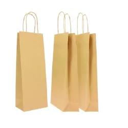
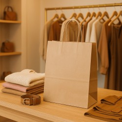
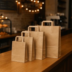
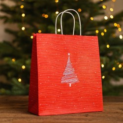
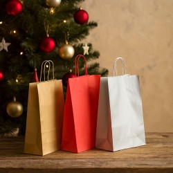
A concrete example of this strategy is the use of bright and eye-catching colors in spring-summer gift packaging, which not only enhance the product, but communicate joy and freshness.
The Influence of Colors on Brand Perception
A brand that carefully chooses its color palettes is able to communicate its values and mission in an immediate way. In 2025, trend palettes will allow brands to:
Be perceived as up-to-date and detail-oriented.
Evoke emotions that enhance the customer experience.
Create immediate associations with the themes of sustainability, innovation and creativity.
2025 Trends: The Return to the Essentials
The introduction to the spring-summer 2025 season cannot be separated from a reflection on the values that guide consumption and design: authenticity, balance and innovation. The colors chosen reflect a changing world, where the need for connection with nature mixes with the desire for lightness and imagination.
In a world where images dominate communication, colors play a fundamental role in defining trends and brand identity. Spring-summer 2025 marks the beginning of a new chromatic era, where natural, energetic and futuristic shades converge to offer endless creative possibilities. Choosing the right colors means not only following trends but also creating a lasting emotional connection with your audience.
2. The Must-Have Palettes for Spring-Summer 2025
Each season brings with it an explosion of colors that reflect the global feelings, cultural trends, and artistic influences of the moment. For spring-summer 2025, the color palettes stand out for their ability to combine optimism, sustainability and innovation, offering a range of shades perfect for fashion, design, decoration and packaging. This chapter explores the main palettes that will dominate the season, analyzing their meaning, applications, and impact.
1. The "Blooming Pastels" palette
Pastel colors, loved for their delicacy and versatility, are back in the spotlight in 2025 with richer and more multifaceted shades. Shades such as peony pink, mint green and lavender will be revisited with more saturated accents to express energy and contemporaneity.
Meaning:
This palette reflects lightness, hope and a desire for rebirth after years of uncertainty. It is perfect for celebrating spring, evoking the colors of newly bloomed flowers.
Applications:
Fashion: Light and floating fabrics, suitable for both casual and elegant outfits.
Interior design: Ideal for creating bright and welcoming environments, with furnishing accessories in pastel shades.
Packaging: Gift boxes, ribbons and decorations for spring events, perfect for conveying freshness and vitality.
2. The "Eco-Chic Naturals" palette
Description:
Inspired by nature and sustainability, this palette includes earthy hues such as sand beige, terracotta brown and moss green, enriched with plant accents such as mustard yellow and olive.
Meaning:
This palette recalls the urgency to reconnect with the planet, choosing shades that celebrate the earth and its beauty. It is a response to the growing need for sustainability.
Applications:
Fashion: Minimalist looks and natural materials, such as linen and organic cotton, paired with this palette.
Packaging: Perfect for brands that promote ecological values; boxes and packaging in natural shades with matte or raw textures.
Design: Used for relaxing and sustainable environments, with furnishings made of recycled or biodegradable materials.
3. The "Electric Escape" Paddle
Description:
This explosive palette combines neon hues like electric lime, bright orange, and fuchsia with futuristic metallic accents.
Meaning:
A tribute to technological innovation and the desire for boldness, this palette expresses dynamism, energy and experimentation. It is perfect for those who want to stand out and dare.
Applications:
Fashion: Statement dresses and bold accessories, ideal for those who want to get noticed.
Packaging: Packaging with a futuristic design, which captures the attention with bright colors and metallic details.
Events: Decorations for summer parties and events, which focus on a lively and unforgettable atmosphere.
4. The "Oceanic Dreams" palette
Description:
This palette explores the marine world, with shades ranging from ocean blue to deep turquoise, enhanced with pearly and sandy accents.
Meaning:
Blue, a symbol of calm and stability, is at the heart of this palette, which celebrates the bond between man and sea. Perfect for evoking freshness and relaxation, it also recalls the importance of protecting the oceans.
Applications:
Fashion: Summer dresses and accessories with marine shades, perfect for casual and holiday looks.
Interior design: Soothing colours for living or commercial spaces, ideal for modern environments.
Packaging: Elegant and sophisticated packaging for luxury products, such as cosmetics and perfumes.
5. The "Radiant Earth Tones" Palette
Description:
Warm and welcoming shades such as terracotta red, papaya orange and turmeric yellow, inspired by desert landscapes and tropical sunsets.
Meaning:
This palette represents energy, vitality and connection with cultural roots. It is ideal for evoking a feeling of warmth and inclusivity.
Applications:
Fashion: Boho-chic look, with clothes in natural fabrics and ethnic motifs.
Packaging: Perfect for products related to well-being, such as natural cosmetics or handcrafted candles.
Design: To create warm and welcoming spaces, with a touch of exoticism.
6. The "Soft Futurism" palette
Description:
This palette combines soft hues like pearl gray, blush pink, and light beige with silver and gold metallic accents.
Meaning:
It expresses the combination of simplicity and technology, offering a vision of soft and elegant modernity. It is perfect for those looking for a balance between tradition and innovation.
Applications:
Fashion: Formal dresses and minimalist accessories with metallic details.
Packaging: Clean and sophisticated designs for premium products.
Interior design: Ideal for modern and bright spaces, with a touch of futurism.
The trendy palettes for spring-summer 2025 reflect an evolving world, where color becomes the bridge between emotions, culture and innovation. Choosing the right shades for fashion, design and packaging means not only following trends, but also telling stories that inspire and connect people.
3. Renewed Pastel Tones: Lightness and Elegance
Pastel colors have always been synonymous with delicacy and serenity, but for spring-summer 2025 these tones evolve, acquiring new shades and meanings. From traditionally soft and light hues, they are transformed into vibrant and contemporary shades, capable of expressing energy and refinement without losing their natural charm. This chapter delves into how revamped pastel tones will be the stars of fashion, design and packaging, and why they continue to be a winning choice.
The Essence of Pastel Tones: Symbolism and Emotional Impact
Pastel colors, often associated with spring for their connection to nature and rebirth, evoke positive and relaxing emotions. However, in 2025 these shades are enriched with depth and meaning:
Optimism and hope: shades such as pale lemon yellow and peach represent the desire for positivity.
Sustainability: mint green and light blue recall nature and water, emphasizing environmental themes.
Modernity: the most saturated pastels, such as intense lavender and orchid pink, combine tradition and contemporaneity, adapting to both classic and innovative contexts.
This transformation makes pastel tones versatile, capable of adapting to multiple sectors and communicating different messages depending on their use.
The Trending Pastel Colors for 2025
Here are some of the shades that will be the protagonists in the spring-summer 2025 season:
Peony Pink: A warm and welcoming pink, perfect for evoking romance and delicacy.
Brilliant Lavender: a brighter version of the classic lilac, a symbol of creativity and modern femininity.
Ice Blue: Fresh and clean, this soft blue conveys tranquility and sophistication.
Pistachio Green: a natural and light shade, which recalls well-being and sustainability.
Sorbet Yellow: a delicate but energetic yellow, ideal for conveying optimism.
Satin Peach: warm and soft, perfect for creating a welcoming and sophisticated atmosphere.
How Renewed Pastel Tones Influence Fashion and Design
1. Fashion:
The pastel colors of 2025 find application in different types of clothing, adapting to casual, elegant and sporty styles.
Feminine outfits: floating lavender chiffon dresses or peony pink silk shirts express elegance and lightness.
Men's clothing: Suits in pistachio green or ice blue offer a fresh alternative to classic tones, while maintaining a sophisticated look.
Accessories: bags, shoes and jewelry in pastel shades become distinctive elements, perfect for adding a touch of freshness to any outfit.
2. Interior Design:
Renovated pastels are ideal for furnishings that combine modernity and comfort.
Walls: tones such as lavender or ice blue create relaxing environments, ideal for living spaces or offices.
Furnishing accessories: cushions, curtains and carpets in pastel colors add a touch of style and brightness.
Natural materials: combining pastels with light wood or gilded metals enhances their sophistication.
3.Packaging:
In packaging, renewed pastel tones are powerful tools to attract attention and convey specific messages.
Luxury products: boxes lined in peony pink or pistachio green communicate exclusivity.
Natural products: Packaging in ice blue or mint green reinforces the idea of sustainability.
Events and gifts: pastel tones are perfect for boxes and ribbons dedicated to weddings, baby showers and spring gifts.
Why Pastel Tones Are a Strategic Choice
The popularity of pastel colors is not accidental: it is a strategic color choice that responds to the aesthetic and emotional needs of the contemporary consumer.
Versatility: pastels adapt to many contexts, from elegant minimalism to the most eccentric design.
Emotional connection: Delicate shades create a sense of comfort, positivity, and nostalgia.
Recognizability: pastel colors are easily distinguishable, making a product or design immediately identifiable.
Color Combinations with Pastel Tones
Renewed pastel tones can be used both as protagonists and as accents. Here are some pairing ideas:
With neutral tones: combine peony pink with creamy white or gray for an elegant effect.
With bright colors: combine pistachio green with mustard yellow to create a dynamic and contemporary look.
With metallic accents: Pair ice blue with silver or lavender with copper for a futuristic touch.
The renewed pastel tones for spring-summer 2025 represent an evolution that combines lightness and elegance with modernity and innovation. These colours, adaptable and full of meaning, establish themselves as absolute protagonists in fashion, design and packaging. Using them means not only following trends, but also telling a story of beauty, sustainability and creativity.
4. Neon and Fluo Colors: Boldness and Dynamism
Neon and fluorescent colors make their triumphant return in spring-summer 2025, redefining the concept of energy and chromatic boldness. These vibrant hues, often associated with a futuristic and youthful aesthetic, evolve to become the symbol of a world that celebrates dynamism and the desire to emerge. This chapter explores how neon and fluorescent colors will be used in fashion, design, packaging and lifestyle, offering creative insights to exploit their potential.
The Emotional Impact of Neon and Neon Colors
Neon colors aren't just bright – they're vibrant, provocative, and irresistible. They have the power to capture attention at first glance and evoke intense emotions.
Here are some of their key features:
Energy: Shades such as lime, fuchsia and bright orange infuse vitality and positivity.
Boldness: neon lights challenge sobriety, inviting you to dare and express personality.
Futurism: often associated with technology and cutting-edge, fluorescent colors represent an optimistic vision of the future.
In 2025, the use of neon colors moves away from excess to embrace a new elegance, turning them into versatile tools for creativity.
The Trending Neon Colors for 2025
The neon palette for spring-summer 2025 includes iconic shades reworked with a touch of sophistication:
Electric Lime: an acid green that conveys energy and freshness.
Fuchsia Intenso: lively and decisive, a symbol of modern and bold femininity.
Fluorescent Orange: warm and vibrant, perfect for evoking the summer sun.
Neon yellow: bright and optimistic, ideal for attracting attention.
Electric Blue: a futuristic shade that combines stability and modernity.
How Neon Colors Fit Fashion and Design
1. Fashion:
Neon and fluorescent colors find a new dimension in fashion, becoming the protagonists of bold but also sophisticated looks:
Sports outfits: neon shades for activewear, perfect for transmitting energy.
Evening dresses: neon details combined with elegant fabrics such as silk or velvet for a striking contrast.
Accessories: Neon bags, shoes, and glasses that add a futuristic touch to minimalist looks.
2. Interior Design:
In interior design, neon colors are used sparingly to create modern and eye-catching spaces:
Bright accents: neon lamps or fluorescent furnishing accessories to give character to the rooms.
Accent walls: A wall painted in neon yellow or electric blue transforms a room into a dynamic and contemporary area.
Balanced contrasts: Combine neon colors with neutral tones such as gray or white for a balanced effect.
3.Packaging:
Neon colors are a powerful marketing tool, capable of immediately capturing the consumer's attention:
Technological products: electric blue packaging or files to communicate innovation.
Cosmetics: fuchsia or fluorescent orange packaging that evokes energy and playfulness.
Gifts and decorations: Ribbons and neon boxes that add a surprising touch to events and celebrations.
Neon Colors in Packaging: Capturing Attention
Neon packaging is a strategic choice for brands that want to stand out on the shelf or online. Thanks to their brightness, these shades create an eye-catching visual effect that increases the perception of the value of the product.
For young people: fluorescent colors are perfect for young targets, evoking dynamism and contemporaneity.
For summer products: summer drinks, gadgets and accessories benefit greatly from neon packaging, which evokes the energy of the season.
For premium products: combining neon colors with metallic or matte finishes creates a sophisticated and innovative contrast.
Neon and Sustainability: A New Approach
Despite the traditional association with artificiality, the neon colors of 2025 are evolving to integrate into an increasingly sustainability-conscious world:
Eco-friendly pigments: The color industry develops fluorescent tones obtained with more sustainable processes.
Digital applications: Neon graphics for digital marketing reduce the need for physical materials.
Recyclable packaging: neon boxes and packages made with eco-friendly materials meet the needs of a conscious public.
Color Combinations with Neon Colors
To use neon colors effectively, it is essential to combine them with shades that enhance their impact without being excessive:
With neutral tones: neon lime goes perfectly with white or gray, creating a modern and balanced look.
With pastels: Pairing neon fuchsia with blush pink adds a bold touch to a delicate palette.
With metallic accents: electric blue with silver or gold details creates a futuristic and refined effect.
The neon and fluorescent colors of spring-summer 2025 represent a hymn to creativity and boldness. No longer relegated to specific niches, they establish themselves as protagonists in fashion, design and packaging, adapting to a world that celebrates vitality and personal expression. Using them means not only following trends, but also embracing an innovative aesthetic that does not go unnoticed.
5. Nature as Inspiration: Earthy and Vegetal Colors
For spring-summer 2025, the link between nature and design becomes stronger than ever, with a color palette that draws inspiration from the colors of the earth and plants. These tones, deeply rooted in the natural imagination, reflect a growing desire for connection with the environment and sustainability. From earthy browns to shades of green and vegetal yellow, this color trend is perfect for those who want to embrace an authentic and harmonious style.
Earthy and Vegetal Colors: Meaning and Symbolism
This palette represents the authentic and timeless beauty of nature, bringing with it a strong ecological message. Each color has a deep meaning:
Terracotta Brown: evokes warmth, stability and deep roots. It is the symbol of a return to the origins.
Sand Beige: recalls softness and balance, perfect for a relaxed and sophisticated style.
Moss Green: A symbol of rebirth and growth, it reflects the importance of sustainability.
Turmeric Yellow: A vibrant and spicy hue that represents vitality and natural energy.
Deep Olive: sophisticated and versatile, this shade recalls Mediterranean vegetation.
Not only do these colors please the eye, but they also convey a feeling of calm and connection to the planet, making them ideal for a wide range of applications.
The Colors of Nature in the 2025 Trends
Earthy and vegetal colors dominate multiple industries, from apparel to interior design to packaging. Let's see how these shades translate into the main creative areas:
1. Fashion: The Charm of Wearable Nature
In the fashion world, nature-inspired colors are synonymous with sophistication and authenticity.
Natural fabrics: organic cotton, linen and silk dye garments in moss green or terracotta brown, emphasizing the use of sustainable materials.
Boho and casual styles: tunics and long dresses in earthy shades are perfect for a relaxed and chic look.
Accessories: Vegetable leather bags and shoes in olive tones add a touch of naturalness to any outfit.
Unisex collections: earthy and vegetal colors fit perfectly with gender-neutral garments, reflecting an inclusive and modern trend.
2. Interior Design: Relaxing and Sustainable Spaces
In interior design, these shades are used to create warm and welcoming environments, which promote relaxation and well-being.
Walls and furniture: Sand beige and moss green are ideal for walls, while terracotta brown adds depth to the décor.
Organic materials: natural wood, stone and textiles such as wool and cotton strengthen the connection with nature.
Furnishing accessories: cushions, rugs and curtains in turmeric yellow or deep olive create points of interest without being intrusive.
Natural lighting: these shades blend perfectly with bright environments, where natural light enhances their shades.
3. Packaging: Sustainable Elegance
Nature-inspired packaging is a strategic choice for brands that want to communicate authenticity and sustainability.
Eco-friendly materials: recycled cardboard or kraft boxes, enriched with terracotta brown or moss green details.
Minimalist design: Sand beige with turmeric yellow graphics creates a clean, modern effect.
Tactile textures: matte or raw surfaces, combined with earthy colors, reinforce the idea of naturalness.
Industry applications: This palette is perfect for packaging natural cosmetics, organic food or artisanal products.
4. Events and Decorations: Celebrating Nature
Earthy and vegetal colors are ideal for events and decorations that want to celebrate authenticity.
Rustic weddings: decorations in moss green and terracotta brown for a bucolic and romantic style.
Corporate events: natural palettes that convey professionalism and sustainability.
Personalized gifts: gift boxes in sand beige or turmeric yellow for a unique and memorable touch.
How to Combine Earthy and Vegetal Colors
These colors are extremely versatile and lend themselves to combinations that enhance their natural beauty:
With neutral tones: sand beige goes perfectly with white and grey for a refined effect.
With vibrant accents: turmeric yellow or olive can be enhanced with details in cobalt blue or terracotta red for a bold contrast.
With natural materials: combine these shades with wood, leather or burnished metals for an authentic and sophisticated look.
Why Choose the Colors of Nature?
Earthy and vegetal colors are not only an aesthetic choice, but also represent a commitment to a more sustainable and authentic world. Using them means:
Communicating values: they reflect attention to the environment and sensitivity to nature.
Create a unique identity: stand out with a color palette that conveys authenticity and warmth.
Attracting the public: consumers, who are increasingly attentive to sustainability, appreciate color choices that recall respect for the planet.
The earthy and vegetal colors of spring-summer 2025 celebrate the authentic beauty of nature, offering endless creative possibilities in fashion, design and packaging. These shades are not just a trend, but a message: living in harmony with the planet and embracing a more conscious and sustainable lifestyle. Choosing these colors means not only following trends, but also making a statement of respect and connection with the world around us.
6. Blue in all its Shades
Among the undisputed protagonists of spring-summer 2025 we find blue, a color that lends itself to countless interpretations thanks to its versatility and strong emotional impact. From deep and reassuring shades such as navy blue to more lively and bright ones such as sky blue or electric blue, blue dominates the color trends of the season, adapting to different sectors: fashion, interior design, packaging and much more. In this chapter, we will explore the hottest shades of blue, their meanings, and their practical uses.
Blue: Symbolism and Meaning
Blue is a universal color, often associated with positive and deep values. Its shades evoke different emotions and symbols:
Calm and serenity: light blue, like sky blue, is relaxing and calls for peace.
Reliability and professionalism: navy blue is synonymous with security and stability, often used in branding.
Freshness and dynamism: bright shades such as electric blue add energy and modernity.
Connection with nature: aqua blue and ocean blue recall natural elements such as the sea and sky, emphasizing sustainability.
In 2025, blue is reinterpreted in a contemporary way, offering surprising combinations and innovative applications.
The Trending Shades of Blue for 2025
Here are the shades of blue that will dominate the season and their use:
Deep Navy Blue: elegant and versatile, it is perfect for formal outfits and minimalist designs.
Sky Blue: fresh and relaxing, ideal for evoking lightness and positivity.
Electric Blue: Vibrant and futuristic, suitable for bold designs and technological products.
Blu Acqua: delicate and natural, it recalls the sea and lends itself to contexts related to sustainability.
Indigo Blue: intense and sophisticated, perfect for creating contrasts with neutral or bright tones.
Blue in Fashion: Elegance and Innovation
Blue is establishing itself as the protagonist in spring-summer 2025 fashion, thanks to its ability to adapt to different styles and materials.
Casual and sporty garments: sky blue and aqua blue dominate the collections of light clothing, such as t-shirts, shorts and summer dresses, perfect for the day.
Formal outfits: navy blue is used for elegant suits and evening dresses, often enriched with metallic details for a contemporary look.
Accessories: Bags, shoes and belts in electric blue add a touch of originality to any look.
Innovative materials: shiny fabrics such as satin or technological fabrics such as neoprene enhance the most vibrant shades of blue, making them ideal for futuristic dresses.
Blue in Interior Design: Relaxing and Modern Spaces
Blue is a color that transforms spaces, making them relaxing and welcoming or bold and dynamic, depending on the shade chosen.
Walls: navy blue or indigo give depth and create sophisticated atmospheres, while sky blue is perfect for relaxing spaces such as bedrooms or offices.
Furnishing accessories: cushions, rugs and curtains in aqua blue or electric blue add freshness and personality to the rooms.
Maritime style: combining aqua blue with white and beige evokes nautical style, ideal for beach houses or spaces that want to recall the freshness of summer.
Lighting: lamps with blue glass or electric blue LED lights create striking effects, ideal for modern or futuristic environments.
Blue in Packaging: Refinement and Innovation
Blue is a strategic color choice in packaging, thanks to its ability to convey positive values such as trust, elegance and freshness.
Luxury products: navy blue and indigo blue, combined with gold or silver details, create sophisticated packaging for perfumes, wines and jewelry.
Cosmetics and skincare: aqua blue and sky blue evoke purity and freshness, ideal for beauty and wellness products.
Technology: electric blue captures the attention and communicates modernity, perfect for technological devices or gadgets.
Sustainable packaging: aqua blue combined with recycled materials conveys a message of sustainability, perfect for eco-friendly brands.
Color Combinations with Blue
Blue is extremely versatile and can be combined with different shades to create unique effects:
With neutral tones: navy blue pairs perfectly with white, gray and beige for a classic and sophisticated look.
With bright colors: electric blue creates bold contrasts with neon yellow or fuchsia.
With metallic accents: indigo and navy blue are enhanced by silver or gold details for a luxurious effect.
With shades of green: aqua blue combined with mint green or pistachio green recalls natural landscapes, creating a relaxing and sustainable atmosphere.
Blue and Sustainability
In 2025, blue is not only an aesthetic color, but also a symbol of sustainability and environmental awareness:
A reminder of the oceans: shades such as aqua blue raise awareness of the importance of protecting the seas.
Eco-friendly materials: the packaging in blue on recycled or kraft paper communicates a message of respect for the environment.
Durable design: navy blue and indigo, being timeless shades, lend themselves to creations that defy passing fads.
Blue, in all its shades, dominates spring-summer 2025 as a symbolic color of elegance, reliability and modernity. From fashion to design, from packaging to interiors, blue adapts to any context, offering endless creative possibilities. Using it means not only following trends, but also embracing a color that speaks of calm, sustainability and progress.
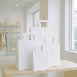
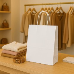
7. Color Trends in Spring-Summer 2025 Packaging
Packaging is the first point of contact between a product and the consumer, and for spring-summer 2025, colors play a fundamental role in defining the brand identity and attracting attention. This season's color trends focus on palettes that combine aesthetics, emotion and sustainability, responding to the expectations of an increasingly aware and detail-oriented public. In this chapter, we will explore the main color trends for packaging, analyzing the most innovative shades, materials and combinations.
The Role of Color in Packaging
Colour is not only decorative, but communicates values, emotions and messages in an immediate way. In 2025, consumers are looking for packaging that tells stories, conveys sustainability, and reflects personality.
Brand identification: Distinctive colors help build recognition and reinforce brand identity.
Emotional stimulation: Vibrant shades such as neon attract attention, while natural colors evoke trust and sustainability.
Visual experience: Color can enhance the shopping experience, making the product memorable.
Trend Palette for Spring-Summer 2025 Packaging
This season's color palettes are divided into five main trends, each with a well-defined identity and versatile application.
Natural and Sustainable: Earth and Green
Main shades: terracotta brown, moss green, sand beige.
Meaning: they evoke authenticity, sustainability and connection with nature.
Applications: packaging for natural cosmetics, organic food and artisanal products.
Recommended materials: kraft paper, recycled cardboard, matte finishes to emphasize the natural look.
Futuristic and Technological: Neon and Metallic
Main shades: electric blue, neon lime, silver and gold accents.
Meaning: they convey innovation, boldness and modernity.
Applications: packaging for technological products, fashion accessories and exclusive gadgets.
Recommended materials: glossy surfaces, metallic details, tactile textures for a high-tech effect.
Fresh and Light: Renewed Pastels
Main shades: powder pink, lavender, sky blue, pistachio green.
Meaning: They evoke delicacy, lightness and a sense of rebirth.
Applications: packaging for gifts, favors, baby products or cosmetics.
Recommended materials: satin paper, soft-touch details, minimalist graphic elements.
Warm and Enveloping: Spices and Sunsets
Main shades: turmeric yellow, papaya orange, terracotta red.
Meaning: they convey energy, vitality and warmth.
Applications: packaging for food, wine, preserves and summer products.
Recommended materials: raw textures, hand-painted details, natural finishes.
Timeless Elegance: Deep and Neutral Blues
Main shades: navy blue, indigo, pearl grey.
Meaning: they communicate reliability, luxury and professionalism.
Applications: packaging for premium products such as perfumes, watches, fine wines.
Recommended materials: rigid cardstock, embossed details, matte or metallic finishes.
Color Combinations for Attractive Packaging
The 2025 trends encourage the use of color combinations designed to create contrast, harmony or a surprising effect:
Bold contrasts: neon like lime combined with black for a strong visual impact.
Complementary shades: moss green and turmeric yellow for a fresh and natural look.
Elegant monochromes: different shades of blue for a sophisticated and modern effect.
Metallic accents: silver or gold with neutral tones to add luxury without excess.
Materials and Finishes for the Packaging of 2025
The color is also enhanced by the choice of materials and finishes, which influence its perception.
Matte finishes: perfect for natural palettes, they convey authenticity and warmth.
Glossy surfaces: ideal for neon, they add brilliance and modernity.
Tactile textures: worked papers or embossed details enhance the sensory experience.
Sustainable materials: The use of recycled or biodegradable paper reinforces the ecological message.
Blue in Spring-Summer 2025 Packaging
Blue, the protagonist of the season, adapts perfectly to the packaging thanks to its versatility:
Navy blue: perfect for luxury boxes with gold or silver details.
Electric blue: ideal for technological products, with glossy surfaces or minimalist graphics.
Aqua blue: used in combination with natural materials for eco-friendly packaging.
Packaging and Sustainability: The New Standard
The packaging of 2025 cannot ignore the importance of sustainability, and color plays a crucial role in communicating this focus:
Natural palettes: browns and greens strengthen the link with ecology.
Recycled materials: kraft paper and recycled cardboard combined with natural tones convey authenticity.
Minimalist design: pastel colors on essential packaging reduce visual and environmental impact.
The spring-summer 2025 packaging combines aesthetics, sustainability and innovation, with color palettes ranging from earthy naturals to futuristic neon. Capitalizing on these trends means creating packages that not only attract attention, but also tell a story of value, authenticity, and modernity. In an increasingly competitive market, color in packaging is not a detail, but a fundamental strategy to stand out and connect with consumers.
8. Color combinations: how to create the perfect harmony
Color matching is an art that combines aesthetics and psychology, influencing the perceptions and emotions of the viewer. In spring-summer 2025, design, fashion and packaging find new life thanks to color combinations that balance bold and sophisticated trends with more natural and minimalist approaches. This chapter explores how to create visual harmony using trendy palettes, analyzing the fundamental principles of color matching, the most effective combinations, and their practical uses.
The Role of Chromatic Harmony
The choice of colors and the way they are combined is not only about aesthetics, but also about communicating a message.
Emotional: Colors can evoke feelings such as calm, energy, happiness, or nostalgia.
Functional: A well-thought-out combination helps to guide visual attention, highlighting important details.
Identity: cohesive color combinations strengthen the image of a brand or product.
Basic Principles of Color Matching
To create perfect harmony, it is important to follow some fundamental principles:
Color Wheel:
The color wheel is an essential tool for choosing balanced combinations.
Complementary colors: opposites on the wheel (e.g. blue and orange) create vivid and dynamic contrasts.
Similar colours: close together on the wheel (e.g. green and blue) offer a harmonious and relaxing effect.
Triadic colors: arranged in a triangle (e.g. yellow, blue and red) balance contrast and harmony.
Contrast and Balance:
Bold contrasts attract attention and energize the design.
Neutral tones balance the vibrant colors, creating an elegant and sophisticated effect.
Psychology of Color:
Each color has an emotional meaning that must be considered to create combinations that communicate the desired message. For example, blue conveys calmness and reliability, while yellow evokes energy and positivity.
Trendy Color Combinations for 2025
For spring-summer 2025, color trends offer innovative combinations that suit fashion, interior design, and packaging.
Natural and Sustainable:
Combination: moss green + terracotta brown + sand beige.
Effect: Creates a warm, organic and authentic atmosphere.
Applications: eco-friendly design, rustic furniture, packaging for natural products.
Bold and Dynamic:
Combination: neon lime + electric blue + matte black.
Effect: it conveys energy, innovation and modernity.
Applications: streetwear fashion, technological packaging, event decorations.
Delicate and Elegant:
Combination: powder pink + lavender + pearl grey.
Effect: communicates lightness and refinement.
Applications: formal dresses, wedding decorations, gift wrapping.
Energy and Heat:
Combination: turmeric yellow + papaya orange + terracotta red.
Effect: evokes vitality and exotic warmth.
Applications: food packaging, summer fashion, home accessories.
Timeless Elegance:
Combination: navy blue + gold + cream white.
Effect: conveys luxury and professionalism.
Applications: luxury packaging, minimalist furniture, institutional branding.
How to Adapt Color Combinations to Contexts
Each context requires a different approach to color matching to maximize impact:
Fashion:
Creative mix: Combine complementary colors like electric blue and papaya orange for a bold look.
Refined details: Use neutral colors with fluorescent accents to add personality without going overboard.
Interior design:
Relaxing harmony: similar shades such as sky blue and pistachio green are perfect for bedrooms or offices.
Eye-catching contrast: combine turmeric yellow with navy blue for modern and dynamic spaces.
Packaging:
Visual Appeal: Pair bright colors like neon lime and black to instantly catch the eye.
Sustainable elegance: Combining earthy hues such as terracotta brown and moss green to convey authenticity and ecological values.
Mistakes to Avoid in Color Matching
While using color offers endless possibilities, it's important to avoid common mistakes:
Color overload: Too many contrasting colors can be confusing and reduce visual impact.
Underestimating context: Choosing colors that are not suitable for the target audience or brand identity.
Ignoring the balance: combinations that are too bright or too off can be unattractive.
Tools and Resources to Create Color Combinations
Thanks to technology, it is now easier to develop effective color combinations. Some useful tools include:
Adobe Color: Create custom palettes and analyze contrasts.
Coolors: an intuitive and versatile paddle generator.
Physical color wheels: to study combinations directly on visual supports.
Creating chromatic harmony is a combination of art and strategy. In spring-summer 2025, color combinations reflect the balance between boldness and naturalness, adapting to different contexts with versatility and creativity. Leveraging basic color trends and principles means not only improving aesthetics, but also communicating values, emotions, and identities more effectively. The perfect match is one that manages to connect with the audience, creating a lasting and memorable impact.
9. Impress with Colors in Design and Everyday Life
Color is one of the most powerful forces in design, influencing consumer emotions, behavior, and choices. Spring-summer 2025, with its trendy palettes, offers an extraordinary opportunity to amaze and innovate, both in design and in everyday life. This chapter explores how colours can transform experiences and communicate messages, inviting designers, brands and consumers to dare and explore new colour horizons.
The Power of Colors: Between Emotions and Strategy
Colors are never neutral: each shade brings with it an emotional and symbolic baggage that influences its impact. In spring-summer 2025, the trendy colors were chosen to reflect contemporary needs and desires, creating a bridge between aesthetics and functionality.
Positive emotions: Bright, natural palettes evoke joy, serenity, and hope.
Innovation: futuristic shades such as electric blue or neon lime speak of progress and boldness.
Connection: Nature-inspired colors, such as moss green and terracotta brown, strengthen the connection to the planet and sustainability.
Knowing how to exploit these qualities means not only creating beauty, but also responding to the emotional needs of the public.
Applying Colors to Impress
To make color a distinctive element, it is essential to use it strategically in different creative fields.
Fashion:
Spring-summer 2025 fashion celebrates color as the protagonist.
Dare with bold combinations: the contrast between neon and pastel tones renews the idea of freshness and energy.
Play with textures and materials: shades such as indigo or turmeric yellow stand out against innovative fabrics such as satin, linen or organic cotton.
Interior design:
Colors can transform an environment, creating unique emotions and atmospheres.
Focal points: walls painted in navy blue or pistachio green become the visual center of the room.
Decorative accents: Accessories such as cushions, lamps or rugs in pastel or fluorescent shades add character and personality to the spaces.
Packaging:
In packaging, color is not just aesthetics, but a communication tool.
Attract attention: Use vibrant tones such as electric blue or fuchsia to catch the consumer's eye.
It communicates values: earthy or natural palettes convey sustainability and authenticity.
Events and decorations:
Colors can define the mood of an event, making it memorable.
Natural themes: Shades such as moss green and sand beige are perfect for outdoor events or eco-friendly weddings.
Vibrant energies: neon yellow and papaya orange create dynamic atmospheres for summer parties and events.
Color Innovation in Everyday Life
Trendy colors are not just for design professionals or brands: they can also enrich everyday life.
Clothing: An accessory in a trendy shade can transform a simple outfit into something unique.
Home décor: Small changes, such as a new sofa cover in aqua blue or pillows in turmeric yellow, can completely renovate a room.
Personal creativity: Choosing the right colours for a diary, diary or even garden helps to create inspiring and positive environments.
Colors as a Storytelling Tool
Every color tells a story, and 2025 invites us to use colors to narrate our vision of the world:
Nature and sustainability: earthy palettes communicate a return to the roots and a commitment to the planet.
Positive energies: neon and vibrant tones speak of an optimistic society ready to innovate.
Elegance and sophistication: Deep blues and sophisticated pastels offer a sense of timeless luxury.
Storytelling through color is not only about the product or the environment, but extends to the very identity of the brand or the person.
Challenges and Opportunities in the Use of Color
Although color offers endless possibilities, using it requires attention and strategy:
The challenge of balance: combining bright colors without overloading the design is essential to maintain elegance and consistency.
The risk of excess: the indiscriminate use of colors can be confusing; Better to focus on studied palettes.
The opportunity for personalisation: thanks to colour trends, it is possible to create unique experiences that stand out in the market.
Embracing the Colors of the Future
Spring-summer 2025 represents a time of chromatic innovation, in which fashion, design and packaging come together to create memorable experiences. Choosing and matching colors is not just an aesthetic process, but an act of communication, which can transform products, spaces and moments into something extraordinary.
Whether it's a natural hue that recalls the earth or a bold neon that defies tradition, each color is an opportunity to amaze and connect. The secret is to dare, explore and be inspired, creating harmony between beauty, emotion and innovation. Colours have never been so powerful: it's time to use them to build the future.