Warm minimalism: an aesthetic that excites
When you enter the world of warm minimalism, you discover a visual language that speaks delicately and suggests elegance without the need for flashy ornamentation. You are faced with an aesthetic that mixes rigor and warmth, where clean lines and the absence of superfluous elements do not betray coldness but, on the contrary, welcome you. You imagine packages in a soft chromatic scale, which breathe a breath of intimacy and tell authenticity with sobriety. In this context, premium packaging becomes a vehicle of emotion, a medium that conveys value without ostentation.
You are in charge of giving shape to a sensory identity, and you choose to focus on neutral and enveloping tones such as sand, cream, powder and dove grey. These colors are not just neutral nuances, but tools that evoke sensations: the sand takes you back to the dunes just moved by the wind, light and material; the cream evokes diffused light and inner calm; powder caresses with its rosy note and discreet femininity; Taupe offers a balance between sobriety and contemporaneity. Each color brings with it an emotional narrative that dialogues with the slow and reflective autumn.
When you apply this aesthetic to high-end packaging, every choice becomes a thoughtful gesture. Choose materials that amplify visual warmth: uncoated natural paper, slightly textured cardstock, soft-touch finishes. Matte surfaces reflect light gently, like a blurred mirror that invites you to touch it. You move in a universe of controlled tactility, where visual simplicity is enriched by refined textures.
You are aware that the modern consumer is looking for authenticity and sobriety. Well-calibrated minimalist packaging can help position the product as premium. Industry studies have found that simplicity in design increases the perception of price and quality, if accompanied by careful implementation. In this scenario, avoiding appearing flat is essential. You have to flee from visual banality, every chromatic and material element must be calibrated to arouse emotion without overpowering.
You adopt a mindful approach, where logo, text, finishes and materials dialogue in harmony. The logo, if embossed or screen-printed tone-on-tone, does not interrupt the chromatic harmony but blends into it. The arrangement of the elements leaves room for visual oxygen, generating breath around the brand. Every chromatic border, every fold of the packaging has a meaning, contributes to a visual ritual that goes beyond the containment function.
You know that warm minimalism is not just an aesthetic choice but a design philosophy. You want to create an experience, not just items to buy. Packaging must invite you to slow down, to discover, to feel. When the sand paper opens on the cream or powder lining, the unboxing gesture turns into storytelling. The color, texture, soft contrast define a visual and tactile path that excites.
In this chapter, I've walked you through what it means to choose warm minimalism as an aesthetic language for premium fall packaging. You have seen how that refined sobriety becomes emotion, how the warmth of the colors and the material depth give value to the content even more than to the container.
The palette of autumn: sand, cream, powder and taupe
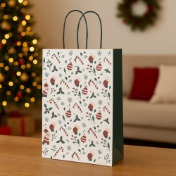
As soon as you enter the chromatic universe of autumn, you immediately perceive a subtle harmony: the shades of sand, cream, powder and dove gray are not simple neutral variations, but subtle tools with which to tell an emotional story. You work with these shades as if they were brushes, painting intimate, warm, reassuring atmospheres. The sand offers itself as a natural base, rich in soft ochre or warm beige undertones that evoke the autumn earth, delicate dunes, dry surfaces illuminated by a warm light. The cream adds a sensation of luminous softness, a colored cream that spreads serenity without excess. Powder pink speaks of discreet femininity and subtle tactility, a dusty pink that remains elegant in essential environments. Taupe remains the sophisticated neutral par excellence, a balance between gray and brown with a warm timbre that makes it perfect for contemporary environments where solidity and sobriety are needed WikipediaWikipedia.
In many contexts, the trend of "warm minimalism" has brought to the fore colors that are not cold or simply neutral, but shades that evoke comfort, authenticity and sensory well-being. It is precisely this approach that has made the shape dominant in which sand, cream and dove grey tones dialogue with natural materials to create visually warm environments without sacrificing minimalist rigor The SpruceBuyerSelect. You can apply the same principles to premium packaging, treating the container as a space to be emotionally designed, using the nuances of the autumn palette to convey calm and authority.
When you choose sand as your base, you're calling to mind arid and soft landscapes, dry surfaces that breathe silence. Cream illuminates without blinding, recalls cream or a diffused and relaxing light, perfect for products that want to talk about delicacy and inner light. Powder, with its pinkish and dusty shade, gives a refined halo that remains neutral but vibrates with femininity and tactility. Taupe, neutral sophisticated, brings balance between modernity and comfort: it appears sober, but warm.
The autumn palette thus composed becomes the perfect basis for premium packaging that wants to be refined without ostentation, emotional without exaggeration. You synthesize visual rigor and emotional tactility, choosing natural materials, matte surfaces and warm textures such as soft-touch or light embossing. In this way, color is not a mere background, but a narrative part of the container, part of the experience of discovering and feeling.
You rely on color theory and design expertise to adjust every shade. You are aware that neutrals that are too cold or impersonal can reduce the expressive power of the packaging. So choose tones that fade into each other, that breathe together, that create an uninterrupted sensory continuum, where sand and cream exchange light, powder diffuses delicacy, dove gray anchors everything with visual authority.
You know that warm minimalism is a response to cold and sterile minimalism, an evolution that favors organic textures and natural colors. In many recent trends, it is evident that this style has gained ground precisely because it recreates environments or containers that invite calm and reflection without sacrificing formal cleanliness. You apply these principles to autumn packaging, imagining a sand box with cream or powder pink interiors, soft tone-on-tone ribbon surfaces and tone-on-tone embossed logo, to offer a visual and tactile experience where the palette becomes voice, emotion, value.
In summary, the autumn palette of sand, cream, powder and taupe is not just a trend: it is an emotional code that you master to convey calm elegance, authentic refinement and a perceived value that feeds on sobriety, touch and warmth.
Premium packaging: simplicity that communicates value
The moment you apply warm minimalism to premium packaging, you transform the container into an emotional ambassador of the product. Your goal becomes to create a visual cue that arouses confidence and desire without resorting to decoration. Through formal cleanliness and the absence of superfluous elements, you convey authenticity and specific perceived authenticity. Contemporary studies show that simplicity in design increases the perception of product value: when packaging is reduced to the essentials but made with quality materials, the consumer's eyes and mind immediately connect that design to a feeling of silent luxury.
By acting on this tension between less and better, you know that minimalist packaging can create a stronger emotional bond, because it eliminates distractions and puts the visual consistency of the brand at the forefront. This approach facilitates a spontaneous attribution of transparency and quality; The consumer's mind associates simplicity with sincerity. The packaging communicates: I don't need excesses because the content speaks for itself. Behavioral research validates this mechanism, finding that more than seventy percent of people choose products that are more visually appealing even if they are objectively less performing.
You are aware that minimalist packaging applied to the autumn color range – sand, cream, powder, dove gray – can increase the perception of value without being impersonal. The warm palette adds a sensory dimension that is missing in designs that are too cold or informative. Enveloping neutral shades evoke a connection with the natural environment, suggesting comfort and authenticity. It is this combination of visual purity and chromatic warmth that creates emotional coherence and perceived sophistication.
When you choose tactile materials such as soft-touch paper, embossed cardstock, or velvety linings, the user experience goes beyond sight. Physical surfaces invite touch and reinforce the message: the product is thought out, not improvised. The word "texture" takes on meaning: not just a finish, but an invitation to feel. You understand that the tactile interaction with the packaging reinforces the feeling of exclusivity, enriching the shopping experience and increasing the willingness to pay.
At the same time, the color choice becomes a symbol of sustainability. Desaturated and natural hues communicate environmental awareness and ethical simplicity. In today's market, consumers, especially millennials and Gen Z, are rewarding brands that embrace authentic ecological values. If your packaging calibrates minimalism and a warm palette, the message becomes twofold: elegance and responsibility. This congruence between form and content strengthens the relationship between brand and consumer, rooting it in shared values.
Of course, you have to avoid visual banality. Minimal packaging that is not carefully developed may seem generic or cheap. But when design is designed with intention, every element becomes meaningful. The absence of graphics also weighs heavily: the empty space becomes the enhancement of every single detail. In this tuned space, the logo, the print, the color, rise. Visual balance becomes a language. The consumer reads absence as a sign of trust and care.
You know well that creating minimalist packaging requires strategy, not giving up. Every colour choice is linked to a feeling, every material to a perceived value. You are the creator of a design that excites under your breath: your packaging speaks of calm, measure, authenticity. He doesn't need slogans or excesses, because he knows how to excite with less.
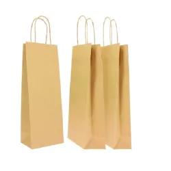
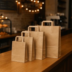
The sand colour: the perfect neutral base
When you choose sand color as the star of your premium packaging, you design an image that is both natural and sophisticated. You approach a hue that brings with it the soft light of autumn landscapes, evoking light dunes, natural fabrics and dry surfaces illuminated by a golden light. It is an ideal chromatic base, capable of welcoming and harmonizing the other warm tones of the palette, without ever being intrusive.
You realize that using sand as the main color means enhancing the sensory perception of the packaging. Its ability to appear neutral but warm makes it perfect for matte, slightly textured surfaces, where the light caresses without reflecting too much. If you combine uncoated sand paper, refined kraft paper or lightly embossed cardstock, you get an elegance that speaks of naturalness and authenticity. The texture you choose reinforces the tactile effect: when you caress the surface, you expect softness, presence, thickness. The tactile sensation becomes part of the promise of superior quality.
When you choose sand tones mixed with finishes such as soft-touch or subtle embossing, you create a balance between visual and tactile that engages the consumer even before they see the contents of the box. This material investment clearly communicates that nothing is left to chance: it is a packaging conceived with intention, capable of arousing amazement as if it were speaking softly but with authority. Even when the logo is discreetly embossed tone-on-tone or delicately screen-printed, it maintains visual harmony rather than breaking it.
If you think about the details, imagine tone-on-tone grosgrain ribbons sealed with a small darker sand wax seal or light powder. That light contrast gives a touch of elegance without interrupting the chromatic legibility. When you open the box, the cream or powder colored inner edge is revealed as a slight contrast, creating a visual sensation that guides the eye and increases attention. The visual experience becomes a sweet discovery, the creation of a sensory journey in the packaging.
In the context of the 2025 trends, neutral monochromatic palettes and desaturated earths dominate the packaging due to their ability to evoke authenticity and support elegant conceptual storytelling. The trend called "muted, monochrome color palettes" fully emphasizes shades such as sand, khaki or taupe, taking advantage of the handcrafted effect and silent sharpness of essential designs that enhance tactile and visual perception. Sand, with its soft ochre shades, fits perfectly into this line of thought, offering an understate luxury that is combined with innovative materials and sustainable finishes.
When you apply cut-outs or folds and paper-engineering structures such as interlocking closures, you have the opportunity to enhance the sand color with plays of shadows and thicknesses, taking advantage of the consistency of natural cardboard. This approach combines functionality and aesthetics, maintaining a minimalist imprint but with a strong personality. You know that in modern packaging design, efficiency and sustainability are never separated from elegance: recycled sand paper or natural kraft reflects these values and reinforces the ethical message of the brand.
Using sand as a chromatic base, you can also think of the light of the store or unboxing: the color adapts to the scene, lights up the content naturally and modulates its perception. You orchestrate silent chromatic harmonies, where the sand serves as a link between the outer frame and the inner nuances of the warm palette. It is a tone that remains elegant and discreet, letting the other tones breathe, accentuating sensory coherence.
In short, sand becomes the heart of the warm autumn palette for you, an essential element for premium packaging capable of speaking with delicacy and authority. You have learned that that natural chromatic base conveys authenticity, touch and silent value: a visual language in which every detail is intentional, every texture is dialogue, every opening is sensory capture.
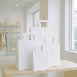
The delicacy of the cream: balance and light
When you decide to use the cream shade in your premium packaging, you are choosing a perfect balance between light and warmth, between elegance and cosiness. You realize that the cream is never aggressive on a visual level, but spreads a pleasant brightness that envelops the product like a caress. It is a nuance that suggests delicacy without losing authority and gives the container an aura that is both ethereal and reliable.
As you develop your packaging, you consider the cream as a vehicle to convey calm and authenticity. In a high-end rigid container, the cream generates a feeling of external softness that invites you to touch and discover. When the autumn light filters through the matte patinated or soft-touch surfaces, the color is transformed into a luminous veil that suggests a precious but not shouted product. You understand that this tone is particularly effective in the cosmetics, artisanal perfumery or luxury textile products sectors, where aesthetics and sensoriality are central.
Cream-coloured packaging works beautifully when paired with warm textures: recycled or velvety paper, lightly embossed cardstock or soft-touch coating lend tactile depth. The visual effect remains minimalist but the touch reveals care and depth, suggesting a quality that is perceived even before reading the name of the brand. This choice is not accidental: the contemporary consumer interprets neutral and matt surfaces as a sign of sustainability and design authenticity.
You know that there are brands that are embracing this direction in 2025, preferring neutral palettes such as cream, sand and powder rather than opting for bright white or cool tones, recognizing that consumers' emotional desires include the search for calm, authenticity and visual comfort. Creamy shades are often associated with values such as personal care, well-being and slow living, becoming ideal for packaging that wants to tell an inner world made of slowness and quality in a whisper.
You understand that color contrast can be achieved with subtle variations: a logo embossed on tone-on-tone cream paper remains elegant and legible, without altering the color harmony. Or you can play on light sand or powder accents on the inner lining or edges of the packaging. The packaging conceived in this way guides the eye in a fluid way, like a silent path towards the contents, letting the tactile sensation create the true emotional impact.
You rely on a material-conscious design: uncoated cream paper, certain boards with natural finishes, velvety inserts or matching fabrics add sensory layers. Creamy packaging thus communicates attention to detail and emotional value. It is a gesture of care that the modern consumer reads as a sign of premium value, because it conveys that every aspect is designed to be experienced with calm, tact and serenity.
Ultimately, the cream color becomes a powerful narrative tool for you: it allows you to create premium packaging that speaks of inner light, delicacy, authenticity. Minimalism is never cold or impersonal, but takes on body and feel through a tone that follows autumn, calm and sophistication.
Powder, the neutral that warms
When you decide to integrate powder into your premium packaging, you pave the way for a chromatic universe that combines delicacy and sophistication. That soft, dusty pink is not just a neutral: it's an emotional nuance that speaks of understated femininity, sophisticated touch, and quiet sophistication. Its presence is subtle, but capable of bringing a material energy that transforms the container into a visual caress. In many marketing insights of 2025, powder pink is recognized as the ideal shade to evoke tender but authoritative, sensitive but mature emotions, especially in areas such as cosmetics, niche perfumery or high-end gift packaging that escapes the stereotype of childish pink.
When you apply this shade to rigid boxes or inner cases, you imagine matte or velvety surfaces that radiate a soft light. The powder, while remaining neutral, vibrates with a slight pinkish undertone that lights up the observation without hitting. It works as an element of gentle contrast to sand or cream, creating a visual path that invites you to linger without causing chromatic disorder. You know well that powder conveys empathy, elegance and sincerity, when used sparingly and with design quality.
When you think about texture, you imagine lightly embossed or soft-touch surfaces that capture light unobtrusively. Powder on velvet, silk ribbon or slightly rough matt paper becomes a tactile invitation. Packaging becomes a sensory experience: touch anticipates emotion, shade anticipates content. This fusion of color and texture amplifies the perception of value, because by communicating care and lightness with legibility, it speaks of a product designed to last in emotions.
Aware of current trends, you know that powder falls into the category of desaturated neutrals that evoke nostalgia and refined reminiscence. Soft pastel palettes, such as dusty pink, are widely used in contemporary luxury packaging to evoke calm and sweetness without sacrificing visual composure. In this context, powder pink stands out for its narrative ability: it knows how to tell emotional care without appearing childish. It's ideal for projects where you want to connect calm aesthetics and high content.
In premium packaging, powder also works well as an internal element: imagine a powder interior that contrasts delicately with a cream or sand exterior, generating a surprise effect that remains in visual harmony. The chromatic harmony between powder, sand and cream becomes a flow, a balanced dialogue between warm tones that speak of shades rather than sharp contrasts. It is a visual strategy capable of enhancing branding without overload.
Even the logo or lettering can slowly dialogue with the powder. A dry-embossed logo on a tone-on-tone powder surface or a soft screen print on the powder edge creates silent elegance, legible but never intrusive. When the logo barely shines through the dusty shade, the message becomes sophisticated, collected, aware.
Powder pink is not just color: it is a symbol of measured refinement, of adult femininity that chooses evocative sobriety. In the premium autumn packaging, its presence dialogues with the soft light of the season, with natural materials and with attention to detail. When you choose powder, you choose visual empathy and emotional touch, tonal perfection and calm nature.
Ultimately, powder allows you to create premium packaging that speaks with a measured voice: it conveys calm, touch, authenticity. Your warm minimalism acquires body and delicacy.
Dove grey: the new grey packaging
When you choose taupe as the central shade of your premium packaging, you decide to work on a shade that combines refinement and sobriety with an almost material naturalness. Taupe is born from the union of the brightest gray with the warmest beige and has a silent but authoritative presence. It's not just a neutral color: it's a neutral that breathes warmth, chromatic richness and a sophisticated calm.
Apply taupe on matte or soft-touch surfaces to emphasise its tactile quality: recycled paper or rough cardboard takes on depth, and the colour seems to live on its own internal light. For you it is not just a supporting nuance, but a tone capable of dialoguing with other autumn colors without disfiguring, maintaining a visual balance that is always elegant. The perception of serenity and visual stability is immediate, as if the packaging became an area of emotional breathing.
Did you know that taupe has been recognized as one of the most versatile colors in contemporary design, appreciated both in interior and fashion for its ability to combine with other neutral and natural tones or even with more intense colors when it is necessary to alternate solidity and contrast. This versatility offers you wide design possibilities: you can combine taupe with sand and cream to create a harmonious continuum, or use it on external surfaces such as magnetic cases, with internal details in powder or cream to accentuate delicate touches.
Aware of its symbolic association with calm, discretion and sophistication, you rely on the taupe to convey a sense of understated but never detached elegance. Even when you use it as a background for the logo, you do it in a measured way: a tone-on-tone embossed print that remains legible but discreet, a minimalist embossing that respects visual harmony. You know that the consumer perceives such calibrated nuances as a sign of high quality and attention to design.
Research on packaging 2025 clearly indicates how earthy and calm shades, including taupe, are gaining ground precisely because of their evocative power combined with formal rigor. Monochromatic palettes based on warm neutrals are particularly effective in the luxury sector, because they communicate authentic sobriety without sacrificing the perception of exclusivity. You understand that taupe represents the perfect balance between contemporary style and sensory comfort, making it ideal for brands that want to talk about authentic elegance through packaging.
When integrating taupe into the packaging design, consider the light of the point of sale or the moment of unboxing: the average saturation of the color makes it stable under different lighting conditions, always returning a warm but never washed out tone. Every fold, every opening creates light shadows that enhance the thickness and craftsmanship of the material. The visual and tactile experience remains consistent, whatever the context.
You also rely on the idea that dove gray humanizes minimalism. In an environment where essential aesthetics risk appearing cold, dove gray brings warmth, rootedness and a sense of welcome. The packaging thus becomes a bridge between reason and touch, order and softness. The container not only protects, but welcomes, guides and reassures.
Ultimately, taupe is not a secondary color for you, it is a calm protagonist that maintains chromatic balance, emphasizes the design intention and responds perfectly to the philosophy of warm minimalism. Between sand and cream, it becomes a tonal fulcrum that generates harmony, visual authority and sophisticated authenticity.
Textures and materials: giving depth to the palette
When you incorporate textures and materials into your packaging design, you entrust shape and tactile sensation to the same chromatic narrative that guides the sand, cream, powder and taupe shades. These surfaces are not simple supports for color: they become tools to evoke sensory depth and experiential coherence. If you use natural uncoated paper or embossed cardboard enriched with soft-touch, you invite the consumer to feel calm and care even before opening the packaging. Consistency becomes a promise of quality, touch takes on narrative value.
Recent sources highlight that textured finishes such as soft-touch laminations, embossing or spot UV and light embossing, make premium packaging more memorable and sensorially robust. When choosing these finishes, you don't add decoration, but depth. A soft-touch cover on sand or cream amplifies the color, making it elegance that feels under your fingers. The use of tone-on-tone or very light raised UV embossing on taupe gives quiet authority without breaking the visual harmony.
Imagine surfaces reminiscent of velvet, linen or even the grain of wood, while remaining in a minimalist register. You can recreate these tactile sensations without exaggerating with decorative patterns, using printing techniques that simulate the feel of fine materials. Modern consumers tend to tie premium packaging to tactile sensation, not just sight, and this approach reinforces the perception of value and authenticity.
When you combine sustainable materials such as FSC-certified recycled papers or papers with post-consumer content, you support an aesthetic and ethical narrative at the same time. The packaging communicates calm, minimal aesthetics and respect for the environment. The natural texture becomes language: a light grain, a rough edge, a matte surface tell the story of the brand more than a glossy finish.
Choose material decisions that reflect the fall weather. Sand with soft-touch, velvety cream, rough or slightly embossed dove grey, powder with a subtle material rhythm: each surface transmits sensory temperatures and dialogues with the palette. Touch becomes the protagonist of the warm minimalist packaging, because no texture flaunts, but all suggest presence and thickness.
You think of unboxing as the brand's skin, as a tactile route: opening a case studded with different surfaces, perceiving the alternation between soft and rough, feeling the timid opening of the cream edge that reveals a velvety powder interior. It is a journey that uses color, material and texture as coordinates of an intentional experience.
Attentive to contemporary packaging trends, you know that the best projects focus on measured surfaces: minimal embossing, material soft-touch, hints of UV spot on neutral shades to define areas of interest without breaking the visual cleanliness. This type of texture does not compete with color, but accompanies it, amplifying its sensitivity, making the packaging refined and slowly perceptible.
When you combine materials such as grosgrain ribbons, linen inserts, small velvet panels or kraft paper with reliefs, you are building a coherent sensory ecosystem, where each element acts as a piece of a perceptual puzzle. Even if visually the design remains minimalist, the touch reveals the complexity of the project, the intentional care.
In conclusion, using textures and materials is crucial in warm minimalism: not to fill the space, but to interpret it. Each finish adds depth to the color, each surface suggests emotion. The premium packaging you choose becomes a tactile as well as visual story, an object that communicates with touch, light and warmth.
Essential branding: discreet logos and tone-on-tone printing
When you get to the topic of essential branding, your goal becomes to insert distinctive signs in a discreet but meaningful way. You want to make the presence of the brand felt without interrupting the visual harmony of the warm and neutral palette. The result is a logo that breathes air, that camouflages and reveals itself, that conveys belonging without screaming its existence. Through the balance between logo, print and materials, you build a silent dialogue with the viewer, a language that speaks of care and authenticity.
Your brand can emerge through techniques such as tone-on-tone dry printing or screen printing on sand or cream surfaces, where the logo almost seems to emerge from the material, without adding color. The lettering, when imprinted with precision and controlled legibility, becomes a sign of refined composure. Choosing to avoid contrasting colors or flashy foils allows you to maintain a clean and consistent footprint. In this way, the perception of the brand remains alive but silent, part of the tactile and visual sensation rather than a disturbing element.
When weighing logo placement, you give each element space and breath. You know that leaving air around the brand helps the eye feel it more strongly, even if visually it remains discreet. The packaging becomes an essential layout, where the negative space is not the absence of content, but added value. Research on contemporary design indicates that well-calibrated spacing increases the perception of quality and legibility, making the brand more memorable without crowding the surface.
If you think of other visual elements, imagine the logo accompanied by small icons or minimal descriptions, printed tone-on-tone with light nuances of taupe or powder on a sand or cream background, without breaking the chromatic uniformity. This approach keeps the focus on sensory experience and the idea of "less is more". Minimalist printing techniques such as matte hot-foil or light relief printing on a neutral base add depth without color, contributing to a controlled and elegant aesthetic.
Consciously apply consistent materials. If the surface is soft-touch or embossed, the logo is also welcomed by dry engraving or tone-on-tone embossing, so that the texture becomes a channel of recognition. Even when you decide to use a foil, you do it in a slightly darker or lighter shade than the color base, maintaining a whispered approach. In this way, the brand's signature is part of the sensory layering, without becoming the visual protagonist.
In the context of elegant and minimalist autumn, the silent branding dialogues perfectly with the warm palette. The logo doesn't scream, it blends in with the color gradation and suggests identity rather than imposing it. The premium packaging conceived in this way communicates: quality, authenticity, calibrated sophistication. The consistent choice to position the identifying sign with spatial balance reflects care, rigor and respect for the visual experience.
You've realized that essential branding is a matter of design skill, not renunciation. The tactfully inserted logo becomes an integral part of the unboxing experience, without breaking the harmony. It can appear on the inside edge of the box, on the closing flap, on the tone-on-tone ribbon, but always as a slightly whispered element. The consumer perceives it as part of the visual fabric and packaging material.
Ultimately, the essential branding in warm minimalism is the practical one that allows you to communicate presence with delicacy: your brand becomes an echo, a breath within a palette that knows how to excite with calm and sobriety. The identifying sign is legible but discreet, part of a sensory project designed to elevate the authority of the product without compromising its emotional coherence.
Thrill with less: autumn as inspiration
When we come to reflect on how warm minimalism translates into emotion, awareness, and authority, you're faced with an ending that is both aesthetic and philosophical. In a world where visual excess still dominates, you decide to invest in measured subtraction. You want every detail of the packaging to speak of calm, selection, care. It is not just a container: it is an invitation to slow down, to deepen, to feel. And autumn, with its earthy tones and golden light, becomes the perfect setting for this narrative.
You see packaging as a ritual and sensory experience. You want the unboxing gesture to be part of the perceived value. When the sand surface opens up to reveal the inside in a cream or powder tone, when you can touch soft-touch textures or barely hinted dove gray edges, the very act of discovering the contents becomes a visual and tactile story. The warm palette is declined as a chromatic rhythm that guides the attention and accompanies the touch, without breaking the visual silence that you have built with elegance.
You know that simply choosing a small palette can make packaging more memorable. Studies show that color consistency increases brand recognition and strengthens quality appreciation. When your packaging speaks in cleverly managed sand, cream, powder and taupe tones, it conveys authority. We don't need slogans, we don't need bright colors: the message is there, clear, silent, inclusive. The visual experience becomes ritual, engaging because it is coherent and reassuring.
In this final chapter we integrate aesthetic and ethical awareness. If you choose sustainable materials, FSC paper, recycled fibers, natural textures, packaging does not only tell about design but also about responsibility. Warm minimalism becomes an ethical manifesto: elegance that respects the environment, authenticity that chooses without exceeding. You communicate the value hidden between the folds of color and material: an object that is precious because it is simple, authentic because it is studied.
The autumn palette, in premium packaging, is thus transformed into a sensory journey. The color becomes an emotional scale between calm and hospitality, the texture sensory background that speaks of craftsmanship and care. Every opening, every chromatic thickness, tells of an idea, not of an empty style. In your project, packaging becomes a sensory language and a manifesto of emotional quality.
You've built a design that exerts charm without screaming. Warm minimalism knows no unnecessary visual overloads, but has presence, rigor and depth. The tone-on-tone closure, cut, seal also contribute to the experience. Packaging is not opened: it is experienced. And the experience, the one that lasts in the mind, remains imprinted as a slow, reflective, authentic gesture.
In conclusion, autumn is not just season. It is atmosphere, rhythm, pure chromatic presence and texture. Premium packaging that embraces warm minimalism dialogues with these natural and human elements. It communicates calm, authenticity, measured refinement. It conveys value with less, emotion with balance, authority with acceptance. It is an aesthetic and ethical project, a visual space that speaks of you, your product, your choice to design that silently excites.
In conclusion, we can say that when you conclude a packaging project inspired by warm minimalism, you realize that the path taken was not only aesthetic, but deeply strategic and sensory. You have carefully chosen every shade, every texture, every absence of superfluous decoration, letting the colors of the earth, the velvety tones of the autumn light, the surfaces that invite the touch do the talking. You have worked to ensure that packaging is no longer just a wrapper, but a calibrated experience that begins even before the product is revealed.
You have understood that packaging can become a story when it is coherent, measured, essential. The neutral palette — made of sand, cream, powder and dove gray — has assumed, in your hands, the role of silent narrator: it has become a metaphor for calm, authenticity, elegance that needs no words. The absence of clamor did not mean poverty of content, but richness of intention. In a world saturated with visual and chromatic stimuli, choosing silence, choosing shade, choosing whispered detail is an act of awareness.
You have moved along a thin border: between rigor and softness, between essentiality and involvement, between minimalism and warmth. And in this balance you have found a style that not only stands out, but remains. The warm minimalism you have applied is not ephemeral, it does not follow fashion to chase it, but crosses it and reinterprets it. It communicates authenticity to those who are ready to recognize it, reassures without imposing, invites without forcing.
You have created a dialogue between visual and sensory, between aesthetics and perceived value, between form and function. And that dialogue — so precise and so human — is what transforms a simple packaging into a brand tool, an identity signature, an invitation to intimacy with the product. It is a sign of design maturity and respect for the customer: respect for his time, his taste, his experience.
In a market that tends to shout, you have chosen to whisper. And precisely because of this, what you have built will not go unnoticed, but will be remembered. Because true elegance — like true quality — is the one that leaves space, breathes, and makes itself felt in silence.