Quiet luxury, citrus and digital teal are not just suggestive labels, but the perfect synthesis of what Spring 2026 asks of retail packaging. Let's imagine the moment when a customer enters the store, touches a box, observes a wrapper, crosses the colors of a window. Even before reading a logo or perceiving the scent of a product, it is the color that speaks, promises an experience, defines the tone of the relationship with the brand. The new season brings with it a clear question: to reassure, surprise and convey innovation, all in the same visual gesture.
In recent years, packaging has ceased to be a simple "dress" to become a full-fledged media. It is a powerful touchpoint, which works in the store, on the shelves, in the window, in the photos shared on social media. In this context, colour is not an aesthetic detail, but a strategic code: it enters the memory, builds recognisability, orients the perception of quality and sustainability. Spring 2026, more than other recent seasons, focuses precisely on this strategic dimension. On the one hand, consumers are looking for calm, well-being, continuity; on the other hand, they need stimuli, energy, clear signals of innovation. The answer lies in a new chromatic grammar that retailers can learn to use consciously.
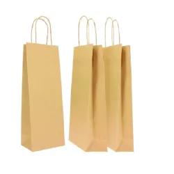
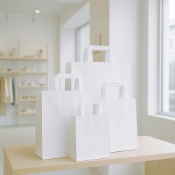
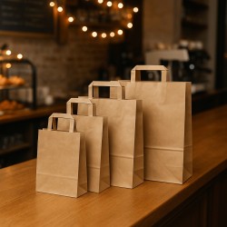
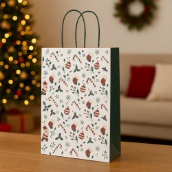
Quiet luxury is the first chapter of this grammar. We are talking about soft whites, warm neutrals, relaxing blues and blues that evoke natural light, quality fabrics, quiet and well-kept environments. It is not cold minimalism, but an enveloping, almost tactile sobriety, which transferred to the packaging translates into butter-colored papers, milk and linen shades, oatmeal and sand shades, powder blue that replace black with a gentler depth. For a shop it means declaring from the checkout counter a promise of care, of time dedicated to details, of products designed to last. In this color family, the packaging does not scream, but conquers for coherence, balance and a sense of implied quality.
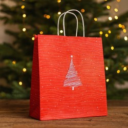
At the opposite end of the spectrum, citrus, citrus and sorbet colors light up, bringing a controlled discharge of energy to the store. Lemon yellows, mandarin oranges, papayas, sorbet roses and almost vitaminic accents do not serve to invade the entire scene, but to create points of visual attraction. A box border, a ribbon, an internal flap, a contrasting print on the wrapping can become a gesture of "dopamine" for the eyes, capable of transforming a simple gift package into an object that makes you smile. In Spring 2026, these colors are no longer linked only to the young or playful world: they also enter more adult contexts, dialogue with neutral bases and material materials, mix with the sobriety of quiet luxury to create contemporary, fresh and commercial palettes.
Between these two poles, like a chromatic bridge, is the digital teal. It is not the classic green nor a simple blue: it lives exactly in the border area between nature and technology. This is why it has become one of the key codes of the season. It evokes water, forests, the "botanical" dimension, but at the same time refers to digital interfaces, new platforms, artificial intelligence, sustainable innovation. Applied to packaging, it immediately tells the story of a brand that looks ahead without denying its environmental responsibility. It works for high-tech beauty and conscious skincare, for supplements and nutraceuticals, for next-generation food and beverage, for concept stores related to wellness and design. Combined with soft whites, warm neutrals or metal details, digital teal gives depth, modernity and a strong recognizability.
These three directions – quiet luxury, citrus and digital teal – should not be read as isolated trends or disposable palettes, but as tools with which to build a real point-of-sale color collection. Spring 2026 packaging does not just change shades "because it is fashionable": it works on layers, combinations, calibrated contrasts, to help the retailer tell its positioning, to segment product lines, to create consistent environments from the display to the checkout, from the window to the gift wrapping service. The customer perceives, perhaps without being able to explain it, when the colors "speak to each other", when the boxes dialogue with the papers and ribbons, when the entire experience is conceived as a unique visual story.
For those involved in retail, this means one thing above all: it is no longer enough to choose a "cute color" for the new season. We need a vision. We need to understand what emotions we want to activate, what promise we want to make, what values we want the packaging to express even before the sales staff has time to say a word. Quiet luxury helps to consolidate trust and perception of quality; citrus allow you to create peaks of attention and seasonality; Digital TEAL signs the vocation for responsible innovation. Played together, these codes allow you to build chromatic paths that guide the eye, organize the assortment, and make the experience memorable.
As ChartaRè, we have learned to read international color trends by filtering them through the real needs of those who manage a store every day. In these pages, we translate the big trends of Spring 2026 into concrete tools for choosing matching papers, boxes, ribbons and accessories, so as to transform packaging into a commercial ally, not just a cost. From the checkout counter to the shop window, there is only one goal: to ensure that, when the customer leaves the store with a package in his hands, that mix of quiet luxury, citrus and digital teal tells the right story, in the most effective and contemporary way possible.
Why color is strategic: Spring 2026 seen from the checkout counter
Spring 2026 asks retailers for a new awareness: color is no longer just an aesthetic choice, it is a strategic decision that is played out in a matter of seconds, right there where everything ends and begins again, at the checkout counter. It is the moment in which the product leaves the display dimension and becomes a "gift", a "thoughtful purchase", a "small daily luxury". It is the moment when the customer really observes the packaging, holds it in his hand, connects it to the value he perceives. In that instant, color tells who we are, how contemporary we are, how attentive we are to detail and the quality of the experience.
In recent years, purchasing behavior has changed profoundly. People come to the store after seeing pictures online, comparing prices, reading reviews. The physical store, to remain relevant, must offer something that digital cannot replicate: atmosphere, relationship, sensoriality. Packaging enters this game as one of the main players. The choice of a buttery paper or natural kraft, a deep blue box or citrus wrapper, a teal ribbon or a warm neutral tone is not marginal, because it defines the emotional tone with which the customer will walk out the door. A color can make a brand memorable, align it with the right trends, place it in an aspirational segment or relegate it to an indistinct, "already seen" area that is not remembered.
Spring 2026 is dominated by a double movement that the colors interpret with precision. On the one hand, there is the need for reassurance, visual calm, a silent luxury that does not flaunt but heals. This is where the quiet luxury palettes are born, made up of soft whites, warm neutrals, desaturated blues and greens that evoke home, well-being, natural light. On the other hand, there is still the need for energy, micro-doses of amazement, colors that ignite the mood. It is the territory of citrus, sorbet hues, yellows and oranges that seem to have been squeezed from fruit, vivid pinks capable of becoming accents and signatures of the season. In the middle, like a conceptual hinge, is the digital teal, that deep green-blue that speaks of nature and technology, sustainability and innovation, craftsmanship and the future.
For the retailer, reading these codes is not a theoretical exercise, but a commercial lever. A checkout counter set on a quiet luxury base immediately communicates reliability and widespread quality: butter-toned boxes, oatmeal papers, relaxing blue ribbons make you perceive order, coherence, care. The calibrated insertion of citrus details – a seal, a band, a box interior, a print on paper – creates the emotional peak, the smile, the feeling of seasonal freshness without distorting the identity of the store. A touch of digital teal, used on a selected line of packaging or on a thematic collection, projects the brand into the terrain of responsible innovation. Faced with these combinations, the customer does not analyze, but feels that "something works", that the image is contemporary and coherent.
Color also acts on a deeper level: it helps to mentally organize space and offering. Let's think of a store where gift boxes follow distinct palettes by category: quiet luxury tones for the more premium range, citrus notes for seasonal or more accessible products, digital teal for tech lines or linked to advanced well-being. The customer, without realizing it, navigates the assortment better, recognizes what is "new" more easily, clearly perceives the different price or value levels. The packaging becomes a chromatic map that guides, reassures, accompanies the choice, and the checkout counter is the point where this map is recomposed in the final gesture of wrapping.
The challenge of Spring 2026 lies precisely in keeping continuity and updating together. Many stores already have established color codes, often tied to the logo or brand story. No one is asking to abandon them, but to work in layers. The historical foundations can be maintained and the new shades of the season can be progressively introduced, using papers, boxes and ribbons to create accents, soft contrasts, new combinations that speak the language of quiet luxury, citrus and digital teal without breaking the existing identity. The underlying coherence remains intact, but the point of sale stops appearing "frozen in time" and begins to dialogue with international trends in a credible way.
In this scenario, packaging is no longer a last-minute variable, with choices dictated only by availability or price. Become part of a project. The question is not "what paper do I use to wrap this year", but "what story do I want to tell with the colors of my next sales season". Spring 2026 offers retailers a rich and precise palette: quiet luxury to build trust and perception of quality, citrus to bring light and energy to the assortment, digital teal to sign the relationship between innovation and responsibility. In the rest of the article we will go into detail about these three directions, translating them into practical palettes and concrete combinations of papers, boxes and ribbons. The goal is both simple and ambitious: to ensure that, seen from the checkout counter, Spring 2026 becomes an opportunity to transform color into a real competitive advantage for your store.
Quiet luxury: soft whites, warm neutrals and soothing blues for discreet elegance
Quiet luxury is much more than a trend: it is a change of language. It doesn't look for special effects, it doesn't chase the twist, it doesn't need giant logos to get noticed. He works in subtraction, entrusts the message to the quality of the materials, the consistency of the details, the softness of the colors. In Spring 2026, this approach also enters retail packaging decisively, becoming the preferred visual code for stores that want to communicate elegance, care and reliability without being cold or distant. It is the realm of soft whites, warm neutrals, relaxing blues that replace absolute black and shouted hues with a more sophisticated and "breathing" palette.
When we talk about quiet luxury in packaging, we are first of all talking about controlled brightness. White is no longer the optical, cold, almost artificial white, but a range of velvety whites reminiscent of cream, milk, natural fabrics. These are tones that we can imagine as Cloud Dancer, buttercream, chalk, modern ivory: shades that envelop the eye instead of dazzling it. On a gift box, on a counter card, on a rigid bag, these soft whites become a neutral and reassuring base on which every other sign – a logo, a graphic line, a border of color – acquires weight and meaning. The customer, taking a package in these tones in his hand, perceives immediacy and cleanliness, but without the detachment of clinical aesthetics.
Alongside whites, the real protagonists of quiet luxury are warm neutrals. Oatmeal, sand, light hazelnut, dove grey with a golden tip, soft greys that fade towards beige: these shades create a story of comfort, tactility, elevated everyday life. It is the color of the walls of a contemporary boutique, of the fabrics of a quality sofa, of the backgrounds of minimal sites that want to be welcoming, not icy. Translated into packaging, these warm neutrals work beautifully on alto thick papers, coated cardstock, rigid boxes, shopping bags with fabric handles. They allow you to place the store in a medio-high range without making noise, as if elegance were a given, not a shouted statement.
The other great color family of quiet luxury is that of relaxing blues. Instead of hard and absolute black, ink blue, midnight blue, washed blues enter the scene that preserve depth but lighten perception. A satin midnight blue on a box, combined with a butter interior or milk tissue paper, communicates an international elegance, suitable as much for fashion as for perfumery, jewellery and leather goods. Lighter blues, those reminiscent of filtered skies or calm water, enter wrapping paper and ribbons as gentle alternatives, perfect for shops that want to combine sophistication and freshness.
The strategic value of quiet luxury, for a retailer, lies in its ability to elevate the perception of quality of the store without creating detachment. Packaging built on soft whites, warm neutrals and relaxing blues never intimidates the customer: it accompanies him, makes him feel welcomed, suggests that the product he has purchased is "right", well chosen, in line with an idea of lasting beauty. At the same time, it allows you to better support medio-high price positions. A product wrapped in buttery paper, with a ribbon in deep blue and a discreet seal, is perceived as more valuable than the same product presented with aggressive colors or anonymous materials.
Then there is an aspect of environmental coherence that quiet luxury interprets very well. The palettes of soft whites and warm neutrals dialogue with the interiors of contemporary stores, often played on light woods, natural stones, linen-colored walls. When the packaging takes up these tones, the effect is that of an orchestrated environment, in which the window, displays, checkout counter and bags speak the same chromatic language. The customer perceives an "invisible direction" and automatically attributes a higher level of care and professionalism to the brand. It's not just about aesthetics: it's a way to make the experience memorable, because everything seems thought out, nothing appears random.
In the context of Spring 2026, however, quiet luxury is not synonymous with monotony. On the contrary, it works as a canvas on which to intervene selectively with seasonal accents. An oatmeal paper can be combined with a citrus ribbon or a teal detail without losing its elegance; A butter-white box can accommodate a tissue sheet inside in a soothing aqua blue or a barely hinted powder pink. The secret lies in keeping the heart of the palette on calm and deep tones, and using the brightest colors as notes, not as a base. In this way, the store manages to be contemporary and aligned with trends, but always recognizable and consistent with itself.
Another key element of quiet luxury is the dialogue between color and materials. Neutrality does not mean flatness. On the contrary, on a backdrop of refined whites and beiges, the differences in textures emerge better: embossed papers, soft-touch surfaces, cardboard with visible fibers, slightly opaque finishes that capture the light without reflecting it aggressively. In the customer's perception, these details make the difference: a butter-colored bag with a thin embossing and a deep blue cotton ribbon is perceived as a valuable object, almost to be preserved, not simply as packaging to be thrown away. Color, in this case, is the vehicle that puts the work on materials in the foreground.
Quiet luxury also lends itself to segmenting the different product lines within the same store in a refined way. You can imagine shades of white and neutral for the basic range, slightly deeper tones or more intense blues for the premium lines, small interventions of satin foil or tone-on-tone hot stamping for the special editions. The customer recognizes the levels without the need for explanation, guided by an intuitive color code, which does not need violent contrasts to make itself understood. This type of color language is particularly effective in contexts where products are not immediately comparable on a rational level, such as perfumes, gift items, fashion, accessories: when the choice is also emotional, packaging becomes a powerful orientation tool.
For us, looking ahead to 2026, quiet luxury represents the ideal basis on which to build the packaging collections dedicated to the most attentive retailers. It is a choice that is not afraid of the passage of time, because it does not rely on a single fashion color, but on a logic of harmony. It is a way of being in the market that tells the customer: here everything is thought out with measure, nothing is left to chance, your purchase is placed in a context cared for from start to finish. In the following chapters, when we enter the world of citrus and digital teal, we will see how this discreet elegance can coexist and dialogue with notes of energy and innovation, without ever losing its distinctive strength. Quiet luxury will remain the backdrop, the silent structure on which the colors of Spring 2026 will be able to dance in a credible and memorable way.
Citrus mood: yellows, oranges and sorbet pink for a packaging with high visual energy
If quiet luxury builds the calm and structured base of Spring 2026, the citrus mood is the controlled discharge of energy that lights up the gaze. It's the moment when the colors stop whispering and start smiling. Lemon yellows, pollen yellows, mandarin oranges and papayas, sorbet pink, coral and fruity nuances enter retail packaging as small doses of liquid light. They are not "shouted" colors in the traditional sense; They are bright, vitaminic shades, designed to attract attention in a positive, almost playful way, without falling into excess. For a store, including them in its packaging collection means working on the most emotional dimension of the purchase, the one that transforms a package into an instinctively "happy" object.
The imagery from which these colors are born is clear: squeezed citrus fruits, summer granitas, sorbets served in the shade, sunsets that turn from gold to coral. Spring 2026 translates these suggestions into a fresh palette, which moves between bright but not acidic yellows, full but refined oranges, pinks that have lost the naivety of the childish pastel and acquired the maturity of a creamy sorbet. The result is a chromatic family that immediately conveys energy, dynamism, and the desire to feel good. Inside the store, these colors function as visual beacons: they guide the eye to a display, highlight a new collection, mark the seasonality of an offer.
The real strength of the citrus mood, for a retailer, however, lies in the way it dialogues with the neutral bases of quiet luxury. Placed on butter, oatmeal, sand, linen backgrounds, these yellows and oranges are never aggressive. A pollen yellow ribbon on a cream-colored box, a papaya print on a greige paper, a sorbet pink box interior combined with a nude exterior: these are examples of how a lively and contemporary effect can be achieved without sacrificing the perception of quality. It is precisely this balance that makes the difference in 2026. Citrus is no longer a "cheap" or exclusive color of young brands, but a grammar of accent that the most advanced stores use with awareness to make their image more dynamic.
From a psychological point of view, citrus colors work on some fundamental registers for retail. Yellow, in its softest forms, is associated with light, optimism, the idea of the day that begins. Orange recalls conviviality, warmth, social energy. Pink sorbet introduces a dimension of pleasure and self-care, combined with a lightness that is not superficial, but relaxed. Bringing these feelings into the packaging means accompanying the customer beyond the simple "I bought something": the package becomes a symbol of a positive moment, of a gift to oneself or to others that has an explicit element of joy. In this sense, the citrus mood is a powerful ally in campaigns designed to celebrate spring, the beginning of summer, passing events and all those occasions when the store wants to communicate openness and vitality.
In retail packaging, citrus products are at their best when they are thought of as tools of visual hierarchy. We can imagine a store that maintains the main structure of the packaging in quiet luxury tones, but uses yellows and oranges to identify some categories: the season's novelties, limited edition products, younger or more accessible lines. A display of all-neutral boxes, with some lemon yellow or papaya elements cleverly inserted, allows the customer to immediately recognize where "something is happening", where the fresh proposals or gift ideas designed for spring are concentrated. It is a strategy that works on the same visual logic as well-designed shop windows and displays: color is not decoration, but emotional signage.
Citrus lends themselves particularly well to entering into dialogue with certain product categories. In the world of food and gourmet, yellows and oranges immediately evoke ingredients, spices, citrus fruits, honey, saffron, golden leavened products. A box for Easter cakes, for artisanal biscuits, for teas and spring infusions, for alto oils and condiments, gains strength if a citrus detail appears on a natural base. In the beauty sector, sorbet pinks and soft corals are perfect for lines dedicated to the body, light perfumes, "fresh" skincare products. In fashion and accessories, the same colors can emphasize capsule collections, summer micro-collections, products designed for travel and weekends. In all these cases, the citrus mood creates an immediate bridge between the product and the seasonal imagery around us.
Another interesting aspect of the citrus palette is its ability to work on the playful dimension without compromising the seriousness of the brand. Many stores fear bright colors because they associate them with a low-premium positioning. Spring 2026 shows that it is exactly the opposite, if the chromatic work is well calibrated. A warm yellow ribbon on a minimal ivory box, a coral adhesive band that closes a melamine kraft paper, a sorbet pink label with essential typography can be more sophisticated than completely neutral packaging. The play lies in the contrast between sober structure and lively detail, between material base and luminous accent. The brand continues to talk about quality, but also shows a certain lightness, an ability to smile, not to take itself too seriously.
The citrus mood is also a very effective tool for working on the theme of seasonality. Not all stores can afford to completely change their packaging every season, but almost all can introduce temporary "color capsules." A series of citrus ribbons, a set of coordinated papers with light prints inspired by fruits, a range of limited-size boxes with citrus inserts can become, for a few months, the signature of spring. At the end of the season, the store can return to the basic palette or choose to keep some elements that have proven to be particularly effective. In this way, the packaging follows the rhythm of the year without tearing, with a low investment and a great visual performance.
Finally, there is the social dimension to consider. Citrusy packaging works great in photographs. Yellows and oranges can be read perfectly on screens, stand out against neutral backgrounds, attract attention in stories and posts, become recognizable in the continuous scroll of the feed. A package with a citrus detail is easier to remember and more likely to share. For a retailer that also thrives on online visibility, this is a lever that should not be underestimated: packaging is not only what the customer takes home, but also what can appear in a photo, in a reel, in a review. Incorporating the citrus mood into the packaging collection therefore means working in synergy between physical and digital, between checkout counter and social showcase.
As ChartaRè, we read the citrus mood as an invitation to design packaging tools that have a structural "dose of spring" inside. Ready-to-use boxes with citrus interiors or details, coordinated papers that dialogue with warm neutrals, ribbons in the citrus range designed to match both soft whites and digital teals, solutions for food, beauty and gifts that allow the retailer to play with the light of colors without sacrificing their identity. In the following chapters we will enter even more into the territory of teal tones and tech-natural palettes, but it is important to make one point: in Spring 2026, the discreet elegance of quiet luxury and the sunny vitality of the citrus mood are not irreconcilable opposites. They are two voices in the same chromatic story, which retail packaging can orchestrate to build consistent and memorable experiences, both in the store and in the hands of the customer who leaves with a package that "tastes of light".
Digital teal and new tech nuances: when packaging speaks of sustainable innovation
Of all the shades that Spring 2026 brings to the forefront, digital teal is probably the one that best defines the spirit of the time. It is a border color, suspended between blue and green, capable of evoking the screen of a device and the depth of a lake, the interface of an app and the undergrowth after the rain at the same time. It's not a detail: this ambivalence is exactly what consumers are looking for in the brands they choose today. They want innovation, technology, advanced formulas, fast services. But they want them within a framework of responsibility, respect for the environment, authenticity. Digital teal thus becomes the ideal visual code to tell the story of "sustainable innovation", where the future does not erase nature, but integrates it.
In retail packaging, this colour takes on a precise function. When it appears on a box, on a bag, on a graphic band, it immediately suggests that that product has something different: a selected active ingredient, a more efficient production process, a link with the digital world, a promise of superior performance. It is a signal that speaks to a generation accustomed to app interfaces, the fluidity of dashboards, the smooth transitions of screens. Digital teal recalls that imagery, but moving it to physical supports: paper, cardboard, tactile surfaces that anchor technology to a concrete sensory dimension.
Alongside teal, Spring 2026 brings a whole constellation of tech nuances to the stage. Aura blue and hazy blues that seem to expand like a soft light. Milky mint greens that seem to be filtered by a layer of digital opacity. Steel grays and soft silvers, less industrial and more sophisticated, which act as a bridge with the world of technological devices and accessories. These shades do not scream futurism, but build a "soft tech" aesthetic, where technology is present, but is presented in a gentle, inclusive, legible way. The packaging that works with these color ranges manages to be advanced without being cold, contemporary without sacrificing the feeling of comfort.
In this context, dialogue with the palettes of quiet luxury is fundamental. If digital teal were used on glossy black backgrounds or combined with extreme contrasts, it would risk slipping into too aggressive, almost cyber language. Spring 2026, on the other hand, offers another model: teal combined with soft whites, warm neutrals, beiges and oatmeal, in order to maintain the link with the human, domestic, tactile dimension. A butter-toned box with a teal edge, a sandbag with blue-green graphics, a milk paper with a tech blue pattern: these are examples of how packaging can speak of the future while remaining welcoming, perfectly integrated into the store experience we already know.
On the other hand, digital teal also relates to the citrus mood, but in a different way. If the yellows and sorbet oranges bring an immediate sunlight, the teal adds depth, structure, a sense of continuity. Together they build palettes that seem to have been taken from a well-designed dashboard: areas of evidence in pollen yellow or papaya orange, information fields in teal and blue aura, neutral backgrounds that keep everything in balance. Translated into packaging, it means being able to segment the lines: citrus accents for the most playful or seasonal products, teal for the ranges most linked to performance, self-care, innovation. The customer, even without realizing it, perceives a chromatic order that helps him to orient himself.
There are many categories that can benefit most from these tech nuances. In cosmetics and skincare, digital teal is perfect for lines that combine botany and science, natural ingredients and cutting-edge research. A matte teal box with an ivory interior, a warm white box with vertical blue-green bands, a teal ribbon on an otherwise neutral packaging immediately tell of a "clean, high-tech, conscious" positioning. In the world of nutraceuticals and advanced wellness, the same color code helps to distinguish supplements, superfoods, functional products from more traditional proposals, without resorting to the often inflated language of the most obvious "eco" greens. In food and beverage, teal and blue-green tech are linked to water, functional drinks, "light" lines and those with a strong storytelling linked to well-being. In stores that deal with technological accessories, objects for the connected home, digital gadgets, these palettes build a continuity between the product and its packaging, reducing the distance between the digital interface and the physical packaging.
The role of finishes, when it comes to tech colors, is decisive. The teal tint itself completely changes perception depending on how it is presented. A matte and soft-touch surface immediately recalls the latest generation smartphones, premium laptops, the objects we associate with high-end technology. A slightly satin, almost iridescent finish brings the perception closer to the world of water, light, air. A glossy detail on a matte background, perhaps in correspondence with the logo or a graphic line, suggests precision, attention to detail, almost engineering care. In this game of subtle contrasts, packaging can evoke the experience of using a device, while remaining a simple box, a box, a bag.
Another typical element of tech nuances is the presence of graphic signs that metaphorically recall the digital world: thin lines, micro-patterns inspired by circuits, delicate screens, grids that organize information, clean and legible typographies. On a teal or blue-green basis, these elements produce a "printed interface" effect, where the packaging seems to dialogue with what the customer has already seen online. It's a particularly effective strategy for those stores that have a strong digital presence and want to align physical and online. The customer subconsciously recognizes the same visual language, and feels that the experience is consistent from the site to the checkout, from the e-commerce to the package he takes home.
Talking about tech nuances in 2026 inevitably also means talking about sustainability. Technology is no longer perceived only as progress, but also as a tool to reduce impacts, optimize processes, limit waste. Digital teal interprets this passage: it is not an artificial neon, but a "breathing" color, which carries within the memory of water and leaves. For the message to be credible, however, the color choice must be supported by consistent materials. Recycled or recyclable papers, certified cardboard, mono-material structures, reduction of the superfluous become an integral part of the narrative. Digital teal packaging that proclaims sustainability but uses materials that are difficult to dispose of risks being perceived as a mask. On the contrary, when color and matter tell the same story, the result is powerful and persuasive.
For the retailer, tech nuances also represent an opportunity to better organize their in-store offering. You can identify real chromatic "islands" dedicated to innovation: a corner where the packaging plays on teal, aura blue, steel grays and soft whites, reserved for the most experimental lines, emerging brands, products that incorporate new technologies. The customer learns to recognize this visual code as an invitation to discovery, to curiosity. At the same time, the controlled use of digital teal on checkout packaging, bags, gift wrapping allows this image to be transferred to the entire store, with a perceived modernization effect that does not require structural interventions on the furnishings.
Even in the social dimension, digital teal and tech palettes prove to be valuable allies. They are colors that photograph well, stand out in feeds without being aggressive, create a recognizable visual identity among the often saturated tones of generic content. A teal package on a neutral table, a butter-white box with a blue-green band, a ribbon that intercepts the light and returns a technological nuance become perfect materials for reels, stories, photographic content. Packaging stops being just a "container" and becomes an object to be shown, to be told, to be associated with the brand at every point of contact.
As ChartaRè, we read digital teal and the new tech nuances as a tool to relate three needs that coexist in retail today: to appear contemporary, to communicate value and to reassure about environmental responsibility. The packaging collections we are developing for Spring 2026 go precisely in this direction: neutral bases and quiet luxury on which to graft teal, soft blue-greens and measured metallic details; combinations that allow the retailer to update its image without tears, introducing a technological but perfectly habitable chromatic grammar. In the next chapter, we will move on to matcha greens, botanical and natural, to explore how the more organic dimension of the 2026 palette can dialogue with this digital side, completing the narrative of a packaging that knows how to look ahead while remaining deeply connected to matter and nature.
From the palette to the in-store proposal: combining papers, boxes and ribbons for Spring 2026
At some point the mood boards have to get off the table and get to the checkout counter. Spring 2026 lives exactly in this step: transforming abstract palettes into concrete combinations of papers, boxes and ribbons that really work in the store, with the constraints of space, budget, stock management and, above all, with the eyes of customers who observe, touch, judge in a few seconds. So far we have talked about quiet luxury, citrus, digital teal and botanical greens as great chromatic families. Now the theme becomes another: how to orchestrate these colors in the packaging, so that the point of sale does not seem like a sum of random choices, but a coherent, recognizable and easy-to-manage color collection.
The first step is to choose a base. Not a single color, but a "background family" that becomes the common thread of the packaging, beyond the seasons. Spring 2026 strongly suggests working with soft whites, warm neutrals and oatmeal shades as the main structure. In practice, it means deciding that large surfaces – the most important boxes, the prevailing counter papers, the everyday shopping bags – will live in that calm and bright chromatic area that we have associated with quiet luxury. It is a choice that pays off over time, because it builds memory. The customer learns to recognize the store by that feeling of soft light, warm background, discreet elegance, and on this backdrop we can place, season after season, all the accents we want.
Once the base has been defined, layering comes into play. Papers, boxes and ribbons do not all have to "shout" the same message; they must dialogue. The paper that wraps the product is often the first visual and tactile contact and occupies the largest portion of the space. For this reason, on counter paper or gift paper it makes sense to bring to life the neutral tones and softer shades of the palette: butter, linen, oatmeal, warm grays, sometimes a desaturated matcha green or a very light blue if the positioning is colder and minimal. Boxes, especially the rigid and more structured ones, can start to move the needle slightly towards the characterizing colors of the brand or the season, remaining in balance. Finally, ribbons, package closures, adhesive labels and box interiors are the natural place to release citrus, digital teal, and the most decisive botanical greens.
Let's imagine the gesture of wrapping as a conscious superimposition. First you spread the paper in a light and soft shade, which makes everything agree. Then the box enters, which can take on a more declared role: it can be in relaxing blue to evoke quiet luxury, in matcha to talk about natural well-being, in teal to sign innovation. Finally, the citrus ribbon or seal adds the spark of the season, that citrus note that makes the package immediately current. In this way, each component performs a precise function: the paper reassures, the box positions, the seasonal color detail surprises. The result is a balanced composition, which does not depend on the whim of the moment but on a clear scheme.
By taking this approach into practice, you can think about how to differentiate the proposals according to the type of store. In a women's fashion boutique working on sophisticated imagery, the cards might stick to buttery whites and warm neutrals, the boxes play with dusty pinks, deep blues and sage greens, while citrus ribbons appear only on certain capsules, special collections or seasonal selections. The more traditional customer will continue to recognize himself in the sober elegance of the neutral wrapping, while those looking for something more contemporary will naturally be attracted by the packaging in which citrus or teal tones appear. In the same logic, a perfumery or a boutique spa could decide to bring matcha greens and spa-blues to life on the boxes and cases, keeping the shoppers in cream and linen tones and using small teal or soft coral details to segment the most innovative lines.
Food and gourmet work on other strings, but the logic does not change. Here, melamine coated kraft papers, warm neutrals and "bread and honey" tones are natural bases. Boxes for sweets, biscuits, special occasions can light up the citrus on lids, on the edges, on the interiors, while bottle boxes and boxes for wine and spirits find the ideal companions in deep blues, tobacco and dark greens. The ribbons, in this scenario, become the device of the season: citrus for Spring 2026, warmer and spicier in the following seasons, always in dialogue with a structure that remains stable. The shop, in the eyes of the customer, appears coherent but never immobile; Each visit offers a variation on the theme, not a radical change.
The role of sizes and formats deserves a separate chapter. The smaller sizes – bijoux boxes, slim cases, mini shoppers – are perfect for experimenting with bolder palettes without distorting the overall image. A totally teal mini box, a full citrus box, an intense botanical green box can coexist without problems in a context where shopping bags and paper remain neutral. The larger sizes, which dominate the visual space in the store and in the window, require more discipline: more neutral, quieter luxury, more attention to soft combinations. It is an unwritten but effective rule: the larger the surface, the more the color must be "breathing"; The smaller the element, the more you can afford to push the intensity.
The customer journey within the store can also be translated into color terms. An entrance area that works more on neutrals and soothing blues creates a threshold of calm. As you get closer to the checkout counter, citrus details and teal presences can increase, especially on ready-to-use packaging materials. In the gift area or near thematic displays, matcha greens and botanicals can define an area of well-being and care. The customer will not perceive this direction as a rigid system, but will feel that the colors change organically, accompanying the experience. When the package is then prepared, the mix of paper, box and ribbon will become a portable synthesis of the path taken in the store.
On a management level, building a reasoned color collection also means simplifying the life of those who run the store every day. Fewer random combinations, more clear protocols. For example, some unwritten but shared internal rules can be defined: premium products always receive boxes in quiet luxury tones with teal or plum details, young or seasonal lines are wrapped favoring citrus ribbons, proposals related to well-being take precedence over matcha and botanical greens. This does not take away the freedom of choice of the staff, but offers a reference grid that makes the overall image more cohesive and recognizable, even when different people with different tastes alternate behind the counter.
Finally, there is the shared visual dimension, the one that continues outside the store. Packaging designed for Spring 2026 does not live only on the checkout counter, but in the window, on social media, in customers' homes. If papers, boxes and ribbons have been designed as a coherent collection, every photo, every story, every spontaneous sharing will become a piece of a larger story. An oatmeal paper with citrus ribbon will be recognized from a distance, a teal box on a neutral background will immediately refer to the idea of sustainable innovation, a matcha box with cream interiors will be associated with a certain way of understanding well-being and care. The store will not have simply "chosen colors", but built a chromatic lexicon that customers will learn to read over time.
Our job, in this perspective, is precisely to accompany retailers in this transition from the abstract palette to the concrete proposal. We design families of papers, boxes and ribbons that are already created to be combined with each other, with neutral ranges ready to serve as a base and citrus, teal and botanical accents calibrated for Spring 2026. The goal is always the same: to allow each store to transform its packaging into a recognizable, functional, easy-to-manage color collection. In the following chapters, we will go even further into the merits of how to build a true "ChartaRè color collection" over time, capable of going through the seasons by updating, but without ever losing that narrative thread that makes each store unique.
How to build your "color collection" with ChartaRè packaging solutions
At this point, Spring 2026 is no longer just a theoretical palette of quiet luxury, citrus, digital teal and botanical greens. It is a concrete material, which must become papers, boxes, shoppers, ribbons, tangible details in the hands of customers. This is where the idea of a "color collection" comes into play: not a series of isolated choices season by season, but a system, a stable visual grammar that the store can use, update and evolve over time. Building a color collection means deciding how the store wants to present itself today and tomorrow, and using packaging as the main tool to tell it.
The first awareness to mature is that the color collection does not coincide with "the color of the moment". The seasonal trend is an ingredient, not the whole recipe. An effective color collection is based on a structure that remains recognizable, regardless of what happens on the catwalks or in international forecasts. In practice, every store needs a chromatic base that supports the brand identity and some accents that change, light up and off, accompanying the seasons. This architecture allows you to be contemporary without compulsively chasing fashion, and above all avoids the risk of finding yourself, after a few months, with a packaging warehouse that no longer represents the store.
We see this structure as a real "chromatic cabinet" of the store. In the stable part live the soft whites, the warm neutrals, the relaxing blues of quiet luxury: the main papers, the universal shopping bags, the neutral boxes that work all year round. The accents of the season are grafted onto this backdrop: citrus to bring light and energy, digital teal to sign innovation, matcha and botanical greens to tell about care and well-being. Spring 2026 is the ideal time to set up this color cabinet with lucidity: define what remains, what goes in and what, if any, the time has come to let go.
To make this logic operational, the starting point is always the same: the DNA of the store. Who enters, what kind of products they buy, what price medio they spend, what atmosphere they are looking for. Hence the choice of the neutral base, which is the heart of the color collection. A concept store with a contemporary taste will be able to push towards buttery whites, oatmeal and powder blues; a boutique-perfumery may prefer a mix of cream, nude and sage greens; A gourmet shop will find it natural to start with melamine faced kraft, warm beige and light tobacco. ChartaRè solutions for papers, shopping bags and boxes in these chromatic areas are designed precisely to become a "backdrop": silent, elegant, perfect for accommodating any type of product and for dialoguing with furnishings, lights, shop windows.
Once the base is consolidated, it is time to work on the next layers. Citrus, teal and botanical accents should not be experienced as a revolution, but as color capsules to be inserted in the right places. We imagine them, for example, on ribbons, on package seals, on decorative papers, on the inside of boxes, on some selected references of boxes or cases. The idea is that it only takes a few changes to update the perception of the store. A series of citrus ribbons coordinated with basic neutrals and matcha greens, some teal boxes dedicated to the most innovative lines, a few box formats or botanical shopping bags for products related to well-being already build a readable Spring 2026, without distorting the whole.
The product families we offer – cards, shoppers, boxes, ribbons and matching accessories – are developed as modules of a single system. An oatmeal card can dialogue with a butter shopper and a relaxing blue box, closed by a papaya ribbon or a teal seal; A fog green paper can find its natural completion in an ivory box and a natural ribbon with a thin matcha colored border. When we design these lines, our goal is not only aesthetic: we want the retailer to be able to build, with a few well-chosen codes, a potentially infinite amount of coherent combinations. This is what transforms a series of packaging items into a true color collection.
Then there is the more practical but decisive issue of management. A well-thought-out colour collection allows you to reduce the number of references without impoverishing the image. By choosing a few solid bases and a few focused accents, the store can cover all packaging occasions, from small daily purchases to important gifts, from seasonal capsules to special events. In this perspective, ChartaRè solutions are designed by scale: the same colour range declined on different sizes of boxes, on shopping bags of different sizes, on ribbons of various heights. The result is a color matrix where each expense item works in synergy with the others, rather than generating fragmentation.
The color packaging collection does not live only in the physical perimeter of the store, but naturally extends to digital. The same palettes that define papers, boxes and ribbons can become the basis for photo shoots, social content, graphics for newsletters, landing pages for seasonal campaigns. When we design a Spring 2026 packaging set, we don't just think about the effect at the checkout counter, but also about the impact on a screen. A butter package with citrus ribbon photographed on a neutral background works perfectly on Instagram; a teal box on oatmeal paper creates a recognizable image in a newsletter; A botanical green shopper next to a pot of plants becomes an ideal content to tell the "green" dimension of the store. In this sense, the color collection is transformed into a true system of visual identity, which holds together physical and digital.
Another central element is the possibility of growing step by step. You don't need to rewrite the packaging from scratch to build your own ChartaRè color collection. Often it is enough to identify a few key interventions: replacing a paper that is too cold with a more current neutral warm, introducing a family of citrus ribbons for the season, inserting a line of teal boxes for innovative products, adding a few formats in matcha green for the wellness range. Over time, these pieces build a new chromatic story, without waste and without sudden rejections. We work so that each new reference can dialogue with the previous ones, so that the store can evolve its image while always maintaining continuity.
Behind this vision there is a constant work of reading trends and translating them into concrete solutions. We look at international palettes, changes in taste, consumer demands, and filter them to make the retailer's choices simpler, not more complicated. Quiet luxury, citrus, digital teal, botanical greens are not abstract labels for us, but guidelines that we use to design colors, finishes, textures, formats. When a store chooses a set of ChartaRè papers, boxes and ribbons for Spring 2026, it does not only buy materials: it adopts a part of this chromatic direction work, readily applicable to its context.
Ultimately, building a color collection with ChartaRè packaging solutions means making a quantum leap in the way you think about the packaging itself. No longer "what paper we will use this year", but "what role we assign to color in our relationship with customers". Spring 2026, with its balance between quiet luxury, citrus and digital teal, is a perfect season to make this transition. The packaging can become a coherent story that the customer recognizes at a glance: a soft backdrop, an elegant structure, a spark of citrus light, a blue-green sign that speaks of the future, a matcha shade that evokes care. We provide the tools, the paddles, the combinations. The store has the most fascinating task: to bring this color collection to life every day, behind the counter and in the hands of those who leave with a package that tells the story of Spring 2026 long before it is unwrapped.
Spring 2026 gives us back a certainty: color is no longer an aesthetic detail to be delegated to the last minute, but a strategic lever that runs through the entire customer experience, from the first glance in the window to the moment the package is placed on the table at home and calmly unwrapped. Quiet luxury, citrus, digital teal, matcha greens and botanicals are not just trend labels: they are tools, visual codes that allow retailers to tell who they are, how they understand their work, what kind of relationship they want to build with those who enter the store.
Quiet luxury, with its soft whites, warm neutrals and soothing blues, offers a solid and lasting foundation. It is the language of discreet elegance, of care that does not need to scream, of quality that is felt in the hands even before being read on a card. Citrus fruits bring light, energy and smile, transform the wrapping into a gesture of vitality, make spring readable at a glance without ever falling into excess. Digital teal opens a bridge between nature and technology, between the physical and digital worlds, and allows packaging to speak of innovation and responsibility at the same time. Matcha and botanical greens give substance to the dimension of well-being and care, evoke daily rituals, conscious choices, an approach to sustainability that is not a slogan, but a lifestyle.
When these codes are translated into cards, boxes, shopping bags and ribbons, packaging stops being a simple container and becomes a system. This is where the concept of "color collection" takes on its fullest meaning: a visual architecture that holds together store identity, international trends, management needs and customer desires. A well-calibrated neutral base, some intelligently chosen accents, sizes and finishes designed to dialogue with each other: from this alchemy comes a recognizable image, which remains consistent over time even as the seasonal details change.
For the retailer, the challenge of the next few years will not be "guessing the right color", but learning to govern color as a real brand language. It will mean asking yourself not only if a certain tone is fashionable, but what emotion it conveys, what promise it suggests, what role it plays within the purchase journey. A package in quiet luxury speaks of trust and continuity, a citrus accent tells of freshness and desire for novelty, a teal sign indicates that the store looks ahead, a matcha green hints at an idea of well-being and respect for the material. Put together, this color vocabulary builds a story that the customer will read before they even hear any arguments.
The role of ChartaRè, in this scenario, is to make all this not only possible, but simple. Translating Spring 2026 palettes into concrete, coordinated and easy-to-use packaging solutions means giving retailers tools ready to be orchestrated in-store without the need for an in-house creative department. Every paper, every box, every ribbon is born already designed to fit into a system, to dialogue with the rest of the range, to become a piece of a personal and recognizable color collection. It is an invisible directorial work, which however makes a big difference in the final perception of the client.
After all, packaging is a store's way of saying "thank you" to those who have chosen to buy. It is the last physical contact with the brand before the product enters everyday life. Deciding what we want it to tell – an elegant calm, a bright spring, responsible innovation, authentic care – is a choice that can no longer be left to chance. Spring 2026 offers a rich, sophisticated, and consistent palette. It is up to retailers to seize it, make it their own, decline it according to their own style, build step by step that color collection that, at a certain point, will become immediately recognizable in the eyes of customers.
We continue to work so that, behind every package that leaves a store, there is not only a beautiful color, but a thought. A project. A story that begins well before it is discarded. And if the future of retail also passes through the silent strength of a well-made box and a carefully chosen ribbon, Spring 2026 is the ideal time to start writing it, color by color.