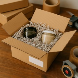
In everyday packaging, real innovation is not a "fashionable" material, but a solution that works every day on the counter, in the warehouse and in the hands of those who open the package. Honeycomb paper was created exactly with this goal: to transform a simple, mono-material and legible support into a protection system capable of wrapping, blocking and presenting the product in an orderly way. Where bubble wrap brings "encapsulated" air and requires compromises on the end of life, the hexagonal lattice brings geometry: it expands when needed, adheres to shapes, reduces accessory materials and speaks a language of sustainability that the customer understands at first glance.
In a context where operational speed and brand image weigh as much as the security of the content, honeycomb offers a rare balance. It takes up little space at rest and becomes thick only in use, makes the workstation more fluid and standardizes the operator's gesture, simplifies downstream delivery because everything remains in the paper family. It's not an "eco" compromise that sacrifices performance: it's a different way of achieving the same protection with higher efficiency and cleaner unboxing.
This guide is designed to give you practical criteria and a clear technical vision. We will go into the functioning of the texture, the reasons why it is the sustainable alternative to bubble wrap, an honest comparison with other solutions, the format choices that really make the job faster, the use cases for cosmetics, wine, ceramics and home décor, up to the direction of the opening experience. The goal is simple: to help you build a more coherent, more readable and more effective packaging, where protection is a fact and sustainability a consequence.
What is honeycomb paper and how does it work
When we talk about honeycomb paper, we mean a roll of die-cut kraft paper with micro-cuts that, under slight traction, opens into a three-dimensional hexagonal cell structure. The transformation is immediate: from a flat material to a spatial grid, capable of adhering to surfaces, blocking the object and absorbing part of the impact energy. The difference compared to any paper lies not only in the fiber, but above all in the geometry of the cuts, arranged in such a way as to generate elastic walls and cavities when the weave expands.
In use, the material flows from the dispenser and the mesh takes shape. As traction increases, the cells lengthen and become more airy; with less traction they remain compact and close together. In practice, the density of the reticle is modulated with the gesture, and it is here that the paper shows its intelligence: more contact where grip is needed, more "air" where it is needed to cushion. By overlapping the layers, the cells fit together in an interlock effect that generates friction and stability; Often the winding closure requires little or no tape, resulting in a clean and consistent result with a sustainable image.
Protection arises from three phenomena that work together: the distribution of the load on the hexagonal walls, the friction between the layers and the elastic micro-deformation of the weft. On bottles, ceramics, cosmetics or home décor accessories, the impact is not concentrated in one point but is distributed over many small walls that flex and dissipate the energy. If the item has sharp edges or very delicate finishes, just increase the turns in critical areas or insert a sheet of tissue paper in contact to facilitate the initial sliding and reduce micro-marks. The entire process remains linear and repeatable on the packaging bench.
The paper used is generally a long-fiber kraft, selected for tensile strength and tear strength. It can be natural or slightly embossed, virgin or recycled - the point is to find the right balance between handling and robustness. A base that is too rigid makes expansion laborious, one that is too light loses cohesion when subjected to traction and stratification. The natural finish also contributes to grip, that "bite" that keeps the coating in place on glass, smooth plastic or glossy paints, as long as you maintain constant traction and a smooth overlap.
The dispenser, often considered a detail, actually affects the quality of the result. Even in the most compact versions, it guides the roll, accompanies expansion and helps to preform the cells before contact with the product. In workstations with a fast pace, the smoothness at the exit reduces tearing, evens out the weft and limits waste during cutting. In practice, the first starting spiral is more "closed", to ensure grip; Then you move on to a greater expansion, so as to create thickness where you need it and not add unnecessary volume where you don't.
From a mechanical point of view, the mesh behaves like an adaptive mantle. It follows irregular shapes without creating rigid folds, fills micro-voids inside the box and helps to immobilize the contents during transport. It is not a substitute for systems with maximum absorption capacity for extreme shocks, but in most daily shipments it solves two needs in one fell swoop: protect effectively and present with order. The visual effect, natural and well-kept, elevates the unboxing and reinforces the perception of a brand attentive to functionality and the environment.
There is also an issue of logistical efficiency that is worth highlighting. Paper arrives flat and only "grows" at the time of use: this means less volume in the warehouse, less frequent reel changes and greater autonomy on the bench. Operational versatility is an additional advantage: with the same material, you can seamlessly switch from a bottle to a candle, from a set of plates to a small glass work. What makes the difference is not having to change support, but the ability to dose expansion, thickness and tightness with a fluid and repeatable gesture.
For those who pack every day, two indicators help to understand if the process is under control. The first is the regularity of the cells along the entire winding: a homogeneous weave signals constant traction and guarantees both protection and aesthetics. The second is the stability of the last flap: if it tends to open, it is advisable to slightly increase the final overlap or lighten the traction in the last few centimeters, so that the cells "bite" each other more effectively. These are small measures that, over time, add up perceived quality and time saved.
Ultimately, honeycomb paper is a converter: it transforms a mono-material substrate into an adaptive protection system thanks to geometry. The dispenser ensures regularity, the hand guides the density of the mesh, the cells manage tightness and absorption. The result is a stable, clean and legible wrapping for the recipient of the package, with fewer accessory materials and a more streamlined process. It is here that the "honeycomb" technology becomes, concretely, the sustainable and contemporary alternative to bubble wrap.
Why it is the sustainable alternative to bubble wrap
When it comes to sustainability in packaging, it is not enough to replace one material with another: it is necessary to look at the entire life cycle, from where the material is born to how you manage it on the counter, from how much space it takes up in the warehouse to how the customer will dispose of it. Honeycomb paper is an alternative to bubble wrap because it enhances all these steps at once, without asking for compromises on day-to-day functionality. It is paper, so it starts from a renewable resource; it is mono-material, so it simplifies every operational choice; it is compact at rest and expands only when needed, thus reducing overall dimensions and passages; It is readable for those who receive the package, so it lowers the risk of disposal errors. In a system that rewards simple and circular solutions, this combination makes the difference.
The first knot is the raw material. Bubble wrap is a polyethylene foam film: a technical material that comes from petroleum, with excellent protection qualities but with an often uncertain end-of-life path. Even when it is theoretically recyclable, it requires dedicated supply chains, clean disposal and reverse logistics that many end customers do not have. Honeycomb paper works on another logic: strong cellulosic fibers, often from kraft to long fibers, that can withstand traction and layering. Its strength lies in geometry rather than in mass: the die-cutting creates, in expansion, a three-dimensional lattice that absorbs part of the impact energy and immobilizes the object. It therefore replaces the cushioning function of bubble wrap without introducing a second material, and this has a direct impact on the circularity of your packaging.
The second node is warehouse and counter management. Those who pack every day know the hidden cost of the "transported vacuum": bulky reels that occupy cubic meters and run out quickly, with frequent changes and continuous refills. Honeycomb paper comes flat and only grows when you take it out of the dispenser. This means more useful meters in the same space, fewer internal trips, less time wasted replacing coils. Even in shipping, a material that starts thin and gains thickness only where it is needed helps you avoid unnecessary fillers: the package is more compact and consistent with the contents. If you consider sustainability as the sum of operational choices, not just labels, logistical efficiency is a chapter that really weighs heavily.
Then there is the issue, often underestimated, of the consistency of the packaging system. A package is made up of several elements: box, wrapping material, closure, filling of residual spaces. Mixing plastic and paper makes the end of life less clear and increases the chances that the recipient will get the wrong bin. The honeycomb allows you to stay in a mono-material perimeter: cardboard box, honeycomb paper for wrapping, paper tape for closing. Downstream, this translates into a simple and almost instinctive gesture: everything in the paper collection. Fewer fractions, less contamination, more value for the recycling chain. By the time the customer understands on the fly where to deliver the material, you have already avoided waste and environmental costs that you do not see but that exist.
On the bench, the advantage is not only philosophical, it is concrete. Interlocking between cells reduces the need for tape, and where a tie point is needed, it can be made of paper. Fewer adhesives means less residue, less time to clean up workstations, fewer accessory materials to source and store. Even the "clean" appearance of the wrapping is not a detail: the perceived order in the packaging affects the customer experience and, indirectly, the durability of the material itself during transport. A stable wrap is a wrap that works better and longer, with less reworking and less waste.
We come to the phase of use and protective yield, because sustainability does not hold up if returns for damage increase. Honeycomb paper offers a balance between absorption and stability: it distributes the load on the hexagonal walls, creates friction between the layers, deforms elastically just enough to dissipate part of the energy. It is not the material for extreme shocks, just as bubble wrap is not the solution to every fall scenario; But in the vast majority of e-commerce shipments, the combination of correct wrapping and targeted layering leads to overlapping results, with the plus of a mono-material system that is easier to manage. True sustainability, here, is to avoid damage: each return is a double transport, a double packaging, a double environmental cost. If the honeycomb reduces risk and maintains the bank's speed, the overall balance is on its side.
Looking at the end of life, clarity wins. The recipient recognizes the card and places it in the paper collection without any doubt. This aspect, which seems trivial, affects the real recycling percentages, not the theoretical ones. With bubble wrap, the variability is high: some municipalities and platforms accept it in plastic streams, others consider it non-recyclable waste; it often ends up in the undifferentiated waste due to uncertainty. Honeycomb paper dramatically reduces ambiguity, and when ambiguity is reduced, circularity increases. If you then accompany the package with a clear micro-message about disposal, the circle closes with even less friction.
Finally, there is a chapter that touches on brand strategy as much as environmental impact: the consistent image. A brand that promises responsibility cannot present itself with packaging that communicates the opposite. The natural texture of the paper, the cleanliness of the wrapping, the visual consistency with paper boxes and ribbons tell the story of a precise choice without the need for proclamations. This is also sustainability: reducing materials, making the language of the package immediate, transforming protection into an understandable gesture. When the customer opens, he understands. And when they understand, they dispose of it correctly, perceive value and associate your company with a careful and contemporary way of working.
Choosing honeycomb paper instead of bubble wrap therefore means intervening on several levels together: renewable raw material, more efficient logistics, operational simplicity, clarity for the end user and aesthetic continuity. In a market that increasingly measures sustainability in the sum of many details, not in a single indicator, this material offers a concrete and everyday advantage. It is not a green shortcut: it is a system that works because it is simple, and that is sustainable because it works.
Technical comparison: honeycomb vs bubble wrap, straw paper and air cushions
Comparing honeycomb paper with bubble wrap, straw paper and air cushions means thinking by functions, not by labels. Each solution is created to do something precise well: wrap in contact, fill voids, block, absorb energy. The point is not to decree an absolute winner, but to understand when the geometry of the honeycomb offers a concrete advantage over the alternatives and when, on the other hand, it is convenient to integrate or replace.
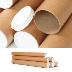
In terms of protection, honeycomb paper works by distributing the load over many hexagonal walls and creating friction between layers thanks to the interlocking of the cells. This double effect limits micro-displacements and dissipates part of the impact without the need to always add a second material. Bubble wrap, on the other hand, offers a more "elastic" response because bubbles are sealed air chambers: in dry falls on edges, especially with light weights, the resilience of air is a powerful ally. Its limit emerges after repeated crushing or under concentrated loads, when the bubbles break and performance declines rapidly. Air cushions face a different task: they are not meant to wrap, but to fill volumes and lock inside the box; if they are used in contact with rigid and smooth surfaces, the object can "float" and regain freedom of movement. Finally, straw paper is a material of mass and friction: it fills well, creates diffuse friction, but absorbs the impact in a less predictable way and can generate punctual pressure on delicate surfaces if a smoother film is not interposed.
Looking at the operating speed, the difference is made by the ergonomics of the gesture. With honeycomb, the winding is linear: you pull out, open the weft, wrap and the layers "bite" each other; Often a single point of paper tape is enough to close, and in many cases it is not needed at all. For those who mass-pack, this translates into fewer interruptions and a cleaner flow. Bubble wrap is intuitive and just as fast in the winding phase, but almost always requires tape to stop the spiral; it is also bulkier on the bench and slows down in reel changes. The air cushions are lightning fast for filling in any remaining space when you have a machine on hand; however, they do not replace the winding phase, for which a second material is required. Straw paper is effective in blocking, but involves longer handling times: it is picked, "kneaded", compacted; the bench remains more disordered and the uniformity of the result depends a lot on the hand of the operator.
The issue of logistical dimensions weighs more heavily today than yesterday. Honeycomb paper arrives flat and "grows" only in use: for the same useful meters, it takes up less space in the warehouse and reduces the frequency of refueling at the counter. Bubble wrap is bulky by definition, because it transports air already incorporated into the material; This results in lighter but bulkier pallets, with hidden costs of internal storage and transport. Air cushions overturn the paradigm: you stock a reel of thin film and produce volumes on demand, a clear advantage for those who have little space and many shipments with oversized boxes. Straw paper remains bulky and, if supplied in bags or boxes, requires large dedicated areas; on the other hand, it lends itself to quickly filling irregular volumes.
Surface compatibility is another practical variable. The honeycomb lattice adheres and follows complex shapes without creating rigid folds that can mark, and with a tissue interleaf it slides over glossy, lacquered paints and glass reducing the risk of micro-scratches. Bubble wrap is delicate to the touch but, if stretched too much, it can leave temporary imprints on soft finishes or generate condensation if the product enters the cold film hot. Air cushions do not scratch, but they do not offer grip: on bottles or smooth surfaces they can promote slippage in the event of vibrations. Straw paper has a warm and natural appearance, but it carries with it dust and free fibers; On cosmetics or light surfaces, it is advisable to interpose a clean veil, otherwise the unboxing loses quality.
Sustainability, understood as clarity of the end of life and reduction of materials, sees the honeycomb playing at home. With a mono-material paper packaging, the recipient has no doubts about where to dispose; The closing tape can also be made of paper, and the entire package speaks a consistent language. Bubble wrap and air cushions depend on recycling chains that are not homogeneous throughout the territory: even when they exist, the uncertainty of the end consumer often leads to undifferentiated waste. Straw paper is paper and therefore "simple" to dispose of, but its specific weight is higher than that of honeycomb with the same protective function, with a less favorable material balance if looked at as a whole.
There are, of course, scenarios where alternatives maintain an advantage. In repeated high-energy drops on lightweight products, bubble wrap resilience remains a reference, as long as the bubbles are not compromised. In shipments with large voids to be filled in standard boxes, the on-demand production of air cushions reduces time and cost per liter of volume filled. In scenographic settings or gift baskets, straw paper offers a "full" aesthetic that honeycomb, born to wrap, does not replicate. The key fact is that these solutions perform different functions: when it is necessary to wrap in contact, immobilize and present in an orderly way with a single material, honeycomb paper combines technique, visual cleanliness and ease of disposal; when it is only necessary to fill volumes, air systems win for speed and cost; When a preformed elastic cushion is needed, bubble wrap remains competitive, even with its end-of-life limitations.
Finally, there is a transversal consideration that affects the income statement as much as it does performance: the stability of the process. The honeycomb reduces the number of components on the table, lowers the use of tape and standardizes the gesture with the dispenser holder. Fewer variables means fewer errors, less rework, and fewer returns for internal handling damage. Hybrid solutions work well when they are conscious: honeycomb for wrapping, a few air cushions to fill a residual void, a reinforcing card on the edges of a particularly vulnerable object. It is in this ability to combine the best of technologies, choosing on a case-by-case basis, that a modern packing department finds the balance between protection, speed, total cost and brand message.
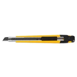
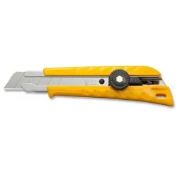
How to choose the right roll (width, weight, length, dispenser)
The choice of the roll is never a detail: it determines the fluidity of the gesture at the bench, the quality of the winding and the stability of the process in the peaks of work. The first variable to focus on is width, because it decides how much coverage you get at each pass. On small and regular items, it is advisable to avoid excessive widths that force continuous trimming; On bottles, frames, vases and objects developed in height, a more generous band allows a continuous spiral without joints, reduces weak points and makes the winding cleaner. The goal is to achieve full coverage in a few turns, with cells that open evenly and with a constant tension that does not mark the surfaces.
The weight must be read in relation to the way in which the network will be expanded. You need a base that holds traction when the cells open and that maintains cohesion in the overlap. Weights that are too light may give way on the edges or in the presence of irregular shapes; Weights that are too rigid stiffen the opening and remove adaptability, forcing the material to be forced precisely where it would be better to let it work with geometry. In the presence of delicate or lacquered finishes, contact protection does not depend on the weight, but on the interface: a thin tissue paper slides the first spiral, preserves the surface and allows the mesh to "bite" safely into the subsequent layers.
The declared length deserves attention because, depending on the producers, it can refer to the actual footage at rest or the "expanded texture" yield. To correctly evaluate, it is useful to reason by real consumption: how much winding is obtained with one's typical traction and how many packages are covered before the reel change. A very open net visually multiplies the meters but reduces the functional thickness and grip; A more compact mesh shortens coverage but increases stability and unboxing quality. The effective measure is the one that guarantees autonomy consistent with daily volumes, limiting interruptions to a minimum.
The dispenser acts as a technical translator between roll and hand. Even in the simplest versions, a sliding mechanism preforms the cells with regularity, accompanies the exit and returns clean cuts, three conditions that are worth more than any promise of speed. In mixed workstations, where cosmetics, home décor and ceramics pass through the same counter, a good dispenser reduces micro-friction, makes the initial spiral replicable and helps to standardize the result between different operators. Visual order, time to pieces and, above all, the reduction of errors that generate rework or returns benefit from this.
When the catalog is heterogeneous, the instinct to multiply formats clashes with the need to keep the process lean. The most effective choice is a combination that covers eighty percent of the cases with a single code and leaves the modulation of the expansion to the operator's gesture, not to the material change. It is in this logic that the right compromise emerges clearly: a width that governs bottles and medio-bulky objects without penalizing the small ones, a length that offers real autonomy on intense shifts, a reel weight that can still be managed at the counter and full compatibility with tabletop dispensers.
For these reasons, in daily work the most correct purchase choice is the 50 × 250 meter roll. The 50 centimeters guarantee continuous coverage on bottles, frames and accessories without joints, but remain manageable enough to wrap even compact references; The 250 meters offer an autonomy that lowers the reel changes, stabilizes the time per piece and reduces the stops in the station, with an ideal balance between operational performance and warehouse space.
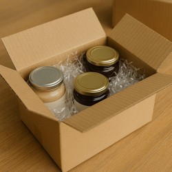
Use cases by sector: cosmetics, wine, ceramics, home décor
Bringing honeycomb paper into your daily work means adapting it to the products, rhythms and expectations of the public who will open the package. Each sector has different sensitivities: surfaces change, shapes change, priorities change between protection, speed and presentation. The geometry of the lattice is the constant; what varies is the way you make it work in your favor, modulating expansion, overlap and couplings.
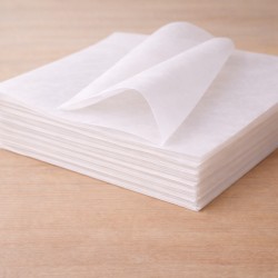
In cosmetics, the starting point is the delicacy of the finishes. Lacquered bottles, metallized lids, screen-printed glass and melamine paper products require impeccable initial sliding and a "soft" contact that leaves no marks. Here the winning combination remains the tissue interface. The contact veil slides the first spiral, preserves graphics and paints and allows the mesh to bite regularly only in subsequent layers, when the object is already "encapsulated". The expansion of the weave remains contained at the start and grows gradually, so as to distribute the load without punctual crushing. In the picking routines of a beauty e-commerce, where the pace is fast and the formats are repetitive, a fluid countertop dispenser and a compact width allow for short and repeatable gestures. The visual effect, natural and clean, completes the experience: those who receive skincare or make-up products expect order, silence of materials and clarity on the end of life, three elements that the mono-material paper enhances without requiring explanations.
In wine and spirits, the goal is axial stability. The bottles have a defined center of gravity and a height development that makes the neck and shoulder vulnerable. The honeycomb lattice is at its best when the wrap follows a continuous spiral from the bottom to the neck, with a denser initial grip to create platform and a progression that accompanies diameter changes without rigid creases. On natural paper labels, the tissue interface remains advisable, especially in contact with embossing and relief. In the cellar or wine shop, where it is often packaged in front of the customer, the more generous width avoids joints and maintains the linearity of the gesture, while a clean cut at the exit of the dispenser elevates the perception of care. Inside the box, the honeycomb works in tandem with the architecture of the cardboard: partitions or separators block, the mesh prevents micro-slipping, the whole reduces the possibility of bottles "singing" in transit. For mixed shipments, alternating between Burgundy and Bordeaux formats, the ability to adjust the tension with the hand is worth more than any pre-forming: fewer different components, more uptime.
With ceramics, the dominant theme is localized fragility. Plates, cups, vases and objects with handles or protrusions require protection that follows the contours and, above all, that does not transfer the thrust of a bump to exposed points. The hexagonal weave, when governed with progressive expansion, creates a mantle that embraces, distributes and absorbs just enough without stiffening. In parts with sharp edges or porous surfaces, it is advisable to start with a compact spiral, working the critical areas with targeted overlaps, and lighten the traction where the diameter widens, so as to avoid unnecessary tension. In the laboratory or in a craft boutique, the balance between speed and precision is delicate: the honeycomb paper helps to standardize the gesture, but it is the consistency of the set-up that makes the difference, with the dispenser aligned with the worktop and the free space to turn the object without interruption. In the finished package, the effect is twofold: the piece remains locked without punctual compressions and the recipient perceives an attention compatible with the value of the content.
In the world of home décor, the range of shapes is wide and uneven. Frames, candles, small accessories, ready-made textiles, wooden or metal elements require a material capable of changing skin continuously. The strength of the honeycomb, here, is its ductility: the same coil can go from a cylinder to a parallelepiped, from a delicate surface to a rougher one, simply by varying expansion and rpm. On products that "slide" easily inside the box, such as glass-on-glass frames or objects with poorly cohesive surfaces, friction between the layers plays a valuable role and reduces dependence on the tape. For voluminous references, the upper width avoids repetitions and maintains the rhythm, while on small items a clean cut that does not leave a paper mustache to disturb unboxing comes in handy. In physical retail, where the packaging is often done in view, the hexagonal mesh tells a contemporary aesthetic consistent with attention to the environment, adding perceived value even to mid-range objects.
In addition to product specificities, there is a transversal constant that determines the success of the transition: the quality of the flow. In beauty it is measured in pieces per hour, in wine it is measured in stability in fall and absence of rattling, in ceramics in reduction of micro-damage to edges, in home décor in visual order and consistency of packaging. Honeycomb paper intervenes on these indicators not by increasing complexity, but by simplifying. Fewer materials to coordinate, fewer changes on the table, fewer doubts of disposal for those who receive. The operator quickly learns to read the cells, to understand when they are too stretched or too closed, to dose traction naturally. In a few days, the repeatability of the gesture enters muscle memory and the results can be seen in the times, in the scraps and in the feedback of customers.
When the catalog crosses different categories in the same turn, the most solid strategy is to build a common base and small variations. A main reel covers eighty percent of cases, a second width or a slightly higher grammage solves the most challenging objects. The tissue interface remains a discreet ally, to be used when contact requires kindness, without weighing down the process. Everything else is done by the geometry of the grid, which multiplies the value of the card thanks to the shape. It is a logic that, once understood, is natural: the air incorporated upstream is removed, it is created only where it is needed, the material is allowed to follow the shapes instead of forcing them. Sustainability, in this context, is not an extra label but the consequence of a protection that works with less. And in every sector, from the bottle to the glass, from the cup to the candelabra, that "less" becomes a clearer experience for those who prepare and more convincing for those who open.
Brand experience and unboxing
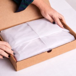
Unboxing is the first real encounter between the customer and what the brand promises. Everything that happens in the first seconds in which the box opens builds a story: the order in which the elements present themselves, the materials they touch, the sound they make, even the air that remains between the layers. Honeycomb paper works here as a very readable visual and tactile grammar. It is warm, natural, clean; it says "cure" without the need to write it. If bubble wrap draws attention to itself with its brilliance and the rustle of plastic, honeycomb puts itself at the service of the product, framing it and stopping it, letting the object speak.
Coherence is the first brick of experience. A mono-material paper packaging creates a logical thread that connects the box, the winding and the closure: the kraft texture of the net dialogues with the cardboard, the paper ribbon completes the sentence. The recipient does not have to interpret, he immediately understands how to move and where to deliver what will remain after the opening. In this painting, details such as a thin tissue in contact become part of the direction: not only do they protect the most delicate surfaces, but they introduce a "curtain moment" that separates the shell from the revelation. The hexagonal mesh, once lifted, opens like a technical fabric and lets the product emerge with a unique gesture, without tears or residues.
The palette matters more than it seems. Natural kraft communicates essentiality and de facto, undeclared sustainability. If the brand works with identifying colors, the choice of a matching tissue or a paper ribbon printed in one or two colors brings identity without weighing it down. Honeycomb paper absorbs light well and reduces reflections: in the candid photos that customers take and share, the product remains the protagonist, the volumes are read and the surfaces do not "burn". This is where the unboxing becomes a small proprietary media: a ready-made set to end up in a story or a review with images.
The sequence of gestures is also the design of the experience. Opening a box and immediately encountering the tightly stretched net, with the spiral closed by a discreet point of paper tape, conveys control. The clean cut coming out of the dispenser avoids mustaches and lints: these are millimeters that make aesthetics. The first spiral is more compact and gives the idea of a secure grip, while the later more airy spirals lighten and allow you to breathe. When the customer loosens the last turn, the net gives way without noise, and the object appears in its cleanliness. In this step, you don't need long instructions: a card with a few words does the task better. "We chose an all-paper packaging. Reuse it or recycle it in the paper collection." Such a short sentence, placed above or below the product, combines practical gesture and brand promise.
Touch and sound are often overlooked, but they add value. Honeycomb paper has a dry, non-sticky, non-wrinkled response like some thin plastics, it does not carry residual odors. The rustle is polite, the tensile strength gives a perception of "tightness" that is reassuring. If the product has a strong sensory component — a scented candle, a skincare cosmetic, a thin glass goblet — the material accompanies without disturbing. Even the edges matter: a clean edge on a greeting card, a precise fold on the tissue, a well-rubbed paper ribbon end without tails build a micro-choreography that is remembered.
Personalization is not about adding layers, but about making a recognizable mark in the right place. An ink stamp on the tape, a paper mini-sticker to close the spiral, a QR that leads to a lightweight page with instructions for reusing the network, and a brief note on the paper supply chain are enough tools to characterize the experience without shifting the center of gravity from the product. If the catalogue speaks different languages — a more technical line, a more decorative one — the same network can support both narratives by varying only the colour of the tissue or the microcopy. "Open, breathe, reuse" tells a fragrance; "Paper protection, zero plastic" reassures those who buy fragile items online.
The best experience is the one that stays the same over time. To achieve this, stability of the gesture on the bench and constant quality of the material are needed. When the net comes out with the same regularity, when the spiral always closes in the same way, when the cut is always clean, the unboxing becomes replicable. This is the terrain on which the results are really measured: fewer returns for damages, more reviews mentioning the care of the packaging, more spontaneous photos shared. It's helpful to listen to the words customers use: if you use terms like "tidy," "easy to open," "plastic-free," the experience is passing. Otherwise, the visible details are intervened — too much traction in the first spiral, inelegant closure, misplaced information card — because they are the ones the recipient sees and remembers.
The last bridge is between environmental promise and operational truth. A consistent unboxing does not proclaim sustainability, the exhibition. Honeycomb paper, in this sense, is a natural ally: the material explains by itself what is happening, indicates the path to the end of life with its mere presence, aligns tactics and strategy. A brand that works like this lowers the decibels of communication and raises the comprehensibility of the gesture. The customer opens, understands, smiles and, often, photographs. It is there that experience becomes memory and memory becomes reputation.
In conclusion, honeycomb paper is not a "surrogate" for bubble wrap, but a paradigm shift: protection comes from geometry, not from the volume transported. A single material, legible and coherent, which envelops, immobilizes and presents with order, lightening the work at the counter and making the disposal gesture clearer for those who receive. This is where sustainability and efficiency really meet: fewer components, less space, less errors, more continuity of result.
In contexts where speed, repeatability and brand image count — from cosmetics to wine, from ceramics to home décor — honeycomb standardizes the gesture and improves unboxing without asking for compromises on safety. The mesh follows the shapes, the friction between the layers makes a block, the kraft finish tells a contemporary and understandable choice. With the same attention in the procedures, returns for damages drop and the experience becomes cleaner and more photographable, therefore more shareable.
The choice of format completes the picture. Among the possible combinations, the 50 × 250 meter roll is the most solid point of balance because it combines coverage and autonomy: the 50 centimeters govern bottles, frames and medio-bulky objects without penalizing small pieces, while the 250 meters reduce reel changes, stabilize the time per piece and optimize warehouse space. It is a measure that works for the process, not against it.
Adopting honeycomb paper means systematizing smarter protection and more honest material language. At ChartaRè, we can help you set up the set-up, define the most suitable traction and interfaces, and measure the benefits on your real flow. The rest is done by geometry: a few moves, a single material, a result that can be seen at first glance.