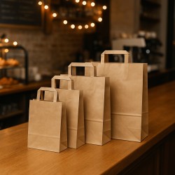
The role of color in seasonal packaging
When choosing colors for your packaging, you're not simply deciding on a pleasing shade. You are building an experience, suggesting an emotion, shaping the perception that the customer will have of your product even before touching it. Color is the first language that your packaging speaks, and if you really want to dialogue with your audience, you need to know how to use it consciously and consistently with the seasonal context in which you move.
Autumn, in particular, is a season that brings with it precise atmospheres: the warmth that takes refuge in warm tones, the light that becomes softer, the desire for intimacy that grows in small daily rituals. The colors of your packaging, in this period, must tune in with these sensations. It is not a purely aesthetic issue: it is a visual communication strategy that allows you to resonate with the consumer's state of mind, with his seasonal imagery and with his undeclared expectations.
Think about it: when a customer walks into the store or receives an order at home, it's the color that makes the first contact. Even before reading a label or touching a fabric, it is the tone of a box, the shade of a ribbon, the contrast between two materials that strikes the eye. And if that first glance resonates with what the season evokes — the authenticity of a yellowing leaf, the softness of a sunset light, the reassurance of a warm brown — then your packaging has already done half the job.
Working with a seasonal palette, therefore, does not mean following a passing fad. It means showing attention, knowing how to speak the visual language of the moment, knowing that each color has a time, a place, a function. In autumn, shades become deeper, contrasts soften, textures take on a central role. You need to know how to read these signals, interpret them for your industry and adapt them to your style. Only in this way can you create packaging that not only protects and presents your product, but enhances it and inserts it into a broader narrative, capable of truly involving those who receive it.
In this sense, color becomes a powerful tool to strengthen the perceived value of your brand. It is through a consistent and seasonal color choice that demonstrates care, awareness and the ability to interpret trends without being subjected to them. And it is precisely from this approach that we can begin to explore the palettes that will dominate autumn 2025.
Fall 2025 Palette Preview
To better face the autumn season, you can't just recycle the colors of the previous year or follow your instinct. Autumn 2025 brings with it a colour range full of new shades and bold reinterpretations of classic shades. It is the result of a long and transversal observation work, which starts from the international catwalks and reaches the interiors of the home, passing through art, nature, technology and even the collective mood. Trendy palettes are never born by chance: they are the reflection of what the world is experiencing, desiring and dreaming.
For this autumn, the colors move along two main lines: on the one hand, you will find warm, earthy shades that speak of roots, comfort, authenticity. On the other hand, deeper and more sophisticated tones emerge, often cold, evoking silence, elegance and introspection. The result is a subtle balance between concreteness and dream, between matter and atmosphere. And this duality offers endless possibilities for those who work in the world of packaging.
Imagine terracotta: it is no longer just the color of ceramics or arid landscapes, but becomes a lively and sensual shade, capable of transmitting naturalness and warmth without ever being banal. Next to him you will find the pomace, deep and velvety, a sort of dark red that smells of ripe grapes, sunsets and velvet. These two colors lend themselves to enveloping, rich packaging, perfect for conveying value and seasonality.
But autumn 2025 does not stop there. To rebalance the emotional component of the warm tones, sage green enters the scene. It is a discreet, almost dusty shade, which brings with it a sense of visual cleanliness, serenity, awareness. It is the green of sustainability but also of natural elegance. Next to it, golden ochre introduces a note of light, like a reflection of the sun on the autumn foliage. It is not a bright yellow or a flashy gold, but an enveloping color, perfect for refined details, to convey energy without screeching.
Finally, we find midnight blue, the most sophisticated of the palette. It is a color that speaks softly but leaves its mark. It communicates solidity, mystery, depth. Used in the right way, it can transform a simple package into a luxury item, or give authority to a brand that focuses on sobriety and essentiality.
These shades should not be considered as isolated trends, but as expressive tools that you can use to tell who you are and where you want to take your product. Autumn 2025 invites you to play with delicate contrasts, to mix warmth and rigor, to build visual harmonies that speak to the heart even before the mind. Get ready to do it the most effective way: starting with color.
Fashion influences in color choices
If you really want to understand which colors will dominate fall 2025 in the world of packaging, you need to look carefully at what happens on the catwalks. Fashion has always anticipated and oriented collective tastes, directly influencing even apparently distant sectors, such as design, graphics and, of course, packaging. The chromatic choices made by the great designers do not remain closed within the confines of prêt-à-porter: they propagate, adapt and, season after season, dictate the visual rhythm of our daily lives.
For autumn 2025, fashion tells of a desire for rootedness and transformation at the same time. We return to seek contact with the land, with the origins, but we do so with a contemporary gaze, attentive to form and function. This vision is reflected in palettes that rediscover natural colors — such as brown, sand and forest green — but interpret them in a more sophisticated way, with matte finishes, dusty effects or slight tonal variations. At the same time, a new chromatic energy is making its way, visible above all in the details: a bright rust on a classic-cut jacket, a deep blue on a dress with minimal lines, a bright ochre that appears as a brushstroke on otherwise neutral textures.
Packaging cannot remain indifferent to these dynamics. If the consumer, looking around, recognizes in everyday objects the same visual signals that he has already seen in the world of fashion, he feels in tune, in step with the times, involved. It is a subtle but very powerful identification mechanism, which you can use in your favor by carefully choosing the colors to be used for boxes, cards, ribbons and shoppers.
Take for example the return of pomace and terracotta in autumn collections. In fashion, these colors are used to express warmth, character and a certain spirit of craftsmanship. Brought into the packaging, they convey authenticity, depth, connection with the material. Or think of sage green, now ubiquitous in the most essential and refined garments: its translation into the packaging suggests balance, modernity, taste. And again midnight blue, chosen by many brands to reinterpret black with greater softness and personality: in packaging, it becomes the perfect color to suggest elegance without ostentation.
Observing fashion allows you to intercept not only the right colors, but also the way in which these colors are treated: matte surfaces, tonal overlaps, muted contrasts. All elements that you can reinterpret in the choice of materials, textures and combinations to make each package current, recognizable and in line with the spirit of the time.
Ultimately, being inspired by fashion is not about copying a style, but about grasping its language. It means capturing the visual rhythm of the season, interpreting it in a way that is consistent with your brand and returning it through packaging that speaks the same aesthetic language as the viewer. And it is precisely this visual coherence that, over time, builds recognizability and value.
Interior design and colour: from the living room to packaging
There is an increasingly thin thread that unites the world of interior design to that of packaging. These are not just trends that travel in parallel, but a real aesthetic osmosis: the atmospheres we experience every day in our domestic spaces influence our visual expectations of everything around us, including the products we buy and the way they are packaged. If in recent years the home has returned to being an important emotional and symbolic center, the colors that define it have also become points of reference for those who design packaging.
For autumn 2025, the color language of interior design is dominated by a sense of sophisticated warmth. Colours are chosen that evoke tranquillity, protection and intimacy, but it is done with a contemporary taste, attentive to detail and overall composition. The walls are tinged with creamy beige, sage green, velvety burnt. Textiles bring touches of mustard, bronze, baby blue. Natural woods are combined with matte metals and material surfaces, in a play of contrasts that is always harmonious, never forced.
These same colors can become very powerful tools for your visual communication. If today your customers live in spaces designed to convey balance, simplicity and comfort, it is natural that they want to find these same sensations in the packaging of the products they choose. A sand-colored box with a satin copper detail speaks the same language as a living room furnished with Scandinavian taste. Forest green and ivory packaging integrates perfectly with a reading corner designed for relaxation. It is not just a matter of aesthetic coherence, but of creating an emotional continuity between the objects that inhabit everyday life.
Interior design also teaches us the value of textures. It's no longer just a question of color, but of how that color is perceived through the surface. A rough or matte paper can restore the tactile sensation of linen, while a glossy detail on a matte background can recall glazed porcelain or a glass element. Playing with these references makes the packaging not only beautiful, but evocative. And this evocation strengthens the bond between object and person.
Don't forget that today living is increasingly photographed, shared, staged. Customers are looking for products that fit naturally into the environments that represent them. Packaging consistent with interior design trends therefore has a greater chance of being perceived as elegant, desirable, worthy of being displayed and photographed. In other words: more memorable.
Looking at the colours and materials of contemporary furniture therefore offers you a visual compass to orient your colour choices strategically. It allows you to stay in tune with what your customer experiences every day and to transform a simple package into an object that harmonizes perfectly with their lifestyle. And it is precisely in this silent harmony that packaging becomes value.
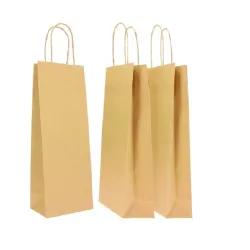
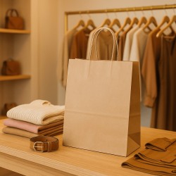
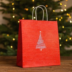
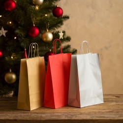
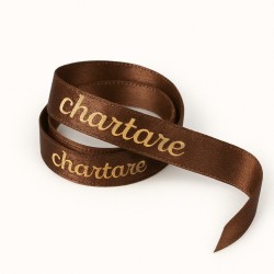
Terracotta and burgundy: the warm palette for enveloping packaging
There are colors that need no introduction: a glance is enough to evoke precise sensations, environments, scents, moods. Terracotta and pomace are among them. They are colors that speak to memory and the senses, that warm the eye and reassure the touch. For this reason, in autumn 2025, they take on a leading role in the world of packaging: because they best interpret that widespread need for authenticity, materiality and warmth that runs through contemporary trends.
Terracotta is a deep-rooted color. Literally, it comes from the earth, and retains all its primordial charm. It is not a bright orange, nor a neutral brown: it is a lively and vibrant middle ground, which knows how to be elegant but also informal, natural but well-kept. When you bring it into packaging, you immediately communicate a sense of craftsmanship and value. It is the perfect color for those who want to tell the story of a product made with care, which comes from expert hands, which has something to say beyond the external appearance. A terracotta box does not shout, but stands out. It conveys warmth without heaviness, personality without rigidity.
Alongside the terracotta, the pomace builds a visual harmony that is pure harmony. More intense, deeper, the pomace adds a note of sophistication. It is a dark red that brings with it the imagery of ripe grapes, velvet, wine that is slowly poured into a glass. It is a color that invites slowness, that creates atmosphere, that suggests elegance without ostentation. When you choose it for packaging, you declare attention to detail, taste for composition, desire to strike the eye in a refined way.
These two colors, when juxtaposed intelligently, work wonderfully together. You can use terracotta as a material base, combining it with a burgundy for graphic details, ribbons or finishes. Or reverse the roles, letting the pomace give structure and depth, while the terracotta softens and warms. In both cases, you get a visual effect consistent with autumn: enveloping, full, emotional.
But there's more. The strength of this palette also lies in its versatility. You can use it on natural kraft papers for a rustic and contemporary effect, or on velvety or metallic surfaces for a more precious and refined result. You can play with textures, with matte or satin finishes, with contrasts between glossy and matte, to further enrich the visual narrative. Each variation adds depth and character, transforming the packaging into an experiential element.
Choosing terracotta and burgundy for your autumn packaging means welcoming your customers with a warm, deep and authentic colour language. It is an invitation to stop for a moment, to perceive quality through the senses, to feel that behind a product there is a story, an identity, a thought. And today, in an increasingly crowded and visually saturated market, this ability to communicate emotion with elegance can really make a difference.
Sage green and golden ochre: sophisticated nature
There are times when color becomes more than an aesthetic choice: it becomes a subtle message, a sign of sensitivity to what surrounds us. Sage green and golden ochre represent exactly that. They are two shades that speak the language of nature, but with a refined, almost whispered accent. They do not simply imitate the plant or mineral world: they reinterpret it with elegance, transforming it into an effective and contemporary visual communication tool. And precisely for this reason, in autumn 2025, they occupy a prominent place among the most interesting colors for packaging.
Sage green is a shade that inspires calm. It does not have the intensity of forest green or the brilliance of grass green: it is located in a middle area, where vegetable freshness meets dust, light, balance. It is a sober, versatile color that conveys a feeling of order and harmony. Using it in packaging means making a measured and intelligent choice: you communicate naturalness without falling into clichés, you suggest sustainability without the need to proclaim it in words. It is perfect for minimal but elegant packaging, for matte materials, for velvety textures or raw cardboard. It works great on its own, but it is at its best when paired with warmer or brighter hues, especially golden ochre.
Golden ochre, in fact, is the ideal counterpoint. It is a deep yellow, full of light, but without excesses. It evokes the arid land, the fields at sunset, the leaves that begin to turn yellow. Unlike bright yellow, it never disturbs: it warms the eye discreetly, enriches without invading. In packaging, golden ochre can become a precious detail: a hot stamping, an inner edge, a ribbon, a label. Or it can be the protagonist, perhaps on a structured surface, combined with raw paper or light wood elements to create a sophisticated visual effect consistent with the natural trends of autumn.
When you put sage green and golden ochre together, you get a surprising combination. The first cools, the second heats. Green communicates stability and attention to the environment, ochre introduces energy, vitality, charm. Together they build a palette that is contemporary but timeless, sober but never dull. A palette that allows you to position your product as attentive, aware, aesthetically pleasing.
It is a color choice that lends itself well to very different sectors. It can discreetly dress a natural cosmetic product, but also embellish a line of artisanal sweets or make a corporate gift box authoritative. The key lies in balance: using color not to surprise at all costs, but to build a language consistent with the values you want to convey. Values that today increasingly revolve around authenticity, simplicity, connection with what is essential.
In a market that rewards transparency and sensitivity, sage green and golden ochre allow you to visually communicate what words sometimes fail to express. And when packaging manages to tell all this, it becomes a silent but very powerful tool to create trust, attraction and recognition.
Midnight blue and cool shades: the silent elegance of autumn
Not all colors speak loudly. Some whisper, get noticed by subtraction, conquer with discretion. Midnight blue and cool shades belong to this category. They don't seek immediate impact, but aim to build an atmosphere. And in the context of autumn 2025, where the balance between intensity and delicacy is central, these tones stand out as ideal choices for sophisticated, essential packaging, capable of communicating luxury without excess.
Midnight blue is much more than an alternative to black. It has a depth of its own, an emotional component that makes it fascinating and versatile. It is the color of stillness, of the sky after sunset, of introspection. And at the same time it is authoritative, structured, solid. When you choose it for packaging, you are conveying a precise feeling: that of something that goes beyond the ephemeral, that has a presence, a texture, a clear vision of itself. It is a color that works perfectly for premium products, for elegant and reserved lines, for proposals that want to stand out without the need to attract attention with flashy effects.
Alongside the midnight blue, other cold shades move naturally: smoky grays, powder blues, certain deep greens barely hinted at. They are colors that build muffled, refined visual environments, perfect for conveying feelings of calm, precision, introspection. In a world where everything runs and is exposed, these shades create a small space of visual silence, a suspended time that invites you to linger. And this, in packaging, is an extraordinary power.
The charm of these colors also lies in their ability to enhance any material. On a rough paper, the midnight blue becomes enveloping; on a satin surface, it becomes almost liquid; on a matte background, it acquires a visual density that recalls fine fabrics. If you then combine it with metallic details – copper, bronze, rose gold – the effect is even more interesting: a measured contrast, never excessive, which enhances the sobriety of the background without betraying its essence.
This palette is perfect if your brand has a reserved but confident tone, if you want to build an image that inspires trust, solidity, authority. But it also works in more creative contexts, as long as you know how to dose the accents well. An entirely midnight blue packaging, for example, can become an elegant canvas on which to bring out a golden logo, an engraving, an embossed texture. Or it can be combined with warm tones to create sophisticated and unexpected contrasts, capable of surprising without breaking the overall harmony.
Choosing these shades for autumn 2025 means moving away from the rhetoric of impactful color and embracing a new form of expressiveness: that of measure, coherence, whispered beauty. It is a less noisy street, but much deeper. And if you walk through it consciously, you can transform your packaging into a space of silent elegance, capable of leaving a lasting imprint on the mind – and eyes – of those who receive it.
Colours and materials: how to enhance packaging
When you think about the color of your packaging, you can't consider it in isolation. Colour, on its own, never really exists: it lives and changes according to the surface that welcomes it, the light that hits it, the sensation it transmits to the touch. For this reason, to obtain a truly effective result, you have to think about the interaction between shades and materials. It is precisely from this relationship that packaging is born capable of exciting, of telling a story, of transmitting values even before words.
A color such as golden ochre, for example, can change radically depending on the support. If you print it on a matte and natural paper, it gives a feeling of earthy, almost artisanal warmth. But if you apply it to a coated card or a surface with a slight embossing, it takes on a different light: it becomes elegant, almost precious, as if it contained metallic reflections even when there are none. The same goes for a sage green: on a smooth and soft paper it looks fresh and tidy, while on a raw or recycled material it takes on a more organic tone, closer to nature, more real.
That's why it's not enough to choose a "trendy" color to be relevant. You also need to ask yourself how that color will interact with the material you've chosen. If you want to communicate sustainability, for example, you can opt for kraft papers, corrugated cardboard, matte or fibrous surfaces, combined with natural colors such as terracotta, beige, olive green. If, on the other hand, you want to convey a sense of discreet luxury, you could work with velvety textures, soft-touch details, satin finishes, combined with deep shades such as midnight blue or burgundy.
Texture, in particular, plays a fundamental role. A matte box in shades of smoky gray or burnt brown can have a minimalist and modern look, but just add a contrasting hot foil – perhaps in bronze or copper – to transform it into a visually rich object, suitable even for the most sophisticated gift or retail world. The visual and tactile contrast between different surfaces creates perceptual levels that make the packaging memorable. And today, in a market where everything is seen, scanned, published, having memorable packaging means entering the minds and feeds of customers.
Don't forget about the sound and strength of the material either: a lid that closes firmly, a paper that tears with a clean sound, a box that does not deform easily are all elements that reinforce the impression of quality. Colour, in this context, becomes the visual complement of a broader, multisensory experience, capable of involving even on an emotional level.
Successful packaging does not just contain: it tells. And to tell in an authentic and engaging way, it needs every element – color, material, texture, shape – to work in harmony. When you can orchestrate these elements with consistency and intention, you create an object that is not only beautiful to look at, but that speaks, welcomes, leaves a lasting impression. It is in this synergy that color finds its true strength.
How to adapt color trends to your brand
Following color trends may seem like a purely aesthetic exercise, but in reality it is much more: it is a way to stay relevant, to speak the same language as your audience, to align yourself with the present without losing coherence. However, for a trend to really work in your packaging, it's not enough to adopt it. You have to reinterpret it. You have to make it your own. And this is where the ability to adapt colors comes into play, that delicate and strategic step that allows you to dress your brand with the colors of the moment without distorting its identity.
Every company has a very specific visual tone, even if it is not always formalized in a brand manual. It's the way you introduce yourself, communicate, choose materials, lay a box, match a ribbon. Color plays an essential role in all of this, because it shapes the overall atmosphere and the type of emotion you want to convey. If your brand is known for its essentiality, for example, you could complement autumn trends with measured accents: perhaps choosing a midnight blue to replace the classic black, or a desaturated sage green instead of a neutral gray. The result will be in line with your style, but with an update that does not go unnoticed.
On the contrary, if your brand works on a more emotional, warm, welcoming communication, you can more clearly embrace the deep shades of autumn: burgundy, terracotta, golden ochre. But even then, you'll need to calibrate the saturation, choose the right finish, adapt the contrasts according to the tone of your visual communication. The goal is not to transform yourself to chase a trend, but to evolve while remaining true to who you are. It's a subtle balance, requiring intuition, awareness, and a deep understanding of your audience.
Another important aspect is the context of use of the packaging. A gift box for a retail audience can afford to be more daring, playing with bright colors and unusual combinations. A box intended for B2B, on the other hand, will probably require a more sober, more structured approach, in which color trends manifest themselves in details, finishes, small touches that update the image without upsetting it. In both cases, however, the guiding principle is the same: use color as a narrative tool, not as a decoration for its own sake.
Adapting trends also means knowing how to filter them through one's own aesthetic sensibility. You can take inspiration from the trends of autumn 2025, but then ask yourself: what about this palette really represents me? What emotions do I want to evoke? How can I reinterpret these colors to make them recognizable as "mine"? It is in these questions that the real strength of a successful color project is played. Because it's easy to copy. Much more difficult – and powerful – is to turn a trend into a distinctive trait.
Ultimately, color is not an accessory element. It's a bridge between who you are and what your customer perceives. Knowing how to cross it, with style and consistency, is what transforms packaging from a simple container to a communication tool. And it's also the most effective way to make yourself remembered.
Colour, season, identity: packaging as a relationship tool
Autumn 2025 invites us to slow down, to look for consistency, to value the sensation more than the effect. The colors that represent it — warm, deep, natural, sophisticated — are the reflection of a collective need for balance and authenticity. Integrating these shades into your packaging does not simply mean "following fashion", but tuning in with the spirit of the time, making your product part of a recognizable, desirable, shareable aesthetic and cultural context.
We have seen how each color carries with it a language, and how its strength increases when it dialogues with the right materials, with the tone of the brand, with the visual habits of your audience. Packaging, today, is much more than a protection or a showcase: it is a narrative space, a gesture of attention, an opportunity to stand out without screaming. And colors are the first words of this story.
Knowing how to choose them with awareness, interpret them with sensitivity, adapt them intelligently: this is the real job of those who want to transform their packaging into a relationship tool, capable of transmitting value and building memory.
The advice is simple: observe, let yourself be inspired, but then choose what really represents you. Because a well-chosen color — at the right time, with the right material, in the right shape — can speak for you much more than a thousand slogans. And stay impressed much longer.