An impeccable Christmas tree is not born by chance: it is the result of method, eye and some window dressing tricks that you can make your own right away. With this manual I accompany you, step by step, on a complete path — from the choice of the structure to the finishing of the last bow — to obtain a professional result in any context: shop window, living room, hotel lobby or company corner. The goal is to give you a clear and replicable process, so as to transform each setting into a coherent, bright and safe scenography.
You will start from the decisions that really matter: proportions between tree and environment, style, materials, stability. You will understand how to read the space (ceiling height, depth, prevailing viewpoints), how to select the most suitable mast and how to mount it solidly and safely, with a focus on anti-tip and orderly cable management. Immediately afterwards you will enter the phase that makes the difference at a glance: the opening of the branches. Here you will learn the "inside-out" technique, that is, shaping from the trunk outwards to give real volume, fill in the voids and build a believable canopy — that depth that makes the tree "rich" even before the decorations.
The lights will be designed, not simply "put". You will work on the color temperature that best suits the mood, on the laying pattern to enhance the volume (spiral from the trunk or zig-zag in depth) and on the invisible but fundamental details: safe power supplies, timers or smart plugs, camouflage of cables. Then you will move on to the language of color and materials: you will build a palette consistent with the environment and a narrative theme (traditional, natural, Nordic, luxury...) by applying simple but effective principles such as the color hierarchy and the right balance between matt, glossy and metallic finishes.
Finally, you will dress the tree "in layers" as the professionals do: first the structural and impact elements, then the fillers for the rhythm, then ribbons, picks and garlands to give movement, and at the end the topper in proportion to the foliage. The base will not remain a fallback to be hidden, but will become part of the composition with covers, baskets or coordinated scenographic packages. You'll close with a photo quality check, minor tweaks, and a disassembly and storage method that preserves materials and time for the following year.
This is not a set of unrelated "tricks", but a system. You can use it regardless of budget and square footage, even in busy environments or with children and animals. Following the path, you will get a clean, harmonious and photogenic tree - one that catches the eye from a distance, convinces up close and stands the test of time. Hello? Let's start with the basics: choosing the right tree for your space and the story you want to tell.
Choice of tree: size, proportions and style
The quality of the result is already decided here, even before opening a branch. Choosing the right tree means reading the space, imagining the finished scene and translating it into measurements, volumes and materials consistent with the environment. Start at the height of the ceiling and where you will place the tree. In the home and in the shop window, the best effect is obtained by leaving an air leak between the tip and the ceiling: consider the size of the topper and keep a margin of at least twenty to thirty centimeters. If, for example, the ceiling is 270 cm and you want an important topper, the natural choice is a tree around 240 cm; With ceilings at 240–250 cm, a 210 cm maintains proportion and breath. In the same way, think about the diameter: don't just look at the base, think about the "growth cone" of the crown. You want the tree to look generous but not constrain the steps; It leaves corridors comfortable and free from accidental impacts, especially in busy environments or with children and animals. In the shop window, where the use is frontal, you can go with a fuller diameter; In the living room, along a path, or near a door, you'll prefer a more streamlined profile.
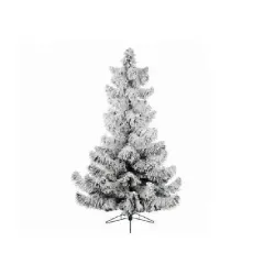
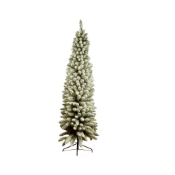
The family of shapes helps you to steer the footprint. A "full" model is the scenographic choice for a central positioning or for a shop window that wants to speak decisively; It communicates abundance, gives you surface for lights and decorations, and creates an authoritative visual cone. The "slim" models lighten the square meters without sacrificing impact: they work very well in niches, between two furnishings or where the axis of passage is close. "Pencils" are surgical instruments: when space is really small or you want to build a multi-element composition (two or three trees in progression), their verticality gives rhythm and modernity. The rule of thumb is to look for a harmonious relationship between height and diameter by reading the room as a set: if the ceiling is alto but the room is narrow, favor height with a reduced diameter; If the room is large and low, choose a less alto but fuller tree to fill the horizontal scene.
When evaluating materials, think about the effect at a distance of one meter and the effect in photos: these are the two tests that a set-up cannot fail. Traditional PVC canopies offer visual density and lightness; the fibers are flat but, if well "shapated", they fill continuously. The PE molded tips, born from the cast of real needles, return superior realism on the front and in macro, with a more sustained structure. The mixed combination, with PE tips on the outside and PVC filler on the inside, is often the most balanced solution when you're looking for depth and fullness without overcosting. In addition to the material, look at the internal metal wire of the branches: the more robust it is and "memorizes" the fold, the more you can sculpt the volume and maintain it over time. Also consider the mounting system: hinged branches reduce time and better withstand seasons of repeated use; Numbered sections make assembly distraction-proof and allow you to plan your light installation logically.
The "pre-lit" choice deserves a separate reasoning. A tree with integrated micro-LEDs speeds up set-up times and ensures a very homogeneous light distribution, especially if the light points are also laid deeply. Check the colour temperature and ask yourself if it dialogues with the environment: a soft warmth enhances natural woods and fabrics, a more neutral warmth is combined with contemporary and metallic atmospheres. Check that the circuits are disconnected to reduce disruption in the event of a fault and that the power cable is discreet, ideally tone-on-tone with the keg. If you prefer total design freedom, choose an unlit tree: you will spend a few more minutes on installation, but you will have complete control over intensity, pattern and dynamics. In professional contexts I often alternate the two paths: pre-lit to have a "safe" base and a second circuit of independent strings to create depth and accents.
The style of the tree must resonate with the architecture and the story you want to tell. A botanical green with thin needles and slightly irregular tips is perfect for natural and warm moods; a darker and more compact green holds up classic red-gold palettes; A snowy or frost effect requires light environments and materials that do not visually dust next to white. Flocking is spectacular but must be managed: choose quality workmanship to reduce dust fall at the first opening and consider that the decorations will stand out better with a less crowded range. If you work in the shop window, think about reflections: in front of glass and mirrors, a deep green absorbs light and makes the image more elegant, while a snowy one amplifies the brightness but requires more chromatic control to avoid the "cold" effect.
Don't neglect the base, which is an integral part of the perception of quality. A wide metal structure, with non-slip feet and the possibility of weighing down, protects you from shocks and micro-vibrations. If you already know that you will use covers or baskets, check the real size and height of the first order of branches: too basso and the cover seems "stuck", too alto and the tree appears raised in an unnatural way. In public spaces, consider solutions that allow invisible anchoring to the floor or wall: safety must never be an aesthetic compromise. Also remember the certifications and compliance of the materials: for interiors, choose shafts with flame retardant finishes and, if you opt for pre-lit versions, check the quality of the transformers and the appropriate marking of the electrical components.
Finally, predict the future. A tree is a multi-year investment: the more it can be shaped, robust and repairable, the more it will retain scenic value. Ask yourself how it will be stored, if the box is reusable or if it is worth equipping yourself with dedicated bags, if there are sections or spare parts available. Also consider "scalability": if you like the idea of replicating the concept in multiple stores or in several rooms, choose a series that offers the same finishes in different heights and diameters, so you can adapt the project while maintaining visual consistency.
When you have lined up these elements — height, diameter, shape, material, integrated or free lighting, style, base and perspective of use — the tree will no longer be a generic object, but a scenic structure designed for your space. At that point, everything you do next — assembly, branch opening, lighting and décor — will work in synergy with the initial choice, and the final result will feel "right" even before you light the first garland.
Workspace Preparation and Tool Kit
A professional set-up begins long before you open the box. Your first move is to transform the space into a tidy, safe and comfortable laboratory, so every gesture will be precise and without unforeseen events. Imagine the perimeter of the tree already positioned: mentally trace the shape, identify the passageways, check where the sockets are located and what will be the most invisible trajectory to bring the power to the base. If the space is public or shared, create a temporary "off-limits" zone with a free corridor for those who have to pass; If you are at home with children or animals, it is time to set up light barriers and remember that the bare cables are an invitation to curious paws.
Protect the floor immediately. A non-woven fabric or a technical mat saves you from scratches, flocking dust and micro-packaging residues; A soft protector under the base prevents vibrations during assembly and makes working on the shell more stable. Clean the area before starting: a wipe with an antistatic cloth on surfaces and mirrors will prevent dirty reflections which, in the window as well as in the living room, ruin the final result. Also prepare the "staging" table for the decorations: choose a light and neutral top, illuminate it well, arrange trays and trays to separate the elements by color, size and fragility. This way you will always keep the palette under control and prevent objects from touching or scratching.
The lighting of the work area deserves attention. Working with uniform white light allows you to correctly judge the tones of branches, lights and finishes; The warm mood light is perfect for the final scene, but during editing, it alters the perception of colors. Have a swivel lamp handy for alto details, especially if you need to work deep into the canopy. If you have commercials or props, turn them on for a few minutes and make sure they don't directly hit heat-sensitive materials or reflective surfaces that could create distracting glare.
Prepare your electricity management as carefully as you prepare your décor. Decide right away where you will place the power strip with switch, preferably behind the tree or in an area that is not visible but accessible; Use an extension cord appropriate for the distance, avoid adapter chains, and make sure that the cable does not pass through unprotected waypoints. If you need to run a power supply through the middle of a hallway, use a floor cord cover or secure the path along the baseboard with removable gaffer tape, so you don't leave any residue and reduce the risk of tripping. Integrate a timer or smart plug already at this stage: you will be able to test programmed ignitions and intensity, and you will be sure that everything will respond as expected when the set-up is closed.
Organize your packaging methodically. Open the boxes with a sharp cutter, engraving only the tape and never the cardboard thoroughly so as not to risk marking branches or decorations. Set aside bags and materials useful for storage at the end of the season and immediately discard the excess to clear the field of vision. If the shaft consists of sections, arrange them in order of assembly on one side, with labels facing the alto; If you have a Pre-LIT, locate and separate the connectors in each section before you start, so you don't have to search for them in the branches when you're already at altitude.
Your tool kit is the extension of your hands. Wear light gloves: cotton protects glass decorations from fingerprints, thin nitrile helps you handle micro-cables and branches without scratching yourself. Keep a wire cutter for cutting ties and wire, nose pliers for micro-hooks, sturdy scissors for ribbons and garlands, and a roll of green florist wire in two different thicknesses for discreet fixings, along with a few "S" hooks for heavier elements. A handful of releasable cable ties are invaluable for cable management, while the removable gaffer tape is the professional solution for temporary fastening on floors and surfaces without leaving a trace. Add a tape measure, a pocket level to check the verticality of the barrel, and a stable ladder with rubber feet: climbing comfortably and safely is the only way to work well on the top. If your project includes invisible anchors, keep a clear nylon fishing line and removable clean-release hooks on the wall or glazing; You'll only use these points where you need them, but you'll already know how to do it without improvisation.
Before placing the first branch, spend ten minutes on functional checks. Connect lights, test effects, verify that the color temperature is consistent with the space and that the transformers remain reachable for any resets. If you're combining a pre-lit shaft with additional strings, test the circuitry separately to make sure there is no visual interference or flickering. Observe the cables with a scenic eye: think about where they will disappear once the hair is "dressed" and already imagine the passages hidden along the trunk.
Manage waste and inventory as a visual department would. Prepare a bag for waste materials and a bag for tools, so you never lose the thread of work. Any object that is not needed immediately leaves the field: less noise around you means more mental cleanliness and fewer mistakes. If you're working as a team, define the roles before you start: who assembles, who opens the branches, who manages cables and powers. When everyone knows what to do, the set-up picks up pace and you can focus on the creative aspect without sacrificing precision and safety.
At this point the space is ready, the tools are within reach, the power supply is planned and the staging table already speaks the language of the project. You will enter the editing with a clear mind and a clear path. It is the invisible method, the one that is not noticeable in the photo but that can be read in the result: a cleaner tree, a more believable scene, a work that flows smoothly from the first graft to the final check.
Structure assembly: stability and safety
Assembly begins before the first section is engaged, with a conscious choice of the exact point where the tree will live. You have to think like a stage technician: visibility from near and far, freedom of passage, access to power, distance from heat sources and openings that generate air currents. When you have decided on the position, center the base and make it work flat; If the floor is not perfectly level, compensate with thin thicknesses under the feet, because a perfect bubble today is equivalent to a straight tree all season long. Before continuing, tighten all the screws of the base and check that the joints do not have any play: a few seconds spent here save you micro-oscillations that trigger vibrations, noises and, over time, sagging.
The first section of the frame is the absolute reference: insert it into the base as far as it will go, lock the clamping system and test verticality with a mini level or, alternatively, aligning yourself with a vertical line in the space, such as a window post or a wall edge. Perform the twist test with a firm grip just below the coupling: rotate slightly and feel if there is any play; If you feel stretch, reopen, clean the seat and retighten. This is also the time to set up the main cable route: wrap it in a spiral along the barrel towards the basso, secure in two or three places with florist's wire or releasable cable ties and create a small service arch near the socket, so you can detach and reconnect without pulling the entire wiring.
If you're working with a hinged tree, allow branches to fall by gravity as you assemble subsequent sections, and limit opening operations to just enough to conveniently access the grafts. If, on the other hand, you have a system with graftable branches, keep the order and enter them only after completing the load-bearing column, so as not to hinder you in operations at height. With the pre-lit shafts, pay attention to the connectors between each section: align them without forcing, check that there are no cables pinched in the seats and check that each circuit turns on before proceeding to the next section. Keeping transformers and electrical joints in places that can be reached but not visible is an art of balance: if you take a minute to locate them and "park" them behind a group of branches, you will thank yourself when you have to intervene when the project is finished.
Stability is not a scenic optional, it is part of the aesthetics, because a mast that does not sway immediately communicates quality. Think about the center of gravity: the more weight you distribute inwards and towards the basso, the safer the structure becomes. If you already know that you will be using important decorations, plan a weighting of the base with flat weights or sandbags hidden by a cover: they will work in silence and prevent the shell from turning into a metronome at the first movement of air. In public environments or with children and animals, it integrates a system of invisible tie-rods from the outset: two or three transparent nylon bindings, slightly tensioned and triangulated towards the wall or solid furniture, eliminate the risk of tipping over without affecting visual cleanliness. The key is to choose clean, reversible anchor points and secure the line at the stem or structural branches, never on decorative spikes.
As you go up with sections, you maintain a steady pace of checks. Every graft must come to the stop, every tightening must be checked and every stretch of cable must be accompanied along the trunk, never left to dangle. After mounting the last section, perform a gentle lateral stress test: push the tree a few centimeters in four directions and watch the return. If the displacement is elastic but the return is clean and without creaking, you are in the field of physiological oscillation; If you perceive noise or progressive drift, identify the critical point and correct before proceeding. It is at this stage that you also define the "front" of the tree: rotate it on its axis until the most generous and regular side looks at the audience or the main perspective. Adjusting the orientation now saves you acrobatics when the hair is full and bright.
Electrical safety runs in parallel with mechanics. Keep transformers and power strips away from thick carpets and heat-trapping materials, ensure minimal ventilation, and provide a quick shut-off point at your fingertips. If you're using a smart plug, remember the power-up scene right away and make sure it doesn't reactivate unpredictably after a power outage. Avoid adapter chains, protect penetrations with cable covers, and if the cable needs to run around a visible perimeter, secure it cleanly on the skirting board with removable gaffer tape, so the path remains discreet and safe. In the vicinity of windows and mirrors, check the reflections of the warning lights and transformers: a small, well-ventilated opaque cover can prevent an unwanted light point in the reflection.
When the structure is standing and the stem is perfectly vertical, give yourself a moment to "read" the 360-degree footprint. Walk around the tree, duck and stand up to change your point of view, check that the first orders of branches do not interfere with handles, doors and natural flows of passage. If you have to move the tree a few centimeters, do it now, before opening the branches: with the crown still closed, the maneuver is quick and you don't risk deforming the structure. Double-check the base supports, especially on slippery floors: a thin non-slip rubber panel, invisible under the cover, can make the difference between a serene installation and continuous worry.
He seals the chapter with a mental check: flat base, level drum, rebate couplings, routed cables, accessible extinguishing point, anchors set up where necessary. Only when these parameters are in place, the assembly is really finished. You will arrive at the chapter of opening branches with a solid, silent structure ready to be sculpted: the creative part that everyone will see will rest on invisible but impeccable foundations, and your tree, even now, will communicate control and professionalism even before it lights up.
Opening branches (shaping) like a visual merchandiser
The difference between a "mounted" tree and a "set up" tree arises here, in the way you open and shape the branches. Think of the hair as a volume to be sculpted: you are not simply bending metal wires, you are building a believable geometry that should be full from a distance and interesting up close. The guiding principle is to work from the inside out. Start with the stem, get to the first tier of branches, and open them up to create depth before you even deal with the outer profiles. If you fill the heart of the foliage well, the lights will find natural supports, the voids will disappear and the decorations will not seem to hang from a grid, but immersed in a forest.
Approach the main branch and let it "breathe". Imagine each branch as a spine with lateral twigs: the correct gesture is to pinch the base of the twig with one hand, accompany the fold with the other and orient the tips in a fan shape. Don't force sharp turns, look for soft and consistent widths, such as a 120-degree opening that suggests naturalness. Alternate the up and down orientation to avoid the comb effect: a twig slightly raised, the next slightly inclined towards the basso, the third on an axis, so that the eye perceives an organic design. Every three or four twigs, it returns towards the trunk to create small steps of depth: these are the niches in which, later, you will place internal lights and decorations that give thickness.
Perimeter management is an exercise in control. Don't chase the perfect silhouette right away; define it only when the inside is robust. When it comes to the profiles, don't sew them like a taut edge: work in micro "waves" and wide triangles, with tips that never align on the same height. If you find that the base tends to empty out, lower the first order of branches by ten or fifteen degrees and then gradually go back up: you will get a more stable cone to the eye and a more basso visual center of gravity. If, on the other hand, the top appears too pointed, open the last orders slightly horizontally and work with small reversals of twigs, so the transition to the topper will be natural and proportionate.
Different materials require different hands. Traditional PVC loves generous "fluffing": the goal is to transform flat bands into three-dimensional volumes, so spend a few more seconds separating each filament and curling the tips with a slight twist that remains in memory. The PE tips, more sculptural, demand precision: you don't bend them, you orient them. Use minimal movements, often at the base of the twig, and think in terms of the "faces" of the branch, as if you were adjusting the blades of a propeller to catch the light. In mixed models, work the inner PVC first to create density and only then tune the front PE tips so you don't have to touch them twice.
Depth is not an abstract concept, it is a rhythm that you build with orderly steps. Proceed in horizontal loops, from the basso to the alto, always completing the loop before leveling up. Each ring should tell the same grammar: robust interior, medio resonant, living but not hysterical perimeter. When you move to the upper order, observe the relationship with the one you have just finished: the "windows" between the floors must dialogue, not repeat themselves. If you see vertical corridors rising like air chimneys, break them up by rotating some branches crosswise or reversing the orientation of two or three twigs; It doesn't take much to break the tunnel and find continuity.
The top requires delicacy. Build a small plateau of branches just below where you will apply the topper, in order to create a solid and flat base that supports it without wobbling. The final tips must not converge in a "pin", but open like a corolla that accommodates the closing element. If you plan an important topper, prepare two invisible fastening paths in advance: a pair of structural twigs folded like a tie around the topper shaft and, if necessary, a thin nylon tie point that you will then camouflage with a twig.
The relationship between shaping and lighting is very close. Even if you dedicate a specific chapter to lighting, you already have to think about where the cables will run and where the micro-LEDs will rest. Whenever you create an indoor niche, imagine the cone of light it will house; Every time you open a fan, ask yourself if that plane will be used to support a spiral or hide a transformer. The golden rule is to keep two vertical corridors, opposite or staggered, clear, which allow you to go up and down with the strings without crossing the façade. When you get to those areas with lights, you'll thank yourself for the work done.
Don't forget the back, even if the tree rests against the wall. A well-kept back does not steal centimeters, it returns them in quality: open internal branches leaning against the wall give stability, erase harsh shadows and increase the light output by reflecting light towards the front. It is a window dresser's trick that makes the difference in the photos and at the side look, where the hasty set-ups immediately betray the poverty of volume.
If you're working with a snowy tree, anticipate two attentions. Quality flocking behaves well, but it must be touched the right. Prefer rotations at the base of the twig and micro corrections at the tips, avoiding multiple folds in the same place. Keep a soft brush handy to remove any excess dust as you go: clean hair is brighter and retains less glitter than the decorations you will lay later. In very white models, remember that shadows are friends: a slight up/down alternation of the tips generates micro shadows that sculpt the surface and prevent the "flat" effect in photography.
Quality control must be done on the run and at the end. Every pair of rings, take three steps back and look at the tree from eye level, then duck and stand up: good shaping holds up at all altitudes. Take a photo with your smartphone with the longest focal length possible; the telephoto lens is ruthless, highlighting central voids and too rigid lines. Fix it now. Don't be afraid to go back to an already open branch: the metal wire must work in your favor, memorizing the last intention, not the first. When you feel that the hair responds as a single mass and not as a sum of pieces, you are at the right point.
Finish by going over the whole thing with your hands as a tailor would do on a freshly ironed coat. The front tips should be alternating and alive, the internal planes full but not suffocated, the silhouette slight small irregularities that suggest controlled nature. If the tree is already beautiful with the light off, it will be extraordinary when the light is on. You will have created a credible volume, ready to host a precise lighting project and, immediately after, a composition of decorations that will find its place naturally. This is the value of professional shaping: making easy what comes next and elevating the whole project, from the first glance to the last detail.
Lighting design: temperature, quantity and installation pattern
Lights don't just "decorate": they sculpt. With the right project, you transform a green volume into a coherent scenography, readable from afar and enveloping up close. Start with the color temperature because the atmosphere decides even before the quantity. If you are looking for classic warmth and coziness, you move into the area of soft warm whites; They enhance woods, velvets, deep reds and greens, soften shadows and make the skin look good in photos. If you're working in contemporary environments, with cooler metals and palettes, a slightly brighter neutral warm will give you sharpness and cleanliness. With snowy and Nordic themes you can push yourself towards lighter shades without falling into technical cold: the important thing is that the light is not "hospital", but remains consistent with the story. Avoid random mixtures of temperatures: if you want to use two tones, do it intentionally, distinguishing the planes. A professional trick is to keep a warm heart that generates the inner glow and reserve some brighter accents on the outside, at low density, to give sparkle without splitting the scene.
Quantity is not an absolute number but a density. Think of the tree for surfaces and depth: the fuller and darker it is, the more light it "absorbs". A flocking reflects a lot and requires fewer dots to appear bright; A dense green forest, on the contrary, requires a generous endowment, especially indoors. To give you a scale, on a 210 cm "full" the elegant but not excessive effect is obtained with an equipment in the order of a thousand micro-LEDs; for a scenic result with photographic depth you can go up to an intermediate density in the area 1500–2000; Beyond that, you enter the spectacular domain, perfect for storefronts and lobbies, as long as you keep control with dimmers and scenes. On slim models you reduce by twenty to thirty percent, on pencils even by forty-fifty. More than the numbers, however, the method counts: do a test on an eighth of a tree, illuminating that sector in a workmanlike manner to the depths, then project the result onto the rest. If you don't see "holes" in that segment, your density is correct.
The installation is based on the inside-out principle. The first lights must inhabit the heart of the foliage, close to the stem and the supporting branches. It's a counterintuitive step if you're used to "dressing" the surface, but this is where you create the glow that will make everything else look rich. Start from the alto or basso depending on the position of the socket, but immediately decide on a route that allows you to go up and down without crossing the façade. Two vertical corridors, opposite or staggered, are your invisible highway: they allow you to distribute the cables in an orderly manner and to intervene later without dismantling half the foliage. The first pass wraps the stem with wide spirals and rests on the internal branches; Don't look for a geometric regularity, look for a rhythm. When the inside begins to "breathe", perform the second pass halfway deep, zigzagging between the floors to break up the shaded corridors. Only at the end do you touch the perimeter and you do it sparingly, brushing a few points to draw reflections and not a grid.
Choose the cable as you would choose a ribbon. On green trees, the green cancels out the traces; on snowy roads, white disappears in light areas but can be evident in indoor areas, so a transparent micro-LED cable on copper is often the cleanest compromise. Thin-wire micro-LEDs are ductile and allow you to unobtrusively latch on; The classics with a more robust cable offer reliability and wider optics. The important thing is to maintain consistency of lens and shade: mixing different sources creates incoherent sparkles that the eye perceives as disorder. If you add circuitry to a pre-lit, it uses the same temperature and a similar pitch of LEDs, allocating the additional strings to what the integrated system can't do well: depth of heart, focused accents, effects layering.
The order of the links is part of the drawing. Keep transformers and joints in reachable but shielded places, ideally behind a cluster of sturdy branches, and always create a small service loop near the power point to avoid tension on the cable. Label circuits in a simple way, for example "core", "mid", "accents": in light tests you can lower or turn off individual zones to calibrate the result. If you're using a smart plug or dimmer, store at least two scenes, a brighter "day" and a softer "evening"; In the window, add a third "recall" scene with a slight liveliness for the busiest hours. Dynamics should never be distracting: prefer a slow, asymmetrical twinkle with few focus points over noticeable flashes. A rule of thumb is to allocate the dynamic component to a small fraction of the system, leaving the large mass in continuous light to give stability to the eye.
The geometry of the installation decides the legibility of the form. The classic spiral works if you respect the depth: an internal turn, half a medio turn, an external hint, then back in. The "ladder" zigzag between two opposite segments is useful for breaking the verticals and distributing evenly without creating rivers of light. The "cascade" descents from the top to the base must be used with moderation and always resting on the branches, otherwise they generate falling lines that the eye chases. Remember that the perimeter should not be sewn: a few points of light on the tips, rotated slightly inwards, suggest the outline without producing the dreaded "mesh effect". When you work on flocked, it leaves micro-shadows between one passage and another: white needs breath so as not to flatten, and the grazing light that filters through the niches returns matter to the surfaces.
The rehearsals are as much a part of the process as the pose. Turn on step by step, photograph from three meters with the longest focal length you have and "squint" your eyes: the cones of light merge and the holes jump out. Correct where you see too dense patches or dark corridors that rise vertically. Rotate the shaft a few degrees and check again, because what looks perfect on the front can uncover one side as soon as you change the angle of view. If you have divided the circuits by floors, play with the dimmers: often it is enough to lower the perimeter slightly and leave more presence to the heart to obtain depth and quiet.
Electrical safety is applied aesthetics. Spread the load across multiple exits when you exceed important equipment, avoid adapter chains, and protect each crossing with clean cable covers or fixings along the baseboard and barrel. Keep transformers ventilated, away from thick fabrics or heat-trapping materials, and make sure the emergency shutdown is within reach without moving the shaft. If the set-up is in a public space, prefer ultra-low voltage systems with secure connectors and, where possible, adopt devices with clear certifications and robust wiring.
When closing, look for the balance between brilliance and visual rest. A professional tree does not dazzle, it invites. The interior light must vibrate like a fireplace, not like a display; the outside must speak by measured strokes of light, not by seams. If you feel that everything is beautiful but "too much", the solution is not to add decorations to cover the light, but to recalibrate the system: lower the perimeter, soften the accents, let the heart work. It is in this modulation that the hand of the visual can be recognized: the same amount of LEDs can tell very different stories depending on how you drive it.
When the project is finished, you will have created a light system that not only enhances the volume but prepares the ground for the next chapter. Decorations and ribbons will find natural supports, the materials will be read for what they are, the colors will be saturated without shouting. When you turn off the environment and let only the tree speak, you will understand if you have hit the nail on the head: a calm, dense, three-dimensional presence must emerge, capable of holding up the gaze and returning, every evening, the same promise of celebration.
Color palette and theme: from the mood board to the choice of materials
The palette is not a list of colors, it is a direction. It is the lens through which you decide how the tree will speak to the space, the lights and the people who will look at it. To get there methodically, always start with a concrete moodboard, not just a mental one: collect real samples of ribbons and fabrics, some key decorations, photographs of the environment in which you will set up and a precise reference of the temperature of the lights you will use. Place everything on a neutral surface and observe the combinations under the same light you will have on the tree: you will immediately discover which materials clash, which metals "scream" and which finishes, on the other hand, blend elegantly. In this phase you also choose the emotional intention: traditional warm, relaxed natural, rarefied Nordic, bright contemporary, velvety luxury, playful and pop. Naming your theme anchors you in your later choices and prevents you from losing consistency when you get to the heart of it.
To build a palette that is readable at a glance, think in terms of dominants, bolsters, and accents, while maintaining a clear hierarchy between quantity and intensity. The dominant is the note that defines the atmosphere and occupies most of the field of view; support creates depth without stealing the show; The accent is the spark that moves the gaze. It is the practical translation of the principle that a color guides, accompanies and signs a color. When applying this scheme to the tree, remember that materials matter as much as RGB: a glossy dark green and a matte one are two different presences, a warm satin gold does not communicate like a mirrored gold, a transparent blown glass lightens where a full sphere, of the same tone, would weigh down. Working for controlled contrasts between finishes — matte vs. glossy, velvet vs. metal, wood vs. glass — allows you to use few colors and still achieve richness.
The space in which the tree lives dictates precise rules. If the room already has strong colors on walls, carpets or furnishings, instead of fighting them, orchestral it: hook the dominant to the range already present and use accents to move the whole towards the intention you want. In a warm living room of woods and beiges, an icy white with cold metals risks becoming foreign; With small adjustments you can make it dialogue by choosing champagne instead of silver and natural fibers instead of shiny plastics. In a modern open space, with metallic surfaces and clean lines, a deep red gains authority when paired with velvety blacks and a very desaturated gold, avoiding reflections that are too yellow. Remember that light changes colors: a warm white softens greens and "golden" metals; a more neutral white makes the blues more taut and the silvers sharper. Always check the palette with the lights on and off, day and night; What is harmonious at dusk can harden in direct sunlight or flatten out in a very dark environment.
Metal handling is the test bed for refinement. Choose a base metal consistent with the light temperature and architecture, then decide whether to introduce a second metal as an echo, not as a rival. Warm gold and champagne coexist if the former remains deep and satin and the latter works as a discreet reflection; silver and nickel match when the rest of the palette is cool and clean; Mixing polished yellow gold and mirrored silver in the same plane almost always produces a visual competition. If you want the contemporary "mix and match" effect, use black, white or wood as a cushion: the presence of a strong neutral separates the metals and prevents them from canceling out.
The materials tell the theme as much as the colors. If you are looking for a sophisticated natural, bring to the table velvets, ribbons with an evident texture, turned woods, realistic berries and transparent glass with small imperfections that catch the light; If you want a very light Nordic, prefer worsted wools, cotton paper, porous ceramics, pale metals and linen inserts, letting the shadows sculpt the flocking. For a luxury language, reduce the color palette and multiply the textures: deep velvet, matte satin, smoked glass, dosed mirrors, some stone or pearling. Playfulness works with more cheerful saturations and smooth surfaces, but remains believable if you dose the gloss with matte islands and insert a "real" material that anchors the whole, such as light wood or a structured grosgrain ribbon. Coherence is often played out in tactile rendering: if everything shines, nothing really shines.
The color of the "field" —the tree itself— changes the balance. On a compact green forest, reds, golds and warm whites explode with ease; careful control is needed so as not to lose measure. On a snowy ground, the same tones must be softened in the surfaces: the white of the flocking brings its own light, so the whites of the decorations must differ in temperature or texture, otherwise they will get confused. With the coldest greens and ice flocking, deep blues, grays and silvers become elegant as long as you introduce a warm counterpart, even minimal, to give life: a natural raffia, a light wood, a drop of champagne. Remember that ribbons are a "continuous" color and have an enormous power of unification: their visual band crosses the hair and can correct chromatic drifts, warm up a set that is too cold or calm excessive saturation.
Distributing the color on the tree is a choreographic gesture rather than a mathematical one. Train your eye to build wide triangulations: repeat the dominant in points that respond from afar, then interpose the support in connecting areas and use accents as sparks that interrupt predictable patterns. Work for depth: bring dark tones even into the hair so as not to let the center fade, and let some metallic reflections appear in the background instead of stopping only on the surface. When you feel that a color is taking over, don't take it off, move back with the scale and change the finish: a matte and smaller version of the same shade brings balance without distorting the palette.
The topper and the base are the punctuation of the chromatic story. The first must not be a foreign body: prepare its entrance with a small plateau of branches and with a gradient of materials that anticipates it, so that the colors of the topper already find similar families in the foliage. The base, which is often decided last, is actually strategic: a skirt in heavy fabric, a basket in natural fiber, a velvet cover or a composition of coordinated boxes consolidate the dominant and push it towards the floor, linking the tree to the architecture. If you work in the store, align gift cards, ribbons for parcels and shopping bags to the palette of the tree: the customer's eye will read a coherent identity from the glass of the window to the checkout counter.
When the mood board "holds" on the table, test it in full scale. Bring a few units of the key decorations, a reel of ribbon and two or three sample pieces of the surrounding materials to the tree; Turn on the lights and take photos from different distances. The telephoto lens of the smartphone is ruthless and reveals if the cast is too heavy, if a metal comes off in an unpleasant way or if a color is lost in the middle of the light. Adjust at this stage, not later: moving the palette to the late project is costly in time and consistency. If you work in multiple stores or in multiple rooms in the same house, think of the palette as a modular family: same grammar, variations in intensity. In an entrance you can use the lightest and most graphic version, in a living room the most enveloping and material version, in a shop window the brightest and most photographic declination.
Close the chapter with an act of discipline: give up the pieces, however beautiful, that do not serve the story. A professional tree is not the sum of all the decorations available, it is the staging of a precise story. When, looking at the whole, you seem to hear a single voice — full, modulated, without discord — you have chosen your palette well. Everything that follows, from the hierarchy of decorations to the design of the ribbons, will flow naturally because the color will have already written the score.
Hierarchy and layering of decorations
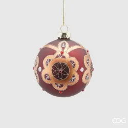
When you start decorating, you're not hanging objects – you're building reading surfaces. The hierarchy tells you who speaks first, who supports the sentence and who puts the exclamation mark; Layering is the technique by which you overlap these roles in depth, because the tree is not a flat board but a volume. You enter the scene with the leading pieces, those that define scale and character, and place them where the structure is most solid: near the trunk or on slightly backward supporting branches. The public must perceive a clear shape from a distance, so the large decorations do not all live on the façade; some are pushed inside to generate masses that, when illuminated, return the material glow you are looking for. As soon as you impose this architecture, you move on to the second register, made up of medium elements that connect the visual poles and fill the rhythm between one accent and another. Only then do you get to the little ones, who do not have the task of "filling in the holes", but of giving texture, micro-flashes, details that make the whole believable at a distance of one meter.
The distribution in space follows a logic of wide and asymmetrical triangulations. Choose an important decoration, fix it where the gaze naturally falls and then build a countermelody around it with two vertices, never at the same height. This design forces the eye to travel and prevents the necklace effect. When the room is large or the display case is deep, you enlarge the bases of the triangles; In small rooms, you make them narrower but retain the asymmetry. It helps you to think in "spans": vertical portions of the tree you cross with a coherent sequence of large, medio, small, repeated with variations. Each span dialogues with the next, without ever replicating it. If you notice diagonal lines that are too regular or a horizontal band "cutting" through the canopy, break the pattern by moving one element back or raising another by half a height.
Visual weight is a sum of size, color, brilliance, and position. A small but very shiny object on the façade can weigh as much as a large but opaque object further inside. For this reason, you always check your balance by looking at the tree against the light and with your eyes slightly half-closed: the density map appears immediately. If an area sinks, do not resort to the first shiny sphere; You advance a matte medio from the depth, add a soft reflection on the diagonal, bring back life without noise. Conversely, if a part "screams," set back a shiny metallic a few centimeters or replace a mirrored accent with a satin finish of the same color. Professional quality can be seen precisely in this ability to modulate without changing the theme.
The relationship with the lights is one of complicity, not of competition. The large decorations near the stem intercept part of the internal glow and reflect it outwards, so you orient them with intention, like small diffused mirrors. The medium elements are placed where the luminous zigzag creates corridors, closing the voids without extinguishing the breath; The minute elements, especially if transparent or thin glitter, live well on the thresholds between light and shadow, because the edge vibrates and not the mass. If an area is too bright after applying the decorations, you don't turn off the system: you change the angle of the objects or move back a couple of reflections that are "shooting" in the room. The result must be a light that passes through materials, not a light that fights us.
Depth is your most powerful ally. Every time you bring a decoration inside, another can stay outside without competing. Build levels as you would a shop window: a background plane with large, low-contrast volumes, an intermediate floor with shapes that create rhythm, a frontal plane with signatures and details. When you move your hand, think of an "S" gesture that enters, brushes, exits; The sinuous course avoids the corridors and makes the weave natural. Remember to work on the back as well, even if the tree rests on the wall: a few pieces right in depth lighten the shadows and increase the feeling of richness on the front.
The anchors must be invisible and secure. Heavy pieces don't rely on the standard hook: you use matching florist wire and "hug" them to the branch in two places, one for support and one for anti-rotation, so they remain oriented as you intended them. Glass blows better if it has a micro point of contact and a second support nearby, so that it does not wobble when you open a door or someone passes by. Fixing is not only protection, it is also aesthetic control: if a decoration tends to rotate showing a less well-kept side, you block the rotation and ensure that it always speaks with its best face. He works with clean gloves, especially on shiny surfaces and velvets, because the imprint is a defect that you can really see.
Consistency with the palette of the previous chapter is the compass. If the chromatic dominant is deep, let the large decorations bring that depth into the hair as well, and use accents to mark the obligatory passages of the gaze. If the palette is very light, avoid flattening the perimeter with too many bright whites on the façade: alternate transparencies and opaques, make the shadows created by the shaping work and bring part of the clarity inside to make it "light up" from behind. The metal chosen as a base does not appear everywhere with the same finish: you make it live in three registers — mirrored, satin, hammered — but not in the same plane, to avoid a competition of reflections.
The rhythm comes from the courage to let yourself breath. Not all space should be occupied; Measured vacuum is a material, especially around pieces of character. An important sphere acquires value if at ten centimeters it does not find imitations, but a smaller companion that echoes it. Pairs and small clusters work when they declare an intention: two elements that brush against each other like a broche on a coat, or three that form a micro group with hierarchies of scale. Avoid families of four alike in a row: they are tiring processions. If you realize that you have created a "necklace", break the sequence with an element of different material, perhaps set back, which interrupts the monotonous singing without changing the melody.
The final reading requires the photographic test and the dynamic test. Shots with long focal length reveal accidental alignments and holes that the eye, in real life, fills in by itself. A brief movement of air, even just passing around the tree, tells you if something is swaying as it shouldn't: correct it immediately, because that defect becomes a distraction every time someone enters the room. Make a complete turn by lowering yourself and getting up: at child level the tree must not seem to end up in a poor "undergrowth"; some more basso material elements, well fixed, tell us that you have thought of all points of view.
When closing, ask yourself if the story is effortlessly readable. You should recognize the protagonists at a glance, feel a fluid accompaniment and discover, as you get closer, details that you did not know were there. If everything sounds together but with distinct voices, you have worked well on the hierarchy. If you feel that you could remove a piece and the whole would improve, remove it: measurement is the most difficult luxury. You have thus prepared the ground for the next chapter, in which ribbons, picks and garlands will enter to orchestrate movement and lines of force, without ever overwriting the structure you have just built.
Decorative ribbons, picks and garlands
When you enter the phase of the tapes, picks and garlands, you are drawing the lines of force of the set-up. The volume that you have sculpted with the shaping and hierarchy of decorations now needs movement, legible trajectories that guide the eye without overwhelming it. The ribbon is the brushstroke, the pick is the botanical accent that breaks the geometry, the garland is the legato that unites the sentences. The secret is to treat them as architectural elements, not as additions: they must come from within, lean on the structure, interact with the light and close the chromatic story with moderation.
Start with the tape by deciding what part it will play in the visual sentence. It can be the protagonist, when you want a couture and material interpretation, or it can remain backlit, with thinner or translucent textures that make the internal light vibrate without weighing it down. If you choose velvets, grosgrain or fabrics with an evident weave, you take responsibility for a clear presence; If you choose organza, light taffeta or ribbons with a thin metal edge, subtraction work and transparency games. In any case, work with quality coils, preferably with a wired edge, because they allow you controlled curves, soft loops that hold the shape and waves that do not collapse. Before even cutting, test the response of the fabric between your fingers: if it returns to position with a slight elastic memory, it will help you build stable volumes; if it remains loose or bends to an edge, orient it in small strokes and accompany the curve with florist's wire.
The laying of the tape never starts from the surface. Create an internal anchor point, near a sturdy branch or stem, secure the garment with a round of matching thread and let the tape "emerge" outwards with a natural gesture. Avoid straight paths: look for an S-line that goes in, shows and re-enters, as a real cloth would do on a body. Vertical waterfalls have a theatrical force, but they only work if they stop at two or three points along the descent and if the arrival in the basso does not end in the void; the helical spirals enhance the tree when respecting depth, touching the heart with each turn to capture light; The horizontal weave is credible if it does not draw school bands, but alternates ascents and descents with soft undulations. The eye must perceive a rhythm, not a seam. For loops, work with groups of two or three wide folds, never all the same: a more generous loop, a medio one, a tail that retracts. The ends are not a minor detail: a clean "dovetail" finish, done with well-sharpened scissors, avoids the frayed effect and declares craftsmanship.
Integrate the ribbons with light as you would a fabric in the limelight. Opaque fabrics require a support close to an internal bright spot to detach from the background; Translucent fabrics, on the other hand, live when backlit and become almost volumetric when light passes through the weave. If you perceive an area that is too bright after inserting the tapes, do not remove the LED: move the curve back slightly or rotate the front of the tape to have less reflective surface. If, on the other hand, a span sinks, let the ribbon cross the niche and hook onto an innermost branch: the play of shadows and transparencies will rekindle the plane without adding objects.
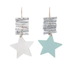
The picks are the botanical counterpoint. Think of them as shoots that grow from the trunk and open to the light. The most common mistake is to put them in the front, like pins on a pillow; Professional installation starts from the heart: insert the base between two structural branches, tilt the stem in the direction of the trajectory you want to suggest and lock it with an invisible ligature in two points, one for support and one for anti-rotation. Orientation is everything: berries and twigs should follow the curves of the ribbons or cross them with a diagonal that gently breaks the symmetry. Picks made of rigid and shiny materials are powerful but risk becoming noisy; To tame them, bring some garments further inside, let the light hit them with a cut and alternate them with more opaque or natural elements. If you work on a snowy tree, use picks with soft finishes or quality frost so as not to add visual dust; On a deep green, waxed leaves, thin woods and satin berries build an elegant realism that dialogues better with warm lights.
The garland is the bond, the musical "slur" that unites the notes. Whether pearls, turned wood, thin metal or micro-ornaments on wire, it should never be laid as a uniform continuous line. Mentally divide it into sentences: lay it down, stop it in an internal point, let it descend with a small chain and climb back up discreetly. When you change direction or move to another section, hide the junction behind a cluster of branches or at a medio ornament so that reading remains fluid. Very shiny garlands need company: a nearby stretch of ribbon or a matte pick breaks the reflection and prevents the necklace effect. Those made of natural material, on the contrary, gain presence if they receive an accent of light when entering and exiting a span, as if they were breathing with the tree.
The relationship between these three tools is a matter of visual weight. If the tape is "loud", the picks become whispers that emerge at the ends of the curves and the garlands work softly as a common thread. If the botanical theme is the protagonist, reduce the amount of ribbon, use narrower widths and let the tails disappear quickly, so as not to overdress the hair. If you want a joyful and graphic language, bring the garland to the forefront as a rhythm and let the ribbons and picks move on an intermediate plane so as not to push everything on the perimeter. Remember that the three elements must exist at different depths: something always inside, something half, something on the façade. It is stratification that creates wealth without chaos.
Anchoring is part of aesthetics. Use matching florist's wire or releasable micro-ties for clean fixings; Avoid bulky knots and visible staples. Each ligature must disappear in the weave of the branches and leave the material free to suggest movement, not immobilized like a sign. The ends of the picks, often metal and sharp, must be folded and the cut covered, especially in the dimensions at hand. If you work in public spaces or with children and animals, keep softer materials in low areas and reserve rigid or protruding elements for high spans, where they maintain dynamism without becoming risks.
Consistency with the palette defined above decides the finesse of the result. A tape can resolve a chromatic dissonance or amplify it: if you feel that a metal is shouting, introduce a fabric of the same tonal family but in a matte finish, so it absorbs the light and calms the reflection; If the whole is too cold, a natural fiber or a warm velvet in a vertical trajectory brings temperature without changing the decorations. Think of the tape as a "healing brush" that evens out the spans, not as a mandatory ornament. The same goes for garlands: a wooden or opaque pearl version can act as a bridge between two metals that do not speak to each other, while a mirror version risks putting them in competition.
The final test is never only photographic, it is also cinematic. Walk around the tree, barely move the air with one hand and observe how the curves and stems behave. A slight movement is alive and natural, a wide oscillation is distraction and must be tamed with an extra fixing point or a minimum twist of the stem. Turn off the ambient light and leave only the tree lights on: the ribbons should appear as soft roads that collect glows, the picks as shoots that catch sparks, the garlands as trajectories that connect without interruption. If a line attracts the eye more than the story as a whole, add nothing else: remove, retreat, lighten.
When you close this phase with a steady hand, the tree breathes. The trajectories are clear but not didactic, the material is present but not redundant, the light inhabits the fabrics and bounces off the surfaces with intention. You have sewn the reading planes together without visible seams. At that point the next chapter — topper and base — will not be an addition, but a natural conclusion: the punctuation that seals the sentence and anchors it to space, completing a composition that, from any distance, appears thoughtful and professional.
Topper and base: finishes that make the difference
The ending and the foundations tell the quality more than any other detail. The topper is the signature in alto, the base is the cadence that binds the tree to the architecture. Treating them as protagonists, and not as accessories, means closing the project with formal coherence, safety and measure.
Start with the topper and think about proportion, orientation and fixation. The rule that always works is to work on a real base, not a "suspended" one: prepare, just below the tip, a small plateau of horizontally modeled structural branches. It is the invisible support surface on which the topper will take stability and from which the tying points will start. If your element is a rigid star or a graphic emblem, check that the "camera ready" side faces the main front and slightly towards the basso: an inclination of a few degrees avoids the billboard effect and integrates the object into the volume. Whether the topper is a botanical bouquet, a couture bow, or a mixed composition, think in terms of directions: a central thrust that rises and two shorter vectors that fan out accompanying the ribbon lines. It doesn't have to look like a deck strung vertically, but like a natural growth that continues the silhouette you've sculpted with the shaping.
Fastening is a technical gesture that decides elegance. Always work with a double safety: a load-bearing tie in matching florist's wire that embraces the stem or a structural branch and a second outermost anti-rotation point that prevents the element from changing orientation as the days go by. If the topper has a rod, create a "tie" with two twigs folded and tightened around the shank before completing with the thread; If it's a light composition, use reopenable micro-ties hidden in the mass, then mask the dots with a small leaf or a piece of tape from the same palette. Strength must not be seen, but be there. In public environments or with intense passages, add a transparent nylon line to an anchor point alto: it is an invisible belt that protects against accidental impacts without weighing down the eyes.
The light of the topper must be designed as a micro scenography. The goal is not to make it shine brighter than the tree, but to give it legibility and three-dimensionality. If you have a metal or mirrored element, avoid "shooting" the perimeter at it: bring two or three points of light from the heart to the back of the topper, so that the profile lights up by contours and not by blinding reflections. On bows and fabrics, a soft backlight enhances the texture without puffing out the volume; On botanical compositions, let a hot micro cone bounce off the inner leaves and only a few sparks arrive on the façade. When you turn off the environment, the topper must emerge as a consistent crown, not as an isolated beacon.
The basis is the other half of the story, the one that is often resolved at the last minute and which, instead, must be thought out from the beginning. The first task is technical: to make the mechanics disappear and stabilize the center of gravity. If you work with a basket, measure the real diameter of the foot and the height of the first order of branches; a basket that is too narrow constricts, one that is too low creates the "sunken tree" effect. Insert a stable shim — an MDF ring, a lightweight footboard, even a coated high-density polystyrene disc — to bring the top edge of the basket a few inches below the branches, so the visual passage is natural and the power cord can run inside without showing itself. If you prefer a fabric tree skirt, choose a material with adequate weight and hand: a velvet with lining or a worsted wool maintain the drape and do not reveal the underlying base; Light fabrics, without structure, sag and betray the technical system you wanted to hide. With flocking or very light palettes, a tone-on-tone base amplifies the brightness; With deep greens and warm metals, a slightly darker tone anchors the composition and ennobles the floor.
The floor composition is where you can consolidate the palette and identity. If you insert scenographic packages, treat them as interior objects, not as fillers. Two or three well-constructed volumes, with quality papers, real ribbons and clean closures, are worth more than a multitude of random boxes. Alternate heights and footprints, leave corridors for passages and provide a "technical" panel that is easily removed to access the transformers or power strip. In the store, he aligns gift wrap and shopping bags with the tree palette and uses the base as a teaser of the packaging that the customer will take home: it is a narrative bridge between the window, the product and the checkout counter. In the home, the base can accommodate a tactile detail that creates atmosphere — a woven blanket, a patinated wooden crate, a basket of berries — as long as each element is fixed so that it does not slip and does not hinder daily movements.
Cable management decides the degree of perceived professionalism. Plan a clean access route to the power strip, ideally on the less exposed side, and always create a service loop to disconnect without pulling the system. Transformers must breathe: avoid suffocating them under thick fabrics and, if you place them in a box, make invisible slots for air to pass through. The excess cable is collected in soft reels and tied with tone-on-tone releasable ties, never with knots that mark the insulation. If the floor is slippery or the passage frequent, a thin non-slip mat under the cover prevents micro movements and vibrations that, over time, loosen the tightening.
Structural security is played right at the base. Discreet weighting — flat plates, coated sandbags, cast iron discs — hidden under the cover makes the shaft firm and quiet. In public spaces or with children and animals, combine this with two low nylon tie-rods towards a solid piece of furniture or a floor hook, masking the path with the same logic with which you hide cables. The final perception is one of calm: the tree does not vibrate at the first draft, it does not swing when someone passes, it does not emit creaks that betray joints under stress.
The chromatic relationship between the base and the foliage is what transforms the roof into a "backdrop". If the palette is dark and velvety, a slightly more opaque base absorbs light and highlights the inner glow; If the whole is light and Nordic, a textured base in wool, linen or natural fiber introduces materiality and prevents the effect "suspended" on the floor. The metals on the foot must be dosed carefully: an overly mirrored crown captures random reflections and multiplies visual disorder. Better satin or hammered finishes, which return light without mirroring the environment. Remember that the base is a large "field of color": it can rebalance a slightly overly bright tree by warming the floor, or lighten a very dense whole with a consistent light tone.
The final quality control is done with the ambient lights off and with only the shaft on, then in reverse. Look at the line that joins the base and hair: there must not be a clear detachment, but a natural transition. The shape of the topper must complete the cone without turning it into a spear; the base must anchor without sinking. Take a photo from eye level and one from basso- does the topper tell the same story from both heights? Does the base maintain dignity even at one meter, where children's eyes read the world? Pass your hand a few centimeters from the fixings: nothing should move more than necessary. If you perceive an excess in alto, do not add weight in the basso: lighten the topper or move its side vectors back; If the base looks noisy, remove two elements and let the fabric breathe.
When you close this chapter with the same care you have dedicated to shaping and lighting, the tree stops being an object and becomes a presence. The topper signs without screaming, the base supports without asking for attention, the cables and mechanics disappear in an honest mise-en-scène. It is here that the visitor, upon entering, feels that elegant calm that distinguishes a professional set-up: nothing is random, everything is in its place, and the whole story — from the first spark at the top to the last drapery on the floor — sounds like a single well-concluded sentence.
Quality control, maintenance and intelligent disassembly
Quality control is the moment when you transform a good set-up into an impeccable one. You do this by turning off the superfluous and training your gaze to read form, light and order. Start from the whole: observe the tree from three distances, close enough to grasp the details, at a medium distance to check rhythm and layering, at the back of the room or from the street to evaluate silhouette and recall. Change altitude, put yourself at the eye level of an adult and then lower yourself to the level of a child: what does not hold up at both heights must be corrected. Reduce ambient lighting and leave only the tree lights on; If you've memorized different scenes, scroll between "day" and "evening" to understand how metals, glass, and ribbons behave in different conditions. Take two photos with your smartphone, one with a wide-angle lens to check perspective deformations, one with a telephoto lens to bring out holes, involuntary alignments, excesses of reflection: the camera is ruthless and gives you an honest map of the areas to be refined.
Corrections are made with a light hand, starting from the fundamentals. If you notice an excess of light density on the perimeter, move a portion of the string back or rotate the light points inwards to transform the glow into depth; If an area sinks, you don't add random objects, you move a decoration medio from the façade to the semi-depth, you create a strip that crosses a niche, you allow the light to bounce. Check the alignments: three elements at the same height create a "necklace" that the eye will chase endlessly; just raise or retreat one of the three to break the song. Pass the hand a few centimeters from toppers, important clusters and garlands: everything must remain still, with minimal and controlled flexibility; If a workpiece rotates or swings, you add an invisible tie stitch, tighten a thread, orient again. Cleanliness is part of the quality: remove residual flocking dust with a soft brush, remove fingerprints from metals and glass with a dry microfiber cloth, cut off any visible thread tails or cable ties. The base must breathe like the rest: clean drape, invisible cables, intuitive but hidden access to the power strip.
In-season maintenance is a short, regular routine, not an overtime job. Schedule a quick check at the start and end of the day: a look at the dimmers, a check of the scenes, a swipe of the fingers to realign tips or tapes that have moved, the possible replacement of a battery on cordless elements. If the set-up is in a public environment, provide a micro kit on hand with matching florist wire, sharp scissors, a few hooks, a pair of removable ties, a dry cloth: five minutes of daily maintenance are worth hours saved in emergencies. Keep the transformers under control: they must remain warm, never hot; Ensure ventilation and do not place heavy fabrics on top. If you're using a smart plug, make sure that any app updates haven't changed the scenes; If you notice any flickering or inconsistencies, isolate the circuit and do a single test to rule out load issues or loose contacts. The lower areas, within reach of curious hands or paws, should be monitored more carefully: if necessary, temporarily replace fragile pieces with soft elements without edges, preserving aesthetics and improving safety.
In the middle of the season, treat yourself to a profound overhaul. Turn off the environment, work only with the tree on and retrace the hierarchy: are the protagonists still legible? Do mids connect with rhythm? Do the little ones add texture without noise? If the eye gets tired, there is probably too much sparkle on the façade: move back three or four mirrored elements, introduce two opaque surfaces of the same colour, restore balance without changing history. The ribbon is your directing tool: a well-laid line can mend a span that has "opened", a lightened tail can take weight off a diagonal that marked too much.
Documenting is investing in the future. Create a technical sheet of the set-up with palettes, lighting scheme, front and three-quarter photos, positioning of key clusters, note of the main heights, list of materials with real, not estimated quantities. If you're working on multiple locations or plan to replicate the concept the following year, add a simple diagram of the light laying and cable routing, point out invisible anchor points, and the topper and base dimensions. Save everything in a folder named by year and theme, print an essential copy and place it in a transparent envelope near the feeding point: when you need to intervene, you will not go by memory.
Smart disassembly starts days before, when you decide not to arrive at the last minute. The goal is to return from the project with the same care with which you entered, protecting materials and time. Proceed in reverse of the set-up, but with warehouse logic: turn off and unplug, let transformers and controllers cool, prepare a clean support surface for decorations, a table for the "triage" of materials and rigid containers already labeled by color families and fragility. You will start from the topper, first removing the anti-rotation points and then the load-bearing binding, taking care to keep dedicated components and fixings together; You will continue with ribbons, garlands and picks, retracting with the curves instead of tearing them, because preserving the memory of the fold will save you time at the next assembly. The decorations go down by hierarchy: first the large, then the medium, finally the small; Each household goes in its own container with soft separators made of neutral tissue paper or thin foam sheets, without plastic that traps moisture. Glass and metals travel separately; Velvety surfaces require acid-free paper interleaves so as not to shine.
The lights are managed methodically, because this is where you really save money. If the shaft is pre-lit, disconnect section by section, verify that each connector fits into its cap or protected location, wrap the cables in soft reels secured with releasable cable ties, and place the transformers in an envelope labeled with the year, color temperature, power, and destination. If you have used independent strings, avoid the "spool" winding, which introduces twists; Prefer the eight-way around two fingers or a cardstock, leaving a free loop for the connector. Insert a card with the lengths and serial number, so you'll know at a glance what you have in stock and what needs to be replaced. Any string with a marked sheath or opaque LEDs must be discarded: maintenance is not conservation at any cost, it is selection.
Shaping is preserved just enough. Do not crush the branches to fit everything back into the original box at any cost: if the package is solid, use it with the addition of dedicated bags; Otherwise, you prefer cases in breathable technical fabric with sturdy handles, in which to store the sections wrapped in light sheets. The ends should not be "ironed" straight; Leave them with a natural curvature and protect the outermost layers with a soft round of micro-perforated film or sheets of tissue paper, so you avoid abrasions and loss of flocking. Insert desiccant sachets, especially if the warehouse is not perfectly conditioned; Humidity is the silent enemy of metals, glues and finishes.
Labeling is your best ally. Each container must tell what it contains, for what theme and for what height of the tree it was used. Add a color code consistent with the palette and, if you want to take it up a notch, apply a small QR label that refers to the photo card: the next time you set it up, your orientation will be immediate. Store tools and small parts in a box dedicated to the tree, so you don't have to start from scratch: florist wire, hooks, cable ties, cloths, gloves, cutter, nippers, pocket level, soft brush. The following season will begin already halfway through the work.
Security concludes the job as it began. Check that there are no tension cables under covers, that the power strip is disconnected and stored, that any tie rods are removed without leaving residues. Clean the area and give the space back its daily function: a professional set-up is also measured in the ability to disappear without traces. Finally, write down what worked and what you would change: light density, tape lengths actually used, fragility found on some finishes, audience responses, real assembly and disassembly times. It's the notes that, next year, will make what is complicated for others seem simple.
When you close in this way, the tree is not just "finished": it is finished, documented, and ready to be reborn. Quality control sealed the scene, maintenance ensured continuity, intelligent disassembly protected value and time. Next time you'll enter the space with a toolbox and a pre-written project; And the effect, again, will be what you are looking for every season: a calm, full, credible set-up, which seems easy precisely because there is a method behind it.
A truly successful scenography is never a stroke of luck: it is the sum of conscious choices, precise technical gestures and narrative coherence from beginning to end. Now you have a complete method in your hands, from tree selection to base care, from intentionally designed lights to building the décor hierarchy, to maintenance and smart disassembly. What matters, more than any individual trick, is the discipline with which you transform the process into a habit: reading the space before going into action, deciding on the palette with a real moodboard, designing the light from the inside and only then "dressing" the surface, keeping safety as part of the aesthetic. When this rhythm gets into your hands, the setting becomes fluid and the tree begins to speak the language of the place it inhabits.
The result you are looking for is not the "full" effect at all costs, but a luminous calm that stands the test of the gaze, photographs and time. If the tree is credible with the light off, with the light on it will be extraordinary; if it is solid in structure, it will withstand passages, drafts and holidays; If the palette is consistent, a few accents will be enough to give rhythm without noise. Professionalism, after all, can be recognized right here: in the ability to remove what is not needed, to retreat a glow when it dazzles, to move a detail to let the whole breathe. Each season you will train your eye on these micro-decisions and you will find that the time invested in preparation buys time in all the subsequent phases.
Think of your tree as a living project, which feeds on memory. Documenting palettes, lighting schemes, anchor points and distribution of decorations is not fussiness, it is capital for the following year: it allows you to replicate consistently, adapt intelligently to different spaces, optimize materials without improvisation. The quality of the components, the care in storage, the choice of finishes that last and are repairable are also a gesture of sustainability: less waste, better results, clearer identity over time. If you work in a shop or in public spaces, this continuity becomes a visual identity; If you set up at home, it becomes a ritual, something that you recognize and rediscover, enriched with small variations that tell the story of the past year.
Don't forget that this method is democratic: it applies in a lobby with high ceilings as well as in a living room, with a large budget or with an essential selection of well-chosen elements. Elegance does not come from quantity but from the precision with which you govern proportions, light, materials and safety. This is the reason why a ribbon laid with criterion is worth more than ten months in a hurry, and a single well-phrased garland can give direction to the whole hair. When you feel that each part cooperates with the others — the base hooks, the body breathes, the light guides, the topper signs without shouting — then you have reached that professional balance that makes what is actually the result of method appear "easy".
Finish the job with the same care you started it with: a control photo, two notes on what you'll repeat and what you'll change, a final look at cable management and hidden fixings. Then give yourself the distance: observe the tree from the entrance, from the sofa, from the sidewalk in front of a shop window. If you recognize the same story at every distance, if your gaze moves naturally and stops where you wanted, you have hit the mark. Your tree isn't just decorated – it's set up. And, above all, it is yours — in method, in style, in measure. Next time you will start from here, with more confidence, more speed and the same ambition: to build a luminous presence that accompanies the party without monopolizing it, that invites, that warms, that lasts.