The Christmas season is one of the most anticipated seasons of the year, not only for celebrations and gifts, but also for the opportunity to create a magical and memorable atmosphere, starting with the packaging. For businesses and stores, Christmas packaging is not just a wrapper, but a key part of the customer experience. The choice of colors, in particular, plays a crucial role: it conveys emotions, recalls the identity of the brand and makes each package irresistible in the eyes of those who receive it.
Every year, the color trends for Christmas are renewed, embracing traditions and innovations. This year we see a strong trend towards the use of colors that combine elegance, modernity and a touch of nostalgia, always maintaining a strong focus on sustainability and quality of materials. From classic and warm shades such as red and gold, to neutral and minimalist tones, to natural greens and trendy metallics, each color choice helps define a brand's identity and make a difference.
In this guide, we'll explore the hottest color palettes for Christmas packaging and provide practical tips on how to best use them. Whether you're looking for a traditional look or a modern, innovative style, you'll find inspiration and ideas for creating Christmas packaging here that will not go unnoticed.
Christmas Color Trends
Christmas is a magical time, and every year brings us not only the joy of the holidays, but also new trends in the world of design and packaging. The choice of colors for Christmas packaging can make a big difference in how customers perceive a gift or product: a well-designed package, with current and harmonious colors, can turn a simple purchase into a special and memorable experience.
Christmas color trends are not random choices: they refer to a careful observation of fashions, the evolution of tastes and market needs. In recent years, we have seen an evolution from traditional and symbolic colors, such as red and gold, to more innovative and sophisticated shades, including pastel shades, metallics, and natural shades. This year, the Christmas palettes are mainly divided into three major directions:
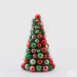
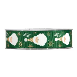
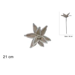
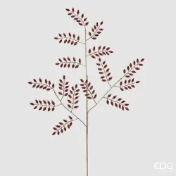
- Classic and Nostalgic Palettes: Traditional colors such as red, green, gold, and silver continue to be popular because they immediately evoke the Christmas atmosphere. However, these shades are evolving towards more mature and sophisticated shades, such as burgundy, pine green and matte gold, to give a touch of elegance and modernity to the packaging.
- Modern and Minimalist Tones: Neutral colors and delicate hues are becoming the protagonists of Christmas. Shades of gray, beige, cream and white are increasingly popular, as they convey a modern and refined aesthetic, perfect for those looking for a minimalist and understated, yet impactful look.
- Color and Nature: As attention to the environment increases, companies and designers are experimenting with nature-inspired colors, such as sage green, earth brown, and ocean blue. These colors not only recall the idea of sustainability, but bring a warm and authentic touch to the packaging, in line with the growing interest in sustainability.
For brands, following Christmas color trends means staying up to date and proposing an image in line with customer preferences. Packaging that reflects current fashions and harmonizes with the Christmas season can make all the difference, not only attracting attention, but also communicating a sense of care and quality. In the next chapters, we will explore the different color palettes in detail and provide advice on how to use them for visually striking packaging, with an eye also to consistency with the brand identity.
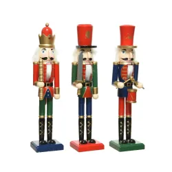
Timeless Classics: Red, Green and Gold
Some colors never go out of fashion, and every year they renew their presence in Christmas decorations and packaging. Red, green and gold are shades that immediately evoke the Christmas spirit, representing tradition, warmth and celebration. These colors are linked to deep symbols: red represents love and joy, green recalls nature and hope, while gold is a symbol of wealth and splendor. Using them in Christmas packaging allows you to create a familiar and reassuring experience, but it is important to know how to reinterpret them to keep them fresh and modern.
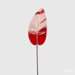
Red: The Color of Joy and Energy
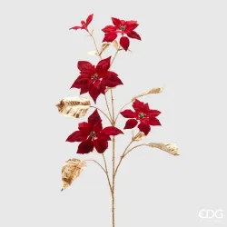
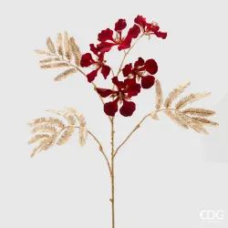
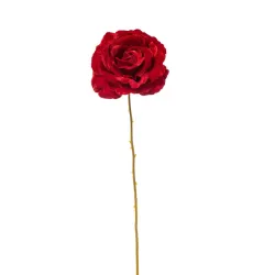
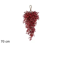
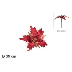
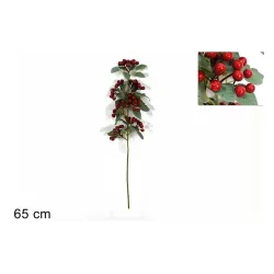
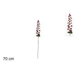
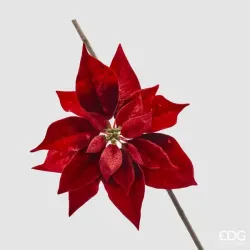
Red is undoubtedly the most iconic color of Christmas. From Santa's suit to tree décor, this warm and vibrant hue instantly adds a festive touch to any packaging. For a modern look, you can opt for deeper shades of red, such as burgundy or ruby red, which give an understated elegance without losing the energy of the color. A gift package wrapped in red paper, paired with a gold bow or pine green label, is a classic option that never goes out of style.
Green: The Call to Nature and Sustainability
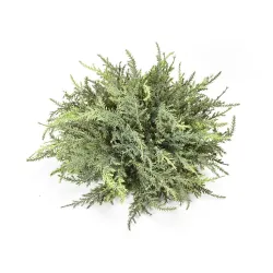
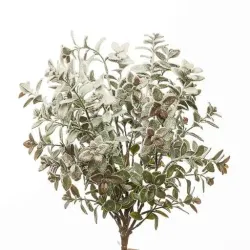
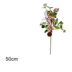
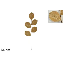
Green is the color of nature, of the Christmas tree and of hope, and this year it also becomes a symbol of sustainability. Popular green tones for Christmas packaging include pine green, forest green, and sage green, which are less vibrant than traditional green but lend a touch of sophistication. These shades evoke a sense of authenticity and naturalness, ideal for brands looking to convey a message of respect for the environment. Pairing it with kraft paper elements or bows made of natural materials, such as jute, can amplify this sustainable message.
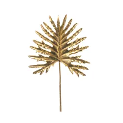
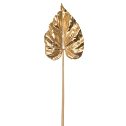
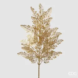
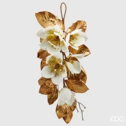
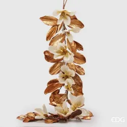
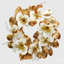
Gold: Elegance and Splendor
Gold is synonymous with luxury and wealth, perfect for making each package a small treasure. In Christmas packaging, gold can be used to add bright accents or to create an opulent look, especially when combined with red or green. Today, gold comes in many shades, from classic polished gold to more matte and vintage variants, such as antique gold or rose gold, which give a more sophisticated touch. For example, a dark green box with gold details or a matte gold ribbon manages to create a luxurious and impactful visual effect, without being excessive.
Classic combinations revisited
For packaging that respects tradition without looking dated, you can combine these classic colors in an innovative way. For example, red and gold work very well on a neutral background, such as white paper or cream, to give lightness and a modern look. Another idea is to add different textures, such as matte paper for a deep red, green velvet for an elegant touch, or gold foil for a bright and eye-catching effect.
Respect the Brand Identity
When using classic Christmas colors, it's important to keep them in line with your brand identity. A minimalist brand might prefer a softer red or sage green, while a luxury brand might opt for more striking gold accents. Finally, it is advisable to choose materials and details that reflect the personality of the brand: velvet ribbons, wooden elements or recycled paper can make a big difference in telling a story through packaging.
Modern Elegance: Neutral and Natural Tones
In recent years, the preference for neutral and natural tones has taken over the world of Christmas design and packaging, bringing a more refined and minimalist aesthetic to packaging. Colors such as beige, cream, gray, and delicate shades of brown and ivory offer a feeling of tranquility and simplicity that moves away from traditional opulence, perfectly fitting an idea of understated and modern elegance.
This color choice reflects not only a style trend, but also a growing interest in sustainability and naturalness: neutral tones recall raw materials, winter landscapes, and the idea of a Christmas in harmony with nature. Using neutral and natural colors allows you to create packages that are elegant and versatile, capable of adapting to different types of brands and attracting an audience attentive to design and the environment.
Beige and Cream: The Charm of Simplicity
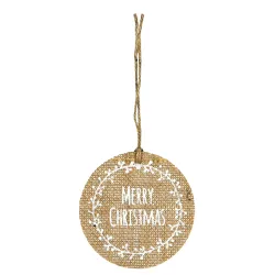
Beige and cream are colors that convey calm and delicacy, perfect for sophisticated packaging without excesses. These shades offer a neutral base that easily matches decorations of all kinds: from golden ribbons to wooden or jute details. Using beige kraft paper for Christmas packaging, for example, adds a rustic and natural touch, ideal for eco-friendly brands or those who want to evoke authenticity.
For an understated luxury effect, you can opt for an entirely creamy white packaging, combined with gold details or elegant calligraphic writing. The use of creamy white gives the packaging a timeless refinement, adaptable to gifts of any kind.
Grey and Powder Grey: The Modernity of the Neutral
Grey has also become an increasingly popular colour during the Christmas season, especially in its lighter variants such as dusty grey or light grey. It is a perfect choice for brands that want to convey modernity and minimalism, offering packaging that stands out from traditional colors. Combined with metallic details, such as silver or matte gold, gray adds a touch of sophistication and lends itself very well to simple and geometric decorations.
Grey can be combined with natural elements, such as a bow of twine or a recycled paper label, to give the package a contemporary and, at the same time, eco-friendly look. This color is also versatile and goes well with both women's and men's gifts, making it an ideal choice for unisex brands.
Natural Colors and Browns: A Call to the Earth
Natural colours such as light brown, earth and terracotta are increasingly appreciated for their authentic and reassuring effect. These shades evoke the idea of nature, forests and sustainability, perfect for those looking for a simple but warm and welcoming look. Brown kraft paper, for example, is a sustainable and aesthetically pleasing option, often used for rustic or vintage packaging, enhanced with elements such as string flakes or pine twigs.
These shades also lend themselves to Nordic-style decorations, with touches of white and small details in wood or natural fabric, for packaging that conveys warmth and simplicity.
Touches of Sage Green and Eucalyptus: Nature Meets Minimalism
To add a color accent to neutral shades, sage green and eucalyptus are delicate but effective choices. These soft greens are perfect for brands that want to convey a message of sustainability and closeness to nature, without sacrificing elegance. Sage green, in particular, pairs beautifully with neutral colors like cream or gray, adding a note of freshness without being overpowering.
Decorating a neutral package with a sage green ribbon or small sprigs of eucalyptus can transform a simple packaging into a refined gift, which communicates attention to detail and a strong connection with the environment.
A Look Consistent with Brand Identity
For brands that embrace a minimalist aesthetic or promote sustainability values, neutral and natural tones are a perfect choice to communicate authenticity and modernity. Details also matter: ribbons made of natural fabric, recycled paper labels and nature-inspired decorations complete the look and make the packaging an extension of the brand identity.
This chapter explores the power of neutral and natural tones for a refined, sustainable Christmas in step with modern design trends. Ideal for brands that want elegant packaging consistent with the values of simplicity and nature.
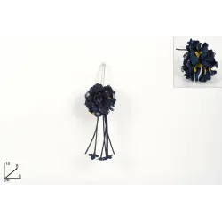
Midnight Blue and Silver: For a Refined and Winter Look
Midnight blue and silver are a perfect color combination for those who want to create elegant and sophisticated Christmas packages, capable of evoking winter enchantment. The deep and mysterious midnight blue recalls the tranquility of winter nights and the starry sky, while the silver adds a touch of light and freshness that recalls snow and ice. Together, these colors create a unique, modern and refined aesthetic, ideal for those who want Christmas packaging outside the traditional schemes.
This combination is particularly suitable for brands that focus on an image of understated luxury and want to convey a feeling of timeless elegance. Midnight blue and silver are versatile and unisex colors that are perfect for creating packaging that is both visually appealing and functional.
Midnight Blue: An Intense and Enveloping Color
Midnight blue is a shade that conveys elegance and depth, evoking images of starry skies and snowy scenery under the moon. This shade, darker than the classic blue, is perfect for brands looking for a sophisticated and unconventional look. It can be used as a base color for packaging, combined with silver or white details to create contrast and give a sense of light and harmony.
For an even more elegant effect, you can use special textures, such as velvet or matte paper, which add a feeling of softness and luxury. A midnight blue packaging, for example, can be enriched with a silver ribbon or with small embossed details, such as stars or snowflakes, for a winter and sophisticated touch.
Silver: Brightness and Freshness
Silver is a color that represents freshness and modernity, ideal for those who want a bright and refined winter look. Its metallic hue pairs perfectly with midnight blue, creating a contrast that is both delicate and impactful. Silver can be used in details, such as ribbons, bows, or decorations, to add an elegant light and add a touch of sparkle to the packaging.
Silver is also a very versatile color, which can be made colder and more modern when used in shiny and bright shades, or warmer and more delicate by choosing a matte or satin finish. For those who want particularly elegant packaging, silver can be used for hot stamping or embossed details, which add texture and depth to the package.
Refined Combinations: Midnight Blue and Silver with Touches of White
One of the most striking combinations for Christmas packaging is midnight blue and silver with touches of white. White, even in small doses, adds brightness and recalls the whiteness of snow, making the package even more wintry and festive. A midnight blue package with a silver ribbon and a white label, for example, can convey a sophisticated and chic look that is ideal for high-end gifts.
This combination can be made even more special by adding small details, such as embossed decorations in the shape of snowflakes or silver stars, or with a delicate glitter effect that recalls the light of ice. White, when used in detail, helps to make the package fresher and lighter, balancing the intensity of midnight blue and the brightness of silver.
Textures and Materials for a Winter Effect
To achieve a winter and sophisticated look, you can experiment with different textures and materials. Matte or velvety paper in midnight blue offers a touch of softness and luxury, while silver details in foil or with a metallic effect create an interesting and modern contrast. Velvet or satin ribbons add a tactile element, which enriches the experience of those who receive the package, making every detail accurate and precious.
Other materials that recall winter are textured cardboard, satin fabric and even kraft cardboard decorated with blue and silver details for a more rustic but still elegant effect. These materials, combined with midnight blue and silver colors, allow you to achieve a look that not only looks elegant, but feels luxurious and pleasant to the touch.
Midnight Blue and Silver: A Consistent Look for Brand Identity
The midnight blue and silver combination lends itself particularly well to luxury brands or those that focus on a modern and clean aesthetic. It is a color choice that communicates elegance and professionalism without being excessive, perfect for those who want a look that is memorable. For brands that offer high-end products or focus on a sophisticated image, these colors allow you to create visual continuity between the product and the packaging, emphasizing the value of the brand.
Pastel Palettes: Bright and Original for an Unexpected Christmas
Pastel shades are an increasingly popular choice for those looking for a fresh and innovative alternative to classic Christmas colors. These delicate shades, such as powder pink, light blue, lilac and mint green, offer a unique and modern look, perfect for those who want to surprise with bright and cheerful packaging. Using pastel colors for Christmas packaging can help brands stand out with a youthful and creative aesthetic that recalls the joy and magic of the holidays in an unconventional way.
This palette is particularly suitable for brands that focus on a playful, contemporary and innovative style, attracting the attention of a young audience attentive to new trends. Pastel colors evoke lightness and lightheartedness, making them perfect for gifts that convey a sense of joy and surprise.
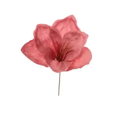
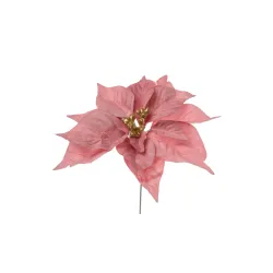
Powder Pink: Delicacy and Modernity
Powder pink is a sweet and sophisticated color that can add a feminine and refined touch to Christmas packaging. This shade, which stands out for its elegance, is perfect for brands that focus on a glamorous and chic image. Combined with gold or silver details, powder pink stands out and lends itself well to packaging that wants to communicate delicacy and luxury.
An example would be a blush pink paper package with a gold or silver ribbon, or decorated with small pearls or glitter for a sparkling touch. This color also works very well in combination with white, creating a harmonious and bright visual effect reminiscent of Christmas sweets or snowflake decorations.
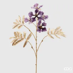
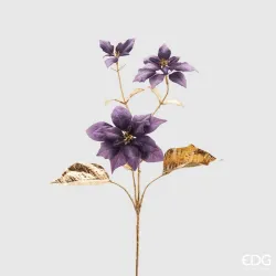
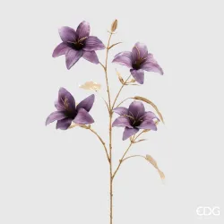
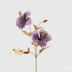
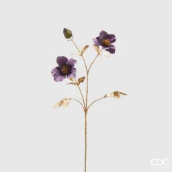
Light Blue and Lilac: Freshness and Originality
Light blue and lilac are shades that bring a breath of fresh air to Christmas packages, offering an alternative and surprising palette. Light blue recalls the winter sky and the serenity of cold days, while lilac adds a touch of creativity and romance. Together, these colors create packaging that looks like something out of a winter fairy tale, perfect for brands that want to convey a sense of lightness and magic.
For a more sophisticated look, you can use a matte pastel sky blue paired with white or silver details, or decorate the packaging with lilac elements, such as bows, ribbons or small floral decorations. These combinations are ideal for a young audience or for those looking for a colorful and fun Christmas, far from the more traditional schemes.
Mint Green: A Hint of Freshness
Mint green is a pastel shade that can add a touch of freshness and modernity to Christmas packaging. This delicate color evokes ice and winter nature, but in a lighter and more modern version than dark green or pine. Perfect for brands that want to convey a young and dynamic image, mint green goes well with both light colors, such as white and cream, and with metallic details that give brightness.
A mint green packaging decorated with white ribbon and small silver details, for example, can be an original idea for packages that recall the idea of freshness and purity, perfect for Christmas gifts with a modern and delicate look.
Creative Combinations: Pastel with Metallic Details
One of the most effective ways to make a pastel palette sophisticated is to combine it with metallic details. Rose gold, silver and matte gold work particularly well with pastel colours, as they create an elegant contrast without weighing down the look of the packaging. For example, a lilac package with a rose gold bow or a powder pink package with silver details can be modern and refined, ideal for brands looking for a glamorous but light touch.
These combinations allow you to maintain the freshness and originality of pastel colors, while adding a touch of elegance that makes the packaging ideal for high-end gifts.
Minimalist Decorations for a Modern Look
Pastel colors, with their lightness, lend themselves very well to minimalist decorations, which accentuate their modern character. For simple but effective packaging, you can use thin ribbons, small geometric labels or matte paper details. Minimalism allows pastel colors to stand out and communicate a sense of freshness and cleanliness, perfect for brands that focus on a simple yet sophisticated aesthetic.
Minimalist packaging, for example, could consist of a mint green box with a small white ribbon and a kraft paper label, or a light blue package with a silver bow and embossed decoration. This type of decoration allows you to achieve a modern and distinctive look, suitable for customers who love contemporary design.
Adapting Pastel Colors to Brand Identity
Choosing a pastel palette for Christmas packaging is a style statement, ideal for brands that want to communicate a young, creative and innovative image. However, it is important to adapt the use of pastel colors to the brand identity: while a children's brand might choose brighter and more playful pastel shades, a luxury cosmetics brand might opt for a matte pastel palette and refined details in gold or silver.
In addition, the use of quality materials, such as velvety paper or satin finishes, helps to maintain the elegance and value of the packaging, transforming a pastel-colored package into a classy and distinctive gift.
Dark and Deep Tones: Mysterious Elegance for a Luxury Christmas
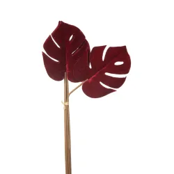
Dark, deep tones are a bold color choice for Christmas packaging, creating an atmosphere of mystery and luxury that departs from the classic bright hues of the holidays. Colors such as burgundy, forest green, plum and black bring with them a timeless elegance, perfect for brands that want to convey exclusivity and sophistication. These shades evoke the image of a sophisticated and enveloping Christmas, focusing on an intense palette that is aimed at an audience in search of uniqueness and prestige.
Using these colors for Christmas packaging allows you to give the product a alto level look, communicating a sense of luxury that stands out from traditional packaging and fits perfectly with high-end gifts or exclusive items.
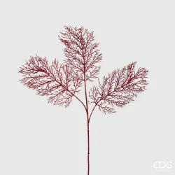
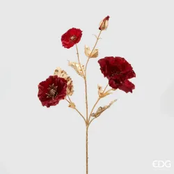
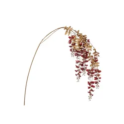
Bordeaux: Warmth and Depth
Burgundy is a warm and sophisticated shade, perfect for those who want an enveloping and deep Christmas look. This color, an intense variant of red, conveys a sense of richness and classicism, ideal for brands that focus on an image of understated luxury. Burgundy can be used as the main color of the package, perhaps combined with matte gold or bronze details for a touch of timeless elegance.
A burgundy paper package, embellished with a golden ribbon or a label with embossed details, can become a distinctive and sophisticated element. This shade also lends itself well to combination with velvety or matt materials, which emphasize the deep and rich character of the color.
Forest Green: The Elegance of Nature
Forest green is a color that recalls nature and the tranquility of winter landscapes, perfect for those looking for an elegant look linked to the environment. Darker than classic Christmas green, forest green is ideal for packaging that wants to convey a sense of discreet luxury and authenticity. This color works well for both a rustic look and a more refined aesthetic, depending on the materials and details used.
For a sophisticated effect, forest green can be combined with silver elements or natural wood details, creating a harmonious contrast that recalls the beauty of nature. A forest green package with a silver ribbon, for example, can be an elegant and striking alternative to the classic red and gold.
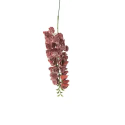
Plum: A Rich and Mysterious Color
Plum is an intense and refined shade, adding a touch of mystery and sensuality to Christmas packaging. This color, a combination of purple and red, is perfect for brands looking to stand out with a luxurious and original aesthetic. Plum goes very well with rose gold or silver details, creating a unique and sophisticated visual effect.
A plum packaging, enriched with a velvet ribbon or small metal details, is particularly charming and can be used for exclusive gifts or luxury products. This color also lends itself well to floral decorations or embossed geometric patterns, which add a touch of originality and sophistication.
Black: A Luxury Classic Reimagined for Christmas
Black is a powerful and sophisticated color, bringing with it a sense of timeless elegance. While not a color typically associated with Christmas, black is a bold and modern choice for Christmas packaging, especially when paired with metallic details or deep colors like burgundy and forest green. Black gives an extremely luxurious look and can be made even more special with matte or velvety finishes.
A black package decorated with gold or silver details, for example, immediately becomes elegant and impactful, perfect for brands that want to convey exclusivity and modernity. Black is particularly suitable for high-end gifts, such as jewelry items or luxury cosmetics, and offers a distinctive and contemporary look.
Combinations with Metallic Details for a Touch of Luxury
Dark, deep tones become even more elegant when combined with metallic details such as gold, silver, bronze or rose gold. These details add a touch of light that balances the intensity of dark colors and creates a sophisticated and eye-catching visual effect. An example would be a burgundy package with a gold ribbon, or a black package with silver details.
The use of matte or satin metals allows for a modern and discreet look, while shiny metallic or foil details can add an element of glamour and sparkle. These combinations are ideal for brands that want to convey an image of luxury and timeless elegance.
Textures and Materials for an Enveloping Look
To enhance the dark and deep tones, you can play with the textures and materials of the packaging. Velvet, for example, is a perfect choice for adding a feeling of softness and luxury, especially when used in colors such as forest green or burgundy. Matte or satin paper, on the other hand, gives a modern and sober touch, ideal for brands that focus on a minimalist but impactful aesthetic.
Embossed details or hot stamping in metallic colors are also great options for creating packaging that stands out. These materials and textures allow for a sophisticated, high-quality look, transforming each package into a memorable visual and tactile experience.
A Look Consistent with Brand Identity
Dark, deep tones are ideal for high-end brands or those who want to convey an image of luxury and sophistication. These colors communicate exclusivity and attention to detail, but it's important to fit them into your brand identity. A minimalist brand might opt for a matte black with subtle details, while a luxury brand might choose a velvety burgundy with gold details.
For those who want their Christmas packaging to stand out and convey prestige and class, dark and deep tones are the perfect choice, ensuring a sophisticated and memorable aesthetic.
Lights and Shadows: The use of Black and White for a Chic and Modern Effect.
Black and white are a timeless combination that evokes elegance, modernity and sophistication. This color combination, although unusual for the Christmas period, is perfectly suited to those who want contemporary and minimalist packaging. The contrast between light and shadow, in fact, allows you to create packages that capture the attention without the need for bright colors, communicating a sense of order and cleanliness that resonates with current design trends.
Black and white are ideal for brands that want to convey a sophisticated and chic image. This color palette is aimed at an audience that appreciates minimalism and modernity, offering an original and unexpected packaging, perfect for a Christmas that goes beyond the usual schemes.
White: Clarity and Brightness
White represents purity, simplicity and calm. In Christmas packaging, white can evoke snow, ice and the lightness of winter, giving the package a clean and refined look. A white packaging is perfect for brands that want to communicate elegance and sobriety, focusing on an essential aesthetic that enhances the content without distractions.
To add character to a white package, you can use interesting textures, such as hammered paper or white velvet, which add depth without weighing down the look. Another option is to decorate the white with black or metallic details, such as a minimalist black ribbon or a gold calligraphy label, for a chic and modern effect.
Black: Elegance and Mystery
Black, a symbol of elegance and mystery, is a bold and sophisticated choice for Christmas packaging. Although not a color traditionally associated with the holidays, black gives the package a distinctive and sophisticated character, especially when paired with white or silver details. Black packaging can be ideal for luxury brands or for those who want a bold and modern look, which conveys professionalism and charm.
For an understated luxury effect, you can opt for an all-black packaging with white details, such as a lettering or a geometric label. Black also lends itself to embossed decorations, such as a white hot stamping or matte texture, which add an element of depth and charm to the packaging.
The Harmony of Black and White: A Modern and Versatile Look
Combining black and white allows you to obtain a refined and versatile visual effect, which adapts to any type of gift. A white package with black details, or vice versa, offers a modern and essential look, perfect for those looking for a minimalist yet impactful style. This combination can be declined in various styles, from a geometric and linear aesthetic to a softer and more enveloping look, adapting to the identity of different brands.
An example of chic packaging would be a white box with a matte black ribbon and a plain label with gold lettering. Alternatively, a black packaging with white decorations such as snowflakes or geometric patterns can create a contemporary, wintry effect, without being trivial.
Metallic Details for a Touch of Luxury
To enrich black and white packaging, metallic details are an excellent choice. Gold, silver, and copper can add an element of luxury and sparkle, balancing the contrast of black and white and giving the package a touch of elegance. These details can be inserted as ribbons, labels or decorations, creating a visual effect that catches the light and attracts the eye.
A black package with a matte gold ribbon, for example, is a sophisticated and ideal choice for high-end gifts. White, on the other hand, can be enriched with silver details for a fresh and modern look, or with bronze for a warm and welcoming variant, perfect for the Christmas season.
Textures and Materials for a Tactile Effect
Black and white, due to their simplicity, lend themselves well to the use of textures and materials that add depth and tactile interest. Velvety, matte or satin paper can make a black or white package even more special, adding an element of discreet luxury. Embossed details, such as hot stamping or embossing, are also ideal for this colour combination, as they create plays of light and shadow that enhance the packaging.
Using quality materials, such as black velvet or white natural cotton, allows you to obtain a sophisticated packaging that is pleasant to the touch, ideal for brands that want to communicate attention to detail and quality. Black and white in natural fabrics or recycled paper can also convey a message of sustainability, combining elegance and respect for the environment.
Adapting Black & White to Brand Identity
Black and white are extremely versatile colors, which can adapt to different styles depending on the brand identity. A minimalist brand might opt for stripped-down packaging, with a simple black ribbon on white packaging, or vice versa. A luxury brand might choose velvety textures and metallic details for a more sumptuous look, while an eco-friendly brand might use natural black and white materials to communicate sustainability.
Black and white offer the possibility of creating elegant and refined packaging, perfect for a brand that wants to stand out and convey a chic and modern image. This combination also allows for visual consistency to be maintained and to create a recognizable and impactful packaging, ideal for leaving a lasting impression on customers.
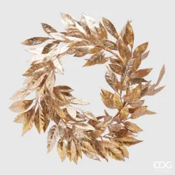
Trendy Metallics: Rose Gold and Copper for a Trendy Christmas
The use of metallic colors in Christmas packaging adds a touch of luxury and brilliance that immediately catches the eye, and in recent years, rose gold and copper have become two of the most beloved and trendy shades. These warm and sophisticated colors offer a fresh alternative to the classic gold and silver, giving the packaging a modern, chic and welcoming look. Rose gold and copper are ideal for brands that want to give a touch of glamour to their Christmas packaging, focusing on a refined and current color combination.
Perfect both on their own and combined with other shades, such as pastel colors or dark shades, these metallics allow you to create Christmas packages that combine tradition and innovation, resulting in packaging with a strong visual impact and in step with trends.
Rose Gold: Refinement and Warmth
Rose gold, with its warm and delicate hue, stands for modern elegance. This variant of classic gold is appreciated for its romantic charm and feminine touch, making it perfect for brands that focus on a glamorous and refined image. Rose gold lends itself to being used both as a dominant color and as a decorative detail on a neutral base, such as white, beige or powder pink.
For luxury packaging, you can choose a satin rose gold box, enriched with a white or light gray velvet ribbon. Alternatively, a black or white package decorated with rose gold details, such as labels, calligraphy lettering or small bows, creates a sophisticated and modern visual effect. This color also goes very well with sage green or light blue, for a delicate and trendy Christmas look.
Copper: A Touch of Warmth and Modernity
Copper is a warm and versatile metallic color, which adds a touch of warmth and industrial-chic charm to Christmas packaging. More accessible and less conventional than classic gold, copper lends itself well to brands that want to communicate a contemporary and innovative image. This color can be used to give a rustic and elegant look to packaging, especially when combined with natural materials such as kraft paper or recycled cardboard.
A kraft paper package with copper details, such as a satin ribbon or geometric decoration, can evoke a cozy and sustainable Christmas, while a matte black box with copper elements gives a modern and impactful look. Copper is also perfect for small embossed details or Nordic-style floral decorations, which recall the authenticity and beauty of nature.
Trendy Combinations: Rose Gold and Copper with Neutral and Pastel Colors
For a harmonious and modern effect, rose gold and copper go very well with neutral colors such as white, gray, and beige, which balance the brightness of the metallics and give a minimalist look. Pastels, such as powder pink, mint green and light blue, are also excellent choices for creating fresh and original Christmas packaging, with a light and sophisticated atmosphere.
An example of a combination could be a blush pink package decorated with a rose gold ribbon or a light gray box with copper details, perfect for a modern and trendy Christmas. These combinations make it possible to obtain a packaging that is chic and delicate, without sacrificing the brilliance and elegance of metallic colors.
Textures and Finishes to Enhance Metallics
Rose gold and copper can be enhanced with different finishes and textures that enhance their brilliance and refinement. The satin or matte finish gives a more delicate and sophisticated look, ideal for brands that focus on a minimalist and sober aesthetic. For a more glamorous look, you can choose a glossy or glitter finish, which gives brightness and makes the package particularly festive.
Embossed details, such as calligraphy or floral patterns, are a great option for adding depth to packaging. Foil decorations on matte or velvety paper also allow you to create an impactful visual effect, perfect for a luxurious and distinctive Christmas look.
Small Details That Make the Difference
The use of rose gold and copper can be made even more special by adding small details, such as bows, labels or metallic wax seals. Even the inclusion of natural elements, such as a pine branch or a small fir cone tied with a rose gold ribbon, helps to create a unique and personalized packaging, which respects Christmas traditions with a modern touch.
These details can also be adapted to reflect the brand's identity: a brand that focuses on sustainability and elegance might choose kraft paper with copper details and a small natural accessory, while a high-end brand might opt for a shiny rose gold box with a gold wax seal.
Consistency with Brand Identity
Rose gold and copper are perfect for brands that want to stand out with a trendy, elegant and innovative aesthetic. However, it is important to adapt these metallic colors to the brand identity: while a luxury brand might focus on all-metallic packaging, an eco-friendly brand might prefer to use copper on recycled paper or kraft for a more natural look.
Adapting the use of rose gold and copper to the brand identity allows you to maintain visual consistency, bringing out the uniqueness of the brand through careful packaging in line with corporate values. These colors allow you to give a touch of class and brilliance without being excessive, while communicating modernity and attention to detail.
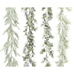
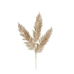
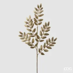
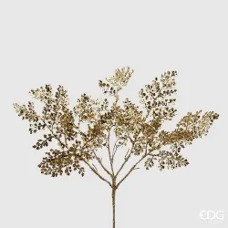
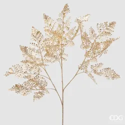
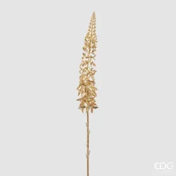
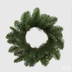
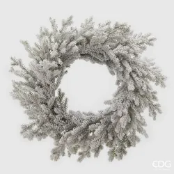
Sage Green and Pine: Natural Colors for a Sustainable Christmas
Natural colors such as sage green and pine green are increasingly popular choices for those looking for Christmas packaging that conveys not only elegance, but also a message of sustainability and connection with nature. These colors recall winter landscapes and snowy forests, bringing a sense of calm and authenticity. Perfect for an eco-friendly Christmas, natural greens allow you to create elegant, sophisticated and environmentally friendly packaging, ideal for brands that embrace values of sustainability and ecological awareness.
Using these colors allows you to create a refined and simple look, which resonates with those looking for an alternative to the more traditional and vibrant Christmas colors. Sage green and pine green are perfect both as main colors and as details that add a natural touch to any type of packaging.
Sage Green: Elegance and Modernity
Sage green is a light and discreet shade, combining elegance and modernity. This soft and delicate color is ideal for brands that want to create refined and light packaging, which conveys a sense of tranquility and freshness. Sage green pairs perfectly with neutral shades, such as beige, white and grey, creating a harmonious and contemporary effect.
For a more sophisticated look, you can choose a sage green box with matte gold or silver details, or combine this color with natural materials such as kraft paper and twine. A sage green package decorated with a small sprig of eucalyptus or white cotton ribbon is a great option for a simple and sustainable Christmas.
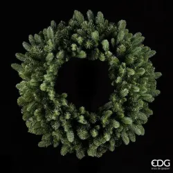
Pine Green: A Touch of Nature
Pine green is a darker, more intense shade, reminiscent of winter forests and classic Christmas trees. This color is perfect for packaging that wants to be elegant and, at the same time, evoke a strong connection with nature. Pine green pairs very well with colors such as white, red, and brown, resulting in warm and cozy packages that are ideal for the Christmas season.
For a rustic and elegant look, you can opt for a pine green packaging decorated with a jute ribbon or a natural wood detail, such as a small star or a log slice. Pine green can also be combined with metallic elements, such as gold or copper, to create a refined and festive contrast.
Combinations with Kraft Paper and Natural Materials
Sage green and pine green go perfectly with natural materials, such as kraft paper, recycled cardboard and cotton fabric. Kraft paper, with its natural brown color, adds a rustic and sustainable touch, perfect for creating packaging that respects the environment. A sage or pine green package with kraft paper details and a natural twine ribbon communicates a message of authenticity and respect for nature, ideal for brands that embrace eco-friendly values.
These materials are also versatile and can be combined in different ways: a kraft paper box with a sage green ribbon or a pine green packaging with a recycled cardboard label are examples of packaging that combines aesthetics and sustainability, perfect for a Christmas with basso environmental impact.
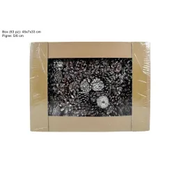
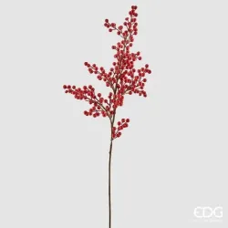
Decorations with Natural Elements: Pine Cones, Sprigs and Berries
To reinforce the natural and sustainable image of the packaging, small decorative details inspired by nature can be added, such as pine cones, pine twigs, and red berries. These elements not only enrich the look of the packaging, but also evoke the beauty of winter landscapes, bringing a little nature into the festive season.
A pine green package with a small pine cone tied with a jute ribbon, or a sage green box decorated with a sprig of rosemary or eucalyptus, becomes a gift that celebrates nature and simplicity. These details can be collected or purchased from sustainable sources, making the packaging even more eco-friendly and in line with an environmentally friendly lifestyle.
Textures and Finishes for a Sophisticated and Natural Look
Sage green and pine green can be enhanced with textures and finishes that add depth and sophistication to the packaging. Matte paper, for example, offers a soft and velvety look, perfect for communicating elegance and simplicity. Recycled cardstock, with its slightly rough texture, is also an excellent choice for a natural and authentic look.
For brands that focus on a luxury aesthetic, embossed details or gold foil embellishments can be added on sage green or pine paper, creating a sophisticated and festive contrast. The use of velvet or organic cotton ribbons can also enrich the packaging, making it pleasant to the touch and even more special.
A Sustainability Message for Brand Identity
The use of sage green and pine green is not only an aesthetic choice, but can also represent a message of sustainability for the brand. These colors, in fact, recall the idea of nature, authenticity and respect for the environment, values that are increasingly important for consumers. For brands that want to convey an eco-friendly and conscious image, sage green and pine green packaging is a perfect choice to communicate these values in a subtle yet effective way.
Packaging that combines elegance and sustainability helps build a positive brand image, attracting an audience that is attentive to environmental issues and strengthening the relationship with customers. This type of packaging also allows you to reduce the environmental impact, using ecological materials and natural details that respect the ecosystem.
Choose Colors to Reflect Your Brand and Create Memorable Experiences
Choosing the right colors for Christmas packaging is not only about following the latest trends, but also about creating an experience that reflects your brand's identity and values. Packaging, in fact, is the first point of contact between the customer and the product, and it is essential that it reflects the essence of the brand and leaves a lasting impression. Using a color palette that is in line with the brand image allows you to stand out and strengthen the bond with customers, creating a unique and memorable experience that goes beyond the simple purchase.
This chapter explores the importance of choosing colors strategically for recognizable and engaging Christmas packaging, offering practical advice on how to combine colors and materials to tell the brand story and convey emotions.
Knowing the Brand Identity
The first step in choosing the right colors is to thoroughly understand your brand identity. Every brand has its own personality, tone and target audience, and it's important that these elements are also represented in the packaging. A minimalist brand might focus on neutral colors and simple textures, while a luxury brand might prefer rich colors and metallic details. A young and vibrant brand, on the other hand, might opt for pastel hues or bold color combinations that catch the eye.
Knowing the identity of the brand allows you to make consistent choices and communicate effectively with the public, transforming the packaging into a natural extension of the brand and its values.
Communicating Emotions through Colors
Colors have a strong emotional power and can evoke different sensations depending on the shades chosen. Using colors that evoke specific emotions allows you to create a deeper connection with customers. For example, warm tones like red and gold can communicate joy and festivity, perfect for a brand that wants to convey a sense of welcome and happiness. Neutral and pastel tones, on the other hand, can evoke tranquility and sophistication, ideal for a brand that focuses on simplicity and elegance.
When choosing colors for Christmas packaging, it's helpful to think about the emotional experience you want to create for your customers and choose a palette that supports this vision.
Create visual consistency
Successful packaging should not only attract attention, but it should also be consistent with the brand image and the rest of the visual communication. Using the colors of the logo or advertising campaigns in Christmas packaging helps to strengthen the brand identity and create a link between the different communication channels. Visual consistency helps make the brand recognizable and memorable, facilitating the customer loyalty process.
For example, a brand that mainly uses neutral colors and natural shades in its communications can use these colors in Christmas packaging to maintain a unified and recognizable image. Even small details, such as the ribbon or label, can reflect the colors of the brand, creating packaging that is unique and immediately identifiable.
Combining Colors and Materials for a Consistent Effect
Materials play an important role in the perception of packaging and must be chosen with the same care as colors. Matching colors to the right materials allows you to create a visual and tactile effect that reinforces the customer experience. For an eco-friendly brand, for example, it is ideal to opt for sustainable materials such as recycled paper or kraft cardboard, combined with natural shades such as sage green or brown. A luxury brand could instead choose velvety finishes and metallic details to communicate refinement and high quality.
The consistency between colors and materials not only makes the packaging more harmonious, but helps to convey a clear message in line with the brand's values.
Packaging as an Extension of the Brand Experience
Christmas packaging offers a unique opportunity to create an experience that goes beyond the purchase, transforming the product into a special gift. Every element of the package can contribute to this experience: from colors to shape, from materials to details. Creating packaging that is in line with the brand identity allows you to strengthen the customer experience and ensure that the moment of opening is memorable and meaningful.
For a brand that focuses on originality, for example, you could opt for an unexpected combination of colors, such as lilac and silver, or for packaging with a unique and innovative design. A traditional brand, on the other hand, could focus on classic colors such as red and gold, to create a festive and family atmosphere.
Customization for Uniqueness and Memorability
Customizing packaging, even with small details, can make a big difference. Personalized labels, ribbons with the brand logo or a handwritten greeting message make the packaging unique and memorable, transforming the packaging into a real experience. Personalization can be a winning strategy to stand out from the competition and to create an emotional bond with the customer, making each gift feel like something special and designed specifically for the recipient.
Adapting Colors to Audience Preferences
Knowing your audience is essential to make effective color choices. Adapting the colors of the packaging to the preferences of the customers allows you to create a stronger connection and meet their expectations. For example, if your audience is predominantly young and trend-conscious, colors such as blush pink, mint green, and rose gold might be ideal. For a more mature audience, however, shades such as burgundy, gold and midnight blue can communicate elegance and refinement.
Creating packaging that responds to the tastes and preferences of your target allows you to build a relationship of trust and ensure that the brand is perceived as attentive and in tune with its customers.
Sustainability as a Distinctive Value
Today, many consumers are attentive to sustainability and prefer to buy from brands that demonstrate commitment to the environment. Choosing natural colors such as pine green, beige and brown, together with ecological materials, allows you to communicate a message of respect for the environment and to make packaging an extension of the brand's values. This type of packaging is particularly popular with customers looking for a sustainable and conscious Christmas.
Colors That Tell a Story
Choosing colors for Christmas packaging means telling a story and creating an experience that remains etched in customers' memories. A well-thought-out packaging, which reflects the identity of the brand and its values, becomes a fundamental element to create a connection with the customer, making the moment of opening special and meaningful. Every color, every material and every detail can help tell the story of the brand, making packaging not just a package, but an extension of its philosophy and soul.
Christmas packaging is much more than just packaging: it is an opportunity for brands to express their identity, create emotions and establish a connection with customers. From the choice of colors, which can range from classic festive tones to trendy metallics and natural hues, to the details that make each package unique, each element is essential to build an experience that speaks to the values and style of the brand.
In a world where attention to sustainability is increasingly important and where the search for personalized experiences is constantly growing, well-thought-out packaging can make the difference, communicating quality, care and originality. Whether it is a luxury brand, young and lively, or oriented towards sustainability, each brand can find its way to surprise and enchant, using Christmas packaging as a business card that encapsulates the essence of the brand.
Choosing the right colors, suitable materials and details that resonate with the brand identity allows you to create packaging that not only attracts the eye, but also leaves a lasting impression and turns every gift into a special moment. This year, with packaging that combines style, sustainability and customer focus, Christmas can become an opportunity to give a memorable experience and to tell the story of the brand in a unique and meaningful way.