Color as a first impact
In the world of packaging, color is much more than just an aesthetic element: it is a strategic tool capable of influencing brand perception and purchase decisions. Before even touching the product, the customer comes into contact with its packaging and the color is the first signal that captures attention, conveys a message and arouses an emotion.
When we study a packaging solution, we consider color as a key element in visual communication. Each shade evokes precise sensations: warm tones such as red and orange convey energy and urgency, while cool colors such as blue and green recall reliability and sustainability. The color choice must therefore be in line with the brand identity, the target audience and the positioning of the product on the market.
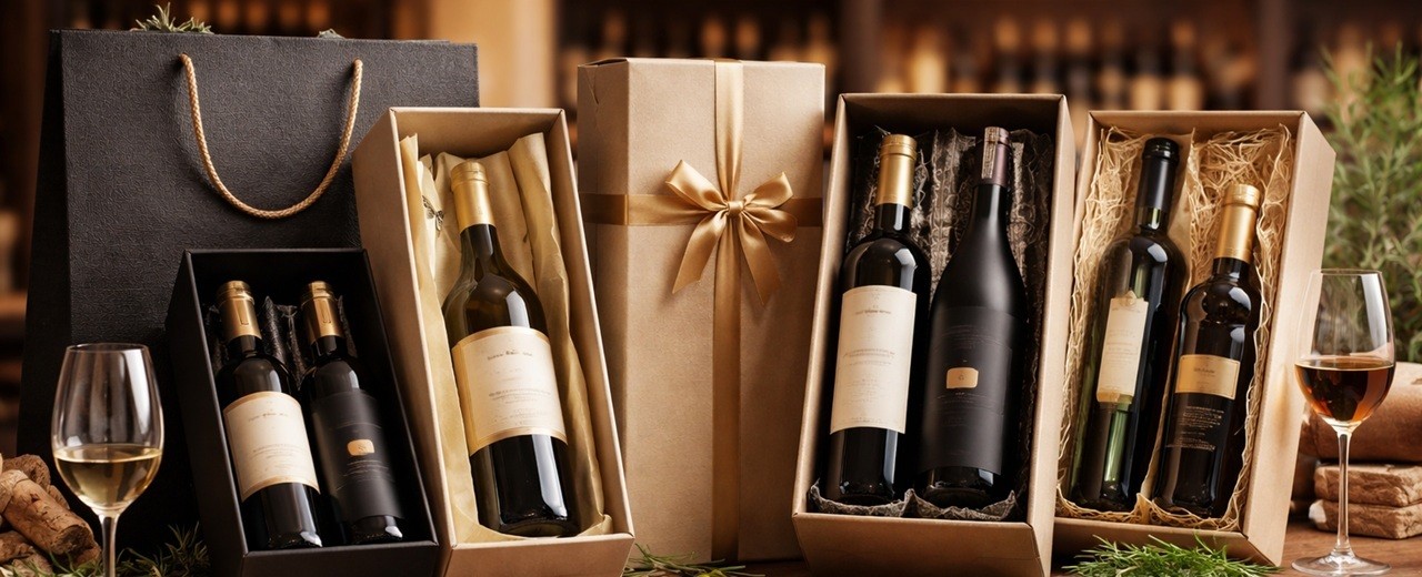
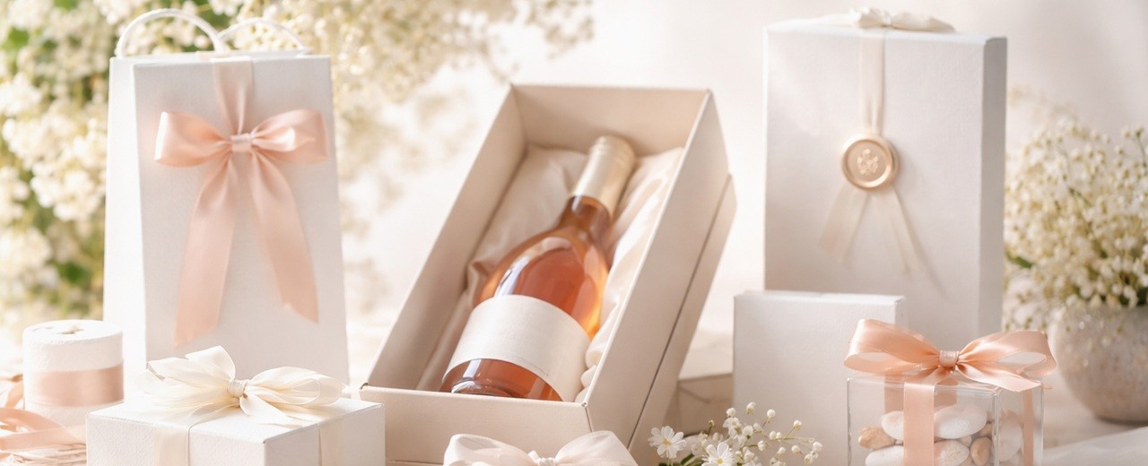
In the high-quality packaging industry, color can also reinforce the perceived value of the product. For example, shades such as black, gold and burgundy are often associated with luxury and exclusivity, while pastel or neutral colours can communicate craftsmanship and sustainability. In addition, the contrast between colors can guide the eye, highlight distinctive elements and improve the readability of information.
Carefully studying the color palette of a package therefore means designing a visual experience that involves the customer from the first glance, reinforcing the memorability of the brand and positively influencing the purchase choice. In the next chapters, we will explore in detail the psychology of color and strategies for using it effectively in packaging.
The psychology of color in marketing and packaging
When we create packaging, we never choose a color by chance. Each shade communicates a precise message and influences the consumer's emotions and decisions. Color psychology is a discipline that studies the impact of colors on human perception, and in marketing it plays a fundamental role in guiding the shopping experience.
The emotions evoked by the main colors
Each color is associated with specific sensations that influence purchasing behavior. Some examples:
- Red → Stimulates energy, passion and urgency. Often used for products related to food or promotions.
- Orange → Communicates dynamism and creativity. Ideal for young and innovative products.
- Yellow → Expresses optimism and warmth. It works well in packaging for baby products and the food industry.
- Green → It is the color of nature, balance and sustainability. Perfect for organic, eco-friendly or wellness-related products.
- Blue → Represents trust, security and professionalism. Used in the corporate, pharmaceutical and technology sectors.
- Black → Elegance, exclusivity, luxury. Often chosen for high-end packaging.
- White → Purity, simplicity, minimalism. Widely used in contemporary design and in the beauty sector.
Cultural differences and subjective perceptions
While it is true that some colors elicit universal reactions, it is equally important to consider cultural differences. For example, white in the West is a symbol of purity, while in some Eastern cultures it is associated with mourning. Red, on the other hand, conveys passion in Europe but in China it is the color of luck and prosperity.
Context and consumption habits also influence color perception. Green packaging can be effective for an eco-friendly brand, but it may be out of place for a luxury product, unless it is combined with gold or black elements to enhance its prestige.
Colour as a strategic lever in packaging
In our work, the choice of colors is never random. The packaging must:
- Reflect brand identity and stand out in the store or online marketplace.
- Arousing the right emotion to create a bond with the consumer.
- Be consistent with the reference sector to strengthen confidence in the product.
- Facilitate the readability of information with a good contrast between text and background.
Studying color psychology means designing packaging that not only protects the product, but tells a story and creates a more engaging and memorable shopping experience. In the next chapters we will see how to apply this knowledge in the strategic choice of the color palette for packaging.
How to choose the right color for your packaging
The choice of color in packaging is not just a matter of aesthetics: it is a strategic decision that influences product perception, brand positioning and purchasing behavior. In our work, we carefully study the color palette to ensure that each package communicates the right message and appeals to the target audience.
Key factors in choosing color
When designing packaging, we consider several elements to select the most effective color:
- Target audience → Color must speak directly to the right audience. For example, bright and playful shades work for products intended for children, while dark and sophisticated colors are ideal for the luxury sector.
- Product sector → Each product category has well-defined color codes. Green is associated with sustainability, blue with technology, white with cosmetics and cleanliness. Complying with these conventions helps the consumer to immediately recognize the type of product.
- Brand positioning → A premium brand will choose refined colors, perhaps with matte or metallic finishes, while a young and dynamic brand could focus on bright colors and strong contrasts.
- Differentiation from the competition → Color can be a distinctive element in the market. While most competitors use neutral tones, a bold color choice can make the product more recognizable on the shelves or in online catalogs.
Examples of effective color choices in different sectors
To better understand the importance of color in packaging, let's look at some practical applications in different industries:
- Food & Beverage → Colors should stimulate the appetite and create an emotional connection. Red and yellow are widely used because they transmit energy and heat, while green communicates naturalness and healthy ingredients.
- Cosmetics and beauty → White is often dominant to evoke purity and minimalism, while pink and gold convey femininity and exclusivity. Sustainability-oriented brands prefer neutral and earthy tones.
- Luxury and high-end → Black, gold, silver and burgundy are synonymous with elegance and refinement. Often combined with special textures or embossed details to enhance the perceived value of the product.
- Tech & Electronics → Blue is the color of trust and innovation, often used for electronic devices and software. Black and gray convey modernity and high technology.
- Sustainability and eco-friendly → Natural shades such as green, beige and brown are the most used to emphasize the link with nature and attention to the environment.
A balance between aesthetics and functionality
The choice of color is not only about the visual appearance, but also about the functionality. Packaging must guarantee:
- Good readability → The contrast between text and background should make the information clear and accessible.
- Consistency with the → material Some colors perform better on certain substrates. For example, pastel shades on kraft paper communicate craftsmanship, while metallic colors on smooth cardstock convey modernity.
- Colour rendering in different light conditions → The colour must maintain its effect even in rooms with artificial or natural lighting.
In packaging, color is one of the most powerful levers to attract the customer and convey the values of the brand. In the next chapters we will see how to combine it effectively with other graphic elements to create packages that leave their mark.
Winning color combinations in packaging
The use of color in packaging is not limited to the choice of a single shade. The combination of several colors allows you to create contrasts, emphasize details and strengthen the visual identity of the product. In our work, we carefully study color palettes to ensure that each package not only captures attention, but effectively communicates the brand's message.
The main color combination strategies
When creating packaging design, we evaluate different techniques to achieve harmonious and strategic combinations:
- Monochromatic scheme → A single shade is used in different shades. This approach is perfect for conveying elegance and visual coherence, widely used in the luxury and beauty sector.
- Complementary combination → Based on opposite colors in the color wheel (for example, blue and orange, red and green). This pattern creates a strong and dynamic contrast, useful for packages that need to stand out on the shelves.
- Analogous combination → Choose colors that are close to each other on the color wheel (for example, yellow, orange, and red). This solution generates a harmonious and natural effect, ideal for eco-friendly or artisanal products.
- Triadic scheme → Three equally spaced colors are selected on the color wheel (such as red, yellow, and blue). It is a lively and balanced choice, often used for product packaging intended for a young and dynamic audience.
- Use of neutral color with color accents → A neutral background (white, black, gray) with a colorful detail creates a sophisticated and refined effect. This style is very effective in conveying a premium image.
Examples of color combinations for different industries
- Food → Red and yellow to stimulate appetite, green and brown to evoke naturalness and organic products.
- Cosmetics → Pastel tones for skincare, gold and black combinations for luxury products.
- Tech & electronics → Blue and silver to communicate innovation and reliability.
- Fashion & accessories → Black and white for a minimal chic effect, bright colors for youth collections.
The role of finishing in colour
In addition to the color combination, the finish of the material influences the perception of the packaging:
- Matte → finishes Refined and modern, ideal for high-end products.
- Glossy finishes → More eye-catching and lively, suitable for packaging that wants to attract attention.
- Metallic effects → Gold, silver or copper convey exclusivity and value.
- Natural textures → Kraft paper or textured cardboard emphasize the authenticity and craftsmanship of the product.
A well-thought-out colour scheme, combined with the right finish, can turn a simple package into a powerful communication tool. In the next chapters we will explore how color integrates with other graphic elements to make packaging even more effective.
Colour and branding: creating a distinctive visual identity
Color is one of the most powerful elements in a brand's identity. Recognising a brand at a glance often depends on the colour choice of its packaging. In our work, we develop packaging solutions that not only protect the product, but strengthen brand recognition, communicating its values immediately and consistently.
The importance of color in brand positioning
Every company has a story, an audience and a visual identity that must emerge clearly through packaging. Color plays a fundamental role in brand positioning, influencing consumer perception:
- Bright and dynamic colors (red, orange, yellow) convey energy and innovation, ideal for young brands and consumer products.
- Dark and elegant colors (black, midnight blue, bottle green) communicate exclusivity and refinement, often used for the luxury sector.
- Natural and earthy tones (beige, brown, olive green) evoke authenticity and sustainability, perfect for eco-friendly packaging.
The color choice must be consistent on all communication materials: from boxes to tapes, from labels to bags. For this reason, we take care of every detail so that the packaging is a direct extension of the brand.
Examples of iconic colors in branding
Some brands have become recognizable thanks to the color choice of their packaging:
- Tiffany & Co. → The famous "Tiffany Blue" is synonymous with luxury and sophistication.
- Coca-Cola → Vibrant red is associated with energy and conviviality.
- Apple → White and metallic gray communicate innovation and minimalism.
These examples demonstrate how color can become a real strategic asset for the brand.
Chromatic customization for exclusive packaging
In our work, we offer a wide range of customized solutions to help brands stand out:
- Printing in Pantone colors to ensure absolute consistency with the corporate identity.
- Special effects such as lamination, relief and varnishing to enhance the color and make the packaging even more exclusive.
- Tailor-made packaging that integrates colors, finishes and materials in line with the brand positioning.
A well-chosen color can turn a simple package into a powerful marketing tool. For this reason, we design packaging that not only enhances the product, but strengthens the brand image in a strategic and distinctive way.
The impact of color on purchasing decisions
The color of the packaging plays a decisive role in the purchasing process. Numerous studies show that the choice of color can influence up to 90% of the first impression on a product. In our work, we design packaging solutions that not only protect and enhance the contents, but also attract attention and convey the right message to the target audience.
How color drives consumer emotions and choices
Each color evokes precise sensations, stimulating unconscious reactions in consumers:
- Red → Energy, urgency, stimulates the appetite (perfect for the food sector and for promotions).
- Blue → Reliability, safety, professionalism (ideal for electronics and technological products).
- Yellow → Optimism, warmth, happiness (suitable for children's products or eco-friendly packaging).
- Green → Nature, sustainability, well-being (perfect for organic products and natural cosmetics).
- Black and gold → Luxury, exclusivity, elegance (a winning choice for perfumery and haute couture).
The correct application of these color strategies in packaging helps to immediately communicate the value of the product, differentiating it from the competition.
Colour in the sales context
The effectiveness of the color also varies according to the store and the placement on the shelves. For this reason, we study solutions that can:
- Stand out among competitors → By using strategic color combinations, we ensure that packaging catches the eye at first glance.
- Promote readability → The contrast between background color and text is essential to make the packaging clear and immediate.
- Adapting to the → sales channel In physical stores, color must attract the eye among dozens of alternatives, while in e-commerce it is essential that it also stands out on digital screens.
From theory to practice: packaging that sells
In our work, we apply these strategies to create packaging that not only represents the brand, but improves sales. Offer:
- Personalized advice to choose the most effective color palette based on the target and the product.
- Colour tests to assess how colours impact the perception of the end customer.
- Advanced printing solutions to ensure color fidelity on every material, from cardboard to natural kraft.
A well-thought-out packaging from a chromatic point of view is not just a package, but a powerful marketing tool. For this reason, every color we choose has a precise goal: to attract, communicate and convert.
Case Studies: Examples of Successful Color-Based Packaging
Color is a strategic element in packaging, capable of transforming a product into a market icon. To demonstrate the impact of color choices, we analyze some success stories and how, in our work, we apply similar principles to develop effective and distinctive solutions.
Examples of winning packaging
- Tiffany & Co. – The power of a unique color
- The famous "Tiffany Blue" has become synonymous with luxury and exclusivity. This shade has been registered as a trademark, demonstrating the power that a color can have in building corporate identity.
- Applicable Lesson: When developing Personalized packaging, we focus on color consistency to strengthen brand recognition. We use Pantone color prints to ensure perfect uniformity on every support.
Coca-Cola – The red that attracts and stimulates the purchase
- Red is associated with energy and conviviality. Coca-Cola uses it to evoke positive emotions and make the brand instantly recognizable in every part of the world.
- Applicable Lesson: For our customers in the food & beverage sector, we study color palettes that stimulate the appetite and desire to buy. The strategic use of reds and oranges, combined with strong contrasts, helps to distinguish the product on the shelf.
Apple – Color minimalism for premium positioning
- White and metallic gray dominate Apple packaging, conveying elegance, innovation and cleanliness. This choice reinforces the message of quality and advanced technology.
- Applicable Lesson: For high-end brands, we offer packaging with special finishes, such as matt varnishing or hot metal details in silver and gold, to enhance the premium effect of the chosen color.
Lush – Sustainable packaging and natural colours
- Lush uses recyclable packaging and colors that recall the natural world, reinforcing its eco-friendly positioning. Greens and browns convey authenticity and respect for the environment.
- Applicable Lesson: For eco-sustainable packaging, we prefer natural colors, printed on kraft or recycled papers. We combine water-based finishes and eco-friendly inks for a solution consistent with the brand's values.
How we apply these principles to our projects
In our work, we help brands choose the most effective color palette for their packaging through:
- Analysis of the market and competitors, to identify distinctive colors that make the product recognizable.
- Colour rendering tests on different materials, to ensure that the packaging is effective in every sales context.
- Advanced customization, with the use of lamination, screen printing and relief details to enhance the chosen color.
Color is not just an aesthetic choice, but a powerful branding and sales tool. For this reason, every packaging project we develop is designed to convey the brand identity and influence purchasing decisions.
Colour in packaging is not just an aesthetic issue, but a strategic tool capable of influencing consumers' perceptions, emotions and purchasing decisions. Each shade communicates a precise message and helps build a brand's identity, differentiating it from the competition.
In our work, we carefully study the psychological impact of colors and apply them in a targeted way, combining them with materials, finishes and printing techniques that enhance their effectiveness. We know that winning packaging is one that captures attention, conveys the right value and strengthens the bond between the brand and its audience.
Investing in the right colour choice means transforming a simple package into a powerful marketing tool. That's why we continue to innovate, offering customized solutions that combine aesthetics, functionality and strategy for packaging that does not go unnoticed.
