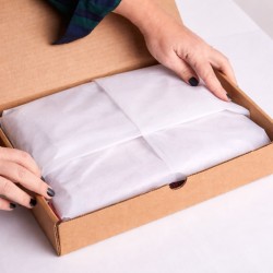
The wrapping is not a gesture of courtesy: it is your last yardstick of sale. When you accompany a purchase over the counter, you're not simply covering a product; You're building a scene where hands, eyes, and memory work together. The rustling paper, the texture of the tissue, the rigor of a clean fold, the knot that closes like a signature: every detail shifts the perception of value and gives the customer the feeling of having been chosen, not just served. It is at that moment that the receipt medio finds room to grow, that the return becomes natural, that word of mouth is born spontaneously and credible.
If you think of the wrapping desk as a cost, you will treat it as a stopgap between the cash register and the exit. If you think of it as an experience, you will turn it into a quick and precise ritual that lightens queues, improves times and naturally paves the way for small upgrades: a more textured ribbon, a seal that tells your aesthetics, a box that protects and stages the contents. It is not a question of adding steps, but of giving shape to a promise. Those who observe that gesture see attention. Those who receive it feel cared for. And care, in retail, is the most solid currency.
In the store, this moment is a living, tangible, photographable touchpoint. It is the point at which branding stops being graphic and becomes a repeatable gesture, quality standard, reassurance. If you're selling fashion, wrapping prolongs the fitting into a small ceremony. If you work in beauty, amplify the feeling of gift to yourself. If you treat food and bottles, it gives structure and safety, protects, elevates. And when the collection is done via click & collect, that ready-made package becomes a sign of efficiency: take, smile, share.
Sustainability enters here without proclamations. You choose it in the material, in the printing, in the format that avoids waste and makes it clear what can be recycled. The customer does not have to look for information: he finds it exactly, where it is needed. It is an act of transparency that does not slow down, but consolidates trust.
This is the "Package Moment": a micro-stage in which you coordinate speed and beauty, order and personality, rigor and warmth. It offers you concrete levers to grow the receipt without forcing, nourish loyalty with replicable standards and free up word of mouth that travels alone, among people who look alike. In the following pages you will put it on the ground: from the design of the gift station to the choice of materials, from the color it sells to the right words to use at the counter. Because wrapping does not close the sale. He accomplishes it. And he starts it again.
Trends & context
You move in a retail where the product is increasingly comparable, margins are under pressure and customer attention is a rare commodity. In this scenario, the only advantage that is really difficult to copy is the concrete experience you build in the last meter. The after-sales wrapping does not reach the end of its run: it is the point at which your promise takes visible shape, where value stops being a claim and becomes a precise sensation in the customer's hands.
In recent years, the ritual of unboxing has shifted expectations. The customer who unwraps an online order at home demands consistency, cleanliness, measured surprise. He enters the store with the same expectations. If the wrapping is improvised, the perception of the brand is lowered by a tone; if it is thought out, the perceived value rises above the price paid. The wrapping becomes a proprietary media: it tells who you are without having to speak, it travels outside the store, it arrives on the table of a recipient who does not know you and who, in that instant, becomes your second audience. When the packaging is photogenic and legible, it also enters the social conversation: a well-designed detail works as a shot that the customer is happy to share.
In the physical store, this moment keeps aesthetics and operations together. It's not just beautiful form, it's flow. If you design it, you govern the queue, give rhythm to the desk, reduce staff anxiety and keep the visual quality constant even in peaks. The customer perceives it as care, you experience it as a method. The difference does not lie in the number of steps but in their orchestration: you prepare what you need before you need it, you make a gesture repeatable, you avoid unnecessary movements, you let the manual skill be precise without becoming slow.
There is also a psychological reason that works in your favor. People remember the climax and end of an experience more than the rest. The wrapping phase coincides with the closure of the path in the store: if you offer order, pleasant tactility, visual clarity there, the memory is fixed on the right point. The customer doesn't just come out with a product, they come out with a short, positive story about you. It is that little story that reopens the door to return and makes the advice to a friend natural.
In comparison with online, in-store wrapping is a terrain where you can win today. You have proximity, real-time, the ability to listen and modulate. If you deal with fashion, prolong the elegance of the proof into a consistent closure. If you work in beauty, you turn the purchase into a gesture of personal care that continues at home. If you're selling food and bottles, add protection and presentation in one sign, with safety avoiding accidents and the scene elevating the gift. In an omnichannel context, the advantage doubles: in click&collect, the ready-made package becomes a promise of efficiency and a style statement, because the first contact is not the queue at the checkout but the pleasure of picking up something already perfect.
Environmental sensitivity has made the material a message. You don't need a proclamation, you need consistency. Choose readable media, easily indicate how to dispose of it, avoid unnecessary formats. Transparency reduces questions and builds silent trust. The customer does not ask you for certifications on the counter: he hears if you are wasting or if you are also thinking about him after the store.
Finally, there is economic leverage. A well-finished wrapping naturally supports small value choices, such as a more material ribbon, a personalized seal, a box that saves time and ennobles the object. It's not adding accessories at random, it's giving coherence to an experience that the customer is willing to pay for because they perceive the difference. And when you standardize the gesture, you gain speed without losing tone, reduce errors, better protect fragile products, limits returned and complaints, you make the team's work more serene and therefore more effective.
This is the context in which you move today: a market saturated with offers and poor in attention, in which those who govern the details win. The "Package Moment" is not an aesthetic quirk, it is a concrete strategy that combines service, communication and margin. If you treat it as a process, it becomes a signature. If you live it as a ritual, it becomes a promise that is renewed with each passage of paper. In the next sections you will turn it into practice: space, materials, color, calibrated words and gestures because, in the end, what the customer takes away is not just a product, but the best possible version of your brand.
Gift Psychology (in practice)
When you wrap you are not adding an accessory, you are shaping the emotion that will accompany the product outside the store. The gift does not live in the object alone: it lives in the expectation of those who will receive it, in the implicit story of those who deliver it, in the scene that you prepare with paper, ribbon and care. Your direction begins before the first cut and continues beyond the exit, because what you build in a few minutes remains in the memory with a sharpness that exceeds the duration of the purchase. People remember the climax and the end of an experience more than the rest: if the climax is the choice and the trial, the end is the "Package Moment". Here you decide the tone of the memory.
The perception of value arises from sensory and cognitive signals that work together. The paper that rustles sharply suggests quality and cleanliness, the tissue that embraces the object communicates protection, the tension of the tape alludes to precision and control. It is not aesthetics for its own sake, it is material semantics: the viewer recognizes order, the person who touches perceives respect. When you accompany the gesture with fluid movements, without hesitation, you reduce the anxiety of waiting and shift the attention to a choreography that calms. The customer reads consistency between what you promise on the shelf and what you do at the counter; This silent but noticeable alignment supports the willingness to pay a little extra for a richer finish, because the extra feels natural, not imposed.
The surprise must be dosed. An effective wrapping does not aim at the gratuitous special effect, but at a moment of unveiling that invites you to slow down. If you enclose the object in thoughtful layers, you tame time: the sequence open, discover, touch becomes a micro-ritual that prolongs pleasure and accustoms you to a positive slowness. In an age of immediacy, giving a few extra seconds intelligently makes the experience seem more generous. You govern the rhythm: a tightly closed knot that is untied with a gesture, a seal that breaks with a clear sound, a short message that appears at the right time. There is no need to amaze, we need to orchestrate.
There is also a principle of reciprocity at work. When the client witnesses an obvious cure, he feels in debt of attention; he responds more willingly to a proposal that adds value to the gift. If you simply say "Do you want me to close with our satin ribbon so the package arrives perfect?" you are not selling a plus, you are removing a problem: the fear that, outside the store, something will lose shape. The same logic applies to the box instead of paper on delicate or rigid products. The choice appears functional, beauty is a happy consequence. Persuasion, here, is ethical because it resolves, it does not insist.
The gift speaks of identity, and that is why the details matter. When you offer a solution that reflects the style of the buyer or the recipient, you show that you have listened. A chromatic hint that recalls the chosen garment, a texture that dialogues with the season, a card written with two words on request. You don't have to guess, you have to read the signs. If you notice hesitation, reduce the number of options and guide with a concrete question: "Do you prefer a matte, more understated, or slightly glossy finish to give light to the gift?" The narrow choice reassures, avoids fatigue and makes you feel accompanied. This way you turn a fork in the road into a track.
Even waiting in line has its own psychology. People tolerate time better if they perceive advancement and justice. By making progression visible — tools in order, constant gestures, predictable times — you shift the perception from "I'm waiting" to "we're finishing well." If you're talking while you're working, use phrases that anticipate the next step: "We'll finish the knot in a moment and you're ready." Give the customer a micro-narrative of the process and the minute gets shorter. When collecting with click&collect, this principle is reinforced: the ready-made package communicates that you have done your part before, lightening theirs now. Efficiency, when it is visible, is a form of courtesy.
Tactility is an underestimated ally. Materials with a recognizable hand create anchors of memory. A ribbon with textile fibers, a tissue with a barely perceptible micro-embossing, a card with real thickness, everything speaks to the perceptual system before to reason. Sound matters almost as much as touch. The paper that stretches and then gives way, the click of the seal, the breath of the tissue that opens like a curtain are micro-signatures that make your wrapping a small scene. The cleaner the scene, the more the customer remembers and tells it.
Environmental transparency also stems from psychological sensitivity, not from a label. If you make disposal intuitive and communicate it in the right place, you avoid post-purchase guilt and release the positive emotion of the gift. A clear line on the card, a legible pictogram on the back, a size of the card proportionate to the contents. The person does not have to ask, he must understand on the fly. Sustainability, experienced in this way, becomes part of beauty and not a brake.
Finally, the right word. At the counter, language shapes the experience as much as the hands. Avoid technicality, promise actions. "We protect the corners well so it arrives impeccable", "I close with our seal so it doesn't open in the bag", "If you want, I can add a note so you don't have to look for it later". Each sentence shifts the focus to a concrete benefit and makes your proposal inevitable because it is useful. The sale happens as a consequence of taking charge, not as a push.
The psychology of giving, in the store, is all this: anticipating needs, reducing friction, orchestrating sensory signals, converting care into perceived value. When you treat wrapping as a precise and hospitable ritual, the customer feels that he has made the right choice and wants to repeat it. It is here that the receipt medio finds space without forcing, that loyalty becomes a habit, that word of mouth is born spontaneously and credible. You prepare a package; The person takes away a memory that speaks well of you.
Designing the Gift Station
The gift station is a small operational theater. If you treat it as a shelf, it gives you back clutter; If you design it as a flow, it becomes a multiplier of speed and style. Start from the natural path of those who work: prepare, wrap, finish. Organize the space in this sequence and let the desk tell the story of the process with visual clarity. On the left what enters, in the center what takes shape, on the right what comes out finished. It is not a layout quirk, it is a compass that reduces unnecessary movements, lowers fatigue and protects the quality of the result even during peak hours.
The height of the top, the useful depth, the position of the tools define the posture of the gesture. If you work standing, keep the table level at a level that allows you to bend without sagging; If you alternate between sitting, choose a height that does not constrict your shoulders. The blade must live in a safe but immediate area, the tape dispenser must slide with one hand, the belts must be kept under tension on supports that do not get caught. Every tool has a place and that place does not change: when the team finds it at a glance, the body memorizes the movement and the time is effortlessly shortened.
Stocks are not a miniature warehouse, they are a reasoned set. Keep only what you really need in the variants you use the most close and store the rest at a distance of one step. Reduce the widths and work for families: three paper sizes that cover most needs, two tape heights that solve ninety-nine percent of packages, a selection of tissues that dialogues with the season and with your brand. The pre-measure saves minutes: cuts standard strips for recurring categories in advance and prepares already coupled tissue sheets. When the customer arrives, your attention is free for the gesture, not occupied by logistics.
The order you show the customer is half of your efficiency. If the counter communicates cleanliness and method, the queue accepts the wait more serenely because it sees progress. The work surface must remain clear of the scenes that have just ended: a parking tray for closing packages, a support area dedicated to shopping bags and cards, a pull-out drawer where waste and end-of-life tools disappear. Beauty here is not decoration, it is information: it indicates where to look, suggests what happens next, reassures those who wait.
The relationship between front and back stage decides the quality of the service. What is private remains discreet, what is public becomes a sign of the brand. Leave materials that tell your aesthetics visible, hide refills, scraps, spare rolls. Insert a polite micro-signage that explains what you can do more without looking like a price list: a small cartouche next to the premium ribbons, a clear phrase next to the already die-cut boxes, a reference to the possibility of personalizzati tickets. You're not pushing, you're showing possibilities.
Modularity saves you on unexpected days. Provide a table extension that opens when needed, a lightweight carriage that approaches when needed, a second belt closure point to double the speed without getting in the way. If space is limited, work vertically: shelves within reach for the most used materials, perforated panels for tools, hooks for belts that flow smoothly. When the activity slows down, close and return the store to its initial cleaning; When the influx increases, open and make the operating lanes readable. It is a controlled breathing that follows the rhythm of the day.
The product categories ask for different attentions. For fashion you need a large surface that respects the garment and does not stress it; for beauty, more consistent formats are enough but it is the delicacy of the finishes that makes the difference; For food and bottles, safety before the scene counts, with reinforcements at the edges, reliable bottoms and clamps that lock without crushing. If the store lives on click & collect, create a pre-staging area separate from the main counter, where you can complete packages in advance and cleanly apply labels and collection messages. The customer who enters for a few minutes must find a ready, flawless item, not a pending process.
Lighting guides the eye and corrects error. An even, neutral light above the countertop reveals creases, corners, and defects before they exit the door. The presence of a small vertical mirror helps to verify the whole at a glance and to ensure the symmetry of the closure. The hand thanks, the result is more constant, the customer perceives a higher level of finish without knowing why.
Hygiene is a matter of trust as much as it is of aesthetics. Keep a quick solution for cleaning the top handy between packs, choose materials that do not retain dust and residue, avoid stickers that leave streaks. Safety is non-negotiable: protected blades, coded movements, tools sharpened to the right point to cut precisely without forcing. When the team works serenely, the gesture becomes softer and the guest perceives it.
Standardization does not flatten, it frees. Define the "right" way to do things and give staff leeway to personalize the ending. The body learns the sequence, the mind remains creative about the choice of the ribbon, the arrangement of the card, the last touch that speaks to the customer you are thinking about. A short visual card resting inside the desk, with reference photographs and essential notes, maintains consistency without turning off your hand.
Communication closes the circle. While you work, you tell what you are doing without weighing it down: protect, finish, guarantee. If you see an opportunity to improve the result, naturally propose the variant that solves a real problem. You don't sell a tape, you prevent the package from opening in your bag. Don't offer a box, prevent a bottle from being damaged on the way. Words follow function and function becomes beauty.
When the gift station lives like this, the counter stops being a bottleneck and becomes a signature. Manage the flow with the calm of someone who has thought of everything, shorten the perception of waiting, stage a ritual that repeats itself the same and better, package after package. The customer sees efficiency, feels care and takes away the certainty of having done the right thing to choose you. And you, as you close the tape, pave the way for the next return.
Right materials at the right time
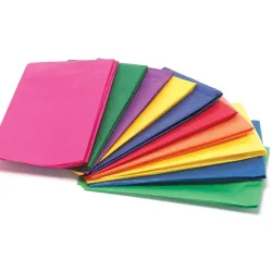
Materials are your grammar. With paper, tissue, boxes, ribbons and seals, compose sentences that the customer understands at first glance. The choice is not only aesthetic: it decides the speed at the counter, the protection of the product, the photogenic nature of the package, the environmental impact and the willingness to pay for a more refined finish. Start with three simple criteria to keep in mind while you work: structure, tactility, color. The structure supports and protects, the tactility conveys quality and calm, the color aligns the package with your identity and with the occasion of the gift.
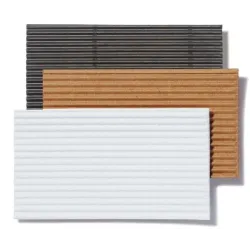
When working with paper, think of thickness as a voice register. An 80–90 g/m² paper flows fast, takes sharp folds and lightens you in peaks; A grammage of 100–120 g/m² provides visual substance and holds the edges of heavy products better. Natural kraft speaks of authenticity and resistance, matt coated cleans light and dampens reflections, metallic must be dosed so as not to saturate the scene. If you have to choose only one profile to cover most cases, you stay on a neutral and matte paper with a firm hand, capable of clean folding without elastic memory. Beauty comes when paper collaborates: a clean cut, a diagonal that does not tear, a flap that fits effortlessly. To get there, the blade must be alive and the bench clean; A flawless paper is damaged in an instant if it slips on residues or bumps into edges.
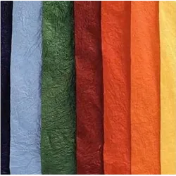
The tissue is the air between the product and the world. In textiles, it protects surfaces, avoids rubbing, emphasizes the moment of unveiling. If you're working with clothes and accessories, choose a light and homogeneous tissue, around 17–22 g/m², preferably acid-free so as not to alter the colors. In beauty, it softens the rigidity of the box and creates a visual embrace; In the gourmet sector, it separates, tidies, lightens, but must not interfere with food odours and surfaces. There is no need to make volume with unnecessary layers: two turns laid coherently are enough, a soft grip that holds without crushing. If you want to give rhythm to the opening, overlap two neighboring shades of the same palette, letting the inner edge emerge a couple of millimeters. It is an almost invisible detail that, however, educates the eye.
Boxes are an accelerator when the shape of the product or the context requires it. A shirt in the store can live on paper and fold, a bottle or a skincare set gain in safety and order inside a rigid structure. Interlocking pleats save you time, automatic bottoms prevent hesitation, magnets have a quiet elegance but require attention to the overall weight. If you work with bottles, a capable, lightweight microwave protects the edges without clutter; If you wrap shoes or accessories, a flat cardboard with real thickness makes the impact clearer to the touch. The box communicates with the paper and does not replace it: when the external surface is sober, a sheet of tissue paper or a ribbon with a textile coat brings back warmth and movement. The balance is simple: structure where needed, softness where you touch.
Ribbons are your handwriting. Satin glides and catches the light, grosgrain offers rigor and a recognizable texture, waxed cotton gives an idea of controlled naturalness, raffia speaks more artisanly and is perfect when you want to lighten costs and impact without losing personality. The width changes the perception: around 10-15 millimeters you accompany small boxes without dominating, at 25 millimeters you sign the package medio generously, over 30 millimeters you enter the scenographic register that fills and slows down the opening. When you are in a hurry, the double round with a flat knot is more elegant than an uncertain bow; When you have time, a short, dense jib stays in shape even after transport. There is only one rule: the ribbon must never impose a tiring gesture on those who will open. Beauty must not turn into an obstacle.
The seals close and tell. A round matte sticker with your branding works as a fixed point, a rectangular label on natural paper gives an editorial note, a modern sealing wax with a flexible core combines theatricality and practicality. If you want to make the gesture more fluid, use thin double-sided adhesives on the main joints and entrust the seal with the narrative, not structural, function. In food and bottles, clarity is part of aesthetics: a seal that guarantees closure and a micro-indication of disposal give security and lighten the sense of responsibility of the giver.
Color is a promise that must be kept the same in the store, in the bag and in the light of the house. Stay in your palette and play for variations, not free tackles. If the environment is warm, choose tones that do not turn yellow under different lighting; If the walls are cold, avoid bluish whites that harden the package. A neutral paper, a tissue a half tone below and a ribbon a half octave above create a progression that the eye reads as natural harmony. In peak seasonal periods you can dare a metallic finish or a more evident texture, but always at the service of the whole. The package must photograph itself well without filters, because that first shot is often your most credible advertisement.
Sustainability becomes simple when you plan the separation first. If paper, tissue, ribbon and box can live on their own at the end of use, you have already done half the work. A discreet title block with clear indications on the recycling inserted inside avoids weighing down the exterior. If you choose the right certified papers and inks, you don't need to proclaim it in large letters: the customer will find out with pleasure at the right time. The important thing is not to create conflicts between materials that require different gestures to be disposed of. Consistency is more persuasive than any slogan.
Stock management is a matter of lucidity, not abundance. Near the counter keep the three shades that embody your season, two heights of ribbon that cover most of the volumes, three paper formats already prepared for the recurring categories. The rest live one step away. When you predict a peak, pre-cut the standard sizes, pair the tissues in color pairs, and replenish the rolls that are about to run out. The goal is not to have everything, it is to have everything you need without forcing you to search. Research is wasted time and time, at the counter, is image.
The product categories guide choices, but the logic remains. In fashion, the order of the folds counts more than the ornament, so paper ready to fold cleanly, tissue that does not stain, ribbon that supports without marking the fabric. In beauty, the scene is compact and central: a harmonious box, a tissue that curbs rigidity, a precise seal. In food and bottles, the priority is the safety of the structure, then beauty: solid bottom, reinforcement at the edges, band that blocks and tape that closes short, so nothing gets caught. In gift electronics, protect the corners of the boxes with a denser paper and choose a matte finish to avoid streaks and fingerprints.
The final combination is your style. If you want to declare minimalism, let the surfaces run wild and use a single distinctive element, perhaps a textile ribbon with a prominent hand on neutral paper. If you want warmth, play with tissue paper just darker than paper and a ribbon with visible texture, then sign with a textural seal. If your identity is graphic, integrate a subtle pattern on the tissue and keep the box clean, so the effect remains elegant and legible. Everything works when the package seems inevitable, not built. Those who watch it must think that it could not have been different.
When you choose materials with this gloss, you wrap faster, protect better, align the package with your brand and create that feeling of value that legitimizes a small upgrade without forcing. The hand works serenely, the eye enjoys an evident order, the customer takes away a gift that already tells a story. It is the moment in which matter ceases to be cost and becomes a tool. In that step, your store gains meters of reputation that last longer than the season.
Color and finishes that sell
Color is not an ornament, it is a lever that guides the eye, defines the emotional tone and decides how long the package remains in memory. When choosing your palette, you're not limited to aesthetic preferences: you're calibrating temperature, saturation, and brightness to make it work under the lights of your store, in the customer's bag, and on the gift recipient's table. Start with the environment in which you work. If the space is warm, with amber woods and lamps, avoid cold whites that turn to gray and choose enveloping neutrals that maintain fullness; If the store is cold and minimal, move away from beiges that are too yellowish and work with soft grays and full colors that do not break at the first shadow. The goal is to avoid perceptual conflicts: when background and package quarrel, the eye gets tired and the perceived quality drops.
The rule of complementarity gives you an elegant shortcut. If the product or brand moves on a dominant register, place the ribbon or tissue on its chromatic opposite, softening with a neutral between the two so as not to fall into the flag effect. A forest green with a touch of deep red finds balance by switching from a natural paper that calms the contrast; a midnight blue dialogues with a copper reference and a smoky gray tissue that acts as a bridge. Complementary pairs work because they promise controlled energy: the visual shot is present, but the package remains refined. If you want to dilate the effect, work by analogy and let three neighbors in the wheel make a chorus, entrusting the seal with a discreet metallic note that signs without shouting.
The brightness decides the degree of packet authority. Dark tones with a matte surface communicate control, weight, stability; Light and clean tones tell of hospitality, airiness, freshness. It modulates light through finishes rather than pure color. A soft-touch ivory is perceived as more precious than an aggressive glossy white; a matte taupe gray with micro-embossing is more tactile and more forgiving to use; A deep blue with glossy screen printing varnish on the brand brings out the signature without weighing down the whole. Remember that the client's camera is ruthless with reflections: an excessively glossy paper immediately shows fingerprints and micro-scratches, while quality mattes hold up to transport and are photographed well even in domestic light.
Finishing is what translates color into matter. The matte cleans the contours, extinguishes unwanted reflections and extends the aesthetic life of the package; glossy amplifies saturation but demands perfect surfaces and light hands; The soft-touch adds warmth and slows down the gesture, because the hand lingers and the object appears more noble. Subtle embossing creates micro-shadows that give depth without visual noise, pearlescences should be used as fine rooms, never as the protagonist, while metallics make sense when they are concentrated in details that collect light, not when they invade the entire field. If you work with bottles and gourmets, the microwave coupled with natural papers restores solidity and reduces transport marks; if you treat beauty and skincare, the velvety surfaces with shiny touches in register communicate cleanliness and care without clinical coldness; In fashion, the textile textures on ribbons and seals dialogue with the materials of the garments and give narrative continuity to the brand.
The color must remain consistent between the desk and the house. Test it in two different lights and make sure it doesn't change its character. Warm lamps tend to turn whites yellow and turn off blues; Cold lights stiffen reds and make greens vibrate. Choose pigments and stable papers, avoid too acidic colors that become digital and unnatural in photography. If your brand lives on a signature color, build a family of midtones around it that accompany it without competing. A tissue half tone below, a base paper a breath warmer or colder depending on the environment, a ribbon half an octave above to close with intention. This way the package breathes and the signature remains clear.
Psychology helps you decide when to dare and when to calm down. Saturated and full colors ignite attention and legitimize a visible upgrade, but consume the eye faster if used without pause. Calibrated neutrals, soft textures and matte finishes build trust and allow you to offer valuable details without seeming pushy. When the occasion is a formal gift, shift the emphasis to the finishes rather than the color and let touch tell the story. On the other hand, when the gift is affective and personal, a bold color accent on the ribbon or seal makes the scene memorable without having to change the whole set.
Sustainability also plays an aesthetic role. Recycle-compatible finishes and non-plastic papers maintain an understated beauty that the customer perceives as honest. Whether you choose laminations, use recyclable versions or reserve the treatment for small areas, so the separation of materials remains intuitive. Transparency is not communicated with long sentences, but with legible choices: a discreet pictogram inside, a hint of the composition of the support, a textile ribbon that can live a second time. The consistency between promise and gesture makes the package more credible than any claim.
Dialogue with the voice of the brand remains your North Star. If your identity is minimal, leave room for solids and voids, work with clean backgrounds, use a single element in evidence, perhaps a material seal on neutral paper. If the brand font is warmer, build soft layers: a deep-toned tissue under a lighter paper, a textured ribbon that makes itself felt, a tone-on-tone print that only appears nearby. If your figure is graphic, insert subtle patterns that hold up to the small scale and do not create moiré in the photo, then keep the box and ribbon essential so that the design remains the protagonist without confusing.
The conversation with the customer ends with simple words that orient without technicalities. When you propose a finish, always link the benefit to the result of use. If you say that the opaque avoids fingerprints, you are defending the dignity of the gift along the way. If you suggest a richer-weave ribbon, you're ensuring that the bow arrives intact. If you offer tissue in a coordinated half-tone, you are promising a more dramatic opening without weighing it down. The choice becomes reasonable because it serves a purpose, not just to decorate.
When you govern color and finishes with this awareness, the package becomes inevitable and natural, not constructed. The eye glides where you want it, the hand feels quality, the memory retains a clean scene. It is at that moment that the receipt medio finds space with elegance, that loyalty feeds on consistency and that word of mouth takes shape in a photograph that speaks well of you even when you are not there.
Ethical upsell at the wrapping counter
Upselling at the wrapping counter is an act of hospitality, not a push. It works when you remove a problem, not when you create it. In that minute when the paper is stretched and the tape takes its place, you govern a rare listening window: the customer sees the cure, feels that you are taking care of him and entrusts him. If you offer him an improvement in simple words and a clear benefit, the choice becomes natural. If you try to force, you interrupt the ritual and undermine trust. The boundary is thin and it's all in function. When you say "so it arrives intact", "so it doesn't open in the bag", "so the bottle doesn't bump", you are doing consultancy. When you only promise "more beautiful", you risk seeming superfluous.
The right time is while you work, not before or after. Anticipating the proposal before touching the product sounds like a cold sale; making it when the wrapping is finished adds a disturbing detour. The best moment is the transition between preparation and closing, when the customer has seen the package born and understands what you are protecting or finishing. It is a soft invitation, almost a thought out loud: "Here a seal holds the fold and stays cleaner", "With a box the bow does not crush during the journey". You don't ask for attention, you accompany her.
The proposal must be short, clear and reversible. Offer a reassuring, binary choice, never a range that fatigues. Show the standard solution that already convinces and its value variant with a gesture, not a catalogue. "I can close like this and it's perfect, or I add our textile ribbon to get the bow into shape." The yes comes because the free alternative is already dignified; Extra value does not replace, it elevates. Reversibility, on the other hand, protects the relationship: if you read hesitation, you withdraw the proposal with a smile and continue fluidly. The customer feels that he commands the pace and that the priority remains his time.
Transparency about cost is part of elegance. No surprises, no figures pronounced in a low voice, no ambiguous gestures. A sober micro-signage, a clear indication at the cash register or a serene hint in a singular phrase are enough. "The textile tape closure has a little extra, can I insert it?" The tone makes the difference: ask for permission, not authorization. When the proposal arises from a concrete advantage, the price appears proportionate and the choice is serene.
Words count as much as hands. Avoid technicalities, promise results. "I reinforce the edges so they remain clean", "I add a tonal tissue for a cleaner unveiling", "I apply the seal and do not risk openings in the bag". Each sentence directs the gaze to the benefit and transforms the upsell into assistance. In the case of bottles, the topic is safety, in boxes the shape of the bow, in textiles the protection of the garment, in beauty the hygiene of the interior. The lexicon changes, the logic remains the same: to make inevitable what is really needed.
Ethics also lies in knowing how to say no. If the product does not ask for a box, do not offer it. If the paper holds up and the shape is compact, don't look for volumes with unnecessary layers. Excess weighs down and undermines credibility. When simplicity is the best solution, declare it. "Here we remain essential, so the garment breathes and arrives perfect." This frankness builds trust for a long time and makes any value proposition stronger on the next lap.
Personalization is the kindest form of upsell, because it comes from listening. A color of ribbon that echoes the tone of the garment, a card with two words written on request, a seal with the recipient's initial if you allow it operationally, are gestures that cost little time and give back a lot in perception. For them to work, you have to remove the clutch: everything you offer must be at hand, ready to use, with clear and few variations. Offering an option that forces you to seek or improvise turns a moment of grace into a stumble.
In click & collect, the leverage moves one step earlier. If the pick-up booking includes the wrapping option, prepare an ending consistent with that of the counter and leave a possibility of upgrade to delivery only when there is a concrete benefit that can be seen with the naked eye. "I have prepared the standard closure, if you want I can add the textile tape so the package arrives in shape even after the journey". In a few seconds, the customer perceives that you had already done what was necessary and that the extra is not an afterthought, but an extra attention.
Handling the objection is an exercise in courtesy. If price is the obstacle, shift the focus to the feature and offer a lightweight alternative. "We can keep this solution that protects the edges and stay within budget." If it's time, promise and keep speed. "I'll seal you and you're ready in ten seconds." If it's the style, align the aesthetic with a short question. "Do you prefer a more sober ending or an accent of light?" You don't win the argument, you untie a knot.
Training the team means giving a single voice to different hands. The strength lies in repeatability, not in acting. All you need are a few guiding phrases, an order of gestures that accompanies the words and a clear threshold beyond which you do not insist. Everyone proposes at the same point in the process, everyone explains the benefit before the price, everyone knows when to stop. Consistency creates recognition and protects the brand's style even at peaks, when speed threatens to cut away kindness.
Sustainability can be an upsell when it frees the customer from a thought. If disposal is intuitive and declared, if the tape is reusable, if the paper has a beautiful hand without unnecessary lamination, the ecological proposal does not sound like a sacrifice, but like an improvement in the experience. "This opaque paper shows no fingerprints and goes straight into the collection; this textile tape is reused". It is an advantage of use before an abstract value.
The last meter is a small and decisive stage. If you treat the upsell as a sober choreography, each proposal comes in and out at the right time. The client feels that you are helping them achieve the best result with the least effort and trusts them. The consequence is a receipt that grows without friction, a relationship that is strengthened without noisy promises, a word of mouth that speaks of you in terms of attention and competence. You close the package with one more detail; the guest takes away the certainty of having been treated better than necessary. This is how a commercial gesture becomes service and service becomes style.
Sustainability, without greenwashing
Sustainability becomes credible when it does not need proclamations. Start by how you design the pack and how you make it live after you leave the store. If you think of packaging as an object that must function, protect, excite and then easily separate into its materials, you have already taken the essential step: transforming an abstract value into a daily practice. Beauty remains intact, efficiency improves, consciousness is light because you are not giving up anything; You're just eliminating what you don't need.
The first sustainable gesture is to control the dimensions. The right size reduces paper waste, shortens working times and limits unnecessary padding. If you logically cut out the three formats that cover most cases and combine them with tissue paper consistently, you avoid scrap that accumulates and overfilled packages that look generous but communicate clutter. When you move on irregular products, the box becomes an ally because it organizes volumes, protects and allows you to use less finishing material. The result is a cleaner look, safer transport and a more basso impact without having to explain it.
The choice of materials follows the same clarity. A paper with a beautiful hand and matte surface tells of quality even without lamination, a neutral and homogeneous tissue protects and ennobles without weighing down, a taut and rigid cardboard allows solid structures that do not require redundant reinforcements. If you need an accent, rely on textures or embossing instead of films that complicate disposal. The ribbon, when it is textile and well constructed, is worth twice because it is reused with pleasure; If you choose natural bindings, slide them well between your hands to avoid that rough feeling that makes you feel like saving money instead of choice. The seal performs its function with measured glues and thin adhesives: it closes, reassures, removes without tearing. It is in the joints that separability is decided, and it is in separability that sustainability becomes simple.
Even the print can be understated and memorable. A well-recorded tone-on-tone, a glossy varnish that marks the brand on a matte background, a light pattern on tissue paper are enough to give identity. When color works with touch, the effect remains elegant and photographable and does not force you to invasive treatments. If you want a metallic accent, concentrate it in small areas where the collected light makes sense and the rest of the support remains easily recyclable. Any choice that avoids making materials inseparable is a choice that the customer recognizes when disposing of it.
Sustainability also lives in the logistics of the counter. Keeping only what you need close reduces breakage, fingerprints, wear. Storing rolls away from light and moisture extends the life of the surfaces and keeps the colors stable. Recovering the cleanest scraps for samples, courtesy cards or discreet package seals gives dignity to the waste and tells without speaking. The speed with which you clean the table, the sharpness of the blades, the order of the tools become part of the ecological footprint because they reduce errors and rework. Every successful package at the first try is a real saving, not a slogan.
Communication with the customer must be clear and short. You don't need paragraphs, you need signals. A discreet pictogram on the inside indicating where the paper goes, where the tissue goes, what to do with the ribbon, a line on the back of the card explaining the separation of materials, a kind reminder near the gift station inviting you to reuse the packaging. Transparency, when it is essential and positioned in the right place, reassures without disturbing the scene. If you use certified materials, let the certification stay where it makes sense and not turn it into lauda; Those who are interested will notice it, those who are not will not be distracted.
The ethical dimension also enters into the way you propose the upgrade. If you offer a box, you do so because it protects and reduces unnecessary padding, not to inflate perception. If you suggest a quality tape, you do it because it will live a second time, not because it shines more. When words link the proposal to a functional benefit and a post-use gesture, the customer feels that he is making an intelligent choice even before a virtuous one. Sustainable upsell is a promise of durability and simplicity, not a moral reward.
Click & collect is a perfect test case. A ready-made package that goes in and out in a few seconds tells efficiency, but also tells about design. If you thought of a wrapping that holds up without double closures and without unnecessary layers, you have shown sustainability in action. At the collection you can insert a very short note, perhaps on the back of the receipt or on a card, reminding you how to dispose of everything. It is a polite invitation, not a strict instruction.
Inventory management completes the picture. Predicting peaks and calibrating orders on what is really needed avoids the accumulation of materials that age badly and colors that change the tone of the season. If a pattern or dye is tied to a specific period, plan its release with an idea of reuse: a smaller run that fits into a set of samples, a second life as an inner lining, a transformation into tags for sales or special initiatives. Sustainability, in the store, is often distributive intelligence rather than technology.
The team is the silent ambassador of this vision. When everyone knows what to say in two sentences, where to indicate the separation of materials, how to propose the cleanest solution without sacrificing beauty, the message spreads naturally. Education becomes part of the experience and not an unplanned. The customer comes out with a package that works, understands on the fly what to do next and perceives that your commitment is concrete. At that moment, sustainability stopped being a claim and became style.
If you treat every decision as an act of clarity — the right size, the right material, the right finish, the right word — the "Package Moment" becomes an everyday example of responsible elegance. You work better, the desk flows, the package is photographed well and lives beyond the gift. Reputation grows because what you do is consistent, not because you tell it out loud. And when consistency becomes habit, sustainability stops being a project and becomes the way you do things.
Omnichannel & Click & Collect
When the order is born online and closes in the store, you play two times: the promise and the delivery. In the first half you talk about efficiency, choice, precision; in the second you transform those words into a ready-made, beautiful and easy-to-collect package. Omnichannel is not an extra channel, it is a single experience in which the customer's gaze must never stumble. If the wrapping is consistent between screen and counter, the transition from digital to physical takes place with a naturalness that makes what is not simple seem simple.
Click & collect thrives on synchronization. You organize a back stage that works in advance and a front stage that does not hold back. The order comes with the wrapping preferences already chosen and you prepare materials and gestures as if you were preparing a scene. The paper is cut to size, the tissue is coupled, the ribbon is threaded into the right backing, the seal is within reach. If the person has indicated a message, print it on a readable card and place it where it will appear when you open it. If they have requested a sustainable option, make the separation of materials immediately apparent. Those who enter to collect do not have to attend a trial, they must see a result.
Withdrawal is a short time that decides perception. If you let the customer through the general queue, you lose the sense of service; If you bring it to a clear, orderly and recognizable point, you defend the idea of efficiency that guided the choice of Click & Collect. The package must be ready without showing haste: the paper taut, the sharp edges, the bow intact, the bag proportioned. An internal label connects order and wrapping for any after-sales needs, while on the outside nothing disturbs visual cleanliness. The main counter continues to scroll, the pick-up point delivers and greets. It is a discreet choreography that lightens the store and reassures the guest.
Communication before arrival is a decisive ally. A message confirming that the order is ready and indicating where to go inside the store reduces questions and micro-waits. If you know that the influx will grow in the next few hours, suggest a useful window and stick to it. A few minutes before collection you can close the last phase of the wrapping, so the tape stays in shape and the package does not mark. Words matter: you indicate the point, you promise a time, you remember that the package is already ready. Those who arrive feel expected, not simply expected.
Omnichannel allows you to offer wrapping as a conscious choice even online. When you show three clear solutions, all dignified, the person chooses without fatigue and you set up without improvising. The value variant only makes sense if it solves a problem that can be understood by eye: a box that protects during the journey, a textile ribbon that retains its shape, a tissue that ensures a clean unveiling. At the retreat, if you see an opportunity for a small improvement, you propose it with the same delicacy used at the counter: a gesture, a phrase, a yes that does not lengthen the time.
The boundary between channels can be seen in the consistency of the materials. If the card you promised online is the same as the one the hand meets in the store, trust grows. If the brand's signature color maintains character in different lights, memory is fixed on the right sign. If the card of dedicas is legible and tastefully positioned, the gift takes voice without confusion. Attention to these steps avoids that feeling of a "repackaged" product that devalues the experience and instead gives the idea of a unique flow, curated from start to finish.
There is also the issue of safety and durability. A click & collect is not a shipment, but the package will still face a journey. You design the wrapping thinking about the riding school, the bag, the car, the house. The corners are reinforced just enough, the jib does not get in the way, the seal guarantees without tearing, the bag holds the real weight and does not deform at the first turn. It's a sober balance between stage and function that avoids accidents and builds reputation.
The return to the store, when the order is born online, is a delicate moment that you can turn into an opportunity. If the person changes size or color and wants to keep the gift, you are ready for a quick and clean re-wrapping, recovering everything that can live a second time. It is not a patch, it is a new conclusion executed with the same quality as the first. Those who attend see consistency and seriousness; the recipient perceives a gesture that lives up to the initial promise.
Teamwork closes the circle. Those who prepare, those who control, those who deliver must share gestures and words. The package is born in the back with the same standards that you apply to the counter, passes a visual check that intercepts defects, arrives at the collection point with the security of a finished object. As you deliver, you tell in one sentence what matters: that the wrapping is ready, that the message is inside, that the separation of materials is intuitive. It is a greeting that does not take up time and adds value.
When you orchestrate omnichannel in this way, the customer has a single, fluid experience. The online choice is simple, the preparation invisible, the delivery fast and courteous, the object beautiful and protected. You reduce friction, ease queues, build confidence and pave the way back. In the following chapter, you transform this consistency into a daily method, aligning roles, times, standards and training so that each package, from the first of the opening to the last of the closing, speaks with the same voice.
Team organization and training
Organization is not an organizational chart hanging on the wall, it is a shared rhythm. If you give the team a clear score, the gift station always sounds the same and always good, even when the store speeds up. You define the flow, assign the roles, train the words. The result is a flowing bank, serene customers, consistent packages. The difference between improvisation and method is all here.
I start from the package path and translate into accountability. Those who prepare stage the right material without making it weigh on the customer: paper in size, laminated tissue, tape ready in tension. Those who wrap govern the heart of the gesture: sharp folds, clean corners, controlled adherence. Those who finish close with determination and delicacy at the same time: aligned seal, bow intact, proportionate bag, greeting and delivery. When the flow is intense, add those who replenish and replenish silently, so no one leaves the place and the quality does not drop. People rotate to these positions throughout the day to distribute attention and fatigue; The hand changes task, the standard remains the same.
Training begins before touching materials. You show the finished result, then you disassemble the scene step by step until every gesture becomes inevitable. The new colleague observes from a useful distance, repeats on pieces not intended for sale, switches to reality only when the movement is clean. The hand learns what the eye has already understood. You explain in short and precise sentences, avoiding confusing technicalities: you pull, you stretch, you align, you close. Every word is a call to action, not a theory.
You train speed as a consequence of precision, never the other way around. At first, ask for conscious slowness, then reduce the time without shortening the steps. You use packages of increasing size, introduce different materials, simulate queues and background noises to reproduce the real thing. When the gesture also keeps you under pressure, you know you have a skill that will hold the peaks. Customer trust comes from this operational calm that is not discomposed.
The visual standard lives in a clear and non-negotiable threshold. The package that comes out has four sharp corners, a flap that does not lift, a ribbon that runs straight, a centered bow that does not deform at the first impact. If something is missing, it is made up for it without discussion. It is not perfectionism, it is coherence; Consistency is what the customer buys in addition to the product. A summary sheet with reference photographs remains hidden from view but within reach: it reassures those who work, aligns those who take over, resolves doubts in an instant.
The voice of the brand is taught as a second language. You give the team a simple and hospitable vocabulary to use while working. Describe what you are doing, anticipate the next step, propose improvements as solutions and not as frills. Avoid vague phrases, promise concrete results: it arrives intact, it does not open in the bag, the edges remain clean. When everyone speaks with the same clarity, the store acquires personality without becoming rigid.
Tail management is as much a part of training as the use of the blade. Those who are at the counter maintain eye contact with those waiting, inform about the times naturally, give the customer the feeling of being in good hands. The narration of the process is a simple and very powerful technique: in a moment we close, I am finishing the knot and you are ready, only the seal is missing so it does not open. The perceived time is shortened because the path is legible. On peak days, those who welcome at the entrance intercept special requests, direct them to the collection of the click & collect, lighten the counter before the traffic jam is created.
Security protects people and reputation. The blades live in defined areas, they are used with coded movements, they are stored immediately. Surfaces are cleaned often, materials are handled without sudden gestures, waste disappears from the top so as not to end up in the wrong fold. Every detail speaks of care. A small accident compromises ten successful packages; Prevention is the smartest form of efficiency.
The handover decides the quality of the shift. Arriving, those who take over find the desk in order, the rolls full, the tapes under tension, the visual card in its place. On leaving, the concluding person leaves brief notes on what needs to be replenished, any special requests of the day, and tricks that have worked. It is a silent continuity that the customer does not see but feels in the constancy of the service.
The relationship with the backstage supports the front stage. Those who prepare for click & collect work with the same standards as the counter, mark each package with an internal reference that does not spoil the aesthetics and deliver a finished object, not a construction site, to the collection point. If a size change or readaptation takes place, the re-wrapping is quick and clean, reusing what can live a second time and restoring the same dignity as the first performance. The initial promise remains intact.
The insertion of the new materials follows a shared ritual. First you test on the technical table, then you bring it to the bench with a short demonstration for everyone, finally you leave a period of shadowing in which an expert colleague observes and corrects. The innovations do not come as impositions but as tools that facilitate the work. If something doesn't flow, you say it immediately and adjust your focus; Frankness avoids repeated errors and saves time and paper.
The feedback is daily and light. At the end of the day, you spend a few minutes looking with fresh eyes at two or three packages that came out better and one to correct. Celebrate the successful gesture, explain why, indicate the exact point to improve. People grow faster when they know what to repeat, not just what to avoid. Every small victory becomes the team's heritage, every stumble dissolves before it becomes a habit.
Sustainability becomes natural when you teach it as a routine. You separate already at work, not at the end, you use materials that are understood at a glance, you explain with a sentence how to dispose of it without weighing down the conversation. Those who sit at the desk do not preach, they accompany; Education works because it is concrete. The same naturalness applies to ethical upselling: you only offer what is really needed, words link the choice to the benefit of use, the customer feels that you are helping him, not convincing.
The tone of the service is the sum of your standards and the people who bring them to the stage. If you train the team to breathe together, the gift station becomes a signature: elegant, fast, reliable. You control the pace, the customer takes away a memory that is worth more than the time spent in line. In that step, training stops being a cost and becomes an asset: every hand you learn to lead is one more package that succeeds at the first try, one less conversation to manage, one more return that happens without proclamations. When the organization is clear and the training continues, the last meter stops being fragile and becomes the place where your brand is fulfilled every day.
The strength of your store is decided in the last meter. Here the product stops being a commodity and becomes a promise kept, here the customer leaves with something in his hands and a memory in his head. You have seen how each step is held: the gaze that you orient with color and finishes, the material that protects and tells, the gesture that flows on a gift station designed to help you work better, the words that accompany without taking up space. The wrapping does not add weight, it removes friction. It lightens the queue, reassures the viewer, puts order where chaos could appear. It is in this conquered simplicity that the receipt medio find a margin without friction, because the upgrade does not appear as a vanity but as a solution. This is where loyalty becomes a habit, because the customer recognizes a reliable ritual. It is from here that word of mouth takes voice, because a beautiful experience tells itself.
When you treat wrapping as a process and not as a favor, you give yourself clear rules and intelligent freedom. The station is not a support, it is a direction. Materials are not costs, they are tools. The team is not a rush hour fallback, it's your style made human. Sustainability stops being a label and becomes a way of working that simplifies the aftermath, without asking for sacrifices in the present. Omnichannel stops being technology and becomes continuity: what you promise online you deliver the same and better in the store, at a pace that makes you feel expected. Within this coherence, every value proposition arises from an obvious reason. You don't sell a ribbon, you guarantee the shape. Don't offer a box, protect the journey. You don't add a tissue, you promise a clean unveiling. Beauty comes as a consequence of function, and this is the most elegant form of persuasion.
If you look at tomorrow with operational eyes, you already know what to do. Put gestures in line before haste, choose a few materials that hold the scene and speed, train short sentences that talk about outcomes and not technicalities, make your care legible even when the store accelerates. Every successful package at the first try is time earned, trust built, reputation that grows. Every customer who leaves with a wrapping at the height brings a part of your brand with them and lets it into homes, offices, party tables where you don't arrive. It is marketing that does not ask for additional budget, it is a service that does not sound servile, it is style that is not afraid of imitations because it lives in the sum of the details.
The "Package Moment" does not close the sale, it completes it. And as he performs it, he opens the next one. If you keep the gesture clean, the matter honest, the word clear, that final meter becomes the place where you become preferable. It is a choice that can be seen and felt, a signature that remains the same and improves every day. When you raise the shutter, you're not just starting to sell – you're preparing the keepsake with which your customers will talk about you. Make it precise, warm, unavoidable. The rest will come naturally.