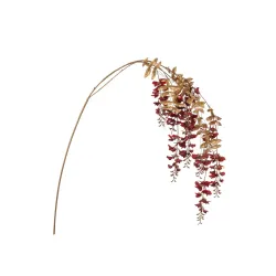
Red berries everywhere. We see them intertwined in the garlands on the doors, set between the needles of the tree, lying on the centerpieces, fixed as a small chromatic seal on the bows of the gift packages. At Christmas it is almost impossible for your gaze not to stumble, several times a day, on these tiny points of color. Yet, precisely because they are so present, we tend to take them for granted, as if they were a purely decorative detail, an aesthetic habit that is now codified. But are red berries really just a "cute ornament", or do they hold a much deeper meaning, sedimented over the centuries and reaching our windows and packaging?
When we talk about red berries in the Christmas context, we move in a space crowded with symbols. There is winter nature, with its bare branches and those that resist, evergreen and loaded with ruby-colored fruits. There is the memory of the pagan celebrations linked to the solstice, when bringing green branches and berries into the house was a rite of protection and good luck. There is the Christian reinterpretation, which sees in red the color of blood and sacrifice, and in the thorny leaves of the holly a reference to the crown of thorns. Finally, there is the modern imagery, built in the nineteenth century and then amplified by advertising, publishing and the media: a visual universe in which red berries become one of the most immediate codes to say "Christmas" without the need for words.
For those who design installations, shop windows, photo shoots and packaging, this detail is by no means marginal. Behind a simple red berry, cultural history, religious symbolism, color psychology and visual merchandising strategies are intertwined. The red of the berries, in fact, does not only warm the atmosphere: it attracts the eye, creates contrast, defines focal points, guides the customer along a visual path. Against a background of deep greens, snow whites, natural krafts and tactile materials, those small shiny globes function as accents that illuminate the whole, making a wrapping, an exhibition or a photo set immediately readable as "Christmas".
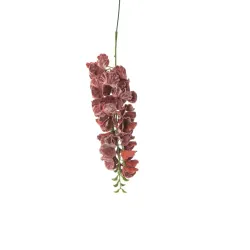
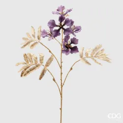
The strength of red berries also stems from their dual nature, halfway between the real world and the idealized world of décor. On the one hand, they refer to very specific plants – holly, rose hips, hawthorn, viburnums – which in European woods and gardens mark the winter with stubbornly alive patches of color. On the other hand, through the hand of designers, they are transformed into decorative objects: artificial picks, scenographic branches, miniaturized details ready to be fixed on a bow or a shopper handle. The result is a sort of "enhanced nature", which preserves ancient symbols but puts them at the service of contemporary narratives: that of the brand, the store, the product, the shopping experience.
In this scenario, the red berry is not just an ornamental element, but a real three-dimensional graphic sign. It is a punctuation point within the visual story of Christmas: it can underline, highlight, close a composition, guide the eye towards a logo, a label, a textile or paper detail. When paired with neutral papers and ribbons, it introduces a warm and sophisticated note; if it dialogues with traditional patterns, such as tartan and stripes, it reinforces a classic imagery; If it fits into more contemporary palettes, such as dusty mixes or natural tones, it creates a controlled contrast that still maintains the link with tradition.
For those of us who deal with packaging and décor, reading red berries in this key means going beyond the simple "looks good" or "it's Christmas". It means recognizing that every choice, even the smallest, contributes to the construction of a coherent and memorable visual identity. Deciding whether or not to insert a branch of berries on a gift box, on a counter composition, on a garland for the entrance is not a neutral detail: it is a stance with respect to the type of Christmas we want to communicate to our customers. More classic, more natural, more scenic, more essential: those small red spheres, used with awareness, can shift the balance.
Ultimately, talking about red berries and the magic of Christmas means entering the heart of one of the most iconic symbols of the season, decoding its language and transforming it into a design tool. It is an invitation to look at what we take for granted with different eyes, to understand how a micro-detail can become, if well orchestrated, the red thread that connects tradition, emotion and visual strategy. Because yes, at Christmas a red berry is never just a red berry: it is a signal that ignites the memory, warms the atmosphere and, if used in the right way, enhances even the simplest of wrappers.
A small detail, a great symbol: why we see red berries everywhere at Christmas
Red berries are one of those details that seem to go almost unnoticed, until we really decide to look at them. Suddenly we realize that they are everywhere: in the branches that wrap around a garland, between the needles of the tree, set in a centerpiece, fixed with an iron wire to the knot of a ribbon, printed on a gift card, reproduced in the foreground of photos for social media. It is as if Christmas had scattered in the visual landscape a constellation of small red dots, discreet but insistent, which together build an unequivocal signal: it is time for celebration.
If we look at them with the eye of those who design a set-up or packaging, red berries immediately stop being a simple "cute ornament". They become a real code. The guest who enters the store, the customer who receives a package, the user who scrolls through a social feed recognizes that visual message on the fly, even before reading a writing or decoding a pattern. A wreath with red berries hanging on the door, a closed box with a thin, shiny branch, a bag decorated with a small bunch of berries are all different ways of saying the same thing: what you're looking at belongs to the Christmas ritual.
The appeal of this detail lies in its ability to hold different dimensions together. On the one hand, it is a natural element, or at least inspired by nature, which immediately refers to the forest, to winter, to an almost archetypal dimension of cold outside and warmth inside. On the other hand, it is a designed, studied, often artificial object, carefully inserted in a composition that must function in the window, on the checkout counter, in the gift box, in a photographic shot. This double identity allows the red berries to move with extreme agility between the emotional world of tradition and the strategic world of visual merchandising.
The eye looks for them, even if we don't realize it. The red of the berries stands out against the dark green of firs and pines, on the white of the recreated snow, on the kraft of natural papers, on the neutral tones of fabrics and surfaces. In a complex setting, where lights, different materials, products and messages coexist, those small shiny globes work like micro-spotlights: they attract attention, concentrate it, guide the eye to a precise point. A bow without berries is simply a beautiful bow; The same bow, with a small red branch applied, immediately becomes Christmassy and acquires a different narrative force. It is in this minimum gap that the power of a sign is measured.
For those who manage a shop or a brand, learning to read red berries in this key means understanding that there are really no "neutral details". Each element, however small, participates in the construction of the overall experience. A showcase that uses berries consistently, dosing and distributing them wisely, tells a precise idea of Christmas: it can be more traditional, more natural, more luxurious, more essential, but in any case it communicates a choice. In the same way, packaging that inserts berries as a visual signature, season after season, ends up creating an immediate link between that micro-sign and the identity of the sign.
Red berries also function as a silent bridge between physical and digital. The customer encounters them upon entering a store, finds them in the photographs of the products on the site, recognizes them in the short videos in which a package takes shape, sees them printed on a coordinated gift card, on a card, on a ribbon. This apparently random repetition builds familiarity and consolidates an imaginary. Without the need for slogans, without forcing, that small red sphere becomes a fragment of branding, a detail that confirms, every time, the same promise of atmosphere and care.
Behind this effectiveness there is not only the habit or fashion of the moment. There is a long work of history and visual culture, which has stratified meanings and associations to the point of transforming a simple fruit into a shared symbol. There is the echo of the most ancient celebrations, there is the Christian reinterpretation of red as the color of blood and life, there is the contribution of nineteenth-century publishing and graphics that codified the combination of red and green as the official palette of Christmas. All this sediments in our gaze and means that, today, a single berry is enough to recall an entire imagination.
In this first chapter, our goal is precisely this: to stop the frame on a seemingly minimal detail and recognize its strength. Red berries are one of the most iconic Christmas decorations not because they fill the space, but because they direct it, accent it, make it immediately legible. Understanding this mechanism allows us, as designers of installations and wrappers, to use them not automatically, but with intention. In the following chapters we will explore the historical and symbolic roots of this sign and see how to transform that awareness into concrete choices for shop windows, packaging and brand experiences capable of really speaking to the customer.
From the winter solstice to modern homes: the pagan roots of red berries
Before becoming a refined detail in our shop windows and on our wrappers, red berries were, for centuries, a sign of resistance and hope in the dead of winter. Imagine a European landscape of many centuries ago: short days, bitter cold, bare fields, bare trees. The world seems to slow down, almost turn off. In this scenario, the evergreen branches laden with brilliant berries were a silent promise that life had not given up entirely. Holly, rose hips, hawthorn, mistletoe and other shrubs became, in the eyes of ancient communities, much more than simple plants: they were symbolic presences, almost plant talismans.
The period of the winter solstice was a delicate and meaningful time. The longest night of the year was not just an astronomical fact, but a ritual passage. The pre-Christian populations of Europe, from the Celts to the peoples of the North, had developed a system of gestures and signs to deal with this critical point of the year: lighting fires, sharing food, gathering in communities and, above all, bringing the greenery that resisted the winter into the home. Hanging branches with red berries near the entrance, laying them on the rafters, placing them next to the hearth meant inviting nature to remain present, to protect the house, to ensure that light and warmth would return.
In this context, the red of the berries had a particular strength. It was the color of blood, therefore of life, but also of the fire that warms and protects. In the midst of a landscape dominated by grays, browns, dull greens, those small shiny spheres looked almost like frozen sparks. It is not surprising that they have been associated with fertility, good luck, and the ability to repel evil. A branch laden with berries, hanging above the door or near a window, functioned as a visual amulet: it kept hostile spirits away, accompanied domestic rituals, marked the passage from one year to the next. It was a primordial form of communication, which did not need words.
Bringing a piece of the forest into the house, with its red berries, was also a way to tame what was outside. The forest, for ancient cultures, was both resource and mystery, nourishment and danger. Taking a fragment of that nature and placing it in the heart of the inhabited space meant establishing a symbolic pact: recognizing the power of nature and, at the same time, asking to be able to live in balance with it. The red berries, so vivid and so delicate, perfectly embodied this ambivalence. They were small enough to be handled, intertwined, arranged, but showy enough to mark the scene and become the protagonists of a ritual decoration.
If we look closely, many of the contemporary practices related to Christmas are nothing more than a sophisticated legacy of those ancient gestures. When today we design a wreath with berries to hang on the door, we are unknowingly repeating a ritual that had, from the beginning, a protective and propitiatory value. When we build a centerpiece with evergreen branches and red berries for the holiday table, we are bringing back to the center of the house that same pact with nature that rural communities sought to renew every winter. The difference is that we have infinitely richer materials, finishes and aesthetic solutions, but the underlying logic remains surprisingly similar.
For those of us who work with packaging, installations and the visual narrative of a brand, recognising these pagan roots is not a purely cultural exercise. It is a valuable key to understanding why certain elements continue to function on an emotional level, even in a hyper-contemporary context. The customer who enters a store or receives a package certainly does not think of the winter solstice, Celtic rites or amulets against evil spirits. Yet, in front of a branch of red berries, he feels a feeling of familiarity, warmth, protection, which arises precisely from this long symbolic sedimentation.
There is another interesting aspect: the red berries originally marked a precise time, that of late winter, of the most intense cold. Today, when they appear on shelves, in shop windows and on packaging, they continue to perform the same function, but in a commercial and narrative key. They announce that the holiday season has begun, that we have entered a special period, in which daily gestures – shopping, preparing the house, choosing a gift – take on a different value. Every red berry, whether we know it or not, is a small passing signal.
Retracing the journey that leads from solstice rites to modern homes therefore allows us to see red berries not only as a Christmas cliché, but as a thread that connects our present to a much older imagery. In that thread, fear of the dark and desire for light, the need for protection and the desire to celebrate, respect for nature and the attempt to domesticate it are intertwined. When we incorporate them into a décor or packaging project, we are tapping into this deep reserve of meaning, even if often subconsciously.
In the following chapters, we will look at how Christianity reinterpreted these symbols and how the visual imagery of the nineteenth century definitively codified them. But it is important to keep in mind that it all starts here: with the simple and powerful gesture of cutting a branch, bringing it into the house and entrusting it with the task of protecting, warming, accompanying the transition between darkness and light. The red berries, even before illuminating our wrappers and our windows, illuminated the winter of the communities that preceded us. And this is also why, even today, they continue to speak to us with such force.
Holly, blood and crown of thorns: the Christian reinterpretation of berries
If we follow the thread of red berries throughout history, at some point we inevitably encounter holly. He is the silent protagonist who, more than others, has brought berries into the Christian imagination of Christmas. Evergreen, resistant to cold, dotted with vivid red fruits, holly soon lent itself to a new symbolic interpretation, capable of dialoguing with theology and with the sensitivity of Christian communities. Here a decisive transformation takes place: what in pagan rites was protective and propitiatory, becomes, in the Christian reading, the memory of sacrifice and the promise of salvation.
The rereading is powerful and, in many ways, brilliant. The hard, thorny leaves of the holly are associated with the crown of thorns placed on Christ's head during the Passion. The berries, of an intense red, become the immediate reference to the blood shed on the cross. The fact that the plant remains green even in the middle of winter takes on a new meaning: it is no longer just a sign of natural vitality, but a symbol of eternal life, of a hope that does not wither, even in the darkest time of the year. It is as if the holly were transformed into a small living icon, capable of concentrating birth, sacrifice and resurrection in itself.
This overlapping of planes is particularly noticeable at Christmas time. In December, Christianity celebrates the birth of Jesus, but it does so knowing that that birth is inseparable from its mission and destiny. Inserting the holly in the setting of the holidays means, even without openly declaring it, combining the sweetness of the nativity scene with a more intense and dramatic note. The green and red of the leaves and berries tell, in synthetic form, that that child came into the world to give life, and that the light that enters the darkness is not only consolation, but also passage through pain. In this sense, red berries acquire a symbolic weight that goes far beyond aesthetics.
Over the centuries, this reading has been absorbed and relaunched by the liturgy, art, and popular iconography. Red is one of the liturgical colors of the Church; it is linked to the blood of the martyrs, to the Holy Spirit, to the Passion. To see it shine in the berries of the holly, set in garlands, Advent wreaths, altar decorations, means weaving a visual bridge between the natural calendar and the liturgical calendar. The communities, often illiterate, learned to read these color codes with a naturalness that today we struggle to imagine. A glance at a decorated frame was enough to understand that we had entered an "other" time, separate and sacred.
With the passage of time, red berries began to populate not only sacred spaces, but also homes, markets, streets. Garlands hanging from doors, branches resting on fireplaces, small crowns placed in the center of the table: all elements that were born as a domestic extension of a profoundly Christian imagery. Even when the theological references are no longer explicit, the structure of the symbol remains there, under the radar. The pointed leaves and red fruits continue to tell, in a sober but eloquent way, an interweaving of life and sacrifice, of joy and memory, which is at the heart of Christian Christmas.
For those who design décor and packaging today, this stratification is a precious terrain. It means knowing that by choosing to include red berries in an arrangement, we are not adding a simple generic ornament, but we are drawing on a symbolic repertoire deeply rooted in European culture. Even a client far from religious practice, in fact, unconsciously recognizes in those combinations of green and red a certain gravity, a certain emotional intensity. The sweetness of Christmas is never completely naïve; it coexists with a deeper note, and holly, with its berries, continues to suggest it.
This does not mean that every wreath with berries must "teach theology", nor that retail must become a visual catechism. It means, rather, using the symbol with awareness. An environment that chooses red berries, instead of other purely decorative solutions, is linked to a more traditional Christmas imagery, steeped in memory and handed down stories. A package that combines berries and natural materials, such as material papers or kraft, intuitively recalls the domestic dimension of the ritual, the warmth of the home, the shared moment. On the contrary, the choice to minimize these references, or to reinterpret them in a more abstract key, communicates a more contemporary, more conceptual idea of Christmas, less linked to the Christian tradition.
There is another interesting nuance: the presence of holly and its berries in Christmas decorations creates a kind of "long memory" even in commercial places. A shop that every year, in different forms, inserts this element builds continuity over time. The customer who returns, season after season, perceives a sort of red thread, a sign that returns and reassures. It is as if the brand, through that small detail, declares that it respects a heritage of meanings that goes beyond pure trend. In a rapidly changing market, these references to the depth of tradition can become a distinguishing factor.
At the same time, the world of décor and packaging has learned to play with this symbolism, to modulate it, to reinterpret it. The berries can come in very shiny and almost glazed versions, or opaque and dusty; they can be deliberately hyper-realistic, or stylized and graphic; They can dialogue with luxurious ribbons, velvets and lamé, or with minimalist materials and raw papers. In every declination, the symbolic core remains, but the tone of the narrative changes: more cultured and sophisticated, more familiar and affective, more scenographic or more essential. It is precisely in this ability to adapt that we see how much holly and its berries have entered the visual lexicon of Christmas.
For those who work with brands and stores, knowing the Christian reinterpretation of berries does not mean having to make it explicit, but being able to use it as a compass. If the brand identity dialogues with an audience that appreciates tradition, history, continuity with family rituals, then enhancing red berries in a central way can be natural and coherent. If, on the other hand, the positioning is more experimental and avant-garde, you can decide to mention holly only in small details, perhaps playing on alternative palettes or bolder contrasts, but allowing a glimpse, against the light, of the link with this archetypal symbol of Christmas.
In any case, what matters is not to reduce berries to a pure decorative cliché. Their strength lies precisely in the fact that they hold together, in a minimal space, a complex story: the memory of pagan rites, the Christian refoundation of the symbol, the nineteenth-century visual codification, today's domestic and commercial practices. When we decide to fix a small branch of berries on a gift box, on an envelope, on a shopper handle, we are adding a piece of this story to our project. In the following chapters we will see how modern visual culture has made these choices even more recognizable, transforming holly and red berries into one of the most immediate signs of Christmas, inside and outside the stores.
The nineteenth century invents the Christmas imagery: postcards, illustrations and red-green palettes
If the symbolic roots of red berries lie in ancient rites and centuries-old Christian readings, it is in the nineteenth century that this small natural element really becomes part of the collective imagination as we know it today. It is the century in which Christmas stops being just a religious and family occasion and begins to turn into a great shared visual story, made up of images, prints, decorations, shop windows, products. It is in this context that red berries, together with holly, conquer a stable presence on surfaces: paper, fabrics, illustrations, interior decorations, gift items. And the combination with the green of the fir trees, already sedimented in tradition, becomes a real "official" palette of Christmas.
The heart of this revolution is the spread of Christmas cards and prints. With the evolution of printing techniques, in particular chromolithography, it becomes increasingly simple and accessible to reproduce color images. Bourgeois families and the rising middle class discover the pleasure of exchanging greeting cards, small paper supports that have not only a practical function, but also an aesthetic one. Each postcard becomes a small scene, a fragment of history in which natural and symbolic elements are selected and codified. The holly with its red berries is one of the absolute protagonists of this iconography: it frames greeting texts, wraps borders, intertwines with bells, candles, ribbons, angels, snowy landscapes.
In these depictions, the idea is consolidated that a handful of red berries on a green background is enough to immediately evoke Christmas. It is no longer necessary to show a nativity scene or a biblical scene to communicate the meaning of the holiday: a garland, a holly frame, a branch laden with fruit on a snowy background are enough to convey the message. The power of these stylistic features is such that, within a few decades, the red-green combination takes root in the collective mind as a stable code. Christmas, in the West, begins to have "its colors", recognizable at a glance, as if the holiday had its own visual identity that crosses languages and borders.
The same years saw the birth and development of department stores and shop windows intended as spaces of visual seduction. Cities light up, streets fill with people, goods come out of warehouses and are staged. The exhibition is no longer just an exhibition, but a story. In this new urban theatre, the red berries and holly, already consecrated by postcards and illustrations, become privileged scenographic elements. Branches, garlands, wreaths, festoons decorate entrances, window frames, display stands. The customer who passes by immediately recognizes the language: those decorations, those color combinations inform him that the holiday season has begun, that inside those stores daily time is suspended in favor of a special time.
What makes the nineteenth century so decisive is the fact that, for the first time, the Christmas imagery is massively produced, standardized and disseminated. The same images of holly and berries appear on cards, stationery, calendars, home textiles, decorative plates, tin boxes, wrappers and gift wrapping. A real visual grammar is created: the red berry as an accent, the holly as a frame, the dark green as a base, the snow white as a background, the gold and red as the notes of light. It is a grammar that is also beginning to speak the language of consumption, finding a delicate balance between the sacred and the profane, between devotion and desire, between domestic intimacy and commercial spectacle.
For us who work with packaging and décor today, this step has a huge impact. It means that many of the choices that we consider "natural" are, in reality, the result of that nineteenth-century codification. A gift wrapping paper printed with small berry patterns and green twigs is not only a cute pattern, but the direct heir to those chromolithographs that taught the public to recognize Christmas on a simple paper support. A rigid box covered with holly pattern and red details dialogues, even today, with the same repertoire of images that dotted bourgeois homes between the late nineteenth and early twentieth centuries.
Another interesting aspect is the growing attention to decorative detail as an element of identity. In an environment where products are becoming more accessible and markets are expanding, the difference is no longer only what is sold, but also the way in which it is presented and packaged. Christmas decoration, including red berries, thus becomes a form of brand language ante litteram. A department store, a tea house, a city pastry shop can choose how to use holly and its berries to characterize invitations, packaging, cake papers, take-away bags. The public learns to recognize certain combinations as "more refined", "more familiar", "more luxurious", and this helps to define a positioning well before brand identity manuals existed.
It should also be emphasized that the technical reproducibility of berries on paper and fabric greatly amplifies their presence. It is no longer just a matter of branches collected in the woods or gardens, but of repeated, serial patterns, capable of covering entire surfaces, from curtains to wallpapers, from napkins to boxes. The red berries become a recognizable texture, a sort of "Christmas skin" that can cover any support. It is a fundamental step to understand how, today, we can use the same motif with great freedom: from the bottom of a cosmetic box to the decorative band on a food bag, from the all-over print on a shopping bag to the regular micro-illustrations on a personalized tissue.
In our digital present, this nineteenth-century iconographic heritage continues to live and regenerate itself. Berries and holly appear in newsletter templates, in the layouts of e-commerce sites, in photo sets for social media, in the graphics of Christmas campaigns. They are often stylized, simplified, reduced to an essential sign; other times they are celebrated with a deliberately retro taste, as if to evoke the charm of old postcards. In all cases, the red-green palette remains a reassuring constant: even when altered with touches of pink, burgundy, sage green, champagne or graphite, the reference remains legible. It is as if the visual lexicon invented in the nineteenth century was so sedimented as to allow all kinds of variations, without losing its immediate recognizability.
For those who design packaging collections and fittings for the holiday season, becoming aware of this story means being able to play on several levels. You can decide to adhere to tradition with conviction, building cards, boxes and ribbons that openly celebrate the classic iconography of red berries. You can choose to cite the nineteenth-century imagery in a subtle way, perhaps with a barely hinted pattern on a tissue or with a small illustration in the corner of the case. Or you can start from that repertoire to propose more contemporary interpretations, moving the palette, working on different scales and proportions, but maintaining the perceptive link that makes you feel "Christmas" at first glance.
Ultimately, the nineteenth century did not only tell the story of Christmas, it literally drew it. He gave shape and color to a set of symbols that, in previous centuries, lived above all in rituals, sacred spaces, domestic practices. He took the red berries and holly, brought them to paper, fabrics, surfaces, transforming them into replicable graphic signs. He codified a red-green palette that still structures much of our way of imagining and representing the holiday. For us, who every year reinvent the Christmas wrapping and store fittings, recognizing this genealogy is not just a cultural exercise: it is a precious design tool, which allows us to dialogue with tradition with greater lucidity, knowing when to indulge it, when to reread it and when to subvert it, without ever breaking the thread of recognizability that makes red berries one of the most iconic decorations ever.
Psychology of color: why the red of berries immediately "lights up" Christmas
If there is a color that, on its own, is able to change the tone of a room, it is red. In the case of Christmas berries, this characteristic becomes even more evident: just add a few red dots to a composition made of deep greens, soft whites, natural krafts or neutral colors for the scene to be transformed, almost instantly, into a "Christmas atmosphere". It is not a simple aesthetic effect, but the result of a whole constellation of psychological, cultural and perceptive associations that work together and that those involved in décor and packaging can exploit strategically.
Red is, first of all, the color of attention. In our perception it is one of the most immediately visible tones: it emerges in the background, asks to be looked at, interrupts the distraction. In a complex set-up, made up of shelves, products, lights, different materials and flows of people, red berries act as small visual signals, capable of capturing the eye and directing it. The customer may not be aware of it, but his eye is guided by those red dots that stand out against the green of the fir trees, the white of the scenic snow, the beiges of the papers and woods. This is one of the reasons why, in a wrapper, a sprig of berries applied to the bow is often enough to make the package feel richer and more cared for.
But the effectiveness of red is not only perceptive, it is also emotional. This color has always been associated with heat, fire, blood, life. In the winter context, dominated by cold tones and reduced light, the red of the berries becomes a promise of warmth, conviviality, shared energy. A branch of berries on a centerpiece, a garland dotted with red on the door, a kraft box closed by a neutral ribbon and a small tuft of berries all convey the same feeling: here someone has prepared a space to live in, to live together, to remember. For a store or a brand, this means working directly on the perception of welcome and care, even before the product itself.
Then there is an aspect related to the deepest symbology, which continues to resonate even when it is not made explicit. Red, in the Christian tradition, is the color of blood and sacrifice, but also of love, passion, and the Spirit. During the Christmas period, when the affective dimension is central, these associations intertwine and produce an intense emotional background. A package that uses red only for the logo or for a typographic detail communicates an identity; A package that entrusts the red of the berries with the task of closing the package recalls something warmer and more visceral, linked to family ties, traditions, rituals repeated from year to year.
From the point of view of color, red berries have an additional advantage: they work by contrast. The combination with the green of the conifers is a classic, and not only for tradition. Green and red are complementary colors, they enhance each other, they make each other brighter. In a set-up or wrapper, this means achieving strong visual legibility with a very simple solution: green base, red accent. To this couple, in the Christmas context, white is often added, real or evoked: snow, light surfaces, cold lights. The red of the berries then becomes the point of heat in a context that might otherwise appear too cold or distant.
Interestingly, this dynamic is also important in photography and digital content. A photo set for an e-commerce or for social media that includes papers, ribbons, boxes and fabrics in neutral palettes acquires depth and character as soon as a branch of berries enters the scene. Red introduces a rhythm, creates a point of focus, breaks uniformity. In close-up shots, a single berry can be enough to tell that we are in the middle of the Christmas period, transforming a product image into a micro-story of atmosphere. In this sense, berries become a very powerful tool for those who work with visual brand communication: they are easy to use, immediately recognizable and highly "photogenic".
Color psychology, however, is never neutral with respect to positioning. Not all reds communicate the same thing, and not all variations of red fit the same type of brand. The berries, with their full and intense hue, recall a bright red, which speaks of tradition, warmth, affectivity. When combined with natural materials and matte finishes, they build a more authentic and domestic imagery. If, on the other hand, they are combined with glossy, metallic or highly processed paper surfaces, they can contribute to a more sophisticated and precious effect. In both cases, the emotional core remains the same, but the register changes: more familiar and "at home" in the first, more scenographic and "representational" in the second.
For us who design shop windows, displays and packaging solutions, the point is not to "use red because it's Christmas", but to understand how to modulate the presence of this color to achieve the desired effect. A display case with a few berries, well positioned, can communicate elegance, control, measure; A showcase full of branches, garlands and red-kissed compositions tells of abundance, generosity, full celebration. Similarly, an essential package, built on a natural paper with a single sprig of berries, speaks of attention to detail and sobriety; A wrapping that multiplies ribbons, bows and berries declares a desire to amaze and celebrate in a more theatrical way.
There is also an element of temporal coherence that should not be underestimated. Red, out of season, can be aggressive or out of place; during Advent and Christmas, on the other hand, it is perfectly integrated into the overall visual landscape. Cities, media, products, domestic interiors align themselves on a common image: in this context, the red of the berries does not disturb, but reinforces, because it dialogues with what the customer sees everywhere. For a store or a brand, intelligently inserting oneself into this "chromatic symphony" means exploiting a context already predisposed to reading red as a positive, festive, desirable signal.
Finally, there is an almost tactile dimension of color, which in the case of berries is particularly evident. The shiny, full red of the artificial berries, their rounded shape, the brilliance of the surface invite contact, even if only visually. The customer who picks up a package closed with a sprig of berries perceives a micro-relief, a small three-dimensional object applied to the paper. The color here works together with the material, and the sensory experience is enriched: it is no longer just a printed paper, it is a "living" element that protrudes, can be touched, looked at closely. This combination of stimuli, on an emotional level, makes the gesture of unwrapping or delivering a gift more memorable.
In short, the red of the berries is not a decorative expedient, but a design tool that relies on very solid perceptive, emotional and cultural mechanisms. It lights up Christmas because it catches the eye, warms the atmosphere, dialogues with tradition and enhances the contrast with the other colors of the season. For those involved in retail, brands and packaging, recognizing this strength means being able to govern it, deciding where, how much and how to use it to build installations and wrappers that are not only "beautiful to look at", but really touch the customer's sensitivity. In the following chapters we will see how the creative industry has multiplied the shapes and finishes of red berries and how to translate this awareness into effective dripping choices, from materials to compositions.
From nature to décor: how the creative industry has multiplied red berries
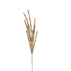
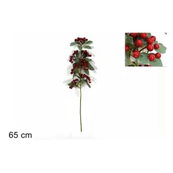
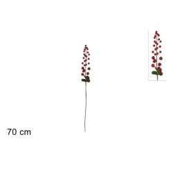
For centuries, red berries have been a gift of the winter landscape: they were found on holly branches, on rose hip hedges, among brambles and along the edges of woods. Today, those who design installations, shop windows and packaging no longer depend on chance or seasonality. Berries are not only harvested, they are designed. This transition, from nature to décor, has radically changed the way we use them, multiplying their shapes, finishes and narrative possibilities.
The first big leap was the transformation of the branch into a product. What was once a living plant element, with all its variables and imperfections, has become a controlled, repeatable decorative component, available in the catalog. Red berries today are also born in design workshops: the diameter, the shade of red, the degree of gloss, the effect of the surface, the flexibility of the stem are decided. The goal is not to imitate nature in a neutral way, but to interpret it, accentuating some features, correcting others, making everything functional to the needs of retail, visual merchandising, packaging.
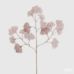
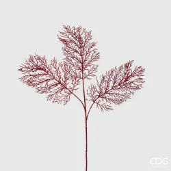
Hence the proliferation of different types. The hyper-realistic berries, which faithfully reproduce holly, rose hips, hawthorn or small berries, are flanked by explicitly decorative berries, deliberately "too perfect" to exist in nature. Some are shiny like enamel, others matte and velvety, others have frosted or slightly sugary finishes, as if they had just come out of the morning frost. In some cases, red is declined in several shades, from intense ruby to almost burgundy, to dialogue with more sophisticated palettes. In others it approaches brighter and more playful tones, designed for installations full of energy and lightness.
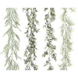
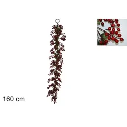
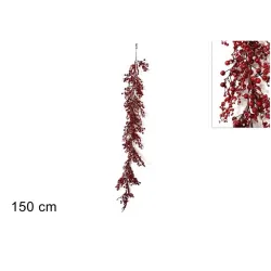
The creative industry has understood that the strength of berries lies not only in the individual shape, but in the composition. For this reason, together with the whole branches, the picks were born: small ready-to-use elements, compact, easy to insert into garlands, centerpieces, trees, shopper handles, ribbons of gift boxes. A complete micro-composition is concentrated in a few centimeters, often enriched with leaves, pine cones, metal or textile micro-decorations. For those who work in the shop or laboratory, this means being able to quickly and manageably add that "Christmas point" that closes the visual circle of a set-up or wrapping, without having to turn into a florist or set designer every time.
Then there is the question, far from secondary, of duration. Natural berries have a limited life: they wither, lose color, dry out, detach from the branch, in some cases stain surfaces and fabrics. Artificial berries, on the other hand, are designed to withstand the time of prolonged exposures and long campaigns. A Christmas window set up in November must arrive in January still legible and dignified; A store that prepares compositions for the counter, for the shelving or for the checkout corner cannot afford that, in the middle of the season, the décor begins to "give way". The decorative berries allow you to keep the visual message consistent for weeks, creating a more solid and professional experience in the eyes of the customer.
Practicality also translates into safety and handling. Many natural berries are potentially toxic to children and pets, or in any case not advisable in highly frequented contexts. In shops, catering spaces, and environments where families move, the use of artificial berries reduces risks and simplifies maintenance. They do not fall to the ground, do not attract insects, do not require water or special care, do not require continuous replacement. This translates into better management of staff time and greater overall aesthetic consistency, essential factors in periods of peak work such as Christmas.
Another key advantage is the ability to design coordinated collections. Red berries, reinterpreted by the décor industry, can appear in coherent variations on multiple supports: in the branches for window displays, in the picks for packaging, in the micro-compositions for the checkout counter, in the graphics printed on the cards or boxes. This creates a sort of visual red thread that crosses all points of contact with the customer, from the physical space to packaging, up to photographic content for the web. The customer does not only see individual details, but recognizes a unified language, a "signature of the season" that reinforces the brand identity.
This process of multiplication does not only concern the forms, but also the ways in which they are used. The berries applied to the décor can be concentrated in large scenographic installations, which serve as a backdrop to products and contents, or be reduced to minimal, almost graphic marks on wrappers and accessories. The same type of berry can live in an important garland at the entrance, in a vase alto next to a display, on a composition of gift bags, on the handles of some selected shopping bags. In this way, what in nature is confined to a few months a year becomes a "repertoire" element that we can modulate according to the spatial needs and positioning of the store.
The industrial dimension has also introduced the logic of reuse. If chosen carefully, artificial berries can accompany the store for several seasons, perhaps placed in slightly different contexts each year. One year they dialogue with kraft papers and ribbons in natural fabric for a more organic and artisanal image; the following year the same berries are moved to darker, metallic backgrounds, along with gold or satin details, for a more sophisticated Christmas. The decorative investment thus acquires a strategic value, because it allows you to build a recognizable visual memory over time without sacrificing renewal.
For those who design packaging, the multiplication of red berries also opens up interesting possibilities in terms of composition. A bow can become the place where the berry is inserted as a natural closure, a paper band can accommodate a small three-dimensional protrusion, a box can provide an anchor point designed precisely to accommodate a decorative micro-branch. The berry, in short, is no longer an accessory added at random, but an element already provided for in the design phase, which dialogues with the dimensions, proportions and materials of the packaging. It is in this dialogue between paper design and décor that the "extra" sense of care that the customer immediately perceives is built.
Finally, the translation of berries from the forest to the world of décor has made it possible to free them from the constraint of mere imitation. Today we have berries that look almost like small glass spheres, others that resemble opaque pearls, others that play with metallic or slightly glittery finishes. While maintaining the perceptive link with the idea of winter fruit, these versions go beyond naturalism and border on the jewel, the precious detail, the abstract sign. This allows brands to choose not just a "type of berry", but a real stylistic register: more realistic and woody, more graphic and minimal, more theatrical and brilliant, in line with their identity.
From nature to décor, red berries have gone through a process of reinterpretation that has made them a flexible tool in the hands of those who tell the story of Christmas through spaces and packaging. We no longer have just one type of berry available, but a whole vocabulary of shapes, finishes and solutions, ready to be combined. In the next chapter we will see how to translate this wealth into practical choices for retailers and brands: from shop windows to packaging, up to digital content, to transform these small red globes into strategic allies of the season's story.
Practical ideas for retailers and brands: using red berries in shop windows, packaging and social content
At this point, red berries are no longer simply an ornamental detail: they have become a real tool of language. They have a deep history, a strong imagery, an evident chromatic power. The question, for those who manage a store or a brand, is how to translate all this into concrete choices, every day, between shop windows, packaging and digital communication. In other words: how to transform those little red globes into a recognizable, coherent and truly effective sign for your way of telling Christmas.
The display case is the first stage on which the berries can act. You don't need to turn it into a forest full of branches to obtain a convincing result. The starting point is always the gaze of the passer-by. The red berries, cleverly placed, are perfect for building a visual path: they can frame the central area of the window, emphasize a specific level of the shelves, accompany the gaze towards the key product of the season. Think of them as small light indicators that guide those passing by from the outside to a precise point. A band of berries that crosses the window horizontally makes a narrative line perceptible; a column of branches that rises from the base towards the alto suggests a verticality that slims the space. The important thing is to avoid the random effect: each group of berries should play a role, dialogue with the heights, with the lights, with the materials of the displays.
Inside the store, berries function as signs of continuity. If they appear in the window, they should return, consistently, in at least some strategic points: at the entrance, on the checkout counter, in the most important product islands. A customer who finds the same type of berry next to premium products, on displays dedicated to gifts or on seasonal corners perceives an invisible thread that holds the experience together. You don't need to replicate the same composition everywhere; as long as there is a recognizable call. A branch in a vase at the entrance, a few berries among the objects of a central display, a small composition near the cash register: the shop thus begins to speak a unified visual language, and those berries become the punctuation that marks the path.
Packaging is the second great theater in which red berries can give their best. In paper converting and packaging, what really makes the difference is the ability to transform a set of materials into a gesture. The berries, inserted between paper, boxes and ribbons, become the final touch, the one that transforms a "well-made" wrapping into a "memorable" wrapping. Imagine a box lined with a sober paper, perhaps natural, closed by a tone-on-tone ribbon. It's elegant, but it could be anything. If you insert a small pick of berries between the knot and the edge, suddenly the package takes on a personality, declares belonging to the Christmas ritual, communicates an extra care. The same goes for bags and shoppers: a small branch attached to the handle, a tag tied to a thread with two or three berries, a band of paper that blocks a pick on the front can transform a standard support into an object that the customer perceives as special.
The interesting aspect is that this type of intervention does not necessarily require large budgets or infinite time. Working with decorative berries means being able to design repeatable "moves": a closing method that becomes your seasonal signature, a combination of paper-ribbon-berry that is recognizable at first glance, a three-dimensional detail that invites you to look at the package closely. If this visual signature is maintained throughout the season, the customer will begin to associate it with your brand. Each envelope that leaves the store becomes, in turn, a traveling micro-showcase, which carries around your Christmas story.
It is also essential to think about the balance between printing and decoration. In some cases, the gift wrap paper or box will already be printed with patterns of berries, branches and Christmas motifs. In these situations, the applied berries can function as a three-dimensional echo of the design, a sort of translation from the plane to the volume. A paper with micro-illustrations of berries goes very well with a single real or artificial twig attached to the bow; A box covered with a holly pattern can be closed with neutral tape and a berry placed right next to the logo, marking the point of maximum attention. On the contrary, if the paper is completely neutral, berries can take on the role of protagonists, becoming the only strong chromatic element and creating an image of great visual cleanliness.
Consistency between physical and digital is the next step. The same berries that you use in the window and on the packaging can become a recurring element in product photographs, images for the website and social content. A detail of a hand that closes a package with a branch of berries, a flat lay composition with ribbons, labels, tissue paper and a few berries to mark the scene, a short video in which the last gesture on the wrapping is precisely the insertion of that small red mark: all this builds continuity between what the customer sees on the screen and what he experiences in the store. The perception is that of a cohesive story, in which nothing is left to chance.
Even on social platforms, berries are a powerful ally. They have a clear shape, an interesting texture, a brilliance that reacts well to light. Taken up close, they immediately convey the idea of Christmas without the need for redundancy. They can appear as an element that introduces the season, for example in a post or newsletter announcing the Christmas collections, or become a common thread that returns in more content, creating a sort of visual mini-series. The same berry composition can be photographed in different ways: immersed between papers and ribbons, next to the products, placed on a neutral surface with your logo. The controlled repetition of this sign helps the algorithm recognize a consistent aesthetic and, above all, helps the customer memorize your way of interpreting the party.
All this, of course, must be calibrated with respect to your identity. A brand with a very essential positioning will be able to use berries as a minimal sign, an almost graphic touch, always in dialogue with material materials and reduced palettes. A more narrative and warm brand will be able to dare more generous compositions, with important branches in the window, scenic centerpieces in the store and wrappers rich in details. A sign that focuses on a luxurious image will be able to move the berries towards deeper, almost ruby shades, placing them in darker contexts, with fine papers, doubled ribbons, metallic finishes. In any case, the question to ask is not "how many berries to use", but "what kind of Christmas we want to tell and with what chromatic and emotional intensity".
From an operational point of view, working with berries also means organizing the warehouse and flows in an intelligent way. Choosing a limited range of types, well coordinated with each other, helps not to disperse and ensures greater uniformity between the different points of contact. The same berries that enter the window can be used for the counter and for packaging, avoiding the collage effect of non-dialoguing elements. Thinking of them from the beginning as part of a seasonal collection allows them to be used for several years, inserting them each time in slightly different contexts without losing recognizability.
Ultimately, red berries are a micro-detail capable of generating great value, if used consciously. In the shop windows they guide the eye and announce, discreetly or forcefully, the beginning of the party. In the packaging they become the signature that makes each wrapping unique, transforming a simple gesture of service into a memorable experience. In digital content, they connect the physical world to the online story, offering a strong, replicable and always readable visual motif such as "Christmas". It's up to you whether you want to make it a subtle accent or a distinctive element of your style. In any case, remember that, in a sea of visual messages, a small well-placed red berry can be worth as much as a long speech: it speaks to the customer, recalls deep memories, transmits care, and ensures that your Christmas remains etched in the minds and eyes of those who enter, buy, unwrap and share.
A small berry, a great language of Christmas
At the end of this journey, red berries are no longer just a detail that "creates an atmosphere", but a real language, sedimented over the centuries and still surprisingly current. We met them in the pagan rites of the solstice, when bringing a branch full of fruit into the house meant inviting nature to remain present in the heart of winter. We have seen them reread in a Christian key, become a memory of the crown of thorns and the blood of Christ, become a symbol of a life that continues beyond the darkness. We followed them in the nineteenth century, as they entered postcards, prints, home decorations, codifying once and for all that visual alphabet made of red, green and white that we still recognize today as "Christmas" at first glance.
On this journey, red berries have proven to be much more than an aesthetic choice. They are a concentrate of memory and meaning that works deeply, even when we are not aware of it. Red lights up, attracts, warms. It dialogues with the green of the fir trees and the white of the snow in a chromatic balance that is, at the same time, pleasing to the eye and rich in symbols. Each small shiny globe that we cross in a garland, on a centerpiece, on a gift package sets in motion a chain of associations: winter, warmth, home, party, tradition, sharing. It is from this density that the strength of berries as a three-dimensional graphic sign is born, capable of transforming objects and environments with a minimal but decisive presence.
The creative industry has perfectly grasped this potential and amplified it. From nature to décor, berries have become designed, repeatable elements, declinable in many variations: hyper-realistic or openly decorative, glossy or matte, frosted, glittery, micro or oversized. They have been transformed into window branches, ready-to-pack picks, details for counter compositions, textures printed on papers, boxes, shoppers. At the same time, digital communication has also made them protagonists on screens and feeds: a few well-photographed berries are enough to tell, on their own, that the brand has entered the Christmas season. The result is an extremely rich vocabulary which, however, remains legible because it rests on a clear and shared symbolic core.
For us who deal with retail, packaging and visual storytelling, this awareness is fundamental. In a context where the offer is wide and the customer is constantly exposed to visual stimuli, the difference is not only the products, but the way we stage them. Red berries, used wisely, become precious allies: in the window they guide the gaze towards what really matters; inside the store they create a thread of continuity between entrances, product islands and the checkout counter; in packaging they transform a service into a gesture of care, which the customer perceives and remembers; In digital content, they connect the physical world to the online world, making the experience consistent between what you see on the screen and what you touch.
It is not a matter of filling every space with berries, but of learning how to dose them, to orchestrate their presence according to the identity of the brand and the type of Christmas you want to tell. A sign that focuses on a warm and familiar image will be able to choose full red berries, combined with natural papers and textured ribbons, to evoke an idea of home and rituality. A brand with a more sophisticated positioning may prefer deeper shades, glossy finishes, darker and metallic color contexts, to build an elegant and almost theatrical party imagery. A minimalist brand will be able to use berries as the only breaking element of white, kraft, grays, entrusting that small red dot with the task of declaring the season with a single, very calibrated note.
In this perspective, the berry becomes a strategic choice, not a decorative habit. Deciding to include it in a wrapper, in a layout, in a shop window means choosing a certain type of relationship with the customer: more emotional, more narrative, more linked to the long thread of traditions that are repeated. It also means taking responsibility for building coherence. A well-thought-out Christmas season is one in which the customer recognizes, in the window, on the counter, in the package he takes home and in the images he sees online, the same "visual voice". If red berries become one of the key signs of that voice, then each of their appearances strengthens the positioning, feeds the memory, consolidates the bond.
There is, ultimately, a broader lesson that this small element gives us. In the design of spaces and packaging, details are never neutral. A berry, a ribbon, the choice of a certain paper or a certain shade of green speak of the brand as much as a logo or a headline. The customer, perhaps, would not be able to rationally explain why one package seems more "right" than another, but he feels it. He perceives when everything is aligned, when every detail tells the same story. Red berries are one of those details that can immediately activate this feeling, because they carry with them a wealth of images and meanings that we have absorbed since childhood.
Looking at berries in this key, as we have done in these pages, therefore means changing perspective. No longer an accessory to be added at the end, when "something is missing", but an element to be considered from the beginning of the project: from the collection of papers and boxes to the scenography of the windows, up to the editorial plan of digital content. It is in this step that a decoration becomes a language and that a micro-detail is transformed into a conscious branding tool.
In conclusion, the real power of red berries lies in their dual loyalty: to tradition and to the present. They bring with them the forest, the solstice, domestic rituals, Christian symbols, nineteenth-century postcards, family memories. At the same time, they allow themselves to be reinvented every year, in every collection, in every showcase, in every shot. They are, in other words, a bridge. Between past and contemporary, between nature and design, between emotion and strategy. It is up to us, as packaging and décor professionals, to decide how to go through it. One thing is certain: in a world saturated with images, those little red berries, if used with intelligence and measure, will continue to be one of the most powerful signs to light up Christmas in the eyes and memory of our customers.