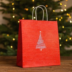
Entering the store and asking for a gift wrapping is, for your customer, a moment of trust. He is not just buying a product: he entrusts you with the last step, the one that transforms an object into a gesture. Mocha Mousse is the perfect ground on which to grow this confidence. It is a soft brown, with warm undertones, capable of warming the atmosphere without weighing it down, of reassuring without being anonymous. It is a "premium neutral" that communicates care, quality and competence, and allows you to dress both the daily gift and the important purchase with consistency.
When you choose Mocha Mousse as your color base, you take advantage of versatility. Just modulate the accents to shift your perception: a deep blue makes the wrapping authoritative and precious, a thin sage makes it feel natural and refined, a touch of powder accentuates its sensory dimension. The strength of this color lies precisely in its ability to dialogue with different worlds without losing identity. In a retail crowded with messages, chromatic uniformity helps you to be recognizable and to tell a coherent brand idea, at the counter as well as in the window, at the checkout as well as on social media.
Colour, in the store, is not only aesthetic: it guides the eye, affects memory, determines the rhythm of service. With Mocha Mousse you can build a simple and replicable grammar. Matte or soft-touch paper gives an elegant tactile base; a velvet ribbon in winter or a fine satin in spring modulate the season; A light foil, used with measure, signs the package without stealing the show. You work by subtraction, avoid visual noise, choose a single accent and let it speak. In this way, each package is made with certain times, reduces waste and keeps costs under control, without sacrificing the wow effect that makes the customer say "yes, I want wrapping".
Then there is one aspect that makes the difference in the long run: your ability to transform the wrapping into content. A well-constructed Mocha Mousse pack is photogenic by nature. The matte surface returns light well, contrasts are legible, finishing details emerge cleanly. With a little in-store control — simple backdrops, soft side light, three pack heights per composition — you can create consistent images for newsletters, Instagram, and website. Chromatic consistency becomes recognizability, and recognizability translates into word of mouth and customer return.
Finally, color helps you measure. If you keep the Mocha Mousse as a base and alternate the accents for defined periods, you can clearly see what works. You will notice how wrapping requests, medio packaging time, upsell on boxes and ribbons, stock rotation by nuance change. You will realize that the "basic" package is not a fallback, but a quick and accurate service; that the "plus" raises the perception of value with a limited investment; that the "deluxe" becomes a real product to be offered when the occasion requires it. It all starts with a conscious choice: to use Mocha Mousse as a chromatic platform, and build a method around it.
This is the promise of smart color: make your work easier, improve the customer experience, strengthen your image. With a few well-orchestrated elements you can get packages that talk about you, that tell the story of your store before they are even unwrapped. And when the final gesture is up to the purchase, the customer leaves with a smile and a clear memory. That's where your wrapping becomes a real difference.
What is Mocha Mousse and why does it work in the store
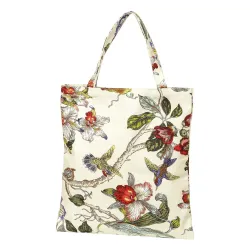
When you talk about Mocha Mousse you are not simply naming a brown. You are choosing an emotional temperature for your store, a chromatic terrain on which the customer can walk confidently from the entrance to the checkout. Mocha Mousse is a soft, creamy brown, with warm and slightly milky undertones: reminiscent of polished wood, a well-whipped cup of coffee, leather that ages well. It is a "polite" color, which does not claim center stage and for this reason holds the entire stage of experience. Where a raw kraft can be a bit poor and a dark chocolate too self-referential, Mocha Mousse is placed in the middle, in that precious territory that customers perceive as quality without ostentation.
You notice its strength when you place it on different materials and it never loses its composure. On matte paper it maintains a velvety elegance that absorbs light and makes contrasts more graceful; on soft-touch it acquires a tactile dimension that invites the palm of the hand; on a textile micro-embossing it brings out small shadows that give it depth. It is a color that can be "taken well" by accents: just a line of ink blue and the packaging becomes more authoritative, a sage detail and moves towards a natural and refined idea, a drizzle of powder and a sensory femininity emerges. In any case, the identity remains strong: the Mocha Mousse is your chromatic floor, the accent is the carpet that changes according to season, category, ticket medio.
In a retail environment crowded with visual noise, smart neutrality is a competitive advantage. The Mocha Mousse clears the scene. It allows you to orchestrate the wrapping desk with simple grammar: a coherent base, an accent, a signature. Thus the gesture of wrapping stops being improvisation and becomes a method. Times are shortened, waste is reduced, the warehouse breathes. With a single color base you keep the family of materials together: paper, ribbons, stickers, tags. You don't need a rainbow of supplies for every occasion: you only need a few well-thought-out variants to move your perception from the everyday to the celebratory. To the customer, this consistency comes as reliability: the packaging "speaks" a clear, recognizable, repeatable language.
There is a sensory aspect that you should not underestimate. Brown, when calibrated as in Mocha Mousse, dialogues with olfactory and tactile memory. It evokes wood, cocoa, leather, good paper. These are suggestions that make you perceive value even before thinking about the product. It is as if the package already tells a story of care: muffled sounds, surfaces that do not reflect in a mirror, ribbons that grip without "slipping". In the customer's hand, the package has a measured presence, not noisy. In the photo, it renders very well: the matte base avoids light burns, the tape can be read, the foil – dosed – signs without stealing the show. This detail, for you, becomes content. A Mocha Mousse wrapper works under a soft side light, serves as a backdrop for micro-details, holds social feed and showcase together in a cohesive visual narrative.
The versatility of Mocha Mousse is also commercial. With the same base you can legitimize an entry-level purchase by elevating its perception or accompany an important gift without risking the "plaster cast" effect. The difference is built with micro-decisions: the width of the ribbon, the presence or absence of a band, the quality of the paper, the choice between a light foil sticker or a tone-on-tone screen printing. Change the register, not the system. This puts you in your hands even at the checkout: you can offer three levels of service – from the essential quick to the deluxe – while remaining in the same language. The customer immediately understands what he is choosing and you manage times and margins with more serenity.
Another reason why it works is its chromatic education in real-world environments. Store lights are not always controlled, they change temperature throughout the day or depending on the area. Mocha Mousse holds up well both in warm lights, where it remains firm and does not turn orange, and in colder lights, where it does not gray. This saves you the classic problem of set-ups that "change mood" depending on the spotlight. And it allows you to shift the focus to accents without recalibrating the entire set of materials each time. If you work near food, for example, the dialogue with copper capsules or cream labels is natural. If you move into beauty, the contact with satin glass, mirrors and light metallizations remains harmonious. If you treat tech, the counterpoint with warm white and graphite builds a clean contemporary.
On an identity level, using Mocha Mousse as a base helps you to be recognizable without weighing it down. Your brand can discreetly "sign": a tone-on-tone micro-logo, a light foil sticker, a characteristic die on the tag. The strength of the brand does not come from the size of the logo, but from the consistency of the system. The customer, months later, will remember "that warm, well-kept package, always the same but never the same" and will associate it with your store. This is how wrapping stops being an ancillary cost and becomes a multiplier of perceived value, a small media that works for your reputation.
Finally, there is the very concrete issue of management. A single color base simplifies purchases and reorders, reduces waste, allows you to really measure. If you keep the Mocha Mousse stable and vary the accents for clear periods, you can read the impact of the choices on the service: how many wrapping requests arrive, how long it takes per package, how much the material weighs on the medio receipt, how many additional sales the box option generates. You are no longer "going by feeling", you are working with a protocol. And when a change of season is needed, you don't overturn the system: you rotate an accent, update a tape, introduce a band. The customer perceives novelty within a familiar framework, which is the most effective form of updating.
Ultimately, Mocha Mousse works because it provides you with a rare balance: it is warm without being rustic, it is elegant without becoming distant, it is neutral without falling into anonymity. It is a platform-color that supports your service, speaks well with materials, photographs clean, adapts to product categories, accompanies seasonality and, above all, allows you to always promise the same thing: a wrapping that respects the product and those who receive it. When a customer entrusts you with a gift, they entrust you with an emotion. With Mocha Mousse you treat it with care, method and taste. And that care, package after package, makes your store grow.
Guide palette: Controlled base, accents, and contrasts
When you build a gift wrapping palette, you're not choosing "colors": you're designing a system that needs to work every day, with whoever is at the counter, on whatever product passes through your hands. The Mocha Mousse is your base, the safe floor to walk on. On that basis, you stage an accent that orients perception and a contrast that gives rhythm. If you think of the palette as a direction, the Mocha occupies most of the scene, the accent comes in to emphasize the tone, the contrast only occurs when it serves to make a detail read. Proportions are key: let the base speak for most of the package, use the accent as a musical phrase that becomes recognizable and reserve the measure of a whisper for the contrast. So the customer's eye moves where you want it to, effortlessly.
The base works when it is consistent across different materials. The same shade of Mocha Mousse, on papers with different finishes, can change temperature slightly; For this reason, always ask for samples printed on the same supports that you will use in the store and rely on the real light of the counter, not just the lamp in the warehouse. The matte tone dampens reflections and gives a velvety elegance, the soft-touch adds a tactile note that the customer perceives as soon as he touches the package, a textile micro-embossing creates small shadows that enrich the depth. Keep this base stable over time: it simplifies reorders, aligns the supplies of the different formats and ensures that, at a glance, your packages are immediately "yours".
The accent is your tool to shift the meaning of the package without changing the whole system. A deep blue makes you more authoritative and masculine, a sage tells of naturalness and care, a powder hints at sensoriality and well-being, a light dove grey accompanies the home world with discretion. The accent lives on in the ribbons, in the paper bands, in the tags, in the stickers. There's no need to shout: the accent works when it occupies a smaller but strategic portion, such as the diagonal of a bow or the edge of a band that frames the logo. If you rotate it by seasons or campaigns, you communicate news while staying true to your base. It's that consistency that makes your store's recognition grow, both storefront and online.
Contrast is a spice, not a main ingredient. You need it to define contours, give rhythm, bring out a finishing detail. A thread of warm white in screen printing, an inky blue profile on a band, a light metal foil that signs the sticker: small doses that capture the light and guide the eye without breaking the harmony. Choose only one metal at a time and always match it to the temperature of the accent: light gold and copper dialogue well with warm families, light silver with cold and technical ones. If you feel that the package "makes noise", it is not the Mocha that is too much, it is the contrast that has exceeded the threshold.
The success of the palette depends on the consistency of the surfaces. When you combine matte and glossy, you have to do it with intention, remembering that gloss captures the light and therefore steals attention. A matte paper with spot UV varnish on micro-pattern creates a sophisticated effect that can be read at close range, a thin satin on a soft-touch base maintains a uniform tactile dialogue, a strong grosgrain on natural papers reinforces the idea of craftsmanship. Avoid dissonant pairings, such as very bright satin on a super shiny base: the risk is that the eye will not find a resting point and that the photograph of the package will lose definition.
The light of the point of sale changes the rules of the game. Mocha Mousse holds up well with both warm and more neutral lighting, but the accent can change significantly. Before committing to hundreds of meters of tape, test two meters at the bench and see how it performs under your spotlights. If the light is warm, a cool accent like blue or graphite balances and cleans; If the light tends to cold, a warm accent such as sage or copper restores depth and removes that "clinical" effect that cools the gesture. This control is invisible to the customer, but it results in a perception of quality.
Chromatic uniformity allows you to better tell the brand without forcing. With a stable base and consistent accents, your logo can be reduced to a subtle signature and yet be more authoritative. You don't need to zoom in to make yourself remembered; It is the whole that makes the brand memorable. Use the same grammar even in service media, from greeting cards to adhesive seals, from price tags to labels for anniversaries: when everything speaks the same language, the customer trusts it, and you work faster because you don't have to reinvent the combination every time.
The guide palette is not only aesthetic, it is also management. A single base simplifies purchases, reduces fragmented inventory, and enables you to make economies of scale. Rotating one or two accents per period allows you to plan restocking wisely and measure the impact of choices on service and margins. If you notice that with a certain emphasis the requests for boxes increase or the medio packaging time is longer, you can intervene on the type of tape or the width of the band without changing everything. It is a directorial approach, not an improvisational one.
The bench, with a well-designed palette, becomes a more fluid workplace. The packager does not waste time looking for "that ribbon that looks good", because the choice is already inside the system: a base that is always ready, a well-identified seasonal accent, two or three contrast variants already tested. This reduces decision anxiety, speeds up the gesture, improves the final quality. And it shows in the details: cleaner bows, aligned bands, consistently positioned stickers, packages that resemble each other just the right while remaining "alive".
Even photography is grateful. On a social feed or in a newsletter, the controlled repetition of the palette creates a visual pattern that the customer recognizes at first glance. Mocha Mousse, by its nature, absorbs light gently and brings out both volumes and textures well; The accent reads like a clear brushstroke, the contrast signs like a point of light. You don't have to build complex sets: a cream backdrop, soft side light, and three scale packs are enough for your palette to do the job for you.
The golden rule is simple and powerful: let the base do 70–80% of the speech, let the accent carry the character, and let the contrast just close the sentence. If you respect it, you will have wrappers that are consistent with each other, capable of adapting to different product categories without losing identity. The customer will perceive order, taste, care. And you'll have earned what really matters in the store: a replicable method that makes your service faster, your brand more recognizable and your management lighter. After all, a well-thought-out guide palette is just that: an elegant way to remove complications and add value.
Materials and finishes that make value
When you choose materials and finishes you are not adding "ornaments" to a color: you are building the voice with which the Mocha Mousse speaks to the customer. The same tint can be anonymous or extraordinary depending on the hand of the paper, the light it captures, the sound it makes when you fold it. If you want the wrapping to say quality without shouting it, start with the sensoriality: what the hand feels, what the eye sees, what kind of reflection the surface returns, how sharp the edge of the fold is. Mocha Mousse prefers surfaces that allow it to breathe. On matt it gains depth and sobriety, on soft-touch it becomes velvety and enveloping, on textile micro-embossing it acquires a discreet shadow that makes it seem more material. The key is to make aesthetics and functionality coincide: a paper that is too thin folds badly and "speaks" poorly, one that is too rigid slows you down at the desk. Keep the bar on weights that guarantee a sharp crease and elastic memory, so as to obtain sharp edges without micro-splits.
The color consistency on the supports is another decisive point. The same ink recipe does not behave in the same way on different papers, and Mocha Mousse, being a complex shade, can change half a tone with a coating that is too glossy or with a very absorbent fiber. Ask for evidence on the real substrate, look at them under the shop lights and check how the color reacts in the crease areas. If you work with matte or soft-touch laminations, remember that they protect and even, but change the reflection and therefore the perception of the tone. Alternatively, a well-pulled matte water-based paint maintains recyclability and returns a more "alive" Mocha. There is no absolute right choice: there is the solution that makes your gesture faster, the package cleaner and the image more consistent with what you sell.
The dialogue between surfaces is the grammar that makes value. Mocha Mousse loves controlled contrasts: matte background with a glossy micro-pattern in UV varnish, textile paper with a clear foil seal, soft-touch with a not too shiny ribbon. If you put everything shiny with everything polished, you lose hierarchy; if you combine mirrored satin with an already reflective base, the eye finds no rest. On the contrary, when the base absorbs and the detail captures, the gaze follows the path you want. In this direction, metallization is an accent, not a protagonist. Light gold and copper warm and are natural allies of Mocha; Light silver or nickel work when you want a more technical register. Use them with moderation, on small areas of high perceptual intensity, such as the closing sticker or the signature on the tag. Value comes from intention, not from the amount of metal.
Even the tapes tell a story. Grosgrain gives structure and is easy to read from a distance, velvet in the cold season adds a tactile pleasure that the customer already feels in the hand, thin satin in spring lightens and returns light without invading. If you choose natural fibers or blends with a dry hand, Mocha Mousse remains the protagonist; If you choose finishes that are too glossy, you risk the accent taking over. The width of the ribbon is another powerful lever: an important band normalizes large volumes and makes "premium" with a single gesture, a narrower ribbon keeps the small package clean and allows you quick and replicable knots. Work with knots that do not slip and with standardized lengths: the result will be more consistent and the time at the bench will be shortened without sacrificing the final effect.
The boxes complete the perception. A rigid Mocha Mousse-coated with a sharp edge and fine-pore paper makes any gift authoritative and takes you up a level without having to add too many elements. A well-creased folding die, with correct fiber direction, guarantees you clean crease and no color crack on the edges. If you are dealing with bottles or fragile products, insert alveoli and reinforcements that do not betray the tone of the exterior: a cream or linen interior dialogues better with the Mocha of a cold white that "detaches" and impoverishes. Remember that the experience begins when you open it: if the lid slides smoothly and the internal material does not creak, the customer perceives care before they even see the object.
Printing techniques are the punctuation of your story. A warm white screen print on Mocha Mousse creates a clear and silky mark, ideal for micro-patterns or discreet logos; A light gold or copper hot stamping, on small surfaces and with clean clichés, signs with elegance. If you want a "second look" effect, work with spot UV varnish in register on matte backgrounds: from a distance the package remains sober, up close textures and details emerge that the customer discovers as a secret. Avoid very wide metal tracks or continuous backgrounds: they consume budgets, weigh down and do not increase the perception of value as much as a well-placed detail. The quality can be seen in the small things: the alignment of the sticker, the sharpness of the relief, the absence of glue halos.
Then there is the often underestimated issue of "handling". A material is worth it if it works with you. Papers that do not tear near the fold, finishes that do not mark at the first touch, tapes that set quickly and do not require corrections, adhesives that close immediately without staining. If you use soft-touch, opt for anti-scratch versions to avoid marks during operation; If the counter is very fast, prefer stickers with balanced glue: strong enough to close at the first touch, but not so aggressive as to deform the paper if you have to reposition. In the wet and cold months, check that the tapes do not stiffen and that the glues do not lose grip: short tests at the beginning of the season are enough to avoid surprises below the peak.
Sustainability and performance must go hand in hand. If you work with certified papers and water-based paints, maintain a clean profile without sacrificing the sensoriality of Mocha Mousse. Laminations can create recyclability issues, but there are alternatives with thin films or hybrid coatings that protect and reduce impact. Even metallization, used minimally, does not compromise a well-managed recycling cycle. The point is not to give up beauty, but to direct it with honest materials and conscious processes, communicating it to the customer when it makes sense to do so. If you deal with food or cosmetics, check suitability for indirect contact and resistance to oiliness or alcohol: an impeccable Mocha Mousse that stains at the first panettone betrays the pact of quality.
Finally, think of service as a small liturgy. The rustle of the paper when you pull the fold, the regularity of the cord, the firm pressure of the thumb on the sticker, the bow that falls in the center without forcing: every detail is part of an experience that the customer records even without naming it. The right materials allow you to perform this liturgy calmly even when the store is full. They take away complexity instead of adding it. And they multiply the effect of Mocha Mousse, which in this setting gives its best: a cultured, modern brown, capable of giving value to the product without obscuring it. It is there that the material is no longer a cost, but an investment: it lasts in the hand, takes good photos, holds up to the season and, above all, brings home that "how beautiful" that makes the customer come back. When you close the bow and pass the package over the counter, you want it to talk about you outside the store as well. The choice of materials and finishes is the most direct and concrete way to do it.
Smart formats and cost control
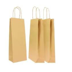
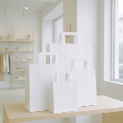
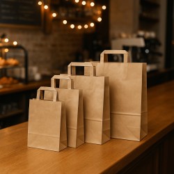
Choosing formats does not mean accumulating measures "so as not to be caught unprepared", but designing a system that makes you fast, consistent and sustainable in costs. If you start with Mocha Mousse as a base, the first decision is to build a family of solutions that covers eighty percent of cases with the utmost simplicity. At the counter you need a roll that allows you to clean folds and smooth cuts, at the checkout a set of pre-cut sheets for quick packs, in the warehouse a basic range of coated boxes and matching shopping bags. It's not a question of having everything, but of having what you really use, with proportions that repeat. When the volumes and weights of the products are similar, your gesture becomes muscle memory: the paper always falls right, the ribbon always has the same length, the sticker always closes in the same place. The result is a more beautiful wrapping in less time, with less waste.
To get there, you need to relate format and perception. The basic pack must flow naturally: matte or soft-touch paper in Mocha Mousse, clean fold, clean closure. If the object is small, it makes no sense to submerge it with material: better a paper that embraces without exaggerating and a narrower ribbon that does not engulf the volume. When you go up in size, the band comes into play: a matching or accent band, capable of normalizing irregular proportions and creating an elegant visual front for your micro-logo. Coated boxes work like a valuable lift: the same product acquires authority if you accompany it with a sliding opening, a cream or linen interior and a clean edge. There is no need to multiply the measures; It is necessary to set two heights and three bases that cover most cases, so that the staff does not have to "hunt the right box" but takes the next scale measurement. The shopping bags, coordinated by colour and hand, close the experience: three well-calibrated sizes cover you from the accessory to the outerwear, without holes or redundancies.
Cost control starts with geometry. Every cut that repeats the same is a cut that costs less. If you're working on the bench with h70 on a reel, draw your folds thinking about how the sheet transforms around the object and literally mark an invisible path made up of constant distances and repeatable margins. At the checkout, pre-cut sheets are a time machine: they close queues, maintain quality, reduce errors. The right size comes from observing your receipts: take the most recurring items, pack them ten times with different formats, time, weigh the scraps and identify the point where the fold falls well without trimming. A well-sized sheet is never "generous": that's right. The tape follows the same principle. If you know that for a medio package you need two turns and a simple bow, that length becomes standard; If you fix it, you can pre-cut, you can predict stocks, you can prevent it from ending up in the air at peak times saver than necessary.
Then there is the economy of choice. Three levels of service – basic, plus, deluxe – are not a creative quirk, they are a management lever. With the base, keep the pace alto and basso the material cost, preserving the perceptive quality of the Mocha Mousse; with the plus you introduce an extra identity element, such as a more important band or ribbon, and raise the perception with a limited impact; With the Deluxe you transform the wrapping into a real product, offering the box when the circumstance requires it and the customer is willing to recognize the added value. The important thing is that these three registers live in the same chromatic and tactile grammar, so that those who pack do not change their profession every time. If the customer chooses, you manage margins and times with serenity, because each option already has an expected cost and an objective time.
Negotiation with suppliers is an integral part of format design. If you reduce the variety and increase the volumes of the really useful sizes, you can ask for better conditions and, above all, you can demand color consistency between batches. The Mocha Mousse, due to the way it is constructed, can be affected by small fluctuations in tone if you change support or finish: the fewer variations you have, the more solid your identity remains. Minimum order quantities should not lead you to proliferation, but to optimization: better to order more on what you use, rather than filling the backroom with measurements you don't need. Every dormant format is capital tied up, every essential format that flows is margin freed.
The design of the bench has as much impact as the choice of sizes. If the sheet cut is always within reach, if the reel dispenser slides without tearing, if the belts are aligned for width and seasonality, your hand works better and faster. It doesn't seem like a cost issue, but it is: thirty seconds saved per package, multiplied by fifty packages on a peak day, are tens of minutes less queue and more serene customers. The typical mistake is to chase the scenographic effect with oversized formats, thinking that more material equals more value. The opposite is true: value comes from the exactness, proportion, cleanliness of the fold. A dry package communicates mastery, a redundant one communicates uncertainty.
Measuring makes you free from impressions. You can start in a simple way: calculate the material cost per package on the three service levels, add an hourly cost of personnel in relation to the average minutes of execution and observe the relationship with the medio receipt. You don't need complicated software: you need discipline. If the base exceeds a threshold that does not convince you, work on the sheet size and the length of the ribbon; if the plus slows down too much, it simplifies the sling or switches to a faster knot; If the Deluxe does not generate a delta of perception, it is not a problem of price but of design: perhaps the box is not the right size, perhaps the interior does not dialogue with the exterior, perhaps a well-positioned light signature is missing. When every choice has a reason and a number, your team feels the direction and respects it.
Seasonality is a testing ground. In some periods, such as Christmas, speed is everything. Here the intelligent formats make the difference: the reel that does not jam, the pre-cut sheets that really correspond to the most gifted items, the box that houses the panettone or the boxes without improvised adaptations. At other times, such as Valentine's Day or Mother's Day, the rhythm is more distributed and you can afford an extra gesture. However, the structure of the formats remains the same: change the accent, not the architecture. The Mocha Mousse keeps your bar straight, the accessories change the music without moving the sound box.
Finally, remember that the customer "feels" your system even if they don't see it. When you get the right format at the first try, when the paper falls precisely and the bow closes in the middle without hesitation, the experience takes a – literally – professional turn. It is at that moment that the wrapping stops being a favor and becomes a service. Mocha Mousse, on well-thought-out formats, speaks the language of quiet quality: it does not shine excessively, it does not clash, it does not ask for attention. Accompanies. And precisely because it accompanies, supports the product and your image. With smart formats and cost control, beauty is not a luxury – it's a natural consequence of a system that works.
The direction of color analysis in Retail: Mocha Mousse as the basis for consistency, speed and value
When you apply color analysis to gift wrapping, you are designing a relationship between your customer, the product, and the space where you deliver it. It's not abstract theory: it's how colors support each other, maintain consistency with the identity of your store and, above all, help the final gesture to look natural, precise, memorable. With Mocha Mousse as a base, you move on a warm and reassuring chromatic terrain, capable of accommodating different accents without losing composure. Your direction starts here: set the tone of the scene with Mocha, choose an accent that orients perception and add a point of light or shadow to give rhythm. When the whole is calibrated, the eye glides smoothly and the hand works more confidently.
The first principle to keep in mind is temperature. Mocha Mousse is born warm, with a softness that suggests matter and care; for this reason, it dialogues well with cold accents when you want to clean and make it authoritative, and with warm accents when you want to intensify the sensoriality. In jewelry, for example, a deep blue makes the package more institutional and entrusts light gold with the luminous signature. In perfumery, a powder pink softens and brings the discourse on well-being and skin, while a pearl diffuses a soft light that photographs volumes well. In wine shops and delicatessens, a green forest tells of naturalness and territory, while a light copper dialogues with capsules, cages and embossed papers without being intrusive. If you work with pastry and chocolate, a Chantilly cream illuminates the Mocha and a ruby touch, dosed, conveys the idea of celebration and special edition. In the children's world, a soft cream with a powder blue or light mauve allows you to stay sweet without falling into childishness. If you move into tech, graphite and warm white build a precise, dry contemporary, where Mocha acts as a human counterweight to technology. Even in optics, a clean oil with a neat pearl communicates sharpness and professionalism. In the floral, sage and musk support an eco-elegant story; In home décor, dove gray and light blue tending to gray are linked to contemporary interiors without clashing. Even in pharmacies you can use a sanitary green with warm white for a tidy and reassuring result, while in sneakers and premium sports the combination of graphite and optical white restores urban rhythm while keeping the Mocha as an anchor of warmth. Finally, for ceremonies, ivory and pale gold transform your base into a sober and precious register, perfect for wedding favors and weddings.
The second principle is contrast control. Mocha Mousse loves surfaces that absorb discreetly and let the right details come out. If the base is matte or soft-touch, the ribbon should not scream: a thin satin in spring, a fuller velvet in the cold season, a grosgrain when you are looking for structure. The metal sheet works as a measured reflection, never as a protagonist background. Choose only one metal at a time and maintain consistency with the accent temperature: light gold and copper warm and round, light silver and nickel clean and define. If you feel that the package "shines through", it is a sign that contrast has taken over. Go back to letting the base breathe and let the accent manifest itself in a precise point, a band edge, a well-constructed knot, a signature on the tag. In photography, this translates into legible volumes, clean blacks, non-burnt whites, textures that are only seen when you get closer: the perfect language for your digital channels.
The third principle concerns light. The lights of the shops are not all the same and change throughout the day. The Mocha Mousse holds up well, but the accent can turn. Under warm spotlights, a blue or graphite restore order and remove excesses of softness; Under colder lights, a sage, copper or light dove grey bring back depth and take away that clinical effect that impoverishes the scene. Before committing to yards of tape or batches of boxes, test at the bench, in the same spot where you pack, and look critically. The same goes for the shop window: if the light is grazing, textile micro-embossing tells more than satin; if it is diffuse, a spot UV varnish on a matte base draws a pattern that is only discovered at the second glance. The customer will not analyze technically, but will perceive order and quality.
The fourth principle is typological consistency. Each product category has an implicit expectation of tone. Those who buy a ring expect authority and rigor, so the Mocha-midnight blue pair with a light gold signature is a certainty. Those who enter the perfumery are looking for softness and touch, and therefore the play between Mocha, powder and pearl becomes a visual caress. Those who buy wine or specialties want authenticity and refinement together, and then Mocha, forest green and copper build a credible story. Those who choose a gift for a child want delicacy without excess, and it is here that powder blue or mauve on a cream base with Mocha keep the course. Those who live on technology demand precision: graphite, warm white, Mocha to keep humanity. Those who work with flowers and botany ask for material truth: sage, moss, plantable cardboard and a warm white print that does not seem synthetic. Knowing what your customer expects saves you from "guessing" at the counter and allows you to repeat a beautiful result over and over again, even with different staff.
The fifth principle is conscious moderation. A few well-orchestrated colors are worth more than a whole color wheel. If you stay within three visual presences and only one metal, the package breathes, the product remains the protagonist and your brand sounds more mature. Moderation is not punitive minimalism, it is discipline. It means choosing an accent by season or by countryside and not deviating to every impromptu request. It means avoiding combinations that cancel each other out, such as gloss on gloss, and preferring clear dialogues, such as matt on gloss in register or velvet on soft-touch. It also means recognizing when a valuable contrast, lighter or darker, is sufficient to give depth without introducing a new color.
The sixth principle is operational translatability. Color analysis makes sense if your team executes it without doubt. It transforms choices into small conventions: the base remains the same throughout the year, the accent rotates at a programmed interval, the metallic finish follows the accent by temperature. Prepare physical samples on the bench, not just video or photo references, because touch drives as much as sight. Decide in advance that the small package will have a narrower ribbon and a single pass, while the medio one will accommodate a band and the important one will go up in material with a lined box. The clearer the system, the less staff have to "create" each time, and the more the result remains alto, even in peaks of work. Color analysis must not become a brake, but a handrail.
The seventh principle is smart seasonality. The Mocha Mousse allows you to change music without changing stages. In winter, a deep green with a light gold signature builds sober and bright festive atmospheres; on Valentine's Day, an antique pink and a gentle copper breathe romance without stereotypes; in spring, linen and sage lighten and bring you back to nature; in summer, sand and powder blue cool without cooling; In autumn, a controlled rust warms up and adds editorial character. Rotating the accent is the most effective way to generate photographable novelty, while the base preserves the recognizability.
The eighth principle is measurement. Color analysis applied to retail has concrete consequences: packaging time, service request, upsell on boxes and tapes, stock rotation, photographic rendering. If you keep the base the same and change just one accent at a time, you can really understand what makes an impact. You can find that an intense blue increases the premium perception in jewelry and justifies the coated box, or that a well-chosen sage in the bookstore pushes the customer to ask for the personalized tag, or that a graphite on warm light in the tech store shortens the execution time because the ribbon "stays in place" at the first node. Evidence allows you to hone season after season without wasting your budget on random attempts.
The ninth principle is fidelity to identity. Color analysis does not ask you to conform to a fashion, but to translate your positioning into a readable language. If your brand speaks of cultured craftsmanship, natural paper with a warm white print and a touch of copper tells a thousand words. If your tone is more fashionable and urban, a Mocha controlled with graphite and optical white, and a geometric spot UV varnish, build an unmistakable sign. If you work in the world of wellness, the softness of powder and pearl must already be felt in the hand, even before the package is unwrapped. The important thing is that every choice has a reason that refers to your store, not just generic beauty.
The tenth principle is the kindness of the gesture. Color analysis, in the end, serves to make your life easier and to make those who receive the package feel good. The customer notices the serenity with which you take the right materials, the cleanliness with which the fold falls, the consistency with which the color of the band "speaks" with the ribbon and with the small flash of metal that signs. Also note how easily the packaging fits into the matching shopper without creasing. And when, on her way out, she looks at the package and finds it effortlessly elegant, associate that feeling with your store. It is there that color analysis is no longer a theory, but a concrete advantage: it makes you faster, more credible, more recognizable. With Mocha Mousse as the base, this direction becomes simple. You decide the temperature, you give the accent, you place the right reflection and you let the color do what it was born to do: give shape to your service.
The perfect balance: how Mocha Mousse dialogues with every retail world
When you make Mocha Mousse your color base, you build a language that you can speak anywhere, with different shades but with the same control. The rule is simple: let the base do the bulk of the speech, use an accent to direct the tone, sign with a finish that catches the light without overpowering. In jewellery and watchmaking, this balance takes on an authoritative character. The midnight blue (#1F2A44) resting on the Mocha Mousse (#B08A7A) links the gesture to an idea of rigor, the light gold foil (#D8C27F) signs with discretion, the soft-touch matte paper and the micro-embossed coated boxes make the touch equal to the value. A 25mm double satin ribbon adds visual weight without screaming – it's the right package when the ticket goes up and the customer expects substance, not ostentation.
In perfumery and cosmetics you shift the axis towards sensoriality. Powder pink (#E4C9C3) softens Mocha (#B08A7A), pearl (#EDE7E3) diffuses a gentle light that makes the volumes breathe in the window. The satin paper glides silkily under the fingers, the micro-pattern UV varnish adds a "second look", the 16 mm velvet in winter or the 10 mm satin in spring modulate the season and rhythm. A pink/gold foil sticker ends the sentence with a short reflection, more caress than sparkle.
In the women's boutique , subtraction work. Sand (#D8C7B4) and deep black (#111111) with the Mocha build a minimal-chic that visually streamlines the package. The noble kraft shopper with cotton cord tells of everyday quality, a sand cardboard band orders the proportions, the black 25 mm grosgrain "cuts" and focuses without weighing it down. It is an elegance that is not afraid of repetition, because it lives on exact proportions.
In menswear and tailoring, you are looking for precision. Graphite (#44464A) and ink blue (#223047) dialogue with a "fabric" paper embossing canvas; The warm white screen print sculpts logos and patterns with discipline, a 19 mm twill ribbon seals the idea of masculine order. It is a package that seems simple and, precisely for this reason, appears competent: perfect for shirts, footwear, well-built accessories.
The world of children wants adult sweetness. Cream (#EFE6DE) with powder blue (#9BB3C7) or light mauve (#CDB8CF) softens the Mocha without falling into the pretty, the matte paper removes distracting reflections, a 15 mm satin keeps the bow clean on small volumes. The shaped tags play, but remain discreet: births and baptisms ask for softness and measure together.
In bookstores, stationery and gifts, tactility is a manifesto. Sage (#8FA392) and ivory (#F5F1EA) resting on the Mocha build an artisanal-cultured tone. The natural papers with visible fiber restore authenticity, the waxed cotton cord holds together without shining, the adhesive seal with micro-logo and the typographic band tell the story of method and editorial taste. The package speaks of good paper even before you read the title.
Wine bars, delicatessens and delicatessen live from the territory. The green forest (#2E473B) brings nature into the store, the copper (#B8734B) dialogues with capsules and cages, the Mocha acts as wood and earth. You use resistant and tear-resistant papers, bottle boxes with honeycomb that protect without bulking, hot stamping copper as a small reminder of light, 25 mm green grosgrain for structure. The result is refined and at the same time sincere.
In pastry and chocolate shops , choose controlled gluttony. Chantilly cream (#F6EDE2) illuminates the Mocha, a dosed ruby (#8A1C2B) accent speaks of celebration and "special edition". The papers suitable for indirect contact avoid accidents, the transparent window shows without revealing everything, the light gold sticker and the 15 mm cream satin complete a package that promises pleasure before the bite.
The floral and the botanical ask for material truth. Sage (#8FA392) and musk (#6E7B62) with Mocha tell about life and care; Water-repellent papers work with the times of the bench, linen or gauze ribbons breathe, plantable cardboard tags transform detail into history. A warm white print keeps the light natural and makes everything look closer to the plant than to the plastic.
In home décor , the home is the measure. Dove grey (#CBB8AB) and blue-grey (#7E909A) respect contemporary interiors, the Mocha holds the finishes together. The soft-touch paper makes the package "furnishable", a textile-woven photographic band creates visual continuity with the materials of the house, the 19 mm grosgrain closes with a clear line. Enter the living room without being out of tune.
In tech boutiques , less is more becomes a method. Cool grey (#9AA0A6) and warm white (#F7F6F4) with Mocha build a human contemporary. The matte anti-finger paper avoids streaks, the spot UV varnish draws a geometric pattern that "you can see when you need it", a flat 10 mm satin ribbon maintains the technical profile. The whole is clean, present, not aseptic.
In optics you are looking for professional sharpness. Oil (#2F5B67) sharpens the look, pearl (#EAE6E1) brings light, nickel hot stamping signs like a cold metallic gust. The rigid shopper gives structure, the 16 mm petrol grosgrain completes a package that speaks of clear vision and precise tools.
Herbalists and bio-perfumeries live on transparency. Sage and linen (#D9CFBF) with Mocha move a story of legible ingredients, the natural FSC papers and the twisted paper cord translate what you promise on the shelf into gesture. A dry stamp is worth more than a heavy metal, a tag with recipes or ingredients puts the product in the center naturally.
In pharmacies and parapharmacies you are looking for reassuring order. Sanitary green (#5BA17D) with a warm white (#F5F5F2) cleans up without cooling, satin coated paper communicates hygiene, 10 mm satin is enough and advances, a sticker with a stylized cross holds the visual code together. The absence of metal excesses is not renunciation, it is competence.
In the pet boutique you sell affection and vitality. Biscuit (#C6A889) and a meadow green micro-accent (#6DA36C) warm up the Mocha and give a flash of energy. The sturdy opaque papers resist the lively bench, the bone or paw shaped tags remain discreet, the waxed cotton twine closes with a simple and true gesture.
In premium sports and in the sneaker world , urban rhythm is needed. Graphite and optical white with Mocha create a contrast that photographs well and pushes the content to the foreground. The matte paper with microgrid introduces technical texture, the flat "tech" ribbon keeps the knot dry, a nickel stamp signs with a short and precise brilliance.
In haberdashery, handmade and craft stores you enhance uniqueness. Ivory (#F5F1EA) and salmon powder (#E7B5A6) with Mocha build an artisanal warmth that does not lapse into naïve. Natural papers have a living hand, tone-on-tone washi tape is story and closure, cotton or linen tape maintains sincerity. The package seems to be handmade, but with direction.
In weddings and wedding favors, choose a precious sobriety. Ivory (#F2ECE6) and pale gold (#DCCFAE) with the Mocha support ceremony and feeling. Rigid boxes give importance, ivory band tidies, pale gold hot stamping avoids the jewelry effect, a 25 mm double satin and a dried micro-sprig sign with poetry.
In corporate gifting, you need formal reliability. Institutional blue (#223D5B) and light silver (#C9CCD1) lean on Mocha and build seriousness without coldness. Boxes lined with pockets organise the contents, the light silver foil speaks the language of the office, the 25 mm blue grosgrain closes with a clear gesture. It is a wrapping that knows how to fit on a desk.
In the lifestyle concept store , you look for an editorial tone. Rust (#A5542A) as an accent on the Mocha with a cream interior (#EFE6DE) warms and characterizes. The soft-touch paper acts as the page, a minimal rust band is the title, the 19 mm velvet in the cold season adds photographic depth. Each package becomes a cover.
To tie everything together there are a few rules that help you stay clean and recognizable. You avoid exceeding three visible colors in the same package and limit yourself to only one metal at a time, so the visual noise does not rise and the Mocha base remains legible. Coordinate materials for hand and shine, because matt with matte and satin with satin maintain tactile and visual continuity. Respect the light in the store, raising warm accents such as copper and powder when the lighting is cool and introducing cool contrasts such as blue and graphite when spotlights warm up the scene. Operationally, you transform everything into replicable recipes: a quick and essential solution for everyday life, an intermediate one to raise perception with just one more gesture, a high one that makes the box a service in its own right. You work this way because this system saves you time, reduces waste, aligns the staff and, above all, gives the customer a precise feeling: wherever they move in your store, your way of wrapping is always the same, warm, competent, measured. It is the Mocha Mousse that holds the thread; You choose, from time to time, the right word to complete the sentence.
Seasonality: ready-to-use variations
The season is not a calendar hanging on the wall: it is a change in visual and tactile temperature that the customer feels as soon as he enters. With Mocha Mousse as a base, you make a choice of continuity that allows you to go through the year without losing coherence. Color remains the floor on which you walk; what revolves are the accents, finishes and rhythm of the materials. In practice, you compose the same melody with different instruments, so the shop is always recognizable and, at the same time, new. To achieve this, you have to observe the light of your store, the type of product that comes out the most at that moment, the sensitivity of your audience. Seasonality, when it is well designed, does not complicate your work: it simplifies it, because it makes choices predictable and makes you work for ready-to-use "kits".
In winter, the shop needs controlled heat. The days are shorter, the lights tend to be warm and the demand for wrapping grows, especially during Christmas. Here the Mocha Mousse is best expressed with deep accents and measured reflections. A forest green that muffles visual noise, a light gold signature that captures the light at the right point, a velvet that restores tactile density transform the package into a small ritual. Operationally, it is advisable to prepare pre-knotted knots and pre-cut bands, in order to save precious seconds without sacrificing quality. Cold and humidity affect glues and tapes, so testing stickers and laminations at the beginning of the season avoids nasty surprises on peak days. The promise to the customer is a quiet elegance that does not invade, with the Mocha that holds together the window, counter and shopping bag creating a coherent chromatic landscape.
After winter, the season of light emotions begins. For Valentine's Day, just move the temperature to an antique pink or a subtle powder and place a gentle copper that sparkles just enough. The risk of clichés is just around the corner, but it doesn't concern you if you remember that the accent is a word, not a monologue: a tight band, a thin satin, a delicate signature in foil are gestures that tell of feeling without redundancy. On Mother's Day, the speech remains similar, with a pearl that spreads a soft light and a satin paper that slips under the fingers; Mocha acts as an emotional counterbalance, avoids affectation and brings the packaging back to the measure of careful care.
True spring is the kingdom of air. The light becomes more neutral, the interiors seek lightness, the fabrics and surfaces become thinner. Here Mocha dialogues with vegetal colors such as sage and materials with a dry touch, such as linen or natural papers with visible fiber. The textile embossing tells an idea of authenticity, the glossy micro-pattern varnish on a matte background creates a second level of interpretation that the customer discovers when he approaches his hand. Decreasing the width of the ribbon, lightening the flakes and reducing the use of metals helps the whole to breathe. Photography is also grateful: with spring light, a Mocha Mousse package with vegetable accents can almost snap itself, returning smooth transitions and clean volumes for your digital channels.
Summer demands order and freshness. The lights are getting stronger, the temperature is rising, shiny materials are likely to shine too brightly. It's time to bring sand and a powder blue into the palette that refresh the Mocha without cooling it. The matte anti-finger surfaces minimize marks and halos, the natural fiber ribbons hold the knot and return a more airy image, the thin bands avoid weighing down the volume. Metal, if there is one, lives in small reflections, more nickel than gold, more light than background. Practical management also involves very concrete choices: with the heat, glues become more reactive, setting times are shortened, synthetic tapes can stiffen. Preparing samples and doing two bench tests aligns speed and accuracy. If your catchment area includes tourists, the international legibility of a Mocha, sand, powder blue palette plays in your favor: it communicates quality without linguistic mediation.
Autumn is the time of modulated intensity. The light becomes more grazing, the interiors return to full colors, the fabrics regain thickness. The Mocha here welcomes a controlled rust that signs without dominating and a taupe that binds well with seasonal woods and metals. Micro-textures are back in the spotlight because grazing light enhances them: a UV spot varnish in register on a matt background, a fine textile embossing, a short-weave velvet build a story that can be discovered up close. For those who work in the living room, this is the moment to give coherence between the objects on display and the packaging, so that those who enter perceive a single direction. It is also the perfect season to reintroduce, with measure, warm reflections such as copper, which on short days give an elegant point of light.
The way you go through the seasons is not just aesthetic, it's organizational. Planning an accent by period, defining in advance which ribbons, which bands, which stamps enter the scene and which return to the warehouse, transforming choices into replicable recipes helps the team to work without uncertainties and allows you to measure. If the base remains Mocha and you change one variable at a time, you really understand what works. You can find that with forest green in winter the demand for rigid boxes grows, that with sage in spring the tags personalizzati increase, that in summer the "basic" versions win for speed and perception of cleanliness, that in autumn a well-calibrated microtexture raises the premium effect without increasing costs. Data doesn't need complex tools: all you need are simple counters, an estimate of times per package, observation of stock turnover and upsells on tape and box.
Seasonality is also about light, which is your invisible ally. With warm spotlights you can afford cool accents like blue or graphite to clear the field; with cold lights, a light copper or powder bring depth. Every variation affects the photo performance: keeping the Mocha as a base guarantees you controlled blacks and non-burnt whites, while the accent, if well dosed, becomes the mark that marks the images in your feed. Planning a photographic scheme that repeats itself with different seasons — three package heights, soft side light, neutral backdrop — builds recognizability and makes the packaging speak like a real media.
Don't forget about the sustainability of the system. Rotating accents does not mean accumulating unnecessary stock; It means working for compact kits, running out of what you have, and designing smart transitions. A copper ribbon from winter can come back in the fall as a micro-signature; A summer powder blue can become an accent for a late winter shop window, when visual cleanliness is needed. The Mocha Mousse, by its nature, allows these continuities because it holds up well to small variations without losing identity. The choice of finishes also matters: well-stretched matt water-based paints, certified papers, natural fibers consistent with the image you propose in the store. Communicating these choices when they make sense, with a tag or a short note, adds value without moralistic tones.
The customer perceives all this as a feeling of order. It won't scan the paddles, it won't mention the accent name, but it will say that your packages are always "right" for the time of year. It is the effect of the constancy of the Mocha and the seasonal direction on the variable elements. You work more serenely because you don't have to reinvent every time; the team moves with sure steps because the materials already tell what to do; The numbers add up because the method reduces waste and downtime. Seasonality thus becomes your most discreet ally: it gives you the strength to change while remaining yourself, to surprise without distorting, to accompany the customer with a beauty that seems natural. When you close a bow in December or August, you want the gesture to have the same degree of care. With Mocha Mousse as a base and a seasonal direction thought out in advance, that care becomes a promise kept, pack after pack.
Lightweight branding: customize without weighing it down
Branding on the wrapping is not a matter of centimeters, it is a matter of visual education. You want the package to talk about you without interrupting the conversation between product and customer. With Mocha Mousse as a base, you play at home: the color already has a recognizable, warm and competent personality, capable of holding the scene discreetly. It is up to you to direct the signs. Decide how much to bring them out, where to pose them, with which hand to make them feel. The goal is simple and ambitious at the same time: to make you remember not because you imposed yourself, but because you were exact.
Start with the role of the signature. On a Mocha Mousse background, the logo must not replace the identity, it must clarify it. A clear hot stamping, a warm white screen printing, a clear embossed stamp are different ways of saying the same thing: we are present, but not intrusive. The difference is made by the proportions and the position. If you choose the sticker as the place of signature, make it the natural closing point of the fold and keep the distance from the edge constant; If you prefer the headband, treat it as a line of text that organizes the front and gives the logo enough space to breathe. The repetition of the same choices over time builds recognizability more than any increase in size. The recipient of the package will not measure millimeters, but will record the order in which the marks return to their place.
The subject matter is an integral part of your tone of voice. Mocha Mousse prefers surfaces that absorb light gracefully, because in this way the branding details find their point of maximum legibility without shouting. On matte or soft-touch paper, a UV varnish in register creates a micro-pattern that is revealed only up close; It is a way to transform the base into a visual fabric, on which your signature can fall with elegance. On structured ribbons, such as grosgrain or twill, a tone-on-tone micro-embroidery replaces the foil and tells tactile quality; On velvet in the cold season, the risk of excess is just around the corner, so let the texture be the protagonist and use the signature as a flash, not as a spotlight. The shopper must also speak the same language: if the noble kraft holds the Mocha with a dry hand, a clean letterpress print closes the circle and makes you feel consistent from the counter to the street.
The scale changes with the format and content. The small package does not tolerate large marks: on small volumes the brand reads better when it is engraved than when it is shouted. On large packages you can widen your breath, but resist the temptation to "fill". Leave generous margins, because the air around the logo is part of the logo. When the composition works, even a smartphone takes a clean photo without the need for a set; And this is where light branding becomes an ally of your digital channels. Mocha Mousse returns controlled blacks and non-burnt whites, the chromatic accent guides the eye, your signature acts as a closing. The result is coherent, repeatable, recognizable shots, capable of weaving continuity between feed and store.
Personalization does not live only on the front. Tags are your storytelling space, but not the slogan arena. A short useful note is more powerful than a generic promise: care instructions, a hint on the materials chosen, a sentence explaining why you preferred the embossed stamp to the full foil. That content adds meaning without adding noise. If you work with seasons and campaigns, use small series of dedicated stickers and tags, while keeping the layout grid and the position of the signature unchanged. The customer will perceive novelty within a family structure, which is the most advanced form of branding.
Co-branding also requires measure. When packaging for companies or events, let the Mocha Mousse remain the chromatic floor and offer the guest a precise space, defined in advance, on the band or tag. It's a matter of visual hospitality: give the place of honor without giving up the direction. Your identity remains legible because the weights, margins and materials do not change. A color accent that dialogues with the palette of the counterpart can do the rest, keeping the whole tidy and credible.
Sustainability is part of the brand even when you don't declare it. Choices such as well-drawn water-based paints, certified papers, balanced glues and non-invasive finishes build silent authority. You don't need to weigh down the package with symbols to communicate it: just feel it and the eye confirms it. If you decide to tell it, do it with the same size as the rest, perhaps with a micro-pictogram on the back of the tag or a line of text in a small body. Credibility comes from consistency, not emphasis.
Light branding is above all a shared method. Turn your choices into standard gestures that the team performs without doubt: where the sticker falls, where the tag is tied, how much space is left at the edge, what finish is used on each material. A short visual guide printed and kept at the counter, with three reference examples for each of the service levels, is worth more than any verbal description. On peak days, this clarity translates into cleaner packages, shorter times, reduced waste. And the customer, even when the queue is long, feels that the quality does not waver.
Finally, there is the decisive test: memory. Successful branding does not leave a gigantic logo on the head, it leaves the feeling of a well-made gesture. The customer who leaves with a discreetly signed Mocha Mousse box does not need to read the name to recognize you when they see a photo or other package on the street. It recognizes you by the way the light slides on the soft-touch, by the exact position of the sticker, by the harmony between accent and base, by the calmness with which the bow falls in the center. It is a sum of details that do not make noise, but make a mark. And when the brand behaves like this, each wrapper becomes a reliable messenger: it doesn't shout who you are, it shows how you work. With Mocha Mousse this language is natural. You choose the tone, you dose the signature, you let the matter and color do the rest. Package after package, your identity grows not in decibels, but in trust.
Workflow at the bench: speed, quality, replicability
The wrapped bench is a small stage: if the setting is thought out, the scene flows naturally; if you improvise, every gesture costs time and quality. With Mocha Mousse as a chromatic base you already have a visual grammar, now you need an operational grammar. Your goal is to transform the wrapping into a fluid sequence, capable of repeating itself identically in the hands of different people, on calm days as well as on peak days. When the workflow is good, you can feel it immediately: the paper falls in the right size without reworking, the tape finds the correct tension at the first knot, the sticker seals exactly where the eye expects to find it. The customer perceives order and security, you gain precious minutes without sacrificing the final effect.
Fluidity starts with ergonomics. The bobbin should run smoothly and at a height that allows you to use your shoulders, not your wrists. The scissors have a unique and always the same place, as well as the trim cutter and the sticker dispenser. If you are right-handed, you organize the direction of the fold to the right, if you are left-handed, you mirror it to the left, avoiding those contrary movements that break the rhythm. The accessories live for visual families: alto ribbons for increasing width, tags and bands in dedicated trays, finishing materials separated by temperature, with hot on one side and cold on the other, so that the color choice is immediate and does not require consultation. Every inch of the desk must make sense; everything that does not serve the gesture is removed, because the superfluous generates hesitation and hesitation is seen in the fold.
Measure, in the workflow, is half beauty. Working with pre-cut sheets and standard tape lengths eliminates the risk that lengthens time and increases waste. For the format you pack thickest, identify the exact fall of the paper with respect to the volume and fix it in a mental template: you change the object, but the geometry remains. You place the item on the Mocha paper, rotate just enough to allow you the clean diagonal fold, close without excess edges and let the base absorb the light, ready to dialogue with the accent. The length of the ribbon is not "felt" by eye: it is defined beforehand, so the bow always falls in the center with equal tension. These conventions transform the bench into a virtuous chain, where quality does not depend on the mood of the moment.
Speed is never haste, it is prediction. You look at the item, choose between basic, plus or deluxe pack in an instant and activate the recipe you know by heart. In the base you favor the purity of the Mocha Mousse and the sharpness of the style; in the plus add the graphic gesture of the band or a more important ribbon; In the Deluxe you elevate the perception with the coated box, the consistent interior and a dosed light signature. The decision is quick because the plant is stable. No one is looking for "that ribbon that looks better": you have already decided it upstream with the seasonal palette, and only operational choices remain at the counter. If the queue grows, the calm does not drop, because each step requires only one right action. It is the combined effect of simple rules and repetition: the hand becomes memory, memory becomes style.
Quality is a set of micro-rituals. The crease is applied with the palm, not with the fingertips, to avoid micro-splits; the edge of the band aligns at a constant distance from the base to create a visual horizon; the sticker is laid with a firm and short pressure, never with rubbing that polishes the surface; The jib is built with two movements and only one correction, because the tension of the ribbon is already the right one. Every now and then you stop for a second and look at the package as the camera would see it: the light glides over the Mocha without burning, the accent leads the gaze, the metal reflects just enough to sign. When this check becomes automatic, the photographic performance is a side effect of good work, not a separate lens.
Replicability comes from the way you build your team. Training is not limited to showing how to tie a ribbon; It tells why one accent is chosen over another, how the temperature of the light in the store affects the result, which materials respond best in the humid or hot months. Those who pack must be able to recognize the right hand for each season: velvet that gives density in winter, thin satin that lightens in spring, dry fibers that breathe in summer, micro textures that grazing light enhances in autumn. The Mocha Mousse is the floor that does not change, the rest is conscious orchestration. If you entrust this knowledge to a short visual guide from the desk, with clear examples of the three levels of service and the position of the signatures, you remove uncertainty and gain consistency, even when it is a colleague in the first week who is packing.
Peak management is the test bed for every method. On busy days you can't afford downtime or too long dialogues at the time of choice. Anticipate the scenario with ready-made micro-kits: ribbons cut to the size of the medio format, bands already creased, threaded tags. The checkout station communicates the available option before the request, so the customer arrives at the counter already oriented. You welcome, evaluate the object at a glance, confirm the solution and begin. The energy remains high because the gesture is short and precise; The queue flows and, paradoxically, the perception of care increases, despite the speed. It is the natural consequence of equal, clean, measured movements.
There is an invisible aspect that affects more than it seems: sound. The rustling paper, the running ribbon, the slight pressure of the sticker are part of the experience. Right materials and well-maintained bench generate a soft soundscape, far from tears and dry blows. This also builds value, because it tells control. The same goes for the order of the back: visible and counted stocks, scheduled restocking, rotations that respect seasonality and kits in use. A bench that does not seek is a bench that wraps well.
Workflow is also a photographic promise. If you keep Mocha as a base and rotate only one accent per period, the images you take on the fly in the store are consistent. Your station already has a gentle side light and a small neutral backdrop ready for use; When the package is finished, it only takes ten seconds for a clear photo that feeds the brand's story. The customer sees the same language in the window, at the counter and on the feed: recognition is consolidated without extra budget, because operational quality naturally translates into visual quality.
In the end, the perfect bench is the one that makes you forget about him. The materials are in place, the color choices are already made, the body works effortlessly, the customer feels in good hands. Each package that comes out is the same and different enough to speak to the person who will receive it. That's what a well-designed workflow is all about: taking friction out of work and restoring beauty on a regular basis. With Mocha Mousse as a common thread it becomes easier, because the base is stable, calm, photogenic; You build a sequence of gestures on top of it that save time, reduce waste and, above all, deliver that feeling of calm quality that keeps the customer coming back. When the bench works like this, speed is not a compromise: it is the highest form of care.
Photogenic and content: wrapping as a medium
If the wrapping is the final gesture of the purchase, the photograph of the wrapping is the first gesture of memory. When you work with Mocha Mousse as a color base, you take home a huge advantage: the packaging is already photogenic by nature. Matte controls reflections, color keeps blacks compact and whites not burnt, accents read like small director's notes. It is up to you to transform this predisposition into a content system that tells the story of the store with the same coherence with which you close a bow. The rule is simple: you photograph like wrappers, with measure, rhythm and attention to detail.
Think of the store as a set that exists every day. You don't need a big studio: just choose a stable spot, a soft side light and a neutral backdrop on which the Mocha Mousse can breathe. If the window receives natural light, use it during the hours when the sun does not shine directly; If you live on spotlights, lighten it up with a white panel to diffuse and a black card to sculpt shadows. The package is always the protagonist, but the context tells who you are: a light wood surface, a linen fabric, a fine stone top are consistent with the material grammar of Mocha and do not steal the show. Your direction can be seen in the way you arrange the volumes, in the breath you leave around, in the space for the text when you need a surtitle for social media or newsletters.
Visual rhythm arises from intelligent repetition. If you keep the base Mocha and rotate only one accent per season, the feed also organizes itself. Recognizability does not mean monotony: it means that each image is a credible variation of the previous one. Sometimes you frame tight and show the knot of the ribbon, the texture of the velvet, the controlled brilliance of the foil; other times you retreat and let the proportions speak, the band that stabilizes the front, the fall of the jib. You alternate fields and details as you would with your voice in a conversation: to capture you use the whisper of the particular, to orient you return to the ordered whole. The customer recognizes your hand precisely because he finds the same calm.
Light is your most reliable ally. With matt and soft-touch surfaces, the risk of sparkles is basso, but exposure remains decisive. Lock the light point on the Mocha, not the accent, to prevent the rest of the scene from collapsing; if you work with smartphones, touch where the color is most present and correct a thread towards the basso, because Mocha loves density and does not tolerate milky veil. The best result comes when you leave a single main source and remove the rest of the noise: a side light draws the volume, a soft reflection opens the shadows, everything else is control. The result is an image that does not tire and that returns the same quiet elegance that the customer sees at the counter.
The composition follows your wrapping architecture. The natural diagonals of the folds give direction to the gaze, the edge of the band creates a stable horizon, the signed sticker coincides with the point of attraction. If you place the package on three different heights, you get a small scenography that can be read at first glance: large, medio, small, like in the store. You don't need to fill in the field: it leaves air, because the air is part of the image. When you insert the hand that closes the bow, you're not just taking a more "human" photo: you're showing competence in action, and that expertise is your difference.
Typographical consistency completes the picture. If you overlay text, do it with the same measure with which you sign the package: short titles, legible bodies, few typographic weights. Mocha holds up well to warm whites and pearls, deep blues and graphite; Avoid aggressive optical whites on soft backgrounds, because they break the harmony. The ideal is to design a simple and reusable cage, so that those who create the content choose without inventing. The same goes for the tone of voice: what you write under the photo must sound like your desk sounds, clear and kind, informative and never emphatic.
Production becomes sustainable when you integrate it into your workflow. Every time you complete a "manifest" package for a category or season, take two images: one narrow, one wide. File with clean names, add two keywords, write down materials and palettes used. At the end of the week you have a mini-bookcase ready to assemble in the editorial calendar. You're not chasing inspiration: you're doing maintenance of your story, such as rearranging ribbons or counting stickers. The quality of the content does not come from extraordinary days, it comes from the regularity with which you transform the work at the desk into visual material.
Customer engagement happens when you make it simple to share. A discreet invitation on the tag, a small postcard at the checkout with your handle, a dedicated light in a "selfie" corner with a neutral background are tricks that multiply spontaneity and coherence. If you collect images generated by customers, preserve your visual canon with gentle care: select, crop, harmonize tones to stay within your palette. The user recognizes authenticity, you defend recognizability. It's a possible balance if you respect both.
Accessibility improves the perception of quality. An essential alternative text describes what matters without redundancy, the readability of captions and surtitles remains high even on small screens, the visual hierarchy does not force effort. These are attentions that are not seen, but felt. Such as the choice to weigh the images little without sacrificing their performance, or to maintain consistent proportions between channels, to avoid hasty adaptations that ruin the work done on the bench.
The same discipline applies to narrative formats. A carousel can tell the birth of a package in four steps without becoming a pedantic tutorial; a short vertical video, with the camera still and the right light, stages the perfect knot or the closure of the band; a quick story introduces the seasonal accent and shows how it goes "well with everything" thanks to the Mocha base. You don't need virtuosity, you need consistency. It is constancy that transforms content into a promise kept and recognizable.
Measuring allows you to grow without betraying yourself. Observe which images generate the most saves, which push box or tape requests, which carry DM messages. When you notice that a palette or shot is working, don't just repeat it – you understand why. Maybe it's the softer side light, maybe it's the presence of the hand, maybe it's the microtexture told up close. Take that insight to the counter and close the circle. The content thus becomes an extension of the service, not a world apart.
In the end, photographing your Mocha Mousse wrapping means giving back to the image the same visual education that you offer live. Each shot tells of calm, precision, warmth. Each publication confirms an identity that does not depend on slogans or special effects, but on a constant direction of color, matter and light. When the customer scrolls through the feed and recognizes your package before reading the name, you've won twice: in the attention-grabbing digital world, and in-store, where that recognition translates into trust. This is how the wrapping becomes media. And when the media tells your work well, it brings new customers to the counter and brings back those who already know you, with the same naturalness with which the paper falls precisely and the bow closes in the center.
Arrived here, you have more than one palette and some "nice ideas" in your hands: you have a method. Mocha Mousse is not only a successful colour, it is the stable base on which to orchestrate accents, materials, formats and gestures. It's grammar that allows you to traverse different categories, seasons, and store rhythms without losing consistency. When you use it as a chromatic floor, everything else aligns: the color analysis becomes a direction, the branding a gentle signature, the workflow a sequence that is repeated with the same quality in different hands, the photography a natural extension of the service.
The strength of this system lies in the combination of beauty and operation. The paper falls precisely, the tapes find the right tension, the costs can be read clearly. The visual consistency you build at the counter returns to the window and on digital channels, creates effortless recognition, transforms the wrapping into a small media that speaks of you even when the customer has already left. You don't need special effects: you just need a clever base, a well-chosen accent, a measured finish. This gives rise to packages that seem simple and, precisely for this reason, are more authoritative.
The promise is concrete. With a single base you reduce stocks and waste, with three levels of service you govern times and margins, with an accent per period you generate news without tears, with a few clear rules you train the team and protect the standard. And while you measure what happens — wrapping requests, time per package, upsells on boxes and tapes, photographic yield — you refine without changing course. The customer perceives order, calm, care. You work better, faster, with more control.
Now it's up to you to put this direction on the ground. Choose your Mocha Mousse, define the accent of the season, prepare the three operational kits, determine where the signature falls and how to take a "manifesto" photo. From the first package you will see the difference: less noise, more clarity, more trust. This is how a color becomes a language, and a wrapping becomes the simplest and most powerful way to tell the story of your store, package after package.