When dealing with the topic of color in autumn retail, you must consider color not as a simple ornament, but as a linguistic code that shapes the customer's perception well before the rational interaction with the product. Each color chosen, each shade selected, acts in the depths of the consumer's psychology, evoking sensations, memories, predispositions to purchase. In your daily work, whether it's gift packaging or personalized shopping bags, color is the first messenger of your brand, the silent voice that opens the visual dialogue with the viewer.
In a seasonal context such as autumn, where the atmosphere becomes intimate and the desire for warmth grows, colors take on an even more decisive function. The autumn palette is not limited to representing a time of year, but evokes a collective state of mind: the search for balance, the desire for enveloping reassurance, the need for beauty in sobriety. Shades such as burgundy, mustard or burnt orange are not simple reminiscences of changing nature; they become real visual storytelling tools capable of conveying identity, values and intentions.
Burgundy, for example, is no longer just the color of elegant tradition and bourgeois velvet: in your hands it can become a sign of emotional depth, an authoritative but refined tone, especially if proposed in matte or velvety finishes that enhance the feeling of understated luxury. Mustard, for its part, frees itself from the nostalgic patina that bound it to the Seventies to emerge as a decisive, energetic and at the same time natural color choice, perfect for those who want to infuse personality into their wrappers without giving in to excess. And finally burnt orange: warm, spicy, capable of combining energy and composure, ideal for packaging that wants to attract without shouting, communicate strongly without attacking.
In this perspective, color also takes on a tactile, almost synaesthetic value. You cannot separate the colour from the material: the perception changes radically if the same shade is applied on a matte or glossy paper, on a smooth or embossed surface. The consistency between color and support becomes part of the emotional language you are building. A natural mustard kraft paper conveys authenticity and environmental awareness; a velvety burgundy card suggests elegance and attention to detail; A matte box in burnt orange communicates craftsmanship and warmth.
Today, buyers are increasingly sensitive to what a colour represents: authenticity, quality, sustainability, comfort. The effect you create with the color choice affects the customer's experiential experience, creating positive and memorable associations. This is why the colors of autumn must be revisited in the light of this new need for meaning. It's not enough to recall the season, you have to interpret it. And to do so through chromatic choices that know how to blend emotion and strategy.
Ultimately, autumn colour in retail is not a seasonal element to be treated lightly, but a powerful communicative tool, a true act of sensitive design. If you know how to use it consistently and consciously, it will become the key to transforming every shopper, every package, every visual detail into a promise kept: that of a brand capable of exciting, of standing out, of lasting.
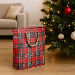
Burgundy: from classic velvet to contemporary glamour
When you choose burgundy as the guiding color for your fall packaging, you're not simply tapping into a seasonal hue, you're evoking a symbolic universe of depth, elegance, and emotional resonance. This color, which has always been associated with mature wine, sober royalty and velvety matter, has a visual power that speaks directly to the consumer's subconscious. It is a color that does not scream, but seduces. It does not dazzle, but conquers slowly, like a perfume that is imprinted in the memory.
In the past, pomace was used almost exclusively in classical contexts, sometimes even anchored to a formal, even austere aesthetic. Today, however, you can reinterpret it according to the logic of contemporary design, giving it a new vitality without depriving it of its charisma. You can use it to give chromatic thickness to gift boxes designed for refined objects, such as perfumes, wines, bijoux or writing items, choosing tactile supports such as leather-effect paper or cardboard coated with soft-touch finishes. In this way, the burgundy stops being a nostalgic quote and turns into a contemporary style statement.
One of the keys to updating pomace is to combine it with new materials and luminous details, capable of generating a sophisticated contrast. The insertion of a satin copper satin ribbon, a matt bronze print or a tone-on-tone adhesive seal with glossy reliefs enhances the chromatic richness of the burgundy, making it more dynamic and modern. Even in personalised shopping bags, this colour acquires a new dimension when applied to matte backgrounds with natural rope or grosgrain handles, to which you can add linear, almost architectural graphic elements in warm white or smoky grey. By doing so, you achieve a balance between the strong identity of the color and the visual lightness of the design.
The burgundy also lends itself to dialogue with wider color palettes, in which it can act as a protagonist or as an accent. Combined with powder pink, it takes on a romantic but adult nuance; If you combine it with sage green, you get an organic and sophisticated effect, perfect for environments where naturalness is a central value. Together with deep blue or anthracite gray, on the other hand, it can create a communication of great authority, ideal for high-end brands or packaging intended for niche products.
It should also be emphasized that, in its darker and desaturated version, the pomace is perfectly linked to a contemporary sensibility increasingly oriented towards sustainability. By using it on recycled or regenerated papers, perhaps printed with natural pigments, you can communicate a conscious luxury, which knows how to be ethical without sacrificing aesthetic impact. The pomace, in this sense, becomes a symbol of a beauty that resists time, that speaks of care and attention, that embraces the past but looks ahead with coherence.
In conclusion, if you want to create gift boxes or personalized shoppers that know how to stand out in the autumn landscape, burgundy represents a chromatic choice of great narrative power. It is not a color to be treated lightly, but a tool for deep visual expression, capable of communicating value, emotion and uniqueness. It's up to you whether to leave it anchored to its classic heritage or to guide it towards new forms of glamour, lighter, more contemporary, but no less evocative.
Mustard: from retro tone to statement color
If you decide to include mustard in your gift boxes or in personalized shopping bags for the autumn season, you are making a choice that has the power to surprise, displace and fascinate. This colour, which carries with it a defined and unmistakable chromatic identity, has emancipated itself from its retro origin to establish itself as the absolute protagonist of a bold, intelligent and current aesthetic. Mustard, in other words, has stopped living in the shadow of nostalgia to become today a real visual statement, capable of attracting attention without being intrusive.
In your packaging design work, it will be clear to you that mustard cannot be treated like just any yellow: it has a deep grain, a warm density that distinguishes it from any other tone. It's sunny but earthy, bright but never brash, energetic but with a subtly elegant component. For this reason, you can use it as a dominant color base when you want to give your packaging a contemporary and vital air, without sacrificing a reference to nature, vegetable, artisanal.
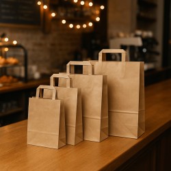
In gift boxes, mustard works perfectly when combined with natural materials such as kraft paper, rough cardstock or linen-effect finishes. The result you get is a chromatic balance that recalls the world of organic, sustainable, but which still manages to speak an urban and refined language. By adding details in midnight blue, such as a band, a label, or a thin ribbon, you create a modern and harmonious color contrast, capable of awakening visual perception and suggesting quality, creativity, originality.
In the case of personalised shopping bags, mustard offers multiple possibilities. If you use it on a matte stand, with flat tone-on-tone or raw cotton handles, you can achieve a casual-elegant effect, which works as well in concept stores as it does in gourmet stores or pop-up shops. But if you combine it with geometric prints in black, or a minimal logo in white, you can transform your shopper into an object with a strong and contemporary design, capable of elevating the shopping experience and, above all, of being reused with pleasure, becoming an integral part of the customer's daily life.
Don't forget that mustard, by its nature, dialogues very well with a variety of materials and contexts. It can become rustic if you choose it on a raw paper, or sophisticated if you apply it on a glossy substrate and embellish it with satin golden details. It can look warm and familiar in autumn interiors, or surprisingly cool when displayed in bright display cases alongside cool colours such as light grey or pale sage. Its versatility is such that it makes it one of the most interesting chromatic tools to tell the story of a season that, by nature, moves between opulence and essentiality.
There is one last aspect, perhaps the most strategic, that you have to take into account: mustard is one of those colors that, once encountered, you will not forget. It has a mnemonic power, an ability to remain etched in the customer's mind, superior to more conventional colors. Because of this, it can become a distinctive part of your seasonal brand identity. If you use it consistently in the layout, in the coordinated materials, in the visual supports, you will be able to build a recognizable and engaging image, which will speak of you even long after the purchase.
Choosing mustard, therefore, means embracing a vision of packaging that is not satisfied with being functional, but aspires to communicate, inspire, tell. It is a color that does not follow trends, but anticipates them. And if you know how to interpret it in the right way, it will become one of the most effective keys to telling the story of autumn with a new, courageous, perfectly contemporary visual language.
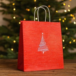
Burnt orange: elegant energy for packaging
Burnt orange is one of those colors that invites you to stop, observe, and feel. It does not have the childlike vivacity of bright orange, nor the mute composure of the most austere browns: it is located in a refined middle ground, where warmth and sobriety come together in an expressive balance ideal for the autumn season. When you choose it for your packaging or personalized shopping bags, you are opting for a color that communicates, almost instinctively, welcome, vitality and rootedness. A color that warms the eye without ever attacking it, and which for this reason proves to be perfect for interpreting autumn according to a contemporary, never nostalgic aesthetic.
Using burnt orange in packaging projects means evoking the image of dry leaves crunching under footsteps, wood burning in discreet fireplaces, sunsets that anticipate the cold but do not give up beauty. But all this, in the language of retail, must translate into an orderly, coherent and, above all, memorable visual proposal. This is where your design sensibility comes in. This color is not satisfied with being a chromatic filler: it demands the right context to shine, and it is your job to build it around it.
In a gift box, burnt orange is best expressed when it meets textured, warm, non-reflective materials. A slightly amber kraft paper, a matte surface with micro-embossing or a canvas-effect coating are ideal supports to enhance its depth. Its earthy soul, when combined with rust-colored details or dull ivory graphics, conveys a feeling of rootedness and sincerity. It can tell the story of an artisanal gastronomic product, a handmade object, an exclusive selection. But it can also become elegant, almost luxurious, if accompanied by satin bronze accents, a velvet ribbon or a seal with a pearl finish.
In personalised shoppers, this colour has the ability to combine solidity and originality. It allows you to create bags with a strong but never shouted character, perfect for stores that want to stand out without falling into the excessive décor effect. A burnt orange shopper, perhaps printed on a matte background and embellished with rope handles and tone-on-tone embossed logo, conveys authority and a sense of detail. If you choose it in combination with desaturated colors such as petrol blue, mauve or charcoal, you will get very elegant color compositions, also ideal for the male target.
In terms of perception, burnt orange acts as a mediator between dynamism and grounding. It is no coincidence that it is increasingly used by brands that want to convey values such as authenticity, balance, conscious passion. In an era in which the consumer is looking for emotional and visual connections that overcome superficiality, offering packaging in this shade means offering a complete sensory experience, from sight to touch, up to imaginative suggestion. Burnt orange manages to make a promise tangible: that of lasting warmth, authentic care, thoughtful beauty.
It must also be said that its strength lies in its versatility: it can live both in rustic contexts and in more sophisticated atmospheres. It all depends on your ability to govern it, to combine it wisely, to enhance it without weighing it down. When treated sensitively, it becomes a refined tool for telling a story. If used excessively, it risks losing its subtle charm.
In summary, when you decide to rely on burnt orange to build your autumn visual language, you are choosing a color capable of speaking to the deepest emotions, of evoking memories and sensations, but also of embodying an elegant, concrete form of energy that becomes packaging, becomes a shopper, becomes a presence. And in that visual gesture there is already everything: the intention, the care, the bond.
Textures and finishes: how color changes "to the touch"
In the world of packaging, color is never perceived in isolation. It is always mediated by the material that hosts it, by the light that passes through it, by the finish that shapes it. For this reason, when working with autumn colors such as burgundy, mustard or burnt orange, you cannot limit yourself to the color choice itself, but you must consider how that particular shade will transform once applied to a specific support. The color, in fact, changes not only by the effect of light, but also by the effect of the texture. And it changes radically.
Pomace, for example, has a natural depth that lends itself to different interpretations depending on the treatment. On an embossed paper, it takes on a noble and material, almost regal air; on a velvety finish, it becomes sensual and enveloping, suggesting a quiet and sophisticated luxury. But the same color, if printed on a glossy support, risks losing its evocative power, giving a colder and more impersonal effect. For this reason, you have to carefully evaluate the surface on which to apply it: the texture becomes the skin of color, and like any leather, it communicates complex emotions.
Mustard, by its nature, is already a warm and full-bodied color, but it is in the choice of material that it can transform from a rustic tone to a modern graphic sign. If you use it on recycled paper with visible fibers, you will enhance its natural and artisanal component, perfect for organic, sustainable, locally linked products. But if you apply it on a compact, slightly satin support, mustard changes its voice and becomes more decisive, urban, almost industrial. The message it conveys is completely different, even though it is the exact same color.
Burnt orange also undergoes surprising mutations based on the finish. A matte, micro-textured version of this colour can immediately evoke a sense of domestic warmth, tactile authenticity, which works great in the food and wine sector. But the same orange, treated with soft-touch paint or with bronze foil inserts, takes on a more elegant and refined tone, suitable for high-end gift packaging, cosmetic products, and design objects. It is the finish that shapes the perception of color, makes it warmer or more distant, more tangible or more ethereal.
The fundamental role of light must also be considered. A glossy finish, as much as it may attract the eye, tends to reflect and make it more difficult to read deep tones. A matte finish, on the other hand, absorbs light and returns the truest and most intimate shades of color. When working with autumn palettes, this difference is decisive. A burgundy on matt cardboard speaks in a completely different way than one printed on reflective material. The first whispers, the second screams. And you need to know which of the two items you want to get to the customer.
Don't underestimate the synesthetic effect of certain combinations of color and texture either. Mustard on rough paper is not only visually warm: it also seems to "smell" of spices, leaves, woods. Burnt orange with a velvety finish is not only soft to the eye: it gives the impression of being physically cozy. The burgundy engraved dry on a rigid box is not only elegant: it conveys the sense of an experience with attention to every detail. In an age where the consumer wants experiences more than objects, this type of sensory communication becomes crucial.
In conclusion, color in autumn packaging never exists on its own. It is part of a larger composition, in which matter, light and touch combine to define its identity. Knowing how to govern these variables means transforming a simple color into a multisensory experience, into a tangible story of what your brand represents. Therefore, when choosing a palette for autumn, always ask yourself not only what you want to say, but how you want it to be perceived. Because color, in the end, is not just looked at. Feels. You can touch it. You live.
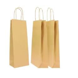
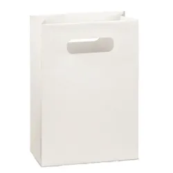
Personalized shopping bags: autumn becomes brand identity
In the contemporary retail landscape, the shopper has now gone beyond the role of a simple container to become a full-fledged identity tool. It is no longer just a functional object, but an extension of your brand, a mobile surface that tells who you are, what you offer and in which direction your values are oriented. In this scenario, autumn represents an extraordinary opportunity to build a coherent and memorable visual narrative, capable of expressing itself through conscious chromatic choices and well-calibrated materials.
Using the typical colors of the season – burgundy, mustard, burnt orange – does not mean adhering to a seasonal cliché, but rather declining the identity of your brand according to a warm, engaging, emotionally rich language. The strength of these colors lies in their ability to evoke deep sensory experiences: the pomace recalls the earth, the wine, the maturity; mustard evokes spice, fabric, craftsmanship; Burnt orange speaks of dry leaves, sunsets and ancient woods. When you apply them to a shopping bag, each dye helps build a mental image that goes far beyond aesthetics.
But it is not enough to choose an evocative color: it is in the consistency between the shade, the shape of the shopper, the print and the material used that the true communicative effectiveness is played. A matte burgundy shopper with copper-colored grosgrain handles, enriched with a tone-on-tone embossed logo, conveys elegance and discretion, ideal for a refined boutique or an artisan atelier. If, on the other hand, you prefer mustard, you can use it on a rough background, perhaps in recycled kraft paper, from which a minimal graphic in black or warm gray emerges: the effect will be modern, urban, perfectly calibrated for gift shops, independent bookstores or contemporary concept stores.
Burnt orange, with its vibrant and natural soul, can be the protagonist of a shopper dedicated to food and wine products or household items: a matte background with cream or rope details, jute handles and a warm print that plays on soft contrasts, can create a visual effect of great emotional coherence. In all these cases, the shopper is not just a means of transporting a purchase, but an object that the customer keeps, reuses, associates with a positive memory and a clearly recognizable identity.
This is precisely the key: to make the shopper memorable. Not through excess, but through visual intelligence, the balance between simplicity and refinement. Autumn, with its enveloping colors and its symbolism linked to the return to the home, care and slow time, is the perfect season to express a welcoming aesthetic, which invites contact and trust. Your shoppers must know how to embrace this language and transform it into a coherent gesture: the one that begins in the store and continues on the streets, in the closets, in the hands of those who return to you.
In a market that increasingly rewards personalization and recognizability, creating a line of autumn shoppers means affirming one's ability to read the seasons not as constraints, but as an opportunity to tell stories. It means understanding that the identity of a brand is not built with proclamations, but through accurate details, well-thought-out colors, materials that speak the same language as the message. If pomace, mustard and burnt orange can interpret this code, your shopping bags won't just look good. They will become symbolic, emotional, indispensable. They will become, for real, the visible face of your brand.
Sustainable packaging and warm colours: a winning combination
In a market that is increasingly sensitive to environmental issues, sustainability can no longer be a marginal or accessory choice: it is a strategic necessity, a value that is reflected in every aspect of your packaging project. But sustainability does not mean giving up aesthetics. On the contrary, today visual beauty is intertwined with the ethics of the product, generating new forms of visual language in which autumn colors play a central role. Pomace, mustard and burnt orange, if reinterpreted through basso -impact materials and conscious production processes, can become the ideal spokespersons for a vision that combines respect for the environment and communicative power.
You have to start from a fundamental assumption: the contemporary customer is not just looking for a product, but a coherent narrative. They want to know what's behind a box, where a paper comes from, what inks it was printed with, if the handle of the shopper is compostable, if the ribbon is made of recycled fabric. In this context, the warm and natural colors of autumn have the power to tell sustainability in an authentic, tangible, almost instinctive way. Desaturated pomace, applied to recycled paper, immediately evokes an idea of care and depth; matt mustard, on untreated supports, communicates balance and craftsmanship; Burnt orange, when printed with natural pigments, gives a feeling of truth and coherence with the cycles of the earth.
The strength of this combination lies in the fact that the warm and earthy colors already have a reference to the organic world, to the seasons, to living matter. When you combine them with raw papers, visible corrugated cardboard, supports with deliberate imperfections, the message you build is immediately legible: here we do not celebrate the superfluous, but the essential. Beauty is not reflection, but substance. In this sense, the choice of a dusty pomace on an uncoated paper is not a decorative act, but an affirmation of consistency. Similarly, mustard wrapped in fully compostable packaging is not just an aesthetic quirk: it is a statement of intent.
Another aspect to consider is how fall colors help build trust. Warm shades are by nature reassuring, welcoming, empathetic. They communicate slowness, dedicated time, attention. And sustainability, if you really want to communicate it effectively, must never appear cold or technical, but close and understandable. This is why a palette based on pomace, mustard and burnt orange can be a winning choice to give warmth and humanity to ecological packaging, making it desirable as well as virtuous.
When choosing finishes, you can reinforce this vision by avoiding plastic paints, favoring matte, natural, velvety solutions. You can opt for cardboard closures, for interlocking systems that eliminate glue, for laser cuts that replace complex graphics. In each of these solutions, colour helps to give voice to design simplicity, transforming every detail into a distinctive sign.
Sustainable packaging, if built intelligently, is never a fallback, but a creative act. It pushes you to rethink everything: from the choice of material to the way the color settles on the surface. And the colors of autumn, with their thousand-year history of transformation, maturity and balance, offer you the ideal tool to express this new paradigm. A marc that tastes of the forest and silence. A mustard that resembles the hot earth under the basso sun. A burnt orange that brings to mind wood, fire, living matter. In these colors there is already everything you need to tell sustainability with authority and beauty.
For your packaging to be truly effective, it must speak a language in which aesthetics and responsibility come together. Autumn colors, if treated with awareness and declined through coherent materials, allow you to build this language without compromise. Because today it is not enough to choose the right paper: you also have to choose the color that makes it credible, desirable, alive.
Multisensory gift boxes: not just to look at
When designing a gift box for fall retail, you need to think about something that goes beyond appearance. It's not just about creating a visually appealing object, it's about building an experience. And the experience, to be memorable, must involve all the senses. Color is only the beginning of this story. It is the element that attracts the eye, that creates anticipation. But it is to the touch, to the smell, to the overall perceptual quality that it is up to the task of transforming that initial perception into a concrete, lasting, emotional sensation.
The most effective gift boxes are those capable of activating a multisensory response, where every element – from the material to the finish, from the scent to the sound of the melting ribbon – contributes to building a suspended, ritual moment. Autumn colors such as burgundy, mustard and burnt orange lend themselves perfectly to this type of approach: they are dense colors, full of evocations, capable of generating expectation, intimacy, warmth. But to really express their full potential, you have to combine them with materials and details that enhance their tactile and sensory dimension.
Imagine a velvety burgundy box, wrapped in a grosgrain tape that offers durability under your fingers, with a slightly rough, dry-stamped adhesive seal. The effect is that of a package that is not only looked at, but touched slowly, which returns soft, reassuring, enveloping sensations. If, then, opening the package, an autumnal scent spreads – cedarwood, vanilla, cinnamon, black tea – the color acquires depth, memory, meaning. It becomes part of an emotional environment that involves the recipient, making the object more than a gift: a careful, personal, unforgettable gesture.
Mustard, so energetic and earthy, can take on a refined dimension when combined with materials such as natural cardboard with felt inserts, or embellished with light, almost textile textures that refer to wool, linen, vegetable fiber. In this combination, color communicates genuineness, tradition, but also a taste for detail. A gift box constructed in this way invites you to be handled, examined, perceived in its layers: the minimalist graphics silently interpret a carefully selected content, while the material – warm, irregular, alive – tells a story of craftsmanship, authenticity, and connection with time.
Burnt orange, on the other hand, can become the protagonist of more intense and enveloping experiences. Combined with leather-effect papers, matte metal inserts, natural scented papers with spicy notes, it generates a sensory atmosphere that recalls damp earth, leaves, spices. A package in this shade, if well constructed, can even evoke sounds: the rustle of a slowly opening paper, the imaginary crackle of a fireplace, the soft voice of autumn. It's these details that make the difference, that elevate your product from a simple purchase to an immersive experience.
When designing multisensory packaging, you must pay attention to the consistency between sensations: the color must dialogue with the material, the scent with the content, the shape with the use. Everything must contribute to a single message: attention, beauty, authenticity. For this reason, it is not enough to choose a trendy color: it is necessary to build an ecosystem of perceptions that makes that color necessary, sensible, evocative. And in this, the autumn season offers you a very rich palette of emotional, cultural, natural references from which to draw.
Ultimately, a well-designed multi-sensory package is not limited to containing an object. It anticipates it, tells it, celebrates it. Turn the gesture of opening into a ritual. And in this ritual, color – if accompanied by a conscious choice of textures, scents, shapes – becomes a narrative tool, an emotional accomplice, a tangible sign of attention that does not go unnoticed. This is how autumn packaging, from a visual element, becomes a total experience. And you, through it, can offer much more than a product: you can offer a memory.
The Future of Seasonal Colors in Visual Merchandising
When you look at the evolution of visual merchandising in a seasonal way, you realize that colors are no longer just indicators of a time of the year. They become tools of visual direction, dramaturgical elements capable of building a coherent narrative between product, environment and brand identity. If until a few years ago the colors of autumn were limited to reproducing a reassuring ritual – leaves, rust, brown tones – today you are witnessing a more profound change: the classic shades do not disappear, but are transformed, contaminated, become a vehicle for a new vision of time and taste.
In this change, the autumn palette emancipates itself from predictable cyclicality and embraces a more fluid aesthetic, where the distinction between classic and contemporary dissolves in favor of emotional and narrative research. Burgundy, for example, ceases to be a noble and closed hue to become a living, almost liquid color, which lends itself to being reinterpreted in a minimalist, urban, sensory key. Mustard moves away from retro imagery and becomes a bearer of energy and positivity, without losing its link with the earth. Finally, burnt orange asserts itself as a transitional color: warm but sophisticated, ancestral but very shiny in its contemporary rendering.
In visual merchandising, all this translates into environments capable of deeply involving the customer, thanks to color palettes that do not just decorate but that tell an identity. Showcases, displays, walls and support materials must no longer just be "in line with the season": they must embody it, interpret it, make it live. The burgundy, perhaps declined in less dark shades, can become the ideal background for premium products, highlighted by warm lights and opaque textures. Mustard, used as a chromatic accent or in graphic patterns, can create focal points that guide the customer along the exhibition path. Burnt orange, applied to material elements or structural details, conveys a sense of rootedness and warmth, encouraging permanence in the space.
This evolution is accompanied by a growing attention to the perceptive quality of space. Autumn colors are no longer chosen for naturalistic imitation, but for what they communicate on a deep level: slowness, care, awareness. And you, in your role as visual designer or brand manager, are called upon to recognize these resonances to build coherent, experiential, distinctive environments. It's not about following fashion, it's about understanding the emotional codes that underpin contemporary shopping behavior.
With this in mind, seasonal colors are no longer rigid or exclusive. They can dilate over time, contaminate each other, extend beyond the conventional calendar. You can start introducing a mustard shade as early as late summer, and then evolve it into more earthy tones around November. You can use pomace in summer by combining it with light materials, and then make it more enveloping with the arrival of the first cold weather. Seasonality thus becomes a flexible tool, at the service of a deeper narrative, capable of accompanying the customer along a coherent but never banal path.
The future of seasonal color in visual merchandising is therefore complex, layered, intimately linked to the ability to interpret the emotional and sensory desires of the public. It is no longer a question of re-proposing consolidated schemes, but of rewriting them with each new season. In this scenario, the autumn classics do not disappear: they regenerate. And it's up to you to recognize its potential, renew its language, guide the customer through a space that is not just sales, but experience, story, vision.
Autumn as an evolved visual language
After going through the ten chapters of this journey, it is now clear to you that talking about autumn colors in retail does not simply mean re-proposing usual shades with a veil of seasonality. Instead, it means recognizing in each color – burgundy, mustard, burnt orange – a narrative potential that is renewed from year to year, rewriting the rules of commercial aesthetics with an eye to both the past and the future. These are no longer just "seasonal" colors, but tools of design, strategy and above all identity.
You have seen how each shade is transformed according to the material on which it rests, the texture that accompanies it, the light that caresses it. You have understood that bold combinations, if well dosed, can generate new emotions and give depth to the visual story of your brand. And you have discovered how multisensory packaging and well-designed shopping bags can become a vehicle for an authentic, memorable, deeply engaging experience. Colour never acts alone, but lives in the relationship: with the customer, with the material, with the context. It is in this relationship that value is built.
Above all, you have learned that autumn is not only a natural season, but also a mental, emotional, perceptive season. It is the time of depth, of slowing down, of rediscovering. And autumn packaging, if well designed, can become a metaphor for all this: an object that invites reflection, that conveys warmth and authenticity, that tells a story with coherence and beauty. In an era dominated by speed, offering a calibrated, elegant viewing experience, consistent with the sensitivity of your audience, is one of the most effective tools for building lasting bonds.
The colors of autumn, if used with intelligence and sensitivity, allow you to overcome seasonality as a limit and transform it into a design opportunity. In this way, your brand does not just "dress" in autumn, but interprets it, inhabits it, tells it. And this, today, is the true hallmark of an identity that knows how to evolve while remaining true to itself.