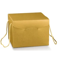
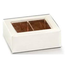
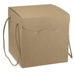
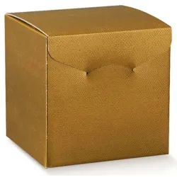
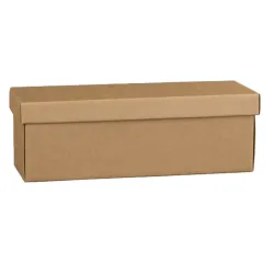
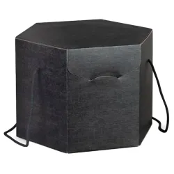
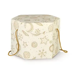
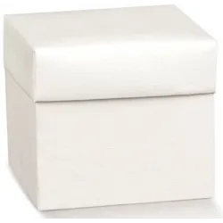
The charm of autumn in packaging
There is a moment, every year, when nature changes its voice. The days are getting shorter, the air is getting cooler, and the colors of the world around you are tinged with deep, warm, reassuring shades. It is autumn, a season of transition and reflection, but also of great inspiration for those involved in packaging and visual communication. If you're in the packaging business, you know how important it is to tune in to people's feelings, and autumn is a precious opportunity to do so in an authentic and memorable way.
In this period, consumers are looking for more intimate, genuine and enveloping experiences. Packaging is no exception: it becomes an extension of the seasonal landscape, a reflection of the desire to return to slower and more natural rhythms. The textures become material, the materials recall the earth, the colors move towards warm and desaturated tones that speak of wood, leaves, clay and moss. It is not a question of following a passing fad, but of responding to a deep need for connection, for true sustainability, for beauty that does not shout but whispers.
Autumn is the ideal time to rethink your packaging in a seasonal key, without forcing, but with consistency and awareness. It's time to be inspired by your surroundings and translate that suggestion into color choices, materials and details that tell a story. A story that speaks of a return to nature, but also of attention to detail, respect for the environment, aesthetics that know how to excite.
Using autumn colors in packaging does not simply mean changing palettes, but creating a dialogue with those who observe and touch that packaging. It means inviting him to stop, to appreciate the gesture, to perceive the value of what it contains. This is why autumn is not just a season: it is a powerful narrative key, which you can use to make each package closer, more human, more real. And if you do it with sustainable materials and with a respectful approach, you are building a strong message: that beauty and responsibility can walk together.
Forest green: natural elegance and depth
If there is a color that manages to evoke the depth of the woods, the humid silence of the land covered with leaves, the mystery and quiet of autumn nature, it is the green forest. It is not a bright green, it is not bright or intrusive. It is a deep, calm, elegant green. It is a colour that immediately communicates authenticity, balance and respect for the environment. If you want to give your packaging a voice that speaks of nature with authority and style, forest green is the right choice.
When you use it in packaging, something immediately changes in the perception of the product. The green forest, in fact, does not limit itself to decorating: it envelops, protects, tells. It is the color of stability and trust, but with a contemporary touch. It works great on textured surfaces, such as natural kraft paper or uncoated cardstock, but it also works best on papers with a slight embossing or matte finish that enhances its depth.
Using it in your packaging means making a conscious choice, capable of combining sustainability and refinement. Forest green is particularly effective when combined with neutral shades such as warm beige or ochre, or enhanced by details in wood, jute or twine. It can become the dominant color or be used for targeted elements: a cotton ribbon, a band, a label printed with ecological inks, perhaps tone-on-tone for a discreet and sophisticated effect.
This color also has a narrative power: it suggests a return to the origins, a reconnection with what is true and lasting. It is no coincidence that more and more sustainability-conscious brands are choosing it for their seasonal lines. He doesn't scream, but leaves his mark. And it does so with elegance, accompanying the hand and the eye towards a shopping experience that is not only beautiful to look at, but also meaningful.
Choosing forest green for your autumn packaging is, after all, a way of saying something deeper. It is like whispering to the customer that what he is receiving is thoughtful, cared for, respectful of nature and people. And this, today, makes all the difference.
Terracotta: earthy warmth and craftsmanship
There is a color that, more than others, manages to evoke the bond with the earth, the warmth of the hands that create, the authenticity of things made with care. It is terracotta. A warm, deep tone, capable of giving character to each package without being intrusive. When you choose terracotta for your packaging, you choose to communicate passion, craftsmanship and a beauty that comes from simplicity.
This shade has a silent force, which warms the eye and tells ancient, almost Mediterranean stories. It recalls clay, dry leaves, stone walls warmed by the basso sun of October. It is a chromatic choice that is perfectly linked to the idea of sustainability, because it conveys a sense of continuity with nature and respect for materials. It does not appear built or artificial: it seems to come directly from the autumn landscape, as if it were born there, among the fields and paths.
In packaging, terracotta lends itself to many interpretations. You can use it on recycled cardboard boxes to give a genuine and sophisticated look, or on raw paper shopping bags to achieve a natural but distinctive effect. It also works wonderfully in the details: a raw linen ribbon, a dry print on a matte surface, a band with a rough finish. Its chromatic intensity allows you to create delicate contrasts or tone-on-tone combinations of great elegance.
But terracotta is not only aesthetics: it is also emotion. When you use it, you create a cozy atmosphere. Invite those who receive the package to take the time to observe, to feel, to appreciate the materiality of the object. It is a choice that enhances the content without obscuring it, on the contrary, it enhances it. Because it communicates that that product has been designed and packaged with the same care with which clay is worked: slowly, with love, with respect.
Incorporating terracotta into your fall palette means resonating with a warm and honest aesthetic, which consumers are looking for more than ever today. It is a color that speaks of home, of seasons, of true bonds. And when you integrate it into a sustainable packaging project, the message is amplified: you are saying that it is possible to combine beauty, ethics and identity. Uncompromising.
Ochre: golden light between the leaves
There is a particular light, in autumn, that filters through the branches of the trees and lights up the air with golden reflections. It is a soft, enveloping light that transforms everything into something precious. Ochre is the color that more than any other manages to capture this magic. When you choose it for your packaging, you are choosing to give shape to that light: you are bringing all the visual and sensory warmth of the season into a package.
Ochre is not just any yellow. It is a complex, nuanced color that embodies a perfect balance between energy and delicacy. It is the tone of dry leaves, straw, arid clods of a field at rest. But it is also the color of lived-in gold, not sparkling but deep. It has a natural quality that makes it immediately consistent with the language of sustainability. It doesn't need special effects to get noticed: it speaks for itself, with elegance and measure.
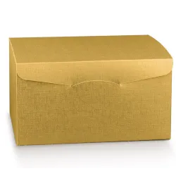
In the context of autumn packaging, ochre allows you to play with light and surfaces. On matte papers it takes on a velvety, almost dusty appearance. On slightly pearly supports or with natural finishes, it comes to life with iridescent reflections, discreet but fascinating. It is perfect for emphasizing graphic details, such as logos or stylized patterns, and can become the protagonist or accent color, depending on the intensity you want to give to your project.
You can combine it with neutral tones such as warm beige to obtain a bright and harmonious palette, or combine it with forest green or terracotta to create natural and sophisticated contrasts. The effect is always authentic, never constructed. And this authenticity goes straight to the customer, who perceives your packaging as something neat, consistent with the values of seasonality and sustainability.
Using ochre also means knowing how to grasp the beauty of time that passes. It means accepting and valuing change, just like nature does in autumn. It is a chromatic choice that tells of transformation, maturity, balance. And if you combine it with natural materials, recycled papers or vegetable fiber decorations, the message you convey is even stronger: here there is attention, here there is awareness, here there is a different way of making packaging — closer to the earth, closer to people.
Warm beige: nature's neutral base
If there is a color that knows how to welcome without invading, that manages to give balance and harmony to any composition, it is warm beige. It's not a flashy color, which is why it's so powerful. In autumn, when nature is stripped of excesses and dressed in essentiality, beige emerges as the protagonist tone, capable of enhancing everything around it. It is the perfect basis for packaging that wants to be natural, reassuring, sober but never banal.
The warm beige immediately recalls images of raw materials: natural paper, untreated textile fibers, the softness of an organic cotton fabric. It is the color of real things, of surfaces that invite you to touch, of objects that seem to tell silent stories. When you use it in your packaging, you are choosing to put the essence at the center, leaving room for the content, the gesture, the message. And it is precisely this discretion that makes it refined.
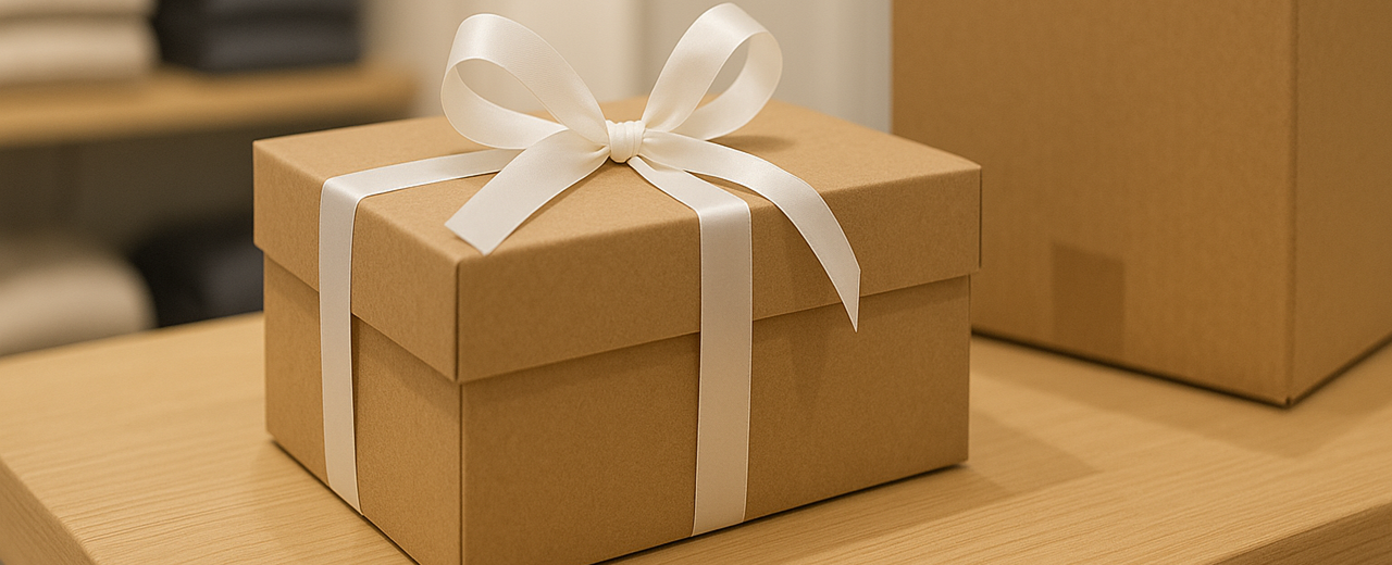
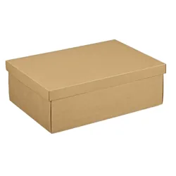
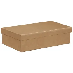
Don't think of beige as a "neutral" color in the sense of flat or anonymous. Warm beige has a thousand shades: it can tend to honey, light caramel, golden sand. Each shade has a precise identity, and when carefully matched it can transform a simple packaging into an elegant and memorable object. On natural substrates such as kraft paper, recycled cardboard or velvety paper, beige is loaded with tactile and visual nuances that communicate sustainability, authenticity and care.
You can use it as the dominant color, creating a uniform and delicate base on which to bring out logos, textures or graphic details in forest green, terracotta or ochre. Or you can reserve a more discreet role for it, letting it dialogue with other autumn colors to build a coherent, natural, never artificial visual identity. In both cases, warm beige works for you quietly but effectively, reinforcing the perception of quality and balance.
In an age where people are looking for visual reassurance, warm beige responds with delicacy and truth. He does not seek to impress, but to bring people closer. He does not want to amaze, but to make himself understood. It is the color of visual sincerity, of hospitality, of simplicity that does not give up style. And in sustainable packaging, this is worth a lot. Because it communicates that every detail has been thought out, that every choice is in harmony with the environment, that every gesture — even that of a package — can speak the language of nature.
Autumn color palettes: harmony and identity
Creating an autumn color palette for packaging is not just about choosing beautiful colors, but building a coherent, recognizable visual language that is deeply connected with your brand identity and the feeling of the moment. Autumn is the season of shades, of golden light, of soft contrasts between hot and cold, between full and empty. It is a season that invites contemplation and selection, even in the way you present your products.
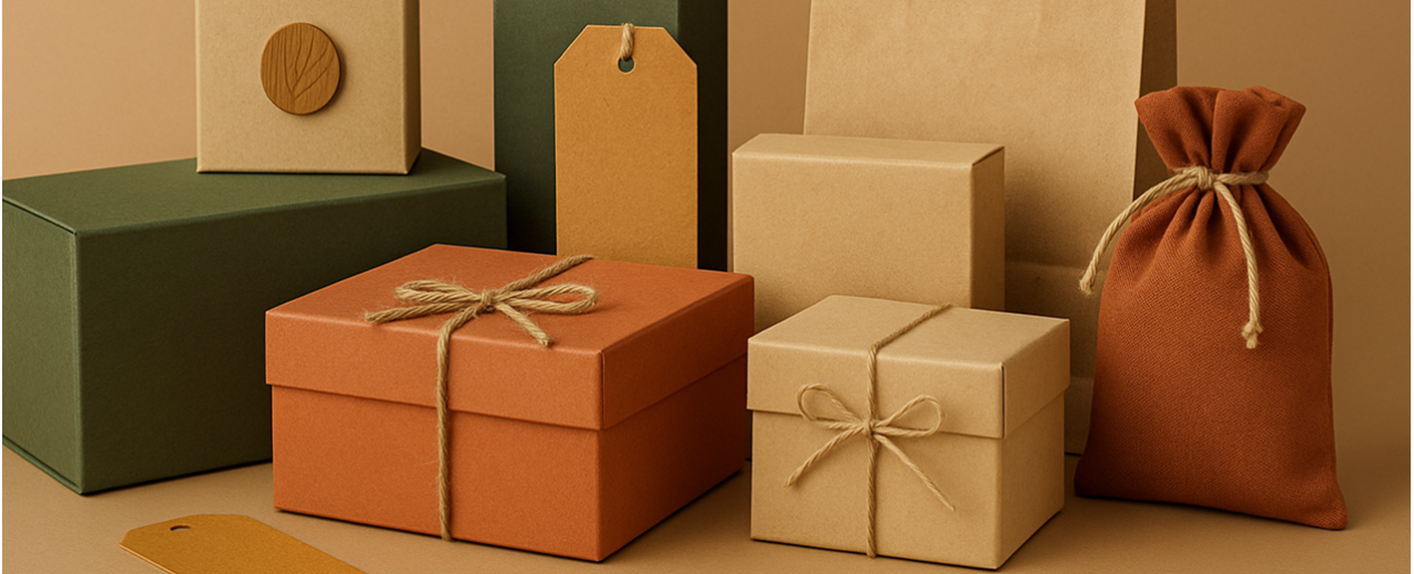
When you compose a seasonal color palette, you're giving yourself a chance to tell a visual story. And the story of autumn is made up of deep and desaturated tones, earthy shades, warm but never shouted combinations. The secret lies in balance. The forest green, with its enveloping intensity, can become the basis on which to build a solid and sophisticated visual identity. Terracotta, on the other hand, brings with it a stronger, more artisanal emotional charge, perfect for expressing passion and authenticity. The ochre adds a touch of light, of controlled energy, almost a visual caress that warms the whole. And the warm beige holds everything together, making a harmonious and natural background.
Playing with these colors is not only about giving a tone to the packaging, but also creating a feeling. Each juxtaposition can elicit a different response from the person who observes or receives the package. A combination of forest green and ochre can convey elegance and vitality. A mix of terracotta and beige tells of raw materials and craftsmanship. The alternation between chromatic solids and voids, between saturated areas and neutral spaces, can accompany the gaze and lead attention to what really matters: the content and the experience that surrounds it.
The autumn palette is also a way to stand out, to communicate seasonally without falling into clichés. It's not about printing leaves on every surface, but about evoking the season with sophistication and consistency. And, above all, to do it in a sustainable way. Choosing colors that come from nature and that dialogue well with recycled materials, natural fibers, certified papers, is a gesture that strengthens your positioning. Tell that your brand doesn't follow seasonality only in aesthetics, but in value.
In autumn, color consistency is also an act of respect for buyers. Because when a customer receives a package in which the colors, materials and sensations speak the same language, he perceives that behind it there is a precise thought, an intention. And this makes everything more believable, more human, more memorable.
Sustainable materials in harmony with colors
The choice of colors alone is not enough to make packaging truly autumnal and sustainable. To give coherence and depth to the message you want to communicate, it is essential that the materials speak the same language as the natural palettes you choose. That's why, if you decide to work with warm and earthy tones such as forest green, terracotta, ochre and warm beige, you need supports that enhance its beauty with true, tactile, recognizable textures.
Sustainable materials are not only an ethical choice: they are also a creative opportunity. They allow you to work with surfaces that tell something at the first touch. A recycled paper, for example, does not need to be coated or treated to look elegant. Its porosity, slight imperfections, that sense of "experience" that it brings with it, make it perfect for welcoming the colors of nature without filters. Each shade harmonizes more authentically when it rests on a non-artificial support.
FSC-certified cardboard, dyeing papers, embossed papers or printable natural fibres are also valuable tools. They allow you to express seasonality in a direct but refined way. A kraft paper band, for example, can become a perfect canvas for a matte forest green, while a warm beige finds its maximum expression on a linen paper or recycled ivory cardstock. If you work with your hands, with materials, you immediately notice it: when color and support are in tune, everything becomes more harmonious, more credible.
And don't forget the details: jute ropes, organic cotton ribbons, raw strings, labels made of plantable or compostable paper. Every element of packaging can help reinforce the message of sustainability, transforming a simple package into a complete experience. Glue or finishes also matter. A rough edge, a closure with a vegetable wax seal or a manual stamp can tell much more than a glossy lamination or an intrusive print.
Choosing sustainable materials in tune with autumn colors means taking an extra step: it is deciding that each component of your packaging must not only "please", but must also "speak" coherently. And this message comes through loud and clear to those who hold your package. Because today more than ever, people are attentive, sensitive, eager to recognize shared values in the products they buy. And you, with the right materials and the right palette, can be the spokesperson for an aesthetic that is not only beautiful to look at, but also the right to choose.
Eco-friendly printing techniques for a natural rendering
When you choose to make sustainable packaging, every detail becomes an integral part of the narrative, including the print. It is not enough that the colors are the right ones and that the materials are environmentally friendly: the way in which those elements are imprinted on the paper must also be consistent with the philosophy of your project. This is why ecological printing techniques represent not only an ethical choice, but also an extraordinary creative resource to obtain refined, authentic and highly evocative results.
If you work with autumnal palettes – such as forest green, terracotta, ochre or warm beige – you already know that their beauty lies in their depth, softness, ability to evoke nature without ever being aggressive. A print that is too intrusive, glossy or artificial would risk breaking that balance. On the other hand, ecological techniques, which are by nature more sober and respectful, help you keep the soul of your packaging intact.
Plant-based inks are one of the most effective solutions today: derived from natural oils, free of chemical solvents, they guarantee excellent color rendering and a lower environmental footprint. And when applied to natural supports such as recycled paper or uncoated cardboard, they blend harmoniously with the surface, enhancing the nuances and letting the materiality of the support shine through.
But it's not just about inks. Techniques such as embossed – i.e. no colour, only embossed – allow you to add depth and character without adding visual weight. A logo embossed on a warm beige card immediately conveys elegance and craftsmanship. Similarly, laser micro-engraving allows you to create textures and patterns inspired by nature, light and precise, ideal for accompanying autumn palettes without overpowering them.
Even basso impact screen printing, carried out on small runs with natural inks, can become a way to give uniqueness and coherence to your project. Every printing choice, if thought out with awareness, tells something: it tells that you are not just selling a product, but you are communicating a system of values, a clean and responsible aesthetic, an attention to detail that is perceived and appreciated today.
Autumn, with its soft colors and its muffled atmosphere, is the ideal season to rediscover essentiality. And ecological printing techniques help you do just that: remove the superfluous, enhance the material, let the color and texture speak with discretion and harmony. This way, every package you make will not only be sustainable, but also deeply in tune with the season it represents.
Season-consistent customizations
Customising packaging isn't just about adding a logo or label: it's about telling a story. And when you're immersed in the autumn atmosphere, made up of warm tones, soft lights and transforming nature, the way you choose to customise your packaging must also follow this rhythm. It's not about filling spaces with random seasonal decorations, but about finding a visual language that truly reflects the essence of autumn and the philosophy of sustainability.
Think about the colors you have chosen: forest green, terracotta, ochre, warm beige. They are colors that already tell a lot, that evoke woods, earth, leaves, filtered light. Personalization must integrate with this palette, not overpower it. Every graphic intervention – from the printed logo, to the texture, up to the graphics of the label or band – must be designed to harmonize with these tones and with the natural materials that support them. This means that the logo doesn't have to be the absolute protagonist: it can be discreet, embossed, printed tone-on-tone or even applied with a manual stamp that reinforces the handcrafted look.
Shapes and decorative elements can be directly inspired by the season, but always with sobriety. You don't need large illustrations of leaves or chestnuts to evoke autumn: all you need is a thin texture that recalls the grain of wood, a graphic sign that recalls the texture of bark or an abstract pattern inspired by the profiles of fallen leaves. The important thing is to maintain consistency with the brand identity and the visual tone you have chosen.
Typography is also part of customization. In autumn, softer, rounded, slow-paced fonts work better. They communicate warmth and humanity. If you then choose to print on untreated paper or slightly rough supports, you will see that the font itself will acquire a particular vibration, as if it were drawn by hand. And this feeling of authenticity comes through strongly to those who receive the package.
Fall customization is a chance to stand out without overdoing it. It is an invitation to rediscover the beauty of measure, detail, coherence. It is the moment in which you can transform every single element – the graphics, the color, the material – into a communicative gesture full of meaning. And if you do it respecting the season and the environment, then your packaging will not only be personalized: it will also be meaningful. It will leave a trace in the memory of those who open it, telling with discretion and warmth that, behind that product, there is a thought that goes beyond aesthetics.
Autumn packaging for every sector: ideas and inspirations
Autumn is a generous season, full of visual and sensory suggestions that lend themselves to being interpreted in many different ways. Whatever your sector – fashion, food, cosmetics, design, craftsmanship – you can take the opportunity to create seasonal packaging that speaks the language of authenticity, sustainability and identity. The key is to tailor colors and materials to your product's specific needs, maintaining consistency and enhancing the recipient's experience.
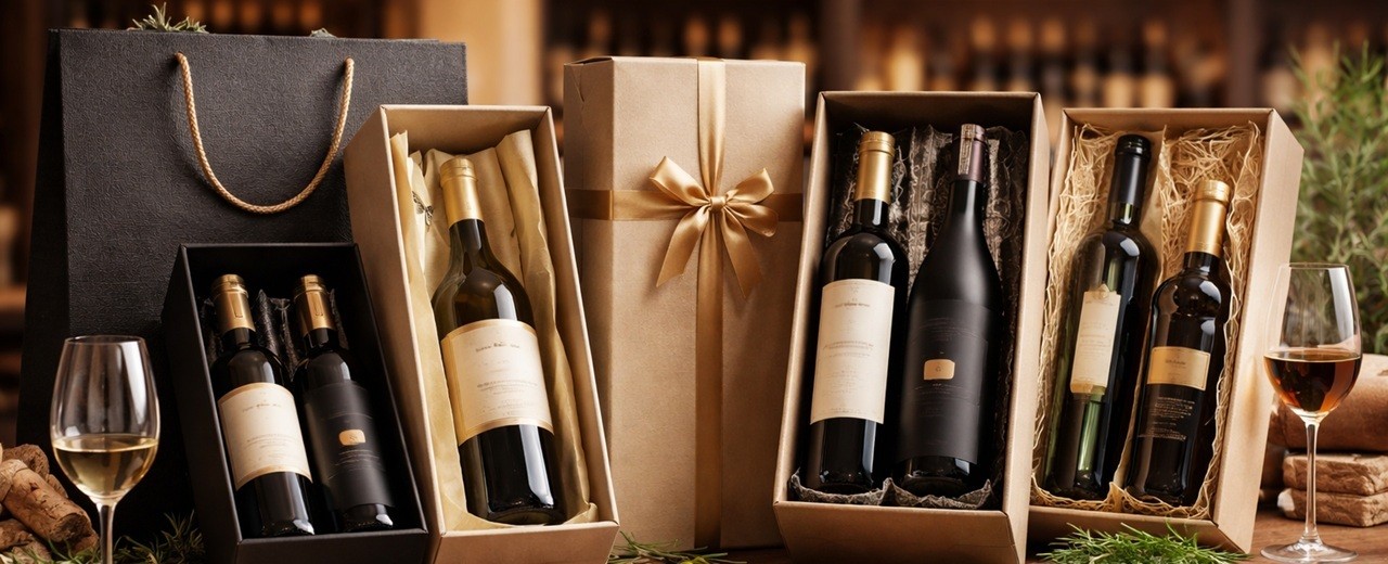
If, for example, you work in the world of food or food and wine, you know how much the sense of seasonality is already present in the gestures and habits of customers. In this context, an autumnal packaging in kraft paper coupled with recycled cardboard, with a palette that combines warm beige and ochre, can immediately evoke genuineness and craftsmanship. A biscuit box or a package of honey in forest green, closed with a simple ribbon in natural string, tells much more than a thousand words. It tells that that product is born from the earth and returns to the earth, in a respectful and conscious cycle.
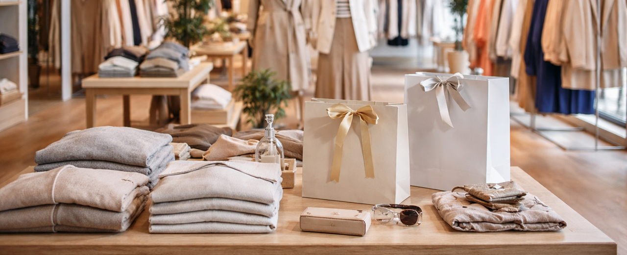
In the fashion and accessories sector, packaging becomes an integral part of the brand image. And in autumn, you can play with textural materials, such as embossed cardstock or paste-dyed papers, combining them with warm colors such as terracotta or forest green. A rigid shopper with cotton rope handles and tone-on-tone dry print, for example, conveys sustainable elegance. There is no need to overdo it: as long as every detail is designed to last, to be noticed in a silent but incisive way.
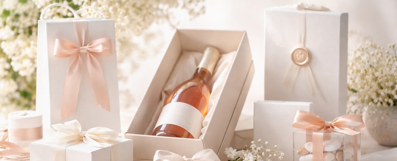
Even in beauty, where the product must convey sensoriality and well-being, autumn offers you a perfect palette to create emotional connections. Imagine a soap or candle box with natural finishes, a recycled paper band printed in ochre, or a compact box in warm beige with micro textures inspired by leaves. Everything contributes to reinforcing the feeling of care, contact with nature, comfort.
In the world of home décor or creative crafts, on the other hand, you can be inspired directly by autumn landscapes. The packaging becomes an extension of your style: rustic but sophisticated, natural but refined. You can experiment with color combinations such as ochre and terracotta, or dare with graphic accents in forest green on neutral papers, for an elegant and modern effect at the same time.
The important thing, however, is that your packaging is not just "beautiful to look at". It must also be consistent with what you sell and with the values you want to convey. The choice of a compostable material, an ecological print, a design without excesses but full of intention, today is perceived and rewarded by those who buy. Because people are looking for real experiences, and you have the opportunity to offer them from the first glance, from the first touch.
Autumn is a season that speaks softly, but clearly. And your packaging can do the same: stand out for its authenticity, for its harmony with the changing world, for the beauty that comes from respect. For every sector, for every product, there is an autumn version capable of telling all this. It's up to you to find it, listening to the season and your vision.
In conclusion, it could be said that choosing sustainable autumn packaging is not just a matter of aesthetics: it is an act of awareness, a way to tell who you are and what values you want to convey, through every detail. The warm and enveloping colors of the season — forest green, terracotta, ochre and warm beige — become powerful narrative tools, capable of evoking authentic emotions and strengthening the bond between your product and those who receive it.
When the color palette blends with natural materials, environmentally friendly printing techniques and consistent customizations, the result is a visual and tactile experience that speaks of balance, beauty and respect. And it is precisely in this silent harmony that the strength of a well-made packaging is hidden: it knows how to excite without shouting, it knows how to communicate without explaining, it knows how to remain in the memory because it is sincere.
At a time when people are looking for meaning even in small gestures, returning to nature through packaging is a winning choice. Because every falling leaf, every golden light, every color of the earth reminds us that simplicity — when done with care — has extraordinary power. And you can carry it straight into the hands, eyes and hearts of your customers.
