Autumn and the mind: why warm colours are reassuring
When autumn arrives, something changes not only outside, but also inside you. The days are getting shorter, the temperatures are dropping and nature is changing its tones: the bright green of summer gives way to a palette made up of deep reds, ochres, enveloping browns and oranges that seem to warm the air. In this transformation, your state of mind unconsciously adapts to what you see. The warm colors of autumn stimulate a very specific psychological response: they evoke protection, domestic warmth, security. And it's these emotions that you can harness, in the right way, to improve your customers' experience both in-store and online.
In physical retail, autumn colors transform the environment into a refuge. When a customer enters a space dominated by enveloping shades such as burgundy, mustard or terracotta, they perceive a sense of calm and well-being. Time slows down, the senses open up, and the attention to detail increases. This is the moment when the customer lowers his defenses, lets himself be guided and observes with greater availability. It is not just a matter of aesthetics, but of activating a psychological condition favorable to permanence and, consequently, to conversion. Warm colors act at a limbic level, that is, in the most emotional and instinctive part of the brain, favoring the association of your store with a comfortable and welcoming place, even if the product you sell has nothing to do with the season.
In the e-commerce context, the impact of colors is just as decisive. The perception of your brand passes through the monitor, and often it does so in a few seconds. By using autumnal hues in your product images, banners, website palettes, or even email graphic details, you can convey a feeling of familiarity and confidence. The user perceives your shop as "warm", coherent, attentive to the seasonal context, and this stimulates a deeper connection. During autumn, people start thinking about gifts, home, personal comfort. Every warm color you insert into your visual language becomes a bridge to reach them emotionally and make them more predisposed to buy.
If you're running a business, online or physical, you shouldn't underestimate the power of these subtle signals. Color psychology works because it speaks directly to your client's subconscious, and autumn offers you an amazing range of possibilities to do so in the most empathetic and natural way possible. Taking advantage of warm colors does not only mean embellishing the environment or changing the layout of a homepage, but getting in tune with a collective mood, intercepting a latent need for stability and giving the customer one more reason to stay, explore, trust and buy.
The autumn palette: meanings and suggestions
Autumn brings with it an unmistakable palette, capable of influencing mood and, consequently, purchasing behavior. When you choose the colors to use in your store or online shop, you're not just making an aesthetic choice: you're telling a story. Each shade speaks, communicates emotions, suggests values. And the autumn palette is perhaps the most powerful in terms of sensory and emotional suggestion.
Think of rust, for example. It is a color that comes from the encounter between the strength of red and the stability of brown. It expresses concreteness, but also restrained passion, and conveys a sense of authenticity. When you use it in a set-up, packaging materials or as a graphic accent on your site, you immediately convey a message of solid, almost artisanal warmth. The customer feels that the product is "real", that there is substance, that it is not something ephemeral or constructed.
Mustard, on the other hand, is a more brazen color, but never aggressive. It has its own vintage elegance, recalls warm fabrics and spicy scents. When you introduce it in the retail or e-commerce context, you ignite a desire for quiet renewal, for personal style. It's perfect for adding character to a storefront, homepage, or promotional design. It triggers curiosity, attracts the eye and suggests creativity.
Olive green is another fundamental color in this period. It is calm, balanced, linked to nature and resilience. In your environments or digital content, communicate sobriety, harmony, sustainability. It is a color that speaks to those who are looking for sincere and not ostentatious experiences. If you work with handcrafted, eco-friendly products or products related to personal well-being, this tone can become a real communicative ally.
And then there is burgundy. Deep, elegant, sophisticated. It is the color that more than any other evokes the idea of warm luxury, of silent quality. Using it in packaging, in site details or in the finishes of furnishings conveys to the customer the perception that what you offer has a higher value. He doesn't need to scream to get noticed. It reassures, conquers, convinces.
Each autumn color has its own emotional register, and you can compose your palette exactly as a musician creates a melody: looking for harmony, but also rhythm. In a store, this means matching shades to guide the customer's visual journey and create consistent atmospheres across shelves, display cases and communication materials. In an e-commerce, it means building a digital experience that also conveys warmth through the screen: from the product photographs to the colors of the buttons or backgrounds.
When you work with the autumn palette, you're not just decorating: you're suggesting an emotion, setting up a mood. The customer does not rationally notice it, but feels it. And often that "feeling" is the real engine that pushes him to buy.
Warm colors = warmer purchases?
It will have happened to you, at least once, to enter a store and immediately feel at ease, as if welcomed in a familiar, welcoming space. Or to browse a site and immediately perceive it as "close", pleasant, reliable. Often, behind this feeling there is not only the quality of the offer or the clarity of the content, but a silent direction made of colors. The warm tones of autumn, in particular, have the power to positively predispose those who buy, generating a deeper and more natural involvement.
In the world of physical retail, warm colors work as a visual embrace. The customer who enters an environment characterized by earthy and enveloping shades – such as brick, caramel, copper – does not feel rush or pressure. He relaxes, pauses, is more inclined to explore calmly and pay attention to details. This perceptual availability is not a coincidence: it is the result of an unconscious response that the brain activates in front of certain tones. It associates them with comfort, familiarity, protection. And from that state of mind comes a more pro-purchase attitude.
If you run a store, you know how much time is important. The more comfortable the customer feels, the longer they linger, and the more likely they are to find something they want. Autumn offers you the opportunity to facilitate this process simply by creating a visual context consistent with the season. Warm lights, combined with the right colors, help to slow down the pace and make the environment more sensorially appealing. And when the experience is pleasant, the purchase becomes almost a natural consequence.
In the e-commerce context, all this translates into another language, but the principle remains the same. A site that adopts warm colors in seasonal graphics, promotional banners, neutral backgrounds of product images, immediately conveys a feeling of care. The user feels that that brand is renewed, that it follows real time, that it is not static. This small detail generates trust. And trusting, in digital, means clicking, adding to the cart, completing a purchase.
The autumn palette also works in terms of value perception. A packaging wrapped in warm tones or an interface that offers promotions on rust or cream backgrounds, unconsciously induces the idea of a higher quality product. Because warmth does not only communicate intimacy, but also attention, detail, intention. And all this helps to strengthen the relationship between customer and brand, between desire and decision.
Using the right colors in the right season is not an aesthetic move, it is a commercial strategy. Visual warmth means emotional warmth. And emotional warmth, in a buying process, can make all the difference in the world. When you choose to embrace fall in your store's or website's visual communication, you're making the customer experience more engaging. And an immersive experience, you know, is the gateway to a successful sale.
Visual and sensory comfort: the key to selling better
In the world of commerce, both physical and digital, selling is not just about displaying a product: it is about creating an experience. And when we talk about experience, one of the most decisive aspects – but often underestimated – is comfort. The customer needs to feel good as they discover what you offer. Not only rationally, but physically and sensorially. This is where autumn colors play an essential role, because they do not act directly, but deeply. They soothe the eyes, relax the mind, stabilize the mood. In other words, they create a safe space where the consumer is more receptive, more inclined to explore and, consequently, to buy.
In physical retail, this translates into environments where the customer feels welcomed as soon as they cross the threshold. Warm and soft shades – such as beige, taupe, mustard or chestnut – have the ability to make the space more intimate, even if it is large. The effect is similar to what you feel when you enter a well-lit, fragrant room, with warm tones on the walls and natural materials under your fingers: the environment does not disturb, does not tire, but accompanies. The senses are opened, attention is concentrated, visual stress is reduced. And it is precisely in that ideal condition that the customer begins to observe the details, to be intrigued by the products, to desire a piece of that well-being to take with him.
Even in the world of e-commerce, visual comfort is a very powerful lever. Your site, in autumn, can become a welcoming place despite the coldness of the screen. Choosing warm colors for seasonal graphics, visuals, and even product photography gives you a feeling of balance. No flashy effects are needed, but visual coherence and chromatic harmony. The user, while browsing, perceives this silent care and is unconsciously attracted to it. His gaze is not attacked by useless contrasts or acid colors, but accompanied along a fluid, relaxing, clear path. This reduces friction in navigation, increases time on site and improves the likelihood of conversion.
Sensory comfort is not a frill, it is an operational tool. In stores, it can mean choosing warm lights to enhance autumn tones, setting up spaces where sight, touch and even smell work in synergy. Online, it means designing an experience consistent with the time of year, where the emotions induced by colors amplify the perception of quality and care. The customer does not notice all these details, but lives them. And when something is experienced in a positive way, the gesture of purchase becomes spontaneous, almost natural.
You have the power to create this kind of environment, and autumn offers you a perfect palette to do it. Just listen to the rhythms of the season and visually translate them into sensations. If your store or your website knows how to welcome with the right warmth, you are already doing much more than selling: you are offering an experience that remains in the memory. And memory, when it is positive, is your best ally to build loyalty and return.
Color as an activator of memory and nostalgia
There is a subtle power that colors possess: they can awaken memories. Without warning, a precise nuance can take you back to a distant moment, to a familiar smell, to a feeling you had forgotten you had. In autumn, this mechanism is activated with particular force, because the seasonal colors – warm, soft, enveloping – recall rituals deeply rooted in the collective imagination. And in the context of retail and e-commerce, this ability to evoke emotions is not just poetic: it is a concrete strategy to create connection and push purchase.
When you incorporate autumn tones into your environments or online visual communication, you're working directly on the emotional level. Burnt red can bring up the memory of a leaf being stepped on during a walk in the countryside, warm brown can bring to mind the scent of hot chocolate drunk as a child, mustard can evoke the thick woolen blankets in grandparents' houses. Each color speaks not only to the eye, but also to the memory, creating an immediate bridge between what the customer sees and what he hears. And when the shopping experience becomes personal, linked to a positive memory, involvement turns into desire.
In physical retail, you can take advantage of this mechanism through seasonal setup. It is not a matter of simply inserting some autumn decorations, but of building an atmosphere that stimulates the customer's experience. A well-thought-out display, with natural materials, consistent palettes and warm visual accents, can awaken that affective part that often guides purchasing decisions. People buy driven by needs, but also – and above all – by emotions. And if what they see awakens emotions related to home, family, the harvest season and comfort, then the product becomes more than an object: it becomes a means to find something of oneself.
You can also activate this same process in e-commerce, with different but equally effective tools. The images you choose, the palette of the site, the settings in which you place your products must speak the language of the season. If you're selling household items, for example, show rooms where the blankets are soft, the light is warm, and the hues are reassuring. If you sell clothing, focus on warm fabrics, full colors, combinations that evoke rainy days or autumn woods. Every visual detail, if thought out carefully, can ignite a memory. And every memory, if linked to a positive feeling, becomes a purchase lever.
Nostalgia is a silent but very powerful force. It is an emotional response that the brain spontaneously activates when something reminds it of a lived and pleasant experience. When you manage to stimulate it in your customer – through a coherent and engaging choice of colors – you are offering him much more than a product: you are offering him a return home, at the same time happy, to an image that comforts. And that feeling is often the decisive reason why he will decide to choose you.
Luxury and depth: the effect of autumn shades in premium retail
In the world of high-end retail, the perception of value is often a matter of detail. It's not enough to have an excellent product: it's crucial that everything from the packaging to the atmosphere communicates a sense of exclusivity, sophistication, and authenticity. And it is precisely here that the autumn palette becomes a powerful tool for visual storytelling. The warm and deep colors typical of the season – such as burgundy, bronze, forest green or chocolate – have a chromatic richness that, if used consciously, amplifies the perception of luxury and makes the shopping experience more immersive and memorable.
In physical retail, these tones act as a silent scenography that accompanies the customer on a sensory journey. Burgundy, for example, is a color that speaks of timeless elegance. It has a visual depth that recalls velvets, wine, the muffled rooms of a certain type of hospitality. When you put it in store details – from furniture coverings to display materials – you're communicating value and depth, without the need for words. The customer, even without realizing why, feels that he is in a place where nothing is left to chance. And that feeling is also transferred to the product.
The green forest, with its sober intensity, tells a story of balance and refinement. It is a sophisticated color, which hints at nature but with an almost aristocratic sobriety. In a premium retail space, it helps you evoke rarefied atmospheres, in which attention to materials and light makes the difference. Inserted in backdrops or furnishing fabrics, it enhances the products as if they were works of art, and induces the customer to observe them with different eyes: not as objects to be bought, but as choices to be carefully evaluated.
In the e-commerce context, the game becomes more subtle but no less effective. The darker and more intense autumn shades give body and authority to the graphic layout. When you choose a palette that includes bronze, amber, warm black, or burgundy as the base for your pages, you create a visual atmosphere that immediately conveys a sense of care and alto placement. Product images stand out more, text seems more punchy, and the whole communicates consistency and value. In this way, even the user who comes from an advertisement or an online search perceives your brand as more solid, more mature, more reliable.
There is also another aspect not to be overlooked: the deep colors typical of autumn slow down the fruition. They are not aggressive, they do not stimulate haste. On the contrary, they invite us to look calmly, to explore. This is a huge advantage, especially in luxury, where the time spent – both physical and digital – is often correlated with the value of the receipt. The more the customer feels immersed in a harmonious and refined context, the more he will be willing to spend. Because he's not just buying an object: he's choosing to be part of a world.
Ultimately, using the colors of autumn in premium retail does not mean following a seasonal fashion. It means thoroughly understanding how perception works, how nuances affect emotions, and how emotions drive decisions. Luxury, after all, is not only what you see, but above all what you feel. And you can amplify this feeling through visual direction that speaks the deep, reassuring and sophisticated language of autumn.
The power of combinations: combinations that work
Each color has a voice, but it is in the combination that harmony is born. In the autumn context, knowing how to match the right shades is not just a matter of aesthetics: it is a strategy to build environments and visual communications capable of guiding the customer, generating desire and influencing their decisions. When you're working in retail, physical or digital, you need to think of color as a visual grammar with which to compose sentences that speak directly to the consumer's sensibilities.
In a store, color combinations determine the emotional tone of the experience. Take, for example, the combination of rust and cream: a duo that conveys warmth, cosiness and softness. Using it in display materials, decorative elements or even seasonal packaging means building a domestic and relaxing atmosphere, perfect for encouraging the customer to stay longer and get involved. It is not just a matter of visual pleasure, but of emotional predisposition: colors speak to the most instinctive part of the brain, the one that decides even before rationalizing.
Other combinations, on the other hand, aim to evoke elegance and prestige. Olive green combined with matte gold, for example, creates a refined balance between naturalness and luxury. If you run a concept store or a store with premium products, this combination can become your seasonal visual code. You communicate refinement without ostentation, exclusivity without coldness. And the same goes for digital: using these two shades in site graphics, banners or product sheets, reinforces the perception of quality and care.
A more modern and dynamic combination is that of mustard and warm gray. This mix, less classic but very current, generates a sense of metropolitan warmth. It's perfect if you're targeting a young audience or want to present contemporary products with a sophisticated soul. You can use it to create contrast in shop windows, to structure the thematic areas of your store, or to give character to the visual content of digital campaigns. Even online, these combinations help to order the space, create rhythm and attract attention without confusing.
The important thing, when choosing how to combine fall colors, is to maintain consistency and intentionality. Every juxtaposition must have a purpose, a narrative function. It's not enough for the colors to "go well together": they have to tell something that your customer can feel and recognize. Autumn, in this sense, is a generous season. It offers you full nuances, capable of dialoguing with each other naturally. But it's up to you to decide how to orchestrate them to build a space – physical or digital – in which every visual element pushes in the direction of purchase.
Color combinations are not just a choice of style: they are a tool. If you use them strategically, you can turn a shop window into a story, a homepage into a welcoming place, an exhibition into an emotional journey. And when the customer feels guided by a well-constructed visual harmony, they enter into a deeper relationship with the product. He's not just watching: he's trusting. And trusting, as you know, is the first step to buying.
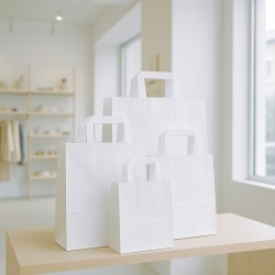
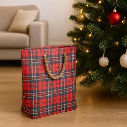
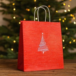
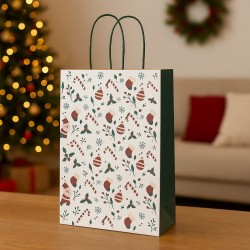
Autumn packaging: dressing products with emotion
Packaging, especially in retail and e-commerce, is much more than a wrapper: it is the first physical or visual contact between the customer and your product. In autumn, this contact can become an emotional experience, if you know how to adapt the packaging in harmony with the season. The colors, materials and textures you choose tell the story of who you are, anticipate the value of what you sell and help create that sense of care that today makes the difference in customer perception.
When a customer receives a package or unwraps a product in the store, they want to feel involved, surprised, considered. And autumn colors, with their ability to evoke coziness and warmth, are perfect for building this atmosphere. Packaging in shades of rust or burgundy does not only communicate elegance: it conveys depth, attention, a discreet but rich beauty. It is the color itself that says that that content has been thought of, that it is not just any product.
In a physical store, seasonal packaging can become an integral part of the shopping experience. Kraft paper packaging combined with mustard-colored ribbons or satin bronze seals create a visual impact that remains imprinted. The customer is not just buying something: he is receiving an item "dressed" for the season, ready to be given as a gift or shared. This reinforces the sense of perceived value and stimulates an emotion that easily turns into loyalty. A wrapping that is beautiful to look at and pleasant to touch is a gesture of respect towards the buyer, a subtle but powerful way to say: "we care about you".
In the world of e-commerce, packaging is one of the few physical elements in an otherwise digital experience. Precisely for this reason it has amplified power. The moment the customer opens the package is often full of expectations, and that's when you can really win them over. Choosing warm materials, papers with natural textures, enveloping colors such as terracotta, forest green or burnished gold transforms unboxing into a small ritual. A gesture that is lived, photographed, shared. It's not uncommon for a well-done wrapping to go viral on social media, multiplying your brand's visibility without any advertising effort.
But seasonal packaging also has another function: it stimulates impulse buying. In the store, a package that stands out for its visual warmth, chromatic harmony and consistency with the season captures the attention and entices you to buy even without a real need. Online, a well-thought-out fall presentation can increase conversions, make a promotion more effective, or raise the perceived value of a product for gifts.
Exploiting the visual language of autumn in packaging does not require large investments, but a lot of awareness. You have to ask yourself: what do I want to make those who receive this product feel? What is the emotion that must accompany the act of opening it? If the answer is "warmth, comfort, attention", then the way is clear. Let the colors of the season speak to you. Let them dress your products with the same intensity with which autumn dresses landscapes. Because well-made packaging is not just something that opens: it is something that remains.
Seasonal colors and store storytelling
Every store tells a story. Even if you don't notice it right away, every detail – from the arrangement of the products to the music in the background, from the choice of materials to the scent in the air – contributes to building a story that the customer perceives the moment he enters. And of all these elements, color is the one that speaks faster and more powerfully. In autumn, colours become precious allies to build a coherent, exciting visual storytelling capable of getting in tune with the atmosphere of the season. If you use them strategically, you can transform your store into a sensory story that takes the customer on a journey, engages them and pushes them to buy.
The seasonal set-up is not just a decoration: it is a narrative. When you choose to use a fall palette in your store, you're saying something about your sensitivity, the way you experience time, and how you want your customer to feel. An entrance illuminated by warm lights and enriched with elements in copper and burgundy tones immediately introduces a feeling of welcome. The customer enters and perceives that everything is thought out, cared for, coherent. If this effect is also consistent within the exhibition itinerary – dark wood shelves, warm fabrics, graphics in nuance with the season – the story works, and the experience becomes immersive.
It is not necessary to completely transform the space: all you need are targeted accents, cleverly chosen details, small settings that dialogue with autumn tones. It can be a wall dressed in burnt tones, a presentation table framed by dry leaves, a display case that plays on shades of mustard, olive and sienna. The point is that each element must contribute to the same story. And the story that autumn offers you is that of calm, of recollection, of the pleasure of feeling good about yourself and others. A perfect story to stimulate purchases related to personal care, home, gifts.
E-commerce can also build its visual storytelling following the same logic. The homepage becomes your digital storefront, and it needs to tune in to the visitor's seasonal mood. If, upon opening the site, the user finds warm tones, ambient images, graphics consistent with autumn, he perceives a visual story that reassures and involves him. Navigation becomes smoother, trust increases, and with it the willingness to buy. Every page of the site can be thought of as a scene: if you maintain consistency between colors, language and atmosphere, the result will be a unified and convincing experience.
In both physical and digital contexts, color becomes the common thread that holds the chapters of your story together. And the more credible the story, the more the customer will feel part of something. In a market where the offer is wide and the competition fierce, the difference is made by the emotion you are able to arouse. A seasonal story built with visual intelligence can become your most effective tool to stand out. Because people aren't just looking for products: they're looking for experiences. And you, through the silent power of autumn colors, can offer them one that will remain imprinted.
From perception to action: color strategies to increase sales
When choosing colors to use in your business, you're not simply making an aesthetic decision. You are deciding how your brand will be perceived, what atmosphere your customer will breathe, what kind of emotion will accompany their journey to purchase. In autumn, colours become real strategic tools: they are the starting point for building environments and content that not only attract attention, but generate trust, desire and a sense of quality. And all of this – if carefully orchestrated – translates into concrete actions. You enter the field of emotional sales, where choosing a palette can be the difference between a quick switch and a full conversion.
In physical retail, applying a seasonal color strategy means first of all rethinking the set-up with a narrative look. You have to ask yourself: what emotion do I want to evoke in those who enter? If the answer is warmth, calm, coziness – and that's exactly what autumn suggests – then your colour choice needs to reflect that direction. It is not necessary to change everything, but modulate. Insert visual accents in the tones of the season: movable walls covered in burnt tones, display tables that play with the contrast between warm and neutral tones, materials such as wood, felt, raw paper that amplify the tactile and visual sensation of comfort. When the atmosphere changes, so does customer behavior. He stops, observes, feels welcomed. And when he feels welcomed, he buys.
If you work online, the principle remains the same, but the language changes. Your digital interface must be consistent with the season, not for a matter of fashion, but to create harmony with the mood of the visitor. A layout with tones that are too cold or out of context in this period can be distant, anonymous. Instead, using a well-calibrated autumn palette – perhaps with visual references to foliage, wood, soft light – can increase permanence on the site and reduce abandonment. Even calls to action, if placed in a warm and harmonious visual context, appear more inviting and less aggressive. And when interaction happens in a pleasant space, the likelihood of completing a purchase naturally increases.
Another way to translate perception into action is to use seasonality in promotions as well. An offer launched as part of a visual campaign consistent with autumn – both in terms of colours and settings – will be more effective because it speaks the emotional language of the moment. If you propose a gift box, dress it in burgundy and bronze, insert visual references to the season, communicate the idea that that product is designed to be experienced in this precise time. The customer is not just buying an object: he is buying an atmosphere, an emotion, an experience.
Finally, remember that the chromatic strategy cannot be improvised: it must be tested, measured, adapted. Changing the set-up or digital layout according to the seasons is not just a matter of taste, but an intelligent practice to keep the relationship with the customer alive. You surprise him, you involve him, you accompany him throughout the year. In autumn, the emotional lever is very strong: people begin to slow down, to come to their senses, to seek warmth and meaning. If you can offer them even just visually, you have already taken a decisive step towards the sale.
It's a short step from perception to action, but only if you've been able to build the right context. And in this context, colors are not just background: they are voice, identity, a tool for conversion. It's up to you to use them consciously and precisely, to turn every season – and especially autumn – into an authentic and memorable sales opportunity.
Colors that speak, emotions that sell
Autumn is a season of transition, but also of depth. It is the moment when the light becomes softer, the air denser, and people begin to seek comfort, beauty, connection. In this context, colors are not simple seasonal decorations: they become a silent and powerful language that you can use to get in tune with your customer, guide him, seduce him. Whether you manage a physical store or an e-commerce, the color choice is a lever capable of influencing the experience, activating memories, generating desire and concretely increasing sales.
When you use autumn colors consciously, you are telling something more about your product: you are telling a feeling, a world, a lifestyle. And today, more than ever, this is precisely what the consumer is looking for. He wants to feel welcomed, recognized, involved. He wants to live an experience that leaves a trace. And you, with the right balance of aesthetics and emotion, can offer it to them.
Dressing your brand in autumn tones is not just a seasonal choice: it is an act of care. It is the most natural way to create relationship through beauty. A beauty that warms, that speaks, that sells.